 README
README
This repository is mirrored on GitHub.
Please note: Tomo is in early development. Some features may not work properly, and its API may change without notice.
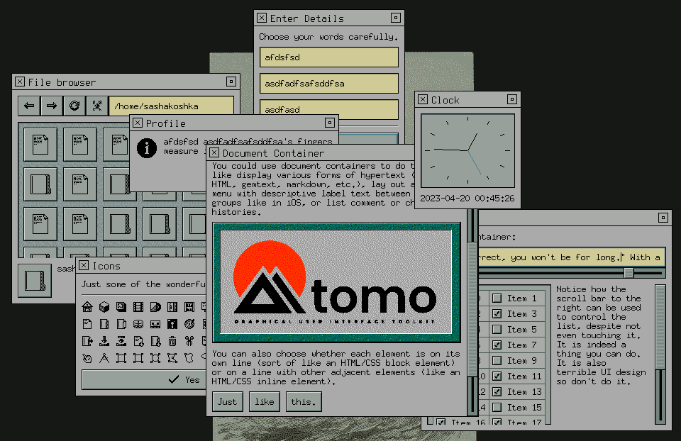
Tomo is a GUI toolkit written in pure Go with minimal external dependencies. It makes use of Go's unique language features to do more with less.
Nasin is an application framework that runs on top of Tomo. It supports plugins which can extend any application with backends, themes, etc.
Usage
Before you start using Tomo, you need to install a backend plugin. Currently,
there is only an X backend. You can run ./scripts/install-backends.sh to install
it. It will be placed in ~/.local/lib/nasin/plugins.
You can find out more about how to use Tomo and Nasin by visiting the examples
directory, or pull up the documentation by running godoc within the
repository. You can also view it on the web on
pkg.go.dev (although
it may be slightly out of date).
 Documentation
Documentation
Index 
- func Bounds(x, y, width, height int) image.Rectangle
- func SetBackend(b Backend)
- type Backend
- type Case
- type Color
- type Config
- type Element
- type Entity
- type FontSize
- type FontStyle
- type Hints
- type Icon
- type IconSize
- type MainWindow
- type MenuWindow
- type Pattern
- type State
- type Theme
- type Version
- type Window
Constants 
This section is empty.
Variables 
This section is empty.
Functions 
func SetBackend 
func SetBackend(b Backend)
SetBackend sets the currently running backend. The backend can only be set once—if there already is one then this function will do nothing.
Types 
type Backend 
type Backend interface {
	// Run runs the backend's event loop. It must block until the backend
	// experiences a fatal error, or Stop() is called.
	Run() error

	// Stop stops the backend's event loop.
	Stop()

	// Do executes the specified callback within the main thread as soon as
	// possible. This method must be safe to call from other threads.
	Do(callback func())

	// NewEntity creates a new entity for the specified element.
	NewEntity(owner Element) Entity

	// NewWindow creates a new window within the specified bounding
	// rectangle. The position on screen may be overridden by the backend or
	// operating system.
	NewWindow(bounds image.Rectangle) (MainWindow, error)

	// SetTheme sets the theme of all open windows.
	SetTheme(Theme)

	// SetConfig sets the configuration of all open windows.
	SetConfig(Config)
}
Backend represents a connection to a display server, or something similar. It is capable of managing an event loop, and creating windows.
type Case 
type Case struct {
	// Namespace refers to the package that the element comes from. This is
	// so different element packages can have elements with the same name
	// while still allowing themes to differentiate between them.
	Namespace string

	// Element refers to the name of the element. This should (generally) be
	// the type name of the element. For example: Button, Input, Container,
	// etc.
	Element string

	// Component specifies the specific part of the element that is being
	// referred to. This parameter is entirely optional.
	Component string
}
Case sepecifies what kind of element is using a pattern. It contains a namespace parameter, an element parameter, and an optional component trail. All parameter values should be written in camel case. Themes can change their styling based on the case for fine-grained control over the look and feel of specific elements.
type Color 
type Color int
Color lits a number of cannonical colors, each with its own ID.
const (
	// The sixteen ANSI terminal colors:
	ColorBlack Color = iota
	ColorRed
	ColorGreen
	ColorYellow
	ColorBlue
	ColorPurple
	ColorCyan
	ColorWhite
	ColorBrightBlack
	ColorBrightRed
	ColorBrightGreen
	ColorBrightYellow
	ColorBrightBlue
	ColorBrightPurple
	ColorBrightCyan
	ColorBrightWhite

	// ColorForeground is the text/icon color of the theme.
	ColorForeground

	// ColorMidground is a generic raised element color.
	ColorMidground

	// ColorBackground is the background color of the theme.
	ColorBackground

	// ColorShadow is a generic shadow color.
	ColorShadow

	// ColorShine is a generic highlight color.
	ColorShine

	// ColorAccent is the accent color of the theme.
	ColorAccent
)
type Config 
type Config interface {
	// ScrollVelocity returns how many pixels should be scrolled every time
	// a scroll button is pressed.
	ScrollVelocity() int

	// DoubleClickDelay returns the maximum delay between two clicks for
	// them to be registered as a double click.
	DoubleClickDelay() time.Duration
}
Config can return global configuration parameters.
type Element 
type Element interface {
	// Draw causes the element to draw to the specified canvas. The bounds
	// of this canvas specify the area that is actually drawn to, while the
	// Entity bounds specify the actual area of the element.
	Draw(artist.Canvas)

	// Entity returns this element's entity.
	Entity() Entity
}
Element represents a basic on-screen object. Extended element interfaces are defined in the ability module.
type Entity 
type Entity interface {
	// Invalidate marks the element's current visual as invalid. At the end
	// of every event, the backend will ask all invalid entities to redraw
	// themselves.
	Invalidate()

	// InvalidateLayout marks the element's layout as invalid. At the end of
	// every event, the backend will ask all invalid elements to recalculate
	// their layouts.
	InvalidateLayout()

	// Bounds returns the bounds of the element to be used for drawing and
	// layout.
	Bounds() image.Rectangle

	// Window returns the window that the element is in.
	Window() Window

	// SetMinimumSize reports to the system what the element's minimum size
	// can be. The minimum size of child elements should be taken into
	// account when calculating this.
	SetMinimumSize(width, height int)

	// DrawBackground asks the parent element to draw its background pattern
	// to a canvas. This should be used for transparent elements like text
	// labels. If there is no parent element (that is, the element is
	// directly inside of the window), the backend will draw a default
	// background pattern.
	DrawBackground(artist.Canvas)

	// Adopt adds an element as a child.
	Adopt(child Element)

	// Insert inserts an element in the child list at the specified
	// location.
	Insert(index int, child Element)

	// Disown removes the child at the specified index.
	Disown(index int)

	// IndexOf returns the index of the specified child.
	IndexOf(child Element) int

	// Child returns the child at the specified index.
	Child(index int) Element

	// CountChildren returns the amount of children the element has.
	CountChildren() int

	// PlaceChild sets the size and position of the child at the specified
	// index to a bounding rectangle.
	PlaceChild(index int, bounds image.Rectangle)

	// SelectChild marks a child as selected or unselected, if it is
	// selectable.
	SelectChild(index int, selected bool)

	// ChildMinimumSize returns the minimum size of the child at the
	// specified index.
	ChildMinimumSize(index int) (width, height int)

	// Focused returns whether the element currently has input focus.
	Focused() bool

	// Focus sets this element as focused. If this succeeds, the element will
	// recieve a HandleFocus call.
	Focus()

	// FocusNext causes the focus to move to the next element. If this
	// succeeds, the element will recieve a HandleUnfocus call.
	FocusNext()

	// FocusPrevious causes the focus to move to the next element. If this
	// succeeds, the element will recieve a HandleUnfocus call.
	FocusPrevious()

	// Selected returns whether this element is currently selected.
	Selected() bool

	// NotifyFlexibleHeightChange notifies the system that the parameters
	// affecting the element's flexible height have changed. This method is
	// expected to be called by flexible elements when their content changes.
	NotifyFlexibleHeightChange()

	// NotifyScrollBoundsChange notifies the system that the element's
	// scroll content bounds or viewport bounds have changed. This is
	// expected to be called by scrollable elements when they change their
	// supported scroll axes, their scroll position (either autonomously or
	// as a result of a call to ScrollTo()), or their content size.
	NotifyScrollBoundsChange()

	// Theme returns the currently active theme. When this value changes,
	// the HandleThemeChange method of the element is called.
	Theme() Theme

	// Config returns the currently active config. When this value changes,
	// the HandleThemeChange method of the element is called.
	Config() Config
}
Entity is a handle given to elements by the backend. Extended entity interfaces are defined in the ability module.
type FontSize 
type FontSize int
FontSize specifies the general size of a font face in a semantic way.
const (
	// FontSizeNormal is the default font size that should be used for most
	// things.
	FontSizeNormal FontSize = iota

	// FontSizeLarge is a larger font size suitable for things like section
	// headings.
	FontSizeLarge

	// FontSizeHuge is a very large font size suitable for things like
	// titles, wizard step names, digital clocks, etc.
	FontSizeHuge

	// FontSizeSmall is a smaller font size. Try not to use this unless it
	// makes a lot of sense to do so, because it can negatively impact
	// accessibility. It is useful for things like copyright notices at the
	// bottom of some window that the average user doesn't actually care
	// about.
	FontSizeSmall
)
type Hints 
type Hints struct {
	// StaticInset defines an inset rectangular area in the middle of the
	// pattern that does not change between PatternStates. If the inset is
	// zero on all sides, this hint does not apply.
	StaticInset artist.Inset

	// Uniform specifies a singular color for the entire pattern. If the
	// alpha channel is zero, this hint does not apply.
	Uniform color.RGBA
}
Hints specifies rendering hints for a particular pattern. Elements can take these into account in order to gain extra performance.
type Icon 
type Icon int
Icon lists a number of cannonical icons, each with its own ID.
const (
	// Object icons
	IconFile Icon = iota + 0x80
	IconDirectory
	IconPopulatedDirectory

	IconStorage
	IconMagneticTape
	IconFloppyDisk
	IconHDD
	IconSSD
	IconFlashDrive
	IconMemoryCard
	IconRomDisk
	IconRamDisk
	IconCD
	IconDVD

	IconNetwork
	IconInternet

	IconDevice
	IconServer
	IconNetworkSwitch
	IconRouter
	IconDesktop
	IconLaptop
	IconTablet
	IconPhone
	IconCamera

	IconPeripheral
	IconKeyboard
	IconMouse
	IconTrackpad
	IconPenTablet
	IconMonitor
	IconSpeaker
	IconMicrophone
	IconWebcam
	IconGameController

	IconPort
	IconNetworkPort
	IconUSBPort
	IconParallelPort
	IconSerialPort
	IconPS2Port
	IconMonitorPort
)
const (
	// Action icons
	IconOpen Icon = iota + 0x100
	IconSave
	IconSaveAs
	IconNew
	IconNewFolder
	IconDelete

	IconCut
	IconCopy
	IconPaste

	IconAdd
	IconRemove
	IconAddBookmark
	IconRemoveBookmark
	IconAddFavorite
	IconRemoveFavorite

	IconPlay
	IconPause
	IconStop
	IconFastForward
	IconRewind
	IconToEnd
	IconToBeginning
	IconRecord
	IconVolumeUp
	IconVolumeDown
	IconMute

	IconBackward
	IconForward
	IconUpward
	IconRefresh

	IconYes
	IconNo

	IconUndo
	IconRedo

	IconRun
	IconSearch

	IconClose
	IconQuit
	IconIconify
	IconShade
	IconMaximize
	IconRestore

	IconReplace
	IconUnite
	IconDiffer
	IconInvert
	IconIntersect

	IconExpand

	IconPin
	IconUnpin
)
const (
	// Tool icons
	IconCursor Icon = iota + 0x200
	IconMeasure

	IconSelect
	IconSelectRectangle
	IconSelectEllipse
	IconSelectGeometric
	IconSelectFreeform
	IconSelectLasso
	IconSelectFuzzy

	IconTransform
	IconTranslate
	IconRotate
	IconScale
	IconWarp
	IconDistort

	IconPencil
	IconBrush
	IconEraser
	IconFill
	IconText
)
const IconNone Icon = -1
IconNone specifies no icon.
type MainWindow 
type MainWindow interface {
	Window

	// NewPanel creates a panel window that is semantically tied to this
	// window, positioned relative to it. This is intended to be used for
	// utility windows, tool bars, torn-off menus, etc. The resulting window
	// will inherit this window's application name and icon, but these can
	// be manually overridden.
	NewPanel(bounds image.Rectangle) (Window, error)
}
MainWindow is a window capable of owning multiple sub-windows.
type MenuWindow 
type MenuWindow interface {
	Window

	// Pin converts this window into a panel, pinning it to the screen.
	Pin()
}
MenuWindow is a temporary window that automatically closes when the user presses escape or clicks outside of it.
type Pattern 
type Pattern int
Pattern lists a number of cannonical pattern types, each with its own ID.
const (
	// PatternBackground is the window background of the theme. It appears
	// in things like containers and behind text.
	PatternBackground Pattern = iota

	// PatternDead is a pattern that is displayed on a "dead area" where no
	// controls exist, but there still must be some indication of visual
	// structure (such as in the corner between two scroll bars).
	PatternDead

	// PatternRaised is a generic raised pattern.
	PatternRaised

	// PatternSunken is a generic sunken pattern.
	PatternSunken

	// PatternPinboard is similar to PatternSunken, but it is textured.
	PatternPinboard

	// PatternButton is a button pattern.
	PatternButton

	// PatternInput is a pattern for input fields, editable text areas, etc.
	PatternInput

	// PatternGutter is a track for things to slide on.
	PatternGutter

	// PatternHandle is a handle that slides along a gutter.
	PatternHandle

	// PatternLine is an engraved line that separates things.
	PatternLine

	// PatternMercury is a fill pattern for progress bars, meters, etc.
	PatternMercury

	// PatternTableHead is a table row or column heading background.
	PatternTableHead

	// PatternTableCell is a table cell background.
	PatternTableCell

	// PatternLamp is an indicator light pattern.
	PatternLamp
)
type State 
type State struct {
	// On should be set to true if the element that is using this pattern is
	// in some sort of selected or "on" state, such as if a checkbox is
	// checked, a file is selected, or a switch is toggled on. This is only
	// necessary if the element in question is capable of being toggled or
	// selected.
	On bool

	// Focused should be set to true if the element that is using this
	// pattern is currently focused.
	Focused bool

	// Pressed should be set to true if the element that is using this
	// pattern is being pressed down by the mouse. This is only necessary if
	// the element in question processes mouse button events.
	Pressed bool

	// Disabled should be set to true if the element that is using this
	// pattern is locked and cannot be interacted with. Disabled variations
	// of patterns are typically flattened and greyed-out.
	Disabled bool
}
State lists parameters which can change the appearance of some patterns and colors. For example, passing a State with Selected set to true may result in a pattern that has a colored border within it.
type Theme 
type Theme interface {
	// FontFace returns the proper font for a given style, size, and case.
	FontFace(FontStyle, FontSize, Case) font.Face

	// Icon returns an appropriate icon given an icon name, size, and case.
	Icon(Icon, IconSize, Case) artist.Icon

	// Icon returns an appropriate icon given a file mime type, size, and,
	// case.
	MimeIcon(data.Mime, IconSize, Case) artist.Icon

	// Pattern returns an appropriate pattern given a pattern name, case,
	// and state.
	Pattern(Pattern, State, Case) artist.Pattern

	// Color returns an appropriate pattern given a color name, case, and
	// state.
	Color(Color, State, Case) color.RGBA

	// Padding returns how much space should be between the bounds of a
	// pattern whatever an element draws inside of it.
	Padding(Pattern, Case) artist.Inset

	// Margin returns the left/right (x) and top/bottom (y) margins that
	// should be put between any self-contained objects drawn within this
	// pattern (if applicable).
	Margin(Pattern, Case) image.Point

	// Sink returns a vector that should be added to an element's inner
	// content when it is pressed down (if applicable) to simulate a 3D
	// sinking effect.
	Sink(Pattern, Case) image.Point

	// Hints returns rendering optimization hints for a particular pattern.
	// These are optional, but following them may result in improved
	// performance.
	Hints(Pattern, Case) Hints
}
Theme represents a visual style configuration,
type Version 
type Version [3]int
Version represents a semantic version number.
func CurrentVersion 
func CurrentVersion() Version
CurrentVersion returns the current Tomo/Nasin version. Note that until 1.0 is released, this does not mean much.
func (Version) CompatibleABI 
CompatibleABI returns whether or not two versions are compatible on a binary level. Note that until 1.0 is released, this does not mean much.
func (Version) CompatibleAPI 
CompatibleAPI returns whether or not two versions are compatible on a source code level. Note that until 1.0 is released, this does not mean much.
type Window 
type Window interface {
	// Adopt sets the root element of the window. There can only be one of
	// these at one time.
	Adopt(Element)

	// SetTitle sets the title that appears on the window's title bar. This
	// method might have no effect with some backends.
	SetTitle(string)

	// SetApplicationName sets the name of the application that this window
	// belongs to. This method might have no effect with some backends.
	SetApplicationName(string)

	// SetIcon taks in a list different sizes of the same icon and selects
	// the best one to display on the window title bar, dock, or whatever is
	// applicable for the given backend. This method might have no effect
	// for some backends.
	SetIcon(sizes []image.Image)

	// NewModal creates a new modal dialog window. The resulting window will
	// inherit this window's application name and icon, but these can be
	// manually overridden. The modal will be placed relative to the parent
	// window, but this position may be overridden by the backend or
	// operating system.
	NewModal(bounds image.Rectangle) (Window, error)

	// NewMenu creates a new temporary window for things like dropdown or
	// context menus. It automatically closes when the user presses escape
	// or clicks outside of it. Like NewModal, the pulldown window will
	// inherit this window's application name and icon, and will be
	// positioned relative to it.
	NewMenu(bounds image.Rectangle) (MenuWindow, error)

	// Copy puts data into the clipboard.
	Copy(data.Data)

	// Paste requests the data currently in the clipboard. When the data is
	// available, the callback is called with the clipboard data. If there
	// was no data matching the requested mime type found, nil is passed to
	// the callback instead.
	Paste(callback func(data.Data, error), accept ...data.Mime)

	// Show shows the window. The window starts off hidden, so this must be
	// called after initial setup to make sure it is visible.
	Show()

	// Hide hides the window.
	Hide()

	// Close closes the window.
	Close()

	// OnClose specifies a function to be called when the window is closed.
	OnClose(func())
}
Window represents a top-level container generated by the currently running backend. It can contain a single element. It is hidden by default, and must be explicitly shown with the Show() method.
 Source Files
Source Files
 Directories
Directories
| Path | Synopsis |
|---|---|
|
Package ability defines extended interfaces that elements can support.
|
Package ability defines extended interfaces that elements can support. |
|
Package artist provides a simple 2D drawing library for canvas.Canvas.
|
Package artist provides a simple 2D drawing library for canvas.Canvas. |
|
artutil
Package artutil provides utility functions for working with graphical types defined in artist, canvas, and image.
|
Package artutil provides utility functions for working with graphical types defined in artist, canvas, and image. |
|
patterns
Package patterns provides a basic set of types that satisfy the artist.Pattern interface.
|
Package patterns provides a basic set of types that satisfy the artist.Pattern interface. |
|
shapes
Package shapes provides some basic shape drawing routines.
|
Package shapes provides some basic shape drawing routines. |
|
Package data provides operations to deal with arbitrary data and MIME types.
|
Package data provides operations to deal with arbitrary data and MIME types. |
|
default
|
|
|
config
Package config implements a default configuration.
|
Package config implements a default configuration. |
|
theme
Package theme implements a default theme.
|
Package theme implements a default theme. |
|
Package dirs provides access to standard system and user directories.
|
Package dirs provides access to standard system and user directories. |
|
Package elements provides standard elements that are commonly used in GUI applications.
|
Package elements provides standard elements that are commonly used in GUI applications. |
|
fun
Package fun provides "fun" elements that have few actual use cases, but serve as good demos of what Tomo is capable of.
|
Package fun provides "fun" elements that have few actual use cases, but serve as good demos of what Tomo is capable of. |
|
fun/music
Package music provides types relating to music theory and the math behind it.
|
Package music provides types relating to music theory and the math behind it. |
|
testing
Package testing provides elements that are used to test different parts of Tomo's API.
|
Package testing provides elements that are used to test different parts of Tomo's API. |
|
examples
|
|
|
clipboard
command
|
|
|
document
command
|
|
|
drawing
command
|
|
|
fileBrowser
command
|
|
|
goroutines
command
|
|
|
icons
command
|
|
|
image
command
|
|
|
input
command
|
|
|
label
command
|
|
|
list
command
|
|
|
panels
command
|
|
|
popups
command
|
|
|
progress
command
|
|
|
spacer
command
|
|
|
Package fixedutil contains functions that make working with fixed precision values easier.
|
Package fixedutil contains functions that make working with fixed precision values easier. |
|
Package flow allows an asynchronous process to be written sequentially.
|
Package flow allows an asynchronous process to be written sequentially. |
|
Package input defines keyboard and mouse code constants.
|
Package input defines keyboard and mouse code constants. |
|
Package nasin provides a higher-level framework for Tomo applications.
|
Package nasin provides a higher-level framework for Tomo applications. |
|
plugins
|
|
|
wintergreen
command
Plugin wintergreen provides a calm, bluish green theme.
|
Plugin wintergreen provides a calm, bluish green theme. |
|
wintergreen/wintergreen
Package wintergreen contains the wintergreen theme.
|
Package wintergreen contains the wintergreen theme. |
|
x
command
Plugin x provides the X11 backend as a plugin.
|
Plugin x provides the X11 backend as a plugin. |
|
x/x
Package x implements an X11 backend.
|
Package x implements an X11 backend. |
|
Package popups provides a set of pre-made pop-up windows such as dialog boxes.
|
Package popups provides a set of pre-made pop-up windows such as dialog boxes. |
|
Package shatter provides boolean operations for image.Rectangle.
|
Package shatter provides boolean operations for image.Rectangle. |
|
Package textdraw implements utilities for drawing text, as well as performing text wrapping and bounds calculation.
|
Package textdraw implements utilities for drawing text, as well as performing text wrapping and bounds calculation. |
|
Package textmanip provides text manipulation functions that are useful for creating editable text fields.
|
Package textmanip provides text manipulation functions that are useful for creating editable text fields. |