 README
README
WillowUI
A reactive UI toolkit for Go, built on Willow and Ebitengine. WillowUI provides a complete widget library, reactive state management, JSON theming, and XML templating for building desktop and game UIs.
Status: Actively developed. API may change before v1.0.0.


Features
- 50+ widgets -- buttons, text inputs, sliders, lists, trees, data tables, menus, color pickers, modals, toasts, and more
- Reactive state --
Ref,Computed,WatchEffect, reactiveArrayandRecordtypes that drive automatic UI updates - JSON theming -- style every widget property from a single JSON file; ships with 7 built-in themes
- XML templates -- declare layouts in XML with reactive bindings, conditionals, and event handlers
- Layout system -- VBox, HBox, Anchor, Flow, and TwoColumn layouts with padding, spacing, and alignment
- Rich text -- inline markup for bold, italic, color, and size within a single text widget
- Focus management -- tab navigation, focus rings, and keyboard-driven interaction
- Screen management -- push, pop, and replace screens with a built-in stage manager
- Visual test runner -- automated screenshot testing via JSON scripts and input injection
Quick Start
go get github.com/devthicket/willowui
package main

import (
	"github.com/devthicket/willow"
	ui "github.com/devthicket/willowui"
)

func main() {
	font := ui.MustLoadDefaultFont()
	clicks := ui.NewRef(0)

	btn := ui.NewButton("inc", "+1", font, 16)
	btn.SetOnClick(ui.Increment(clicks, 1))

	label := ui.NewLabel("count", "0", font, 36)
	formatted, _ := ui.BindFormatterf(clicks, "Count: %d") // app-lifetime: handle not stopped
	label.BindText(formatted)

	row := ui.NewHBox("row")
	row.Spacing = 16
	row.SetPosition(20, 15)
	row.AddChild(btn)
	row.AddChild(label)

	ui.Setup(ui.StageConfig{
		Title:      "Counter",
		Width:      400,
		Height:     70,
		ClearColor: willow.RGBA(0.08, 0.08, 0.10, 1),
	}, row)
}
Widgets
| Category | Widgets |
|---|---|
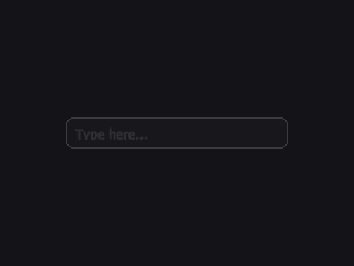
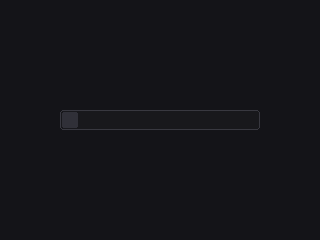
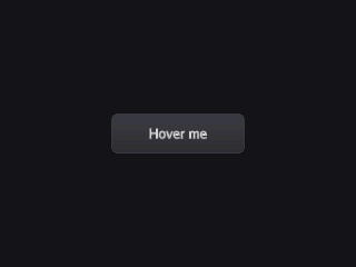
| Input | Button, IconButton, TextInput, TextArea, MaskedInput, KeybindInput, SearchBox |
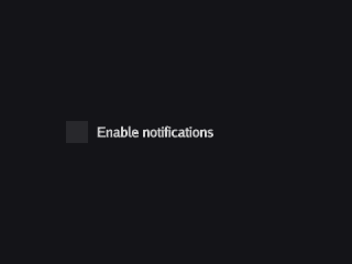
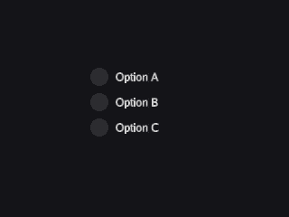
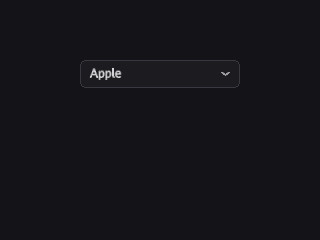
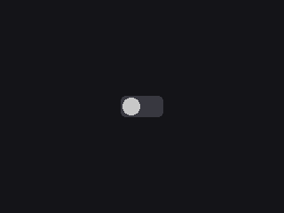
| Selection | Checkbox, RadioButton, Toggle, OptionRotator, Select |
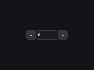
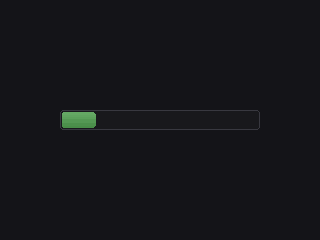
| Range | Slider, NumberStepper, ProgressBar, MeterBar, ScrollBar |
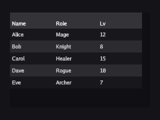
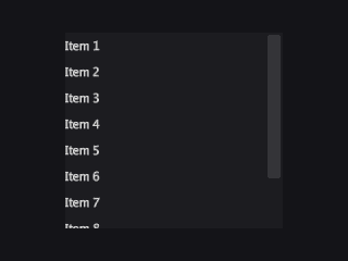
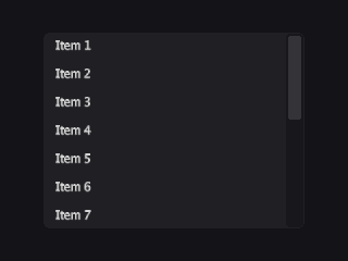
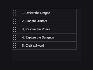
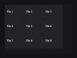
| Lists | List, TreeList, TileList, SortableList, SortableTreeList, DataTable, TreeTable |
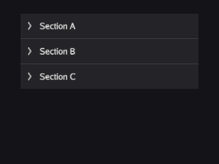
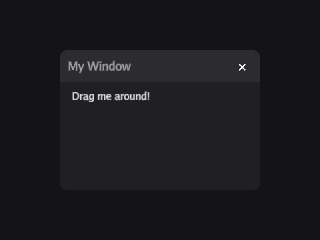
| Containers | Panel, Window, ScrollPanel, NavDrawer, Accordion, Popover |
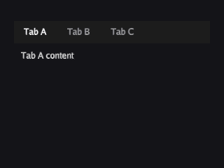
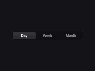
| Navigation | TabBar, ToggleButtonBar, ToolBar, MenuBar |
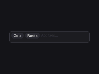
| Display | Label, RichText, Badge, Tag, TagBar, Tooltip, Toast, Image, AnimatedImage |
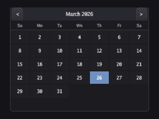
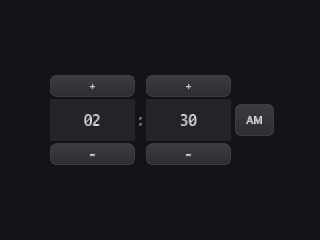
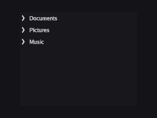
| Specialty | ColorPicker, GradientEditor, ImageCropper, TimePicker, CalendarSelector, StatWeb, DragHandle, InputField |
Widget gallery (click to expand)
 |
|
 |
 |
 |
 |
 |
 |
 |
 |
 |
 |
 |
 |
 |
 |
|
 |
 |
 |
 |
|
 |
 |
 |
 |
 |
 |
 |
|
Theming
Themes are plain JSON. Load one and every widget picks it up:
theme, err := ui.LoadThemeFromFile("themes/dark.json")
ui.SetTheme(theme)
Ships with 7 built-in themes: dark, forest, jrpg, macos, neon, windows, and debug. Create your own -- each widget type has its own section with full control over colors, corners, padding, and more. See the theme docs for the full schema.
XML Templates
Define layouts declaratively and bind reactive state:
<VBox padding="16" spacing="8">
    <Label text="Hello, {{name}}" fontSize="24" />
    <Button text="Click me" on:click="handleClick" />
</VBox>
Templates compile to a binary format for fast startup, and support hot reload during development.
Examples
The examples/ directory has 60+ runnable demos:
go run ./examples/widgets/buttons/
go run ./examples/reactive/counter/
go run ./examples/templating/xml-basic/
go run ./examples/theming/theme-gallery/
Built with
- Go 1.24+
- Willow -- scene graph rendering engine
- Ebitengine v2.9+ -- GPU backend
Contributing
Contributions are welcome. Please open an issue first for major changes to discuss the design. For bug fixes and small improvements, open a pull request directly.
go build ./...
go test ./...
go vet ./...
License
 Documentation
Documentation
Index 
- Constants
- Variables
- func ArrayMap[T, U any](a *Array[T], fn func(T) U) []U
- func ArrayReduce[T, U any](a *Array[T], fn func(U, T) U, init U) U
- func ArraySort[T interface{ ... }](a *Array[T])
- func ArraySortDesc[T interface{ ... }](a *Array[T])
- func ArraySortFold[T any](a *Array[T], key func(T) string)
- func BindFormatter[T comparable](source *Ref[T]) (*Ref[string], WatchHandle)
- func BindFormatterf[T comparable](source *Ref[T], format string) (*Ref[string], WatchHandle)
- func BindSortableListItems[T any](sl *SortableList, items *Array[T])
- func Includes[T comparable](a *Array[T], item T) bool
- func Increment[T Numeric](r *Ref[T], delta T) func()
- func IndexOf[T comparable](a *Array[T], item T) int
- func MustLoadDefaultFont() *sg.FontFamily
- func NewDivider(name string, width float64) *sg.Node
- func NewSectionLabel(name, text string, source *sg.FontFamily, size float64) *widget.Label
- func Set[T comparable](r *Ref[T], val T) func()
- func SetScene(s *sg.Scene)
- func SetSearchBoxFunc[T any](sb *SearchBox, results *Array[T], fn func(query string) []T)
- func SetSearchBoxIntoFunc[T any](sb *SearchBox, results *Array[T], fn func(query string, results *Array[T]))
- func SetUpdateFunc(scene *sg.Scene, fn func() error)
- func Setup(cfg StageConfig, components ...UIElement)
- func ToggleRef(r *Ref[bool]) func()
- type Accordion
- type AccordionConfig
- type AccordionGroup
- type AccordionSection
- type Alignment
- type Anchor
- type AnchorLayout
- type AnimPlayMode
- type AnimatedImage
- type AnimatedImageConfig
- type AnimatedImageGroup
- type Array
- type AttrSetter
- type Background
- type BackgroundProperty
- type BackgroundType
- type Badge
- type BadgeConfig
- type BadgeGroup
- type BinOp
- type BindHandle
- type Button
- type ButtonConfig
- type ButtonGroup
- type CalendarSelector
- type CalendarSelectorConfig
- type CalendarSelectorGroup
- type CellClipMode
- type CellCoord
- type CellStyle
- type Checkbox
- type CheckboxConfig
- type CheckboxGroup
- type ColorMode
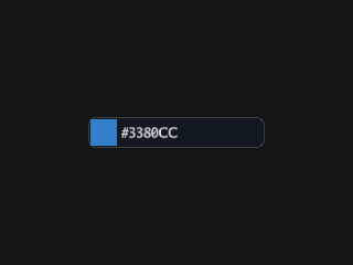
- type ColorPicker
- type ColorPickerConfig
- type ColorPickerGroup
- type ColorPickerManager
- type ColorProperty
- type Component
- type ComponentState
- type Computed
- type Config
- type ContextMenu
- type Controller
- type DataProvider
- type DataTable
- type DataTableColumn
- type DataTableConfig
- type DataTableGroup
- type DataTableScrollMode
- type DataTableSelectionMode
- type DirectiveType
- type DragAxis
- type DragGripStyle
- type DragHandle
- type DragHandleConfig
- type DragHandleGroup
- type EvalContext
- type ExprBinary
- type ExprConcat
- type ExprLiteral
- type ExprNode
- type ExprRef
- type ExprTernary
- type ExprUnary
- type FXAAConfig
- type FactoryContext
- type FillMode
- type FloatProperty
- type FocusManager
- type FontSource
- type Gradient
- type GradientColors
- type GradientEditor
- type GradientEditorConfig
- type GradientEditorGroup
- type GradientMode
- type HeadingLevel
- type HotReloader
- type IRAttribute
- type IRDirective
- type IRNode
- type IconButton
- type IconButtonConfig
- type IconButtonGroup
- type IconLabelPosition
- type Image
- type ImageConfig
- type ImageCropper
- type ImageCropperConfig
- type ImageCropperGroup
- type ImageGroup
- type ImageScaleMode
- type InputField
- type InputManager
- type Insets
- type KeyBinding
- type KeyCombo
- type KeybindInput
- type KeybindInputConfig
- type KeybindInputGroup
- type Label
- type LabelConfig
- type LabelGroup
- type LabelPosition
- type LabelStyle
- type LayoutMode
- type List
- type ListConfig
- type ListGroup
- type ListItem
- type ListenerHandle
- type MaskedInput
- type MaskedInputConfig
- type MaskedInputGroup
- type MenuBar
- type MenuBarConfig
- type MenuBarEntry
- type MenuBarGroup
- type MenuItem
- type MenuPopup
- type MenuPopupConfig
- type MenuPopupGroup
- type MenuPopupManager
- type MeterBar
- type MeterBarConfig
- type MeterBarGroup
- type ModifierMask
- type NavDrawer
- type NavDrawerAnchor
- type NavDrawerConfig
- type NavDrawerGroup
- type NineSlice
- type NumberStepper
- type Numeric
- type OnSortScroll
- type OptionRotator
- type OptionRotatorChevronGroup
- type OptionRotatorConfig
- type OptionRotatorGroup
- type Orientation
- type Outline
- type Panel
- type PanelConfig
- type PanelGroup
- type Popover
- type PopoverConfig
- type PopoverGroup
- type PopoverManager
- type PopoverSide
- type ProgressBar
- type PropertyInspectorConfig
- type PropertyInspectorGroup
- type Radio
- type RadioButton
- type RadioConfig
- type RadioGroup
- type ReactiveTreeNode
- type Record
- type Rect
- type Ref
- type RichText
- type RichTextConfig
- type RichTextEditorConfig
- type RichTextEditorGroup
- type RichTextGroup
- type Scheduler
- type Screen
- type ScreenOption
- type ScrollBar
- type ScrollBarConfig
- type ScrollBarGroup
- type ScrollPanel
- type SearchBox
- type Select
- type SelectConfig
- type SelectGroup
- type SelectOption
- type ShadowConfig
- type Slider
- type SliderConfig
- type SliderGroup
- type SortDir
- type SortDirection
- type SortHandleSide
- type SortKey
- type SortType
- type SortableList
- type SortableListConfig
- type SortableListGroup
- type SortableTreeItem
- type SortableTreeList
- type SortableTreeListConfig
- type SortableTreeListGroup
- type SpriteRef
- type StageConfig
- type StageManager
- type StatAxis
- type StatWeb
- type StatWebConfig
- type StatWebGroup
- type TabBar
- type TabOverflowMode
- type TableColumn
- type TabsConfig
- type TabsGroup
- type Tag
- type TagBar
- type TagBarConfig
- type TagBarGroup
- type TagConfig
- type TagGroup
- type TemplateRegistry
- type TextArea
- type TextAreaConfig
- type TextAreaGroup
- type TextInput
- type TextInputConfig
- type TextInputGroup
- type TextSpan
- type Theme
- type TileList
- type TileListConfig
- type TileListGroup
- type TimeFormat
- type TimePicker
- type TimePickerConfig
- type TimePickerGroup
- type TimeValue
- type ToastAnchor
- type ToastConfig
- type ToastGroup
- type ToastManager
- type ToastOption
- type Toggle
- type ToggleButtonBar
- type ToggleButtonBarConfig
- type ToggleButtonBarGroup
- type ToggleConfig
- type ToggleGroup
- type ToolBar
- type ToolBarConfig
- type ToolBarGroup
- type ToolBarOverflowMode
- type ToolGroup
- type Tooltip
- type TooltipAnchor
- type TooltipConfig
- type TooltipGroup
- type TooltipManager
- type TreeList
- type TreeListConfig
- type TreeListGroup
- type TreeNode
- type TreeTable
- type TreeTableConfig
- type TreeTableGroup
- type TreeTableRow
- type TwoColumnLayout
- type UIElement
- type UnaryOp
- type UserConfig
- type UserGroup
- type ValidationState
- type Variant
- type VisualLine
- type WatchHandle
- type WidgetFactory
- type Window
- type WindowConfig
- type WindowGroup
- type WindowManager
Constants 
const (
	StateDefault       = core.StateDefault       // Normal idle state.
	StateHover         = core.StateHover         // Pointer is over the component.
	StateActive        = core.StateActive        // Component is being pressed.
	StateDisabled      = core.StateDisabled      // Component is non-interactive.
	StateFocus         = core.StateFocus         // Component has keyboard focus.
	StateFocusHover    = core.StateFocusHover    // Focused and hovered.
	StateFocusActive   = core.StateFocusActive   // Focused and pressed.
	StateFocusDisabled = core.StateFocusDisabled // Focused but disabled.
)
const (
	BgNone      = core.BgNone      // No background rendered.
	BgSolid     = core.BgSolid     // Flat solid-color fill.
	BgNineSlice = core.BgNineSlice // Nine-slice image background.
	BgGradient  = core.BgGradient  // Per-corner gradient fill.
)
const (
	Primary   = theme.Primary   // Primary action or branding color.
	Secondary = theme.Secondary // Secondary or supporting color.
	Accent    = theme.Accent    // Accent highlight color.
	Neutral   = theme.Neutral   // Neutral/muted color.
	Danger    = theme.Danger    // Destructive or error actions.
	Success   = theme.Success   // Positive confirmation.
	Warning   = theme.Warning   // Caution or non-blocking alert.
	Info      = theme.Info      // Informational or help context.
	Custom1   = theme.Custom1   // Application-defined variant 1.
	Custom2   = theme.Custom2   // Application-defined variant 2.
	Custom3   = theme.Custom3   // Application-defined variant 3.
	Custom4   = theme.Custom4   // Application-defined variant 4.
	Custom5   = theme.Custom5   // Application-defined variant 5.
	Custom6   = theme.Custom6   // Application-defined variant 6.
	Custom7   = theme.Custom7   // Application-defined variant 7.
	Custom8   = theme.Custom8   // Application-defined variant 8.
	Custom9   = theme.Custom9   // Application-defined variant 9.
	Custom10  = theme.Custom10  // Application-defined variant 10.
	Custom11  = theme.Custom11  // Application-defined variant 11.
	Custom12  = theme.Custom12  // Application-defined variant 12.
	Custom13  = theme.Custom13  // Application-defined variant 13.
	Custom14  = theme.Custom14  // Application-defined variant 14.
	Custom15  = theme.Custom15  // Application-defined variant 15.
	Custom16  = theme.Custom16  // Application-defined variant 16.
	Custom17  = theme.Custom17  // Application-defined variant 17.
	Custom18  = theme.Custom18  // Application-defined variant 18.
	Custom19  = theme.Custom19  // Application-defined variant 19.
	Custom20  = theme.Custom20  // Application-defined variant 20.
	Custom21  = theme.Custom21  // Application-defined variant 21.
	Custom22  = theme.Custom22  // Application-defined variant 22.
	Custom23  = theme.Custom23  // Application-defined variant 23.
	Custom24  = theme.Custom24  // Application-defined variant 24.
	Custom25  = theme.Custom25  // Application-defined variant 25.
	Custom26  = theme.Custom26  // Application-defined variant 26.
	Custom27  = theme.Custom27  // Application-defined variant 27.
	Custom28  = theme.Custom28  // Application-defined variant 28.
	Custom29  = theme.Custom29  // Application-defined variant 29.
	Custom30  = theme.Custom30  // Application-defined variant 30.
	Custom31  = theme.Custom31  // Application-defined variant 31.
	Custom32  = theme.Custom32  // Application-defined variant 32.
	Custom33  = theme.Custom33  // Application-defined variant 33.
	Custom34  = theme.Custom34  // Application-defined variant 34.
	Custom35  = theme.Custom35  // Application-defined variant 35.
	Custom36  = theme.Custom36  // Application-defined variant 36.
	Custom37  = theme.Custom37  // Application-defined variant 37.
	Custom38  = theme.Custom38  // Application-defined variant 38.
	Custom39  = theme.Custom39  // Application-defined variant 39.
	Custom40  = theme.Custom40  // Application-defined variant 40.
	Custom41  = theme.Custom41  // Application-defined variant 41.
	Custom42  = theme.Custom42  // Application-defined variant 42.
	Custom43  = theme.Custom43  // Application-defined variant 43.
	Custom44  = theme.Custom44  // Application-defined variant 44.
	Custom45  = theme.Custom45  // Application-defined variant 45.
	Custom46  = theme.Custom46  // Application-defined variant 46.
	Custom47  = theme.Custom47  // Application-defined variant 47.
	Custom48  = theme.Custom48  // Application-defined variant 48.
	Custom49  = theme.Custom49  // Application-defined variant 49.
	Custom50  = theme.Custom50  // Application-defined variant 50.
	Custom51  = theme.Custom51  // Application-defined variant 51.
	Custom52  = theme.Custom52  // Application-defined variant 52.
	Custom53  = theme.Custom53  // Application-defined variant 53.
	Custom54  = theme.Custom54  // Application-defined variant 54.
	Custom55  = theme.Custom55  // Application-defined variant 55.
	Custom56  = theme.Custom56  // Application-defined variant 56.
)
const (
	LayoutNone   = widget.LayoutNone   // No automatic layout; children are manually positioned.
	LayoutVBox   = widget.LayoutVBox   // Vertical stack layout.
	LayoutHBox   = widget.LayoutHBox   // Horizontal row layout.
	LayoutGrid   = widget.LayoutGrid   // Grid layout with rows and columns.
	LayoutFlow   = widget.LayoutFlow   // Flowing wrap layout.
	LayoutAnchor = widget.LayoutAnchor // Anchor-based absolute positioning within parent.
)
const (
	AlignStart        = widget.AlignStart        // Align children to the start (left or top).
	AlignCenter       = widget.AlignCenter       // Center children along the axis.
	AlignEnd          = widget.AlignEnd          // Align children to the end (right or bottom).
	AlignSpaceBetween = widget.AlignSpaceBetween // Distribute children with equal space between.
)
const (
	FillNone   = widget.FillNone   // No stretching.
	FillWidth  = widget.FillWidth  // Stretch to parent's content width.
	FillHeight = widget.FillHeight // Stretch to parent's content height.
	FillBoth   = widget.FillBoth   // Stretch to fill both dimensions.
)
const (
	Horizontal = widget.Horizontal // Left-to-right orientation.
	Vertical   = widget.Vertical   // Top-to-bottom orientation.
)
const (
	ModNone  = widget.ModNone  // No modifier keys.
	ModCtrl  = widget.ModCtrl  // Ctrl (or Cmd on macOS).
	ModShift = widget.ModShift // Shift key.
	ModAlt   = widget.ModAlt   // Alt (or Option on macOS).
)
const (
	// IconLabelBelow places the label beneath the icon (default).
	IconLabelBelow = widget.IconLabelBelow
	// IconLabelRight places the label to the right of the icon.
	IconLabelRight = widget.IconLabelRight
)
const (
	LabelAbove = widget.LabelAbove // Label is rendered above the input.
	LabelLeft  = widget.LabelLeft  // Label is rendered to the left of the input.

	ValidationNone    = widget.ValidationNone    // No validation state shown.
	ValidationError   = widget.ValidationError   // Field has a validation error.
	ValidationWarning = widget.ValidationWarning // Field has a validation warning.
	ValidationSuccess = widget.ValidationSuccess // Field passed validation.
)
const (
	TabOverflowClip   = widget.TabOverflowClip   // Clip tabs that overflow the bar width.
	TabOverflowScroll = widget.TabOverflowScroll // Enable horizontal scrolling for overflow tabs.
)
const (
	AnchorTopLeft      = widget.AnchorTopLeft      // Top-left corner.
	AnchorTopCenter    = widget.AnchorTopCenter    // Top edge, centered horizontally.
	AnchorTopRight     = widget.AnchorTopRight     // Top-right corner.
	AnchorMiddleLeft   = widget.AnchorMiddleLeft   // Left edge, centered vertically.
	AnchorCenter       = widget.AnchorCenter       // Centered in both axes.
	AnchorMiddleRight  = widget.AnchorMiddleRight  // Right edge, centered vertically.
	AnchorBottomLeft   = widget.AnchorBottomLeft   // Bottom-left corner.
	AnchorBottomCenter = widget.AnchorBottomCenter // Bottom edge, centered horizontally.
	AnchorBottomRight  = widget.AnchorBottomRight  // Bottom-right corner.
)
const ( )
const (
	DragAxisX        = widget.DragAxisX        // Constrain drag to horizontal movement.
	DragAxisY        = widget.DragAxisY        // Constrain drag to vertical movement.
	DragAxisDiagonal = widget.DragAxisDiagonal // Allow free diagonal drag.

	DragGripDots  = widget.DragGripDots  // Render grip as a dot pattern.
	DragGripLines = widget.DragGripLines // Render grip as horizontal lines.
	DragGripNone  = widget.DragGripNone  // No visual grip indicator.
)
const (
	ImageScaleStretch = widget.ImageScaleStretch // Stretch to fill bounds, ignoring aspect ratio.
	ImageScaleFit     = widget.ImageScaleFit     // Scale to fit within bounds, preserving aspect ratio.
	ImageScaleFill    = widget.ImageScaleFill    // Scale to cover bounds, cropping overflow.
	ImageScaleCenter  = widget.ImageScaleCenter  // Center at original size, no scaling.
	ImageScaleTile    = widget.ImageScaleTile    // Tile the image to fill bounds.
)
const (
	AnimPlayOnce     = widget.AnimPlayOnce     // Play frames once and stop on the last frame.
	AnimPlayLoop     = widget.AnimPlayLoop     // Loop from the beginning after the last frame.
	AnimPlayPingPong = widget.AnimPlayPingPong // Reverse direction at each end of the sequence.
)
const (
	TooltipAuto              = widget.TooltipAuto              // Automatically choose the best side.
	TooltipAbove             = widget.TooltipAbove             // Place above the trigger.
	TooltipBelow             = widget.TooltipBelow             // Place below the trigger.
	TooltipLeft              = widget.TooltipLeft              // Place to the left of the trigger.
	TooltipRight             = widget.TooltipRight             // Place to the right of the trigger.
	TooltipCornerTopLeft     = widget.TooltipCornerTopLeft     // Anchor to the trigger's top-left corner.
	TooltipCornerTopRight    = widget.TooltipCornerTopRight    // Anchor to the trigger's top-right corner.
	TooltipCornerBottomLeft  = widget.TooltipCornerBottomLeft  // Anchor to the trigger's bottom-left corner.
	TooltipCornerBottomRight = widget.TooltipCornerBottomRight // Anchor to the trigger's bottom-right corner.
	TooltipFollowMouse       = widget.TooltipFollowMouse       // Follow the mouse cursor.
)
TooltipAnchor constants control tooltip placement relative to the trigger.
const (
	ColorModeHex   = widget.ColorModeHex   // Hexadecimal color input (#RRGGBB).
	ColorModeRGB   = widget.ColorModeRGB   // RGB sliders (0-255).
	ColorModeHSV   = widget.ColorModeHSV   // Hue/Saturation/Value sliders.
	ColorModeHSL   = widget.ColorModeHSL   // Hue/Saturation/Lightness sliders.
	ColorModeFloat = widget.ColorModeFloat // Floating-point RGB (0.0-1.0).
)
const (
	ToastBottomRight = widget.ToastBottomRight // Stack toasts in the bottom-right corner.
	ToastBottomLeft  = widget.ToastBottomLeft  // Stack toasts in the bottom-left corner.
	ToastTopRight    = widget.ToastTopRight    // Stack toasts in the top-right corner.
	ToastTopLeft     = widget.ToastTopLeft     // Stack toasts in the top-left corner.
)
const (
	PopoverBelow = widget.PopoverBelow // Prefer placement below the trigger.
	PopoverAbove = widget.PopoverAbove // Prefer placement above the trigger.
	PopoverRight = widget.PopoverRight // Prefer placement to the right.
	PopoverLeft  = widget.PopoverLeft  // Prefer placement to the left.
)
const (
	SortAlpha   = widget.SortAlpha   // Alphabetic string comparison.
	SortNumeric = widget.SortNumeric // Numeric comparison.
	SortCustom  = widget.SortCustom  // User-supplied comparison function.

	ClipEllipsis = widget.ClipEllipsis // Truncate overflow text with an ellipsis.
	ClipMask     = widget.ClipMask     // Mask overflow with a clipping rectangle.

	ScrollModeVirtual = widget.ScrollModeVirtual // Only render visible rows (virtualized).
	ScrollModeStatic  = widget.ScrollModeStatic  // Render all rows (no virtualization).

	SelectionModeNone   = widget.SelectionModeNone   // Row selection disabled.
	SelectionModeSingle = widget.SelectionModeSingle // Only one row may be selected.
	SelectionModeMulti  = widget.SelectionModeMulti  // Multiple rows may be selected.

	SortNone = widget.SortNone // Column is unsorted.
	SortAsc  = widget.SortAsc  // Ascending sort order.
	SortDesc = widget.SortDesc // Descending sort order.

	OnSortScrollNone        = widget.OnSortScrollNone        // No scroll adjustment after sort.
	OnSortScrollToSelection = widget.OnSortScrollToSelection // Scroll to keep selection visible after sort.
	OnSortScrollToTop       = widget.OnSortScrollToTop       // Scroll to top after sort.
)
const (
	SortDirAsc  = widget.SortDirAsc  // Ascending sort direction.
	SortDirDesc = widget.SortDirDesc // Descending sort direction.
)
const (
	SortHandleLeft  = widget.SortHandleLeft  // Drag handle on the left side of each row.
	SortHandleRight = widget.SortHandleRight // Drag handle on the right side of each row.
)
const (
	// GradientModeH is a horizontal gradient (TL=BL, TR=BR).
	GradientModeH = widget.GradientModeH
	// GradientModeV is a vertical gradient (TL=TR, BL=BR).
	GradientModeV = widget.GradientModeV
	// GradientModeFourCorner is a 4-corner bilinear gradient (all corners independent).
	GradientModeFourCorner = widget.GradientModeFourCorner
)
const (
	TimeFormat24h = widget.TimeFormat24h // 24-hour time display (00:00 - 23:59).
	TimeFormat12h = widget.TimeFormat12h // 12-hour time display with AM/PM.
)
const (
	ToolBarClip   = widget.ToolBarClip   // Clip items that overflow the toolbar bounds.
	ToolBarScroll = widget.ToolBarScroll // Enable scrolling for overflow items.
	ToolBarWrap   = widget.ToolBarWrap   // Wrap overflow items to a new row/column.
)
const DefaultSharpness = 0.15
DefaultSharpness is the recommended SDF sharpness value for labels.
const DefaultWindowHeight = widget.DefaultWindowHeight
DefaultWindowHeight is the default height for new windows.
const DefaultWindowWidth = widget.DefaultWindowWidth
DefaultWindowWidth is the default width for new windows.
const TreeToggleSize = widget.TreeToggleSize
TreeToggleSize is the width and height (in pixels) of a tree toggle button.
const Version = "0.2.0"
Version is the current release version of WillowUI.
const WindowTitleBarHeight = widget.WindowTitleBarHeight
WindowTitleBarHeight is the height of the title bar in pixels.
Variables 
var (
	// ParseMarkup parses XML-like markup into TextSpan slices.
	ParseMarkup = markup.ParseMarkup

	// ParseColor parses a color string in any supported format.
	ParseColor = markup.ParseColor
)
var (
	// NewColorPropUniform creates a ColorProperty with the same color for all states.
	NewColorPropUniform = theme.NewColorPropUniform
	// NewColorPropStates creates a ColorProperty with per-state colors.
	NewColorPropStates = theme.NewColorPropStates
	// NewSolidBgPropStates creates a BackgroundProperty with per-state solid backgrounds.
	NewSolidBgPropStates = theme.NewSolidBgPropStates
	// NewSolidBgPropUniform creates a BackgroundProperty with the same solid background for all states.
	NewSolidBgPropUniform = theme.NewSolidBgPropUniform
	// NewFloatPropUniform creates a FloatProperty with the same value for all states.
	NewFloatPropUniform = theme.NewFloatPropUniform
	// NewFloatPropStates creates a FloatProperty with per-state values.
	NewFloatPropStates = theme.NewFloatPropStates
)
var (
	// ParseHex parses a hex color string (#RGB, #RGBA, #RRGGBB, or #RRGGBBAA) into a color.Color.
	ParseHex = colorutil.ParseHex
	// FormatHex formats a color as a #RRGGBB hex string.
	FormatHex = colorutil.FormatHex
	// FormatHexA formats a color as a #RRGGBBAA hex string including alpha.
	FormatHexA = colorutil.FormatHexA
	// ToRGB255 converts a color.Color to 0-255 R, G, B, A components.
	ToRGB255 = colorutil.ToRGB255
	// FromRGB255 creates a color from 0-255 R, G, B, A components.
	FromRGB255 = colorutil.FromRGB255
	// ToHSL converts a color.Color to hue (0-360), saturation (0-1), lightness (0-1).
	ToHSL = colorutil.ToHSL
	// FromHSL creates a color from hue (0-360), saturation (0-1), lightness (0-1).
	FromHSL = colorutil.FromHSL
	// ToHSV converts a color.Color to hue (0-360), saturation (0-1), value (0-1).
	ToHSV = colorutil.ToHSV
	// FromHSV creates a color from hue (0-360), saturation (0-1), value (0-1).
	FromHSV = colorutil.FromHSV
	// NormalizeRGB clamps and converts a color to 0.0-1.0 float64 RGBA components.
	NormalizeRGB = colorutil.NormalizeRGB
)
var (
	// SampleBilinear returns the bilinearly interpolated color at normalized (u, v).
	SampleBilinear = colorutil.SampleBilinear
	// FormatGradientString returns the theme-compatible JSON fill string for a Gradient.
	FormatGradientString = colorutil.FormatGradientString
	// DefaultGradient returns a horizontal black→white gradient.
	DefaultGradient = colorutil.DefaultGradient
)
var CollectThemeImages = theme.CollectThemeImages
CollectThemeImages extracts all nine-slice image paths from theme JSON without loading them. Use this for prebaked atlas tooling.
var CompileXML = template.CompileXML
CompileXML parses XML template data and compiles it to an IR tree.
var CompileXMLWithTypes = template.CompileXMLWithTypes
CompileXMLWithTypes compiles XML template data, accepting extra custom widget type names.
var CreateNineSliceNodes = widget.CreateNineSliceNodes
CreateNineSliceNodes builds 9 sprite nodes for a nine-slice background.
var DecodeIR = template.DecodeIR
DecodeIR decodes a .xmlui binary blob into an IR tree.
var DefaultColorPickerManager = widget.DefaultColorPickerManager
DefaultColorPickerManager is the package-level color picker manager.
var DefaultFXAAConfig = sg.DefaultFXAAConfig
DefaultFXAAConfig returns an FXAAConfig with FXAA 3.11 quality-15 defaults.
var DefaultFocusManager = widget.DefaultFocusManager
DefaultFocusManager is an alias for FM (backwards compatibility).
var DefaultFont *sg.FontFamily
DefaultFont is the default FontFamily. If not set by StageConfig.Font or directly, Setup auto-loads the embedded Go font bundle.
var DefaultMenuPopupManager = widget.DefaultMenuPopupManager
DefaultMenuPopupManager is the package-level menu popup manager.
var DefaultPopoverManager = widget.DefaultPopoverManager
DefaultPopoverManager is the package-level singleton used by all Popover instances.
var DefaultScheduler = &reactive.DefaultScheduler
DefaultScheduler is the package-level scheduler. It points into the internal reactive package so that Ref.Set() and Computed.markDirty() enqueue to the same scheduler that external callers flush.
var DefaultTheme = theme.DefaultTheme
DefaultTheme is the fallback theme used when no explicit theme is set. This is the canonical variable; theme.DefaultThemeRef is redirected here at init time so that widget.EffectiveTheme() always reads from this variable.
var DefaultToastManager = widget.DefaultToastManager
DefaultToastManager is the package-level singleton used by ShowToast.
var DefaultTooltipManager = widget.DefaultTooltipManager
DefaultTooltipManager is the package-level tooltip manager. Set DefaultTooltipManager.Enabled = false to disable all tooltips globally.
var DefaultWindowManager = widget.DefaultWindowManager
DefaultWindowManager is the package-level default window manager instance.
var EllipsisLabel = widget.EllipsisLabel
EllipsisLabel creates a Label for use in cell rendering.
var EmbeddedGoFont = embeddedGoFont
EmbeddedGoFont is the raw bytes of the embedded Go font bundle (Regular + Bold + Italic + BoldItalic). Pass to willow.NewFontFamilyFromFontBundle to create a FontFamily manually, or use MustLoadDefaultFont for convenience.
var EncodeIR = template.EncodeIR
EncodeIR encodes an IR tree into a .xmlui binary blob.
var EncodeThemeBinary = theme.EncodeThemeBinary
EncodeThemeBinary encodes theme JSON, atlas JSON, and atlas PNG into the WUIT binary format. Use the themec CLI tool for full compilation.
var EvalExpression = template.EvalExpression
EvalExpression evaluates an expression AST node in the given context.
var FM = widget.DefaultFocusManager
FM is the package-level FocusManager singleton. UI widgets and the screen system use this for focus dispatch, hotkeys, and navigation.
var GradientBackground = core.GradientBackground
GradientBackground creates a gradient background.
var Input = widget.DefaultInputManager
Input is the package-level InputManager singleton. Game logic reads key state through this instead of ebiten directly.
var Key = widget.Key
Key creates a KeyCombo from a key and modifier mask.
var LabelColumn = widget.LabelColumn
LabelColumn creates a simple text-label column with the given key, header and accessor.
var LayoutNineSlice = widget.LayoutNineSlice
LayoutNineSlice positions and scales the 9 sprites of a nine-slice.
var LerpColor = widget.LerpColor
LerpColor linearly interpolates between two colors.
var LoadTheme = theme.LoadTheme
LoadTheme parses JSON theme data and produces a *Theme. Returns an error if validation fails (bad colors, missing required groups, etc.). Nine-slice images are rejected — use LoadThemeFromFile or LoadThemeFromFS.
var LoadThemeBinary = theme.LoadThemeBinary
LoadThemeBinary decodes a WUIT binary (.theme file) and compiles the theme. The atlas (if present) is decoded from the embedded PNG + JSON sections.
var LoadThemeFromFS = func(fsys fs.FS, path string) (*Theme, error) {
	return theme.LoadThemeFromFS(fsys, path)
}
LoadThemeFromFS reads a JSON file from an fs.FS and compiles the theme. Nine-slice image paths are resolved within the FS.
var LoadThemeFromFile = theme.LoadThemeFromFile
LoadThemeFromFile reads a JSON file and compiles the theme. Nine-slice image paths are resolved relative to the JSON file's directory.
var MeterColumn = widget.MeterColumn
MeterColumn creates a column that renders an inline MeterBar for each row. The accessor returns a float64 in [0, 1]. Use Cell.OnPostUpdate to customize the fill color dynamically.
var NewAccordion = widget.NewAccordion
NewAccordion creates an Accordion with default settings.
var NewAnchorLayout = widget.NewAnchorLayout
NewAnchorLayout creates an AnchorLayout container.
var NewAnimatedImage = widget.NewAnimatedImage
NewAnimatedImage creates an AnimatedImage widget with no frames set.
var NewBadge = widget.NewBadge
NewBadge creates a Badge with the given name, font, and display size.
var NewButton = widget.NewButton
NewButton creates a Button with the given name, text label, font, and display size.
var NewCalendarSelector = widget.NewCalendarSelector
NewCalendarSelector creates a CalendarSelector with today's date selected.
var NewCheckbox = widget.NewCheckbox
NewCheckbox creates a Checkbox with the given label text, font, and display size.
var NewColorPicker = widget.NewColorPicker
NewColorPicker creates a ColorPicker trigger.
var NewComponent = widget.NewComponent
NewComponent creates a new Component with sensible defaults.
var NewContextMenu = widget.NewContextMenu
NewContextMenu creates a ContextMenu with the given font and display size.
var NewDataTable = widget.NewDataTable
NewDataTable creates a DataTable with the given name and row height.
var NewDragHandle = widget.NewDragHandle
NewDragHandle creates a DragHandle with default dot grip style.
var NewFlow = widget.NewFlow
NewFlow creates a Component with LayoutFlow pre-configured.
var NewFocusManager = widget.NewFocusManager
NewFocusManager creates an empty focus manager.
var NewGradientEditor = widget.NewGradientEditor
NewGradientEditor creates a new GradientEditor with the given name, font, and display size.
var NewHBox = widget.NewHBox
NewHBox creates a Component with LayoutHBox pre-configured.
var NewHotReloader = dev.NewHotReloader
NewHotReloader creates a hot reloader that watches xmlPath for changes and recompiles the template, swapping the live component tree on the screen.
var NewHotReloaderDirect = dev.NewHotReloaderDirect
NewHotReloaderDirect creates a HotReloader without starting a file watcher. Intended for unit tests that call Reload() directly.
var NewIconButton = widget.NewIconButton
NewIconButton creates an icon-first button. Call SetIconImage or SetIconKey to provide an icon source.
var NewImage = widget.NewImage
NewImage creates an Image widget with no source set.
var NewImageCropper = widget.NewImageCropper
NewImageCropper creates an ImageCropper widget.
var NewInputField = widget.NewInputField
NewInputField creates a new InputField with the given name, font, and display size.
var NewInputManager = widget.NewInputManager
NewInputManager creates an isolated InputManager (primarily for tests).
var NewKeybindInput = widget.NewKeybindInput
NewKeybindInput creates a KeybindInput with the given name, font, and display size.
var NewLabel = widget.NewLabel
NewLabel creates a Label with the given name, initial text, font, and display size.
var NewList = widget.NewList
NewList creates a scrollable list with the given item height.
var NewMaskedInput = widget.NewMaskedInput
NewMaskedInput creates a single-line masked input with the given font and display size.
var NewMenuBar = widget.NewMenuBar
NewMenuBar creates a new MenuBar with the given font and display size.
var NewMenuPopup = widget.NewMenuPopup
NewMenuPopup creates a MenuPopup that will display items using font at displaySize.
var NewMeterBar = widget.NewMeterBar
NewMeterBar creates a MeterBar with range [0, 1].
NewNavDrawer creates a NavDrawer anchored to the left edge by default.
var NewNumberStepper = widget.NewNumberStepper
NewNumberStepper creates a NumberStepper with range (-∞, +∞), step 1, and zero decimal places.
var NewOptionRotator = widget.NewOptionRotator
NewOptionRotator creates an OptionRotator with the given name, options list, font, and display size. Panics if options is empty.
var NewPanel = widget.NewPanel
NewPanel creates a Panel with no background and no border.
var NewPopover = widget.NewPopover
NewPopover creates a new Popover with the given name.
var NewProgressBar = widget.NewProgressBar
NewProgressBar creates a MeterBar with range [0, 1]. Alias for NewMeterBar.
var NewRadio = widget.NewRadio
NewRadio creates a new empty Radio widget.
var NewReactiveTreeNode = widget.NewReactiveTreeNode
NewReactiveTreeNode creates a ReactiveTreeNode with an empty Children array.
var NewRichText = widget.NewRichText
NewRichText creates a RichText component with the given font and display size.
var NewScreen = widget.NewScreen
NewScreen creates a new Screen. Options: WithController, WithScene.
var NewScrollBar = widget.NewScrollBar
NewScrollBar creates a ScrollBar.
var NewScrollPanel = widget.NewScrollPanel
NewScrollPanel creates a ScrollPanel.
var NewSearchBox = widget.NewSearchBox
NewSearchBox creates a SearchBox with the given name, font, and display size.
var NewSelect = widget.NewSelect
NewSelect creates a Select with the given name, options list, font, and display size.
var NewSlider = widget.NewSlider
NewSlider creates a horizontal slider with range [0, 1].
var NewSortableList = widget.NewSortableList
NewSortableList creates a new sortable list with fixed item height.
var NewSortableTreeList = widget.NewSortableTreeList
NewSortableTreeList creates a new sortable tree list.
var NewSpacer = widget.NewSpacer
NewSpacer creates an invisible fixed-size gap for use in VBox/HBox layouts. It occupies layout space without rendering anything.
var NewStageManager = widget.NewStageManager
NewStageManager creates an isolated StageManager. Intended for testing; production code uses ui.Stage.
var NewStatWeb = widget.NewStatWeb
NewStatWeb creates a StatWeb with the given name, font, and font size.
var NewTabBar = widget.NewTabBar
NewTabBar creates a TabBar with the given font and display size.
var NewTag = widget.NewTag
NewTag creates a Tag with the given name, font, and display size.
var NewTagBar = widget.NewTagBar
NewTagBar creates a TagBar with the given name, font, and display size.
var NewTemplateRegistry = template.NewTemplateRegistry
NewTemplateRegistry creates a new template registry.
var NewTemplateRegistryWithFont = template.NewTemplateRegistryWithFont
NewTemplateRegistryWithFont creates a new template registry with a default font loaded from raw TTF data and a display font size.
var NewTextArea = widget.NewTextArea
NewTextArea creates a multi-line text area with the given font and display size.
var NewTextInput = widget.NewTextInput
NewTextInput creates a single-line text input with the given font and display size.
var NewTileList = widget.NewTileList
NewTileList creates a scrollable tile list with the given tile dimensions.
var NewTimePicker = widget.NewTimePicker
NewTimePicker creates a TimePicker with default 24h format, no seconds.
var NewToggle = widget.NewToggle
NewToggle creates a Toggle switch with default dimensions.
var NewToggleButtonBar = widget.NewToggleButtonBar
NewToggleButtonBar creates a ToggleButtonBar with the given font and display size.
var NewToolBar = widget.NewToolBar
NewToolBar creates a new ToolBar with horizontal orientation and clip overflow.
var NewToolGroup = widget.NewToolGroup
NewToolGroup creates a new ToolGroup for radio-style icon button selection.
var NewTooltip = widget.NewTooltip
NewTooltip creates a Tooltip with sensible defaults.
var NewTreeList = widget.NewTreeList
NewTreeList creates a TreeList with the given item height.
var NewTreeTable = widget.NewTreeTable
NewTreeTable creates a new TreeTable with the given name, font, and display size.
var NewTreeToggle = widget.NewTreeToggle
NewTreeToggle creates a toggle button for expanding/collapsing a tree node.
var NewTwoColumnLayout = widget.NewTwoColumnLayout
NewTwoColumnLayout creates a TwoColumnLayout container with sensible defaults: left column right-aligned, right column left-aligned, 12px gap, 8px row spacing.
var NewVBox = widget.NewVBox
NewVBox creates a Component with LayoutVBox pre-configured.
var NewWindow = widget.NewWindow
NewWindow creates a Window with the given title, font, and display size.
var NewWindowManager = widget.NewWindowManager
NewWindowManager creates a new window manager.
var ParseExpression = template.ParseExpression
ParseExpression parses an expression string into an AST.
var PasswordDotGlyph = widget.PasswordDotGlyph
PasswordDotGlyph returns the procedural dot glyph used for password masking.
var RoundedRectBorderMesh = widget.RoundedRectBorderMesh
RoundedRectBorderMesh builds a mesh for a rounded rectangle border.
var RoundedRectGradientMesh = widget.RoundedRectGradientMesh
RoundedRectGradientMesh builds a gradient-filled rounded rectangle mesh.
var RoundedRectPoints = widget.RoundedRectPoints
RoundedRectPoints returns the outline points for a rounded rectangle.
var SelectionColumn = widget.SelectionColumn
SelectionColumn creates a column that renders checkboxes (multi-select) or radio dots (single-select) per row. Visibility and mode are controlled by reactive Refs so external UI can toggle batch mode dynamically.
var SetRowClickSelects = widget.SetRowClickSelects
SetRowClickSelects configures whether clicking anywhere on a row triggers the selection toggle for a SelectionColumn.
var ShowToast = widget.ShowToast
ShowToast shows a toast via DefaultToastManager with the given variant.
var SliceBackground = core.SliceBackground
SliceBackground creates a nine-slice background.
var SolidBackground = core.SolidBackground
SolidBackground creates a solid-color background.
var Stage = widget.DefaultStage
Stage is the package-level screen-stack singleton. Add, remove, and replace screens here; the scene is wired automatically by Setup.
var SubRegion = widget.SubRegion
SubRegion extracts a sub-region from a texture atlas region.
var UpdateEllipsisLabel = widget.UpdateEllipsisLabel
UpdateEllipsisLabel updates the text of an EllipsisLabel component.
var ValidateTheme = theme.ValidateTheme
ValidateTheme checks that the given theme defines configs for all the named component types. Returns an error listing any missing configs.
var WithController = widget.WithController
WithController attaches a Controller to the screen.
var WithDismissOnClick = widget.WithDismissOnClick
WithDismissOnClick enables or disables click-to-dismiss (default true).
var WithDuration = widget.WithDuration
WithDuration sets the auto-dismiss duration.
var WithOnDismiss = widget.WithOnDismiss
WithOnDismiss sets a callback invoked when the toast is dismissed.
var WithProgress = widget.WithProgress
WithProgress shows a shrinking remaining-time bar at the bottom of the toast.
var WithScene = widget.WithScene
WithScene sets the scene on a Screen explicitly. Intended for use in tests; in production the scene is set automatically by Stage.Add.
Functions 
func ArrayReduce 
ArrayReduce folds a into a single U value using fn, starting from init.
func ArraySort 
func ArraySort[T interface {
	~int | ~int8 | ~int16 | ~int32 | ~int64 |
		~uint | ~uint8 | ~uint16 | ~uint32 | ~uint64 | ~uintptr |
		~float32 | ~float64 | ~string
}](a *Array[T])
ArraySort sorts a in ascending order. T must satisfy cmp.Ordered.
func ArraySortDesc 
func ArraySortDesc[T interface {
	~int | ~int8 | ~int16 | ~int32 | ~int64 |
		~uint | ~uint8 | ~uint16 | ~uint32 | ~uint64 | ~uintptr |
		~float32 | ~float64 | ~string
}](a *Array[T])
ArraySortDesc sorts a in descending order. T must satisfy cmp.Ordered.
func ArraySortFold 
ArraySortFold sorts a case-insensitively using key to extract a string from each element. Comparison uses Unicode simple case-folding so "Abc" == "abc" == "ABC".
func BindFormatter 
func BindFormatter[T comparable](source *Ref[T]) (*Ref[string], WatchHandle)
BindFormatter returns a *Ref[string] that stays in sync with source, converting values via fmt.Sprint. Use with BindText.
The returned WatchHandle must be stopped when the binding is no longer needed. Pass it to screen.TrackRef or call h.Stop() explicitly.
func BindFormatterf 
func BindFormatterf[T comparable](source *Ref[T], format string) (*Ref[string], WatchHandle)
BindFormatterf returns a *Ref[string] that stays in sync with source, converting values via fmt.Sprintf. Use with BindText.
The returned WatchHandle must be stopped when the binding is no longer needed. Pass it to screen.TrackRef or call h.Stop() explicitly.
func BindSortableListItems 
func BindSortableListItems[T any](sl *SortableList, items *Array[T])
BindSortableListItems binds a reactive Array[T] to a SortableList.
func Includes 
func Includes[T comparable](a *Array[T], item T) bool
Includes reports whether item is present in a.
func IndexOf 
func IndexOf[T comparable](a *Array[T], item T) int
IndexOf returns the index of item in a, or -1 if absent.
func MustLoadDefaultFont 
func MustLoadDefaultFont() *sg.FontFamily
MustLoadDefaultFont loads the embedded Go font bundle into DefaultFont and returns it. If DefaultFont is already loaded, it returns the existing value. This is intended for use in examples that need a font before ui.Setup runs. Panics on load failure.
func NewDivider 
NewDivider creates a horizontal rule sprite styled with the standard divider color. Position it with SetPosition and add it to a node with AddChild.
func NewSectionLabel 
NewSectionLabel creates a Label pre-styled as a muted section header using the standard dim blue-grey palette common across WillowUI example layouts.
func Set 
func Set[T comparable](r *Ref[T], val T) func()
Set returns a func() that sets a ref to the given value.
func SetScene 
SetScene registers the active scene so UI components can read injected keyboard input from test runners. The most recently registered non-nil scene is retained as a fallback when active scene is nil.
func SetSearchBoxFunc 
SetSearchBoxFunc configures the SearchBox with an automatic search callback that returns a slice. Results replace the bound reactive Array on each search.
func SetSearchBoxIntoFunc 
func SetSearchBoxIntoFunc[T any](sb *SearchBox, results *Array[T], fn func(query string, results *Array[T]))
SetSearchBoxIntoFunc configures the SearchBox with an advanced search callback that directly mutates the bound reactive Array.
func SetUpdateFunc 
SetUpdateFunc wraps fn and sets it as the scene's per-frame update function. The reactive scheduler is automatically flushed at the start of each frame before fn runs, so Ref.Set() calls made inside event callbacks (OnClick, etc.) propagate to watchers and bound widgets within the same frame — no manual DefaultScheduler.Flush() required.
func Setup 
func Setup(cfg StageConfig, components ...UIElement)
Setup configures the application window, creates the internal scene, and starts the game loop. Setup never returns; errors are printed to stderr and the process exits.
When components are passed, Setup creates a Screen, adds them to it, and pushes it onto the Stage automatically — no manual Screen/Stage wiring needed.
Types 
type Accordion 
Accordion is a vertically stacked list of collapsible sections, each with a header row and an arbitrary content panel.
type AccordionConfig 
type AccordionConfig = theme.AccordionConfig
AccordionConfig maps variant names to AccordionGroup.
type AccordionGroup 
type AccordionGroup = theme.AccordionGroup
AccordionGroup holds theme properties for Accordion variants.
type AccordionSection 
type AccordionSection = widget.AccordionSection
AccordionSection defines a section to add to an Accordion.
type AnchorLayout 
type AnchorLayout = widget.AnchorLayout
AnchorLayout is a container that pins children to edges or corners of the parent with pixel offsets. The primary tool for HUD composition.
type AnimPlayMode 
type AnimPlayMode = widget.AnimPlayMode
AnimPlayMode controls how an AnimatedImage loops.
type AnimatedImage 
type AnimatedImage = widget.AnimatedImage
AnimatedImage extends Image to play back a frame-strip sprite animation, cycling through regions at a configurable FPS.
type AnimatedImageConfig 
type AnimatedImageConfig = theme.AnimatedImageConfig
AnimatedImageConfig maps variant names to AnimatedImageGroup.
type AnimatedImageGroup 
type AnimatedImageGroup = theme.AnimatedImageGroup
AnimatedImageGroup holds theme properties for AnimatedImage variants.
type Array 
Array[T] is a reactive ordered collection — re-exported from internal/reactive.
func NewArrayFrom 
NewArrayFrom creates a reactive array copied from the given slice.
func NewArrayFromAny 
NewArrayFromAny creates a reactive Array[any] from a typed slice, boxing each element.
func NewArrayWithCap 
NewArrayWithCap creates an empty reactive array with the given initial capacity.
type AttrSetter 
type AttrSetter = template.AttrSetter
AttrSetter applies a named attribute value to a custom widget component.
type Background 
type Background = core.Background
Background describes how to render a component's background.
type BackgroundProperty 
type BackgroundProperty = theme.BackgroundProperty
BackgroundProperty holds a background value for each component state.
type BackgroundType 
type BackgroundType = core.BackgroundType
BackgroundType tags the kind of background rendering.
type BadgeConfig 
type BadgeConfig = theme.BadgeConfig
BadgeConfig maps variant names to BadgeGroup.
type BadgeGroup 
type BadgeGroup = theme.BadgeGroup
BadgeGroup holds theme properties for Badge variants.
type BinOp 
BinOp identifies a binary operator.
const (
	BinAdd BinOp = template.BinAdd // Addition (+).
	BinSub BinOp = template.BinSub // Subtraction (-).
	BinMul BinOp = template.BinMul // Multiplication (*).
	BinDiv BinOp = template.BinDiv // Division (/).
	BinMod BinOp = template.BinMod // Modulo (%).
	BinEq  BinOp = template.BinEq  // Equality (==).
	BinNeq BinOp = template.BinNeq // Inequality (!=).
	BinLt  BinOp = template.BinLt  // Less than (<).
	BinLte BinOp = template.BinLte // Less than or equal (<=).
	BinGt  BinOp = template.BinGt  // Greater than (>).
	BinGte BinOp = template.BinGte // Greater than or equal (>=).
	BinAnd BinOp = template.BinAnd // Logical AND (&&).
	BinOr  BinOp = template.BinOr  // Logical OR (||).
)
type BindHandle 
type BindHandle = widget.BindHandle
BindHandle identifies a registered keybind for later removal.
type ButtonConfig 
type ButtonConfig = theme.ButtonConfig
ButtonConfig maps variant names to ButtonGroup.
type ButtonGroup 
type ButtonGroup = theme.ButtonGroup
ButtonGroup holds theme properties for Button variants.
type CalendarSelector 
type CalendarSelector = widget.CalendarSelector
CalendarSelector is a month-grid date picker with prev/next month navigation.
type CalendarSelectorConfig 
type CalendarSelectorConfig = theme.CalendarSelectorConfig
CalendarSelectorConfig maps variant names to CalendarSelectorGroup.
type CalendarSelectorGroup 
type CalendarSelectorGroup = theme.CalendarSelectorGroup
CalendarSelectorGroup holds theme properties for CalendarSelector variants.
type CellClipMode 
type CellClipMode = widget.CellClipMode
CellClipMode controls how cell content is clipped when it overflows.
type CheckboxConfig 
type CheckboxConfig = theme.CheckboxConfig
CheckboxConfig maps variant names to CheckboxGroup.
type CheckboxGroup 
type CheckboxGroup = theme.CheckboxGroup
CheckboxGroup holds theme properties for Checkbox variants.
type ColorPicker 
type ColorPicker = widget.ColorPicker
ColorPicker is a swatch + label trigger that opens a floating picker popup.
type ColorPickerConfig 
type ColorPickerConfig = theme.ColorPickerConfig
ColorPickerConfig maps variant names to ColorPickerGroup.
type ColorPickerGroup 
type ColorPickerGroup = theme.ColorPickerGroup
ColorPickerGroup holds theme properties for ColorPicker variants.
type ColorPickerManager 
type ColorPickerManager = widget.ColorPickerManager
ColorPickerManager manages the single active floating color picker popup.
type ColorProperty 
type ColorProperty = theme.ColorProperty
ColorProperty holds a color value for each component state.
type ComponentState 
type ComponentState = core.ComponentState
ComponentState represents the visual state of a component.
type Computed 
type Computed[T comparable] = reactive.Computed[T]
Computed is a reactive computed value — re-exported from internal/reactive.
func NewComputed 
func NewComputed[T comparable](fn func() T) *Computed[T]
NewComputed creates a new computed reactive value.
type ContextMenu 
type ContextMenu = widget.ContextMenu
ContextMenu is a list of items shown on right-click.
type Controller 
type Controller = widget.Controller
Controller is implemented by per-screen state owners.
type DataProvider 
type DataProvider = template.DataProvider
DataProvider is implemented by controllers that support XML template data binding.
type DataTableColumn 
type DataTableColumn = widget.DataTableColumn
DataTableColumn defines a column in a DataTable.
type DataTableConfig 
type DataTableConfig = theme.DataTableConfig
DataTableConfig maps variant names to DataTableGroup.
type DataTableGroup 
type DataTableGroup = theme.DataTableGroup
DataTableGroup holds theme properties for DataTable variants.
type DataTableScrollMode 
type DataTableScrollMode = widget.ScrollMode
DataTableScrollMode controls how the DataTable scrolls. Note: named DataTableScrollMode to avoid conflict with existing types.
type DataTableSelectionMode 
type DataTableSelectionMode = widget.SelectionMode
DataTableSelectionMode controls row selection behavior in a DataTable.
type DirectiveType 
type DirectiveType = template.DirectiveType
DirectiveType identifies a structural directive in a compiled template.
const (
	DirectiveIf   DirectiveType = template.DirectiveIf   // Conditional rendering (if:expr).
	DirectiveFor  DirectiveType = template.DirectiveFor  // List rendering (for:item in collection).
	DirectiveShow DirectiveType = template.DirectiveShow // Visibility toggle (show:expr).
)
type DragGripStyle 
type DragGripStyle = widget.DragGripStyle
DragGripStyle specifies the visual indicator rendered on a DragHandle.
type DragHandle 
type DragHandle = widget.DragHandle
DragHandle is a visible grip primitive that emits drag delta events and can optionally resize a target component directly.
type DragHandleConfig 
type DragHandleConfig = theme.DragHandleConfig
DragHandleConfig maps variant names to DragHandleGroup.
type DragHandleGroup 
type DragHandleGroup = theme.DragHandleGroup
DragHandleGroup holds theme properties for DragHandle variants.
type EvalContext 
type EvalContext = template.EvalContext
EvalContext provides the evaluation environment for expressions.
type ExprBinary 
type ExprBinary = template.ExprBinary
ExprBinary is a binary operation node (e.g. a + b, x == y).
type ExprConcat 
type ExprConcat = template.ExprConcat
ExprConcat is a string-interpolation concat node.
type ExprTernary 
type ExprTernary = template.ExprTernary
ExprTernary is a ternary conditional node (cond ? then : else).
type FXAAConfig 
type FXAAConfig = sg.FXAAConfig
FXAAConfig holds tunable parameters for the FXAA post-process pass. Use DefaultFXAAConfig for sensible defaults.
func RecommendedFXAAConfig 
func RecommendedFXAAConfig() FXAAConfig
RecommendedFXAAConfig returns the moderate FXAA config used by default in Setup — SubpixQuality=0.5, EdgeThreshold=0.275, EdgeThresholdMin=0.0505.
type FactoryContext 
type FactoryContext = template.FactoryContext
FactoryContext provides resources needed by component factories.
type FloatProperty 
type FloatProperty = theme.FloatProperty
FloatProperty holds a float64 value for each component state.
type FocusManager 
type FocusManager = widget.FocusManager
FocusManager tracks which component has keyboard focus.
type FontSource 
type FontSource = *sg.FontFamily
FontSource is a type alias for *sg.FontFamily, kept for backward compatibility. New code should use *sg.FontFamily directly.
type GradientColors 
type GradientColors = render.GradientColors
GradientColors defines per-corner colors for gradient backgrounds. It is an alias for render.GradientColors.
type GradientEditor 
type GradientEditor = widget.GradientEditor
GradientEditor edits horizontal, vertical, or 4-corner gradients.
type GradientEditorConfig 
type GradientEditorConfig = theme.GradientEditorConfig
GradientEditorConfig maps variant names to GradientEditorGroup.
type GradientEditorGroup 
type GradientEditorGroup = theme.GradientEditorGroup
GradientEditorGroup holds theme properties for GradientEditor variants.
type GradientMode 
type GradientMode = widget.GradientMode
GradientMode selects which corners are independently editable in a GradientEditor.
type HeadingLevel 
type HeadingLevel = int
HeadingLevel represents a heading size level for rich text content.
const (
	HeadingNone HeadingLevel = 0 // No heading style.
	Heading1    HeadingLevel = 1 // Largest heading.
	Heading2    HeadingLevel = 2 // Medium heading.
	Heading3    HeadingLevel = 3 // Smallest heading.
)
type HotReloader 
type HotReloader = dev.HotReloader
HotReloader watches XML template and JSON theme files, live-reloading when they change. Only available with the "hotreload" build tag.
type IRAttribute 
type IRAttribute = template.IRAttribute
IRAttribute represents a single attribute on an IR node.
type IRDirective 
type IRDirective = template.IRDirective
IRDirective represents a structural directive attached to an IR node.
type IconButton 
type IconButton = widget.IconButton
IconButton is an icon-first button that renders a sprite as its primary content, with an optional text label beneath or beside it.
type IconButtonConfig 
type IconButtonConfig = theme.IconButtonConfig
IconButtonConfig maps variant names to IconButtonGroup.
type IconButtonGroup 
type IconButtonGroup = theme.IconButtonGroup
IconButtonGroup holds theme properties for IconButton variants.
type IconLabelPosition 
type IconLabelPosition = widget.IconLabelPosition
IconLabelPosition controls where the text label appears relative to the icon.
type Image 
Image is a display-only component that renders a sprite, texture region, or engine.Image with configurable fit/fill modes, tinting, and corner radius.
type ImageConfig 
type ImageConfig = theme.ImageConfig
ImageConfig maps variant names to ImageGroup.
type ImageCropper 
type ImageCropper = widget.ImageCropper
ImageCropper displays an image with a draggable crop rectangle.
type ImageCropperConfig 
type ImageCropperConfig = theme.ImageCropperConfig
ImageCropperConfig maps variant names to ImageCropperGroup.
type ImageCropperGroup 
type ImageCropperGroup = theme.ImageCropperGroup
ImageCropperGroup holds theme properties for ImageCropper variants.
type ImageGroup 
type ImageGroup = theme.ImageGroup
ImageGroup holds theme properties for Image variants.
type ImageScaleMode 
type ImageScaleMode = widget.ImageScaleMode
ImageScaleMode controls how the image is laid out within the widget bounds.
type InputField 
type InputField = widget.InputField
InputField is a labeled text input that combines a Label, TextInput, and optional validation message into a single composable unit.
type InputManager 
type InputManager = widget.InputManager
InputManager reads keyboard state once per frame, tracks consumed keys, and exposes availability queries and event-style listeners for game logic.
type KeyBinding 
type KeyBinding = widget.KeyBinding
KeyBinding represents a keyboard or gamepad binding.
type KeybindInput 
type KeybindInput = widget.KeybindInput
KeybindInput is a settings control that captures a keyboard or gamepad binding. It displays the current binding as a styled key cap label and enters listening mode on click to capture a new binding.
type KeybindInputConfig 
type KeybindInputConfig = theme.KeybindInputConfig
KeybindInputConfig maps variant names to KeybindInputGroup.
type KeybindInputGroup 
type KeybindInputGroup = theme.KeybindInputGroup
KeybindInputGroup holds theme properties for KeybindInput variants.
type LabelConfig 
type LabelConfig = theme.LabelConfig
LabelConfig maps variant names to LabelGroup.
type LabelGroup 
type LabelGroup = theme.LabelGroup
LabelGroup holds theme properties for Label variants.
type LabelPosition 
type LabelPosition = widget.LabelPosition
LabelPosition controls where the field label is placed.
type LabelStyle 
type LabelStyle = widget.LabelStyle
LabelStyle is a deprecated alias for CellStyle.
type LayoutMode 
type LayoutMode = widget.LayoutMode
LayoutMode controls how a Component arranges its children.
type ListenerHandle 
type ListenerHandle = widget.ListenerHandle
ListenerHandle identifies a registered key listener for later removal.
type MaskedInput 
type MaskedInput = widget.MaskedInput
MaskedInput is a single-line text entry field constrained by a mask pattern.
type MaskedInputConfig 
type MaskedInputConfig = theme.MaskedInputConfig
MaskedInputConfig maps variant names to MaskedInputGroup.
type MaskedInputGroup 
type MaskedInputGroup = theme.MaskedInputGroup
MaskedInputGroup holds theme properties for MaskedInput variants.
type MenuBarConfig 
type MenuBarConfig = theme.MenuBarConfig
MenuBarConfig maps variant names to MenuBarGroup.
type MenuBarEntry 
type MenuBarEntry = widget.MenuBarEntry
MenuBarEntry defines one top-level menu in the bar.
type MenuBarGroup 
type MenuBarGroup = theme.MenuBarGroup
MenuBarGroup holds theme properties for MenuBar variants.
type MenuPopupConfig 
type MenuPopupConfig = theme.MenuPopupConfig
MenuPopupConfig maps variant names to MenuPopupGroup.
type MenuPopupGroup 
type MenuPopupGroup = theme.MenuPopupGroup
MenuPopupGroup holds theme properties for MenuPopup variants.
type MenuPopupManager 
type MenuPopupManager = widget.MenuPopupManager
MenuPopupManager manages the single active floating menu popup.
type MeterBarConfig 
type MeterBarConfig = theme.MeterBarConfig
MeterBarConfig maps variant names to MeterBarGroup.
type MeterBarGroup 
type MeterBarGroup = theme.MeterBarGroup
MeterBarGroup holds theme properties for MeterBar variants.
type ModifierMask 
type ModifierMask = widget.ModifierMask
ModifierMask is a bitmask of modifier keys for keybind registration.
type NavDrawerAnchor 
type NavDrawerAnchor = widget.NavDrawerAnchor
NavDrawerAnchor specifies which edge the drawer slides from.
type NavDrawerConfig 
type NavDrawerConfig = theme.NavDrawerConfig
NavDrawerConfig maps variant names to NavDrawerGroup.
type NavDrawerGroup 
type NavDrawerGroup = theme.NavDrawerGroup
NavDrawerGroup holds theme properties for NavDrawer variants.
type NineSlice 
NineSlice describes a nine-slice image for use as a component background. It is an alias for render.NineSlice.
type NumberStepper 
type NumberStepper = widget.NumberStepper
NumberStepper is a numeric input combining a text field with decrement and increment step buttons.
type OnSortScroll 
type OnSortScroll = widget.OnSortScroll
OnSortScroll controls scroll behavior after a sort operation.
type OptionRotator 
type OptionRotator = widget.OptionRotator
OptionRotator is a compact selection widget with left/right chevrons and a centered value label. Clicking the chevrons — or pressing Left/Right arrow keys when focused — cycles through a fixed list of string options.
type OptionRotatorChevronGroup 
type OptionRotatorChevronGroup = theme.OptionRotatorChevronGroup
OptionRotatorChevronGroup holds theme properties for OptionRotator chevron arrows.
type OptionRotatorConfig 
type OptionRotatorConfig = theme.OptionRotatorConfig
OptionRotatorConfig maps variant names to OptionRotatorGroup.
type OptionRotatorGroup 
type OptionRotatorGroup = theme.OptionRotatorGroup
OptionRotatorGroup holds theme properties for OptionRotator variants.
type Orientation 
type Orientation = widget.Orientation
Orientation represents horizontal or vertical direction.
type PanelConfig 
type PanelConfig = theme.PanelConfig
PanelConfig maps variant names to PanelGroup.
type PanelGroup 
type PanelGroup = theme.PanelGroup
PanelGroup holds theme properties for Panel variants.
type Popover 
Popover is a floating rich-content panel anchored to a trigger component. It is dismissable, interactive, and designed for heavier content than Tooltip.
type PopoverConfig 
type PopoverConfig = theme.PopoverConfig
PopoverConfig maps variant names to PopoverGroup.
type PopoverGroup 
type PopoverGroup = theme.PopoverGroup
PopoverGroup holds theme properties for Popover variants.
type PopoverManager 
type PopoverManager = widget.PopoverManager
PopoverManager manages the single active floating popover.
type PopoverSide 
type PopoverSide = widget.PopoverSide
PopoverSide controls which side of the trigger the popover prefers to appear on.
type PropertyInspectorConfig 
type PropertyInspectorConfig = theme.PropertyInspectorConfig
PropertyInspectorConfig maps variant names to PropertyInspectorGroup.
type PropertyInspectorGroup 
type PropertyInspectorGroup = theme.PropertyInspectorGroup
PropertyInspectorGroup holds theme properties for PropertyInspector variants.
type RadioButton 
type RadioButton = widget.RadioButton
RadioButton is a single option within a Radio widget.
type RadioConfig 
type RadioConfig = theme.RadioConfig
RadioConfig maps variant names to RadioGroup.
type RadioGroup 
type RadioGroup = theme.RadioGroup
RadioGroup holds theme properties for Radio variants.
type ReactiveTreeNode 
type ReactiveTreeNode = widget.ReactiveTreeNode
ReactiveTreeNode is a tree node with a reactive Children array. Use with TreeList.BindRoots so mutations anywhere in the subtree automatically update the tree view.
type Record 
Record is a reactive key-value object — re-exported from internal/reactive.
func NewRecordFrom 
NewRecordFrom creates a reactive Record pre-populated from fields (copied).
type Rect 
Rect describes a rectangle with position and dimensions. It is an alias for render.Rect.
type Ref 
type Ref[T comparable] = reactive.Ref[T]
Ref is a reactive reference — re-exported from internal/reactive.
type RichText 
RichText is a text display component supporting markup with bold, italic, colors, links, and other inline formatting.
type RichTextConfig 
type RichTextConfig = theme.RichTextConfig
RichTextConfig maps variant names to RichTextGroup.
type RichTextEditorConfig 
type RichTextEditorConfig = theme.RichTextEditorConfig
RichTextEditorConfig maps variant names to RichTextEditorGroup.
type RichTextEditorGroup 
type RichTextEditorGroup = theme.RichTextEditorGroup
RichTextEditorGroup holds theme properties for RichTextEditor variants.
type RichTextGroup 
type RichTextGroup = theme.RichTextGroup
RichTextGroup holds theme properties for RichText variants.
type Screen 
Screen is the unit of UI in WillowUI. It owns a node subtree and an optional controller.
type ScreenOption 
type ScreenOption = widget.ScreenOption
ScreenOption configures a Screen during construction.
type ScrollBarConfig 
type ScrollBarConfig = theme.ScrollBarConfig
ScrollBarConfig maps variant names to ScrollBarGroup.
type ScrollBarGroup 
type ScrollBarGroup = theme.ScrollBarGroup
ScrollBarGroup holds theme properties for ScrollBar variants.
type ScrollPanel 
type ScrollPanel = widget.ScrollPanel
ScrollPanel is a scrollable container panel.
type SearchBox 
SearchBox is a search-oriented single-line input with a magnifier icon, optional clear button, debounce, and reactive result population.
type SelectConfig 
type SelectConfig = theme.SelectConfig
SelectConfig maps variant names to SelectGroup.
type SelectGroup 
type SelectGroup = theme.SelectGroup
SelectGroup holds theme properties for Select dropdown variants.
type SelectOption 
type SelectOption = widget.SelectOption
SelectOption is a single choice in a Select widget.
type ShadowConfig 
type ShadowConfig = theme.ShadowConfig
ShadowConfig describes a drop shadow for tooltip components.
type SliderConfig 
type SliderConfig = theme.SliderConfig
SliderConfig maps variant names to SliderGroup.
type SliderGroup 
type SliderGroup = theme.SliderGroup
SliderGroup holds theme properties for Slider variants.
type SortDirection 
type SortDirection = widget.SortDirection
SortDirection indicates the sort order for a column.
type SortHandleSide 
type SortHandleSide = widget.SortHandleSide
SortHandleSide specifies which side of each row the drag handle appears on.
type SortableList 
type SortableList = widget.SortableList
SortableList is a vertical list widget specialized for ordered collections with drag-handle-based reordering and keyboard reorder commands.
type SortableListConfig 
type SortableListConfig = theme.SortableListConfig
SortableListConfig maps variant names to SortableListGroup.
type SortableListGroup 
type SortableListGroup = theme.SortableListGroup
SortableListGroup holds theme properties for SortableList variants.
type SortableTreeItem 
type SortableTreeItem = widget.SortableTreeItem
SortableTreeItem represents a node in a sortable tree hierarchy.
type SortableTreeList 
type SortableTreeList = widget.SortableTreeList
SortableTreeList is a hierarchical list where nodes can be reordered by drag within their level and optionally reparented by dragging onto another node.
type SortableTreeListConfig 
type SortableTreeListConfig = theme.SortableTreeListConfig
SortableTreeListConfig maps variant names to SortableTreeListGroup.
type SortableTreeListGroup 
type SortableTreeListGroup = theme.SortableTreeListGroup
SortableTreeListGroup holds theme properties for SortableTreeList variants.
type StageConfig 
type StageConfig struct {
	Title      string
	Width      int
	Height     int
	ClearColor sg.Color
	// Font, when non-nil, is a *sg.FontFamily used as DefaultFont
	// before any controller OnCreate is called.
	Font *sg.FontFamily
	// FXAA overrides the FXAA post-process configuration. When nil, Setup uses
	// RecommendedFXAAConfig() automatically. Set DisableFXAA to opt out entirely.
	FXAA *FXAAConfig
	// DisableFXAA opts out of the default FXAA pass. Has no effect when FXAA
	// is set explicitly.
	DisableFXAA bool
}
StageConfig holds the window and scene configuration for ui.Setup.
type StageManager 
type StageManager = widget.StageManager
StageManager manages a stack of Screens. Use the package-level Stage singleton in application code.
type StatWeb 
StatWeb is an editable polygon stat display (spider/radar chart) with named axes and draggable handles for attribute editing.
type StatWebConfig 
type StatWebConfig = theme.StatWebConfig
StatWebConfig maps variant names to StatWebGroup.
type StatWebGroup 
type StatWebGroup = theme.StatWebGroup
StatWebGroup holds theme properties for StatWeb variants.
type TabOverflowMode 
type TabOverflowMode = widget.TabOverflowMode
TabOverflowMode controls what happens when tabs overflow the bar width.
type TableColumn 
type TableColumn = widget.TableColumn
TableColumn defines a column in a TreeTable.
type Tag 
Tag is a compact pill widget used as a category marker, filter chip, or item classifier with optional remove and toggle modes.
type TagBar 
TagBar is a tag-input widget where the user types text and presses Space to create Tag chips. Each tag shows a × to delete it.
type TagBarConfig 
type TagBarConfig = theme.TagBarConfig
TagBarConfig maps variant names to TagBarGroup.
type TagBarGroup 
type TagBarGroup = theme.TagBarGroup
TagBarGroup holds theme properties for TagBar variants.
type TemplateRegistry 
type TemplateRegistry = template.TemplateRegistry
TemplateRegistry stores compiled XML templates and instantiates them.
type TextAreaConfig 
type TextAreaConfig = theme.TextAreaConfig
TextAreaConfig maps variant names to TextAreaGroup.
type TextAreaGroup 
type TextAreaGroup = theme.TextAreaGroup
TextAreaGroup holds theme properties for TextArea variants.
type TextInputConfig 
type TextInputConfig = theme.TextInputConfig
TextInputConfig maps variant names to TextInputGroup.
type TextInputGroup 
type TextInputGroup = theme.TextInputGroup
TextInputGroup holds theme properties for TextInput variants.
type TextSpan 
TextSpan represents a styled segment of text within a RichText component. Fields left at their zero values inherit from the parent RichText.
type Theme 
Theme holds the complete visual configuration for all WillowUI components.
func LoadThemeRelative 
LoadThemeRelative loads a theme JSON file resolved relative to the caller's source file. This is convenient for examples and tests where the JSON file sits next to the Go source.
type TileListConfig 
type TileListConfig = theme.TileListConfig
TileListConfig maps variant names to TileListGroup.
type TileListGroup 
type TileListGroup = theme.TileListGroup
TileListGroup holds theme properties for TileList variants.
type TimeFormat 
type TimeFormat = widget.TimeFormat
TimeFormat selects 12-hour or 24-hour time display.
type TimePicker 
type TimePicker = widget.TimePicker
TimePicker is a compact hour/minute/second picker with up/down stepper columns and an optional AM/PM toggle.
type TimePickerConfig 
type TimePickerConfig = theme.TimePickerConfig
TimePickerConfig maps variant names to TimePickerGroup.
type TimePickerGroup 
type TimePickerGroup = theme.TimePickerGroup
TimePickerGroup holds theme properties for TimePicker variants.
type ToastAnchor 
type ToastAnchor = widget.ToastAnchor
ToastAnchor specifies which screen corner toasts stack at.
type ToastConfig 
type ToastConfig = theme.ToastConfig
ToastConfig maps variant names to ToastGroup.
type ToastGroup 
type ToastGroup = theme.ToastGroup
ToastGroup holds theme properties for Toast variants.
type ToastManager 
type ToastManager = widget.ToastManager
ToastManager manages a stack of transient toast notifications.
type ToastOption 
type ToastOption = widget.ToastOption
ToastOption is a functional option for configuring a toast.
type ToggleButtonBar 
type ToggleButtonBar = widget.ToggleButtonBar
ToggleButtonBar is a row of mutually exclusive toggle buttons.
type ToggleButtonBarConfig 
type ToggleButtonBarConfig = theme.ToggleButtonBarConfig
ToggleButtonBarConfig maps variant names to ToggleButtonBarGroup.
type ToggleButtonBarGroup 
type ToggleButtonBarGroup = theme.ToggleButtonBarGroup
ToggleButtonBarGroup holds theme properties for ToggleButtonBar variants.
type ToggleConfig 
type ToggleConfig = theme.ToggleConfig
ToggleConfig maps variant names to ToggleGroup.
type ToggleGroup 
type ToggleGroup = theme.ToggleGroup
ToggleGroup holds theme properties for Toggle variants.
type ToolBar 
ToolBar is a horizontal or vertical command strip for housing actions, toggle groups, separators, and compact controls.
type ToolBarConfig 
type ToolBarConfig = theme.ToolBarConfig
ToolBarConfig maps variant names to ToolBarGroup.
type ToolBarGroup 
type ToolBarGroup = theme.ToolBarGroup
ToolBarGroup holds theme properties for ToolBar variants.
type ToolBarOverflowMode 
type ToolBarOverflowMode = widget.ToolBarOverflowMode
ToolBarOverflowMode controls how items behave when they exceed the toolbar's bounds.
type Tooltip 
Tooltip is a floating overlay that appears after a hover delay. It embeds Component, so all layout, sizing, and child-management methods are available. Tooltips are never added directly to the scene — use SetTooltip on a trigger.
type TooltipAnchor 
type TooltipAnchor = widget.TooltipAnchor
TooltipAnchor controls where a tooltip is placed relative to its trigger.
type TooltipConfig 
type TooltipConfig = theme.TooltipConfig
TooltipConfig maps variant names to TooltipGroup.
type TooltipGroup 
type TooltipGroup = theme.TooltipGroup
TooltipGroup holds theme properties for Tooltip variants.
type TooltipManager 
type TooltipManager = widget.TooltipManager
TooltipManager manages tooltip visibility for the scene.
type TreeListConfig 
type TreeListConfig = theme.TreeListConfig
TreeListConfig maps variant names to TreeListGroup.
type TreeListGroup 
type TreeListGroup = theme.TreeListGroup
TreeListGroup holds theme properties for TreeList variants.
type TreeTable 
TreeTable is a hybrid tree + column grid where rows can be expanded/collapsed while each row spans multiple data columns.
type TreeTableConfig 
type TreeTableConfig = theme.TreeTableConfig
TreeTableConfig maps variant names to TreeTableGroup.
type TreeTableGroup 
type TreeTableGroup = theme.TreeTableGroup
TreeTableGroup holds theme properties for TreeTable variants.
type TreeTableRow 
type TreeTableRow = widget.TreeTableRow
TreeTableRow represents a row in the TreeTable hierarchy.
type TwoColumnLayout 
type TwoColumnLayout = widget.TwoColumnLayout
TwoColumnLayout arranges children in labeled two-column rows. Each column is independently aligned. Primary use case is settings screens, stat sheets, and form dialogs.
type UserConfig 
type UserConfig = theme.UserConfig
UserConfig holds a user-defined component configuration with variant support.
type ValidationState 
type ValidationState = widget.ValidationState
ValidationState indicates the current validation status.
type VisualLine 
type VisualLine = widget.VisualLine
VisualLine is the exported representation of a visual line for testing.
type WatchHandle 
type WatchHandle = reactive.WatchHandle
WatchHandle is a handle returned by WatchEffect / WatchValue.
func WatchEffect 
func WatchEffect(fn func()) WatchHandle
WatchEffect creates a reactive effect that re-runs when dependencies change.
func WatchValue 
func WatchValue[T comparable](ref *Ref[T], fn func(old, new T)) WatchHandle
WatchValue watches a specific Ref and calls fn with old and new values.
type WidgetFactory 
type WidgetFactory = template.WidgetFactory
WidgetFactory creates a custom widget component by name for use in XML templates.
type WindowConfig 
type WindowConfig = theme.WindowConfig
WindowConfig maps variant names to WindowGroup.
type WindowGroup 
type WindowGroup = theme.WindowGroup
WindowGroup holds theme properties for Window variants.
type WindowManager 
type WindowManager = widget.WindowManager
WindowManager manages multiple floating windows.
 Source Files
 Directories
Directories
| Path | Synopsis |
|---|---|
|
cmd
|
|
|
pixelchecker
command
|
|
|
themec
command
themec is the WillowUI theme compiler and coverage tool.
|
themec is the WillowUI theme compiler and coverage tool. |
|
xmluic
command
xmluic compiles WillowUI assets.
|
xmluic compiles WillowUI assets. |
|
examples
|
|
|
reactive/array-list
command
array-list demonstrates reactive Array bindings on list widgets.
|
array-list demonstrates reactive Array bindings on list widgets. |
|
reactive/array-select
command
array-select demonstrates reactive Array bindings on selection widgets.
|
array-select demonstrates reactive Array bindings on selection widgets. |
|
reactive/binding-gallery
command
binding-gallery demonstrates every widget Bind* method in WillowUI.
|
binding-gallery demonstrates every widget Bind* method in WillowUI. |
|
reactive/computed-chain
command
Computed Chain - reactive demo.
|
Computed Chain - reactive demo. |
|
reactive/conditional-watch
command
Conditional Watch — reactive demo.
|
Conditional Watch — reactive demo. |
|
reactive/counter
command
Counter — minimal reactive example.
|
Counter — minimal reactive example. |
|
reactive/watch-lifecycle
command
Watch Lifecycle - reactive example.
|
Watch Lifecycle - reactive example. |
|
templating/hotreload
command
hotreload demonstrates WillowUI's hot reload feature: edit template.xml while the app is running and see the UI update live.
|
hotreload demonstrates WillowUI's hot reload feature: edit template.xml while the app is running and see the UI update live. |
|
templating/xml-basic
command
xml-basic demonstrates WillowUI's XML template system: a controller that defines its UI via an embedded XML template with reactive bindings, event handlers, and the ui:show directive.
|
xml-basic demonstrates WillowUI's XML template system: a controller that defines its UI via an embedded XML template with reactive bindings, event handlers, and the ui:show directive. |
|
templating/xml-binary
command
xml-binary demonstrates WillowUI's binary template format (.xmlui): the same demo as xml-basic but using a pre-compiled binary template loaded via go:embed and RegisterBinary instead of RegisterXML.
|
xml-binary demonstrates WillowUI's binary template format (.xmlui): the same demo as xml-basic but using a pre-compiled binary template loaded via go:embed and RegisterBinary instead of RegisterXML. |
|
templating/xml-forms
command
xml-forms demonstrates WillowUI's XML template system with form input widgets: TextInput, TextArea, Toggle, Checkbox, Slider, NumberStepper, Select, OptionRotator, and Radio with RadioButton children.
|
xml-forms demonstrates WillowUI's XML template system with form input widgets: TextInput, TextArea, Toggle, Checkbox, Slider, NumberStepper, Select, OptionRotator, and Radio with RadioButton children. |
|
templating/xml-layout
command
xml-layout demonstrates all WillowUI layout modes via a single XML template.
|
xml-layout demonstrates all WillowUI layout modes via a single XML template. |
|
templating/xml-reactive
command
xml-reactive demonstrates every bind: attribute in WillowUI's XML template system.
|
xml-reactive demonstrates every bind: attribute in WillowUI's XML template system. |
|
templating/xml-variants
command
xml-variants demonstrates custom Panel and Label variants defined in a theme JSON file and referenced by name in XML templates.
|
xml-variants demonstrates custom Panel and Label variants defined in a theme JSON file and referenced by name in XML templates. |
|
theming/font-family
command
Font-Family demonstrates loading a custom FontFamily from a .fontbundle and exercising all style variants: regular, bold, italic, bold+italic, multiple display sizes, and RichText with inline markup.
|
Font-Family demonstrates loading a custom FontFamily from a .fontbundle and exercising all style variants: regular, bold, italic, bold+italic, multiple display sizes, and RichText with inline markup. |
|
theming/macos
command
Macos demonstrates a frameless OS window with custom macOS-style chrome built entirely from WillowUI widgets.
|
Macos demonstrates a frameless OS window with custom macOS-style chrome built entirely from WillowUI widgets. |
|
theming/nineslice
command
Nine-slice demonstrates WillowUI nine-slice backgrounds.
|
Nine-slice demonstrates WillowUI nine-slice backgrounds. |
|
theming/sprite-icons
command
Sprite-icons demonstrates WillowUI's theme-driven icon system.
|
Sprite-icons demonstrates WillowUI's theme-driven icon system. |
|
theming/theme-gallery
command
Theme-Gallery demonstrates switching between WillowUI themes at runtime.
|
Theme-Gallery demonstrates switching between WillowUI themes at runtime. |
|
theming/windows
command
Win10 demonstrates a frameless OS window with custom Windows 10-style chrome built entirely from WillowUI widgets.
|
Win10 demonstrates a frameless OS window with custom Windows 10-style chrome built entirely from WillowUI widgets. |
|
widget-showcase/accordion
command
|
|
|
widget-showcase/button
command
|
|
|
widget-showcase/calendar
command
|
|
|
widget-showcase/checkbox
command
|
|
|
widget-showcase/color-picker
command
|
|
|
widget-showcase/data-table
command
|
|
|
widget-showcase/list
command
|
|
|
widget-showcase/masked-input
command
|
|
|
widget-showcase/menu-bar
command
|
|
|
widget-showcase/number-stepper
command
|
|
|
widget-showcase/option-rotator
command
|
|
|
widget-showcase/progress-bar
command
|
|
|
widget-showcase/radio
command
|
|
|
widget-showcase/scroll-panel
command
|
|
|
widget-showcase/select
command
|
|
|
widget-showcase/slider
command
|
|
|
widget-showcase/sortable-list
command
|
|
|
widget-showcase/stat-web
command
|
|
|
widget-showcase/tab-bar
command
|
|
|
widget-showcase/tag-bar
command
|
|
|
widget-showcase/text-area
command
|
|
|
widget-showcase/text-input
command
|
|
|
widget-showcase/tile-list
command
|
|
|
widget-showcase/time-picker
command
|
|
|
widget-showcase/toggle
command
|
|
|
widget-showcase/tooltip
command
|
|
|
widget-showcase/tree-list
command
|
|
|
widget-showcase/window
command
|
|
|
widgets/accordion
command
Accordion - collapsible section panels.
|
Accordion - collapsible section panels. |
|
widgets/anchor-layout
command
Anchor layout demonstrates pinning children to edges and corners of a parent container using LayoutAnchor.
|
Anchor layout demonstrates pinning children to edges and corners of a parent container using LayoutAnchor. |
|
widgets/animated-image
command
AnimatedImage widget demo.
|
AnimatedImage widget demo. |
|
widgets/badge
command
Badge demonstrates the WillowUI Badge widget: pill-shaped count/label overlays and dot-mode status indicators with per-variant color presets.
|
Badge demonstrates the WillowUI Badge widget: pill-shaped count/label overlays and dot-mode status indicators with per-variant color presets. |
|
widgets/buttons
command
Buttons demonstrates WillowUI's Label and Button components: reactive text binding, click callbacks, visual states (normal, hovered, disabled), and an IconButton.
|
Buttons demonstrates WillowUI's Label and Button components: reactive text binding, click callbacks, visual states (normal, hovered, disabled), and an IconButton. |
|
widgets/calendar
command
|
|
|
widgets/checkbox-radio
command
Checkbox & Radio - reactive demo.
|
Checkbox & Radio - reactive demo. |
|
widgets/color-picker
command
ColorPicker - demonstrates all color input modes.
|
ColorPicker - demonstrates all color input modes. |
|
widgets/custom-component
command
custom-component demonstrates how to build a reusable custom widget and register it for use in XML templates via RegisterWidget.
|
custom-component demonstrates how to build a reusable custom widget and register it for use in XML templates via RegisterWidget. |
|
widgets/datatable
command
DataTable example — character roster demo.
|
DataTable example — character roster demo. |
|
widgets/datatable-meters
command
DataTable meters example — demonstrates MeterColumn with dynamic fill colors.
|
DataTable meters example — demonstrates MeterColumn with dynamic fill colors. |
|
widgets/datatable-selection
command
DataTable SelectionColumn example — email inbox demo.
|
DataTable SelectionColumn example — email inbox demo. |
|
widgets/drag-handle
command
DragHandle - resizable panel demo.
|
DragHandle - resizable panel demo. |
|
widgets/filter-search
command
Filter Search — demo.
|
Filter Search — demo. |
|
widgets/flow
command
Flow layout demonstrates LayoutFlow: children placed left-to-right with automatic row wrapping.
|
Flow layout demonstrates LayoutFlow: children placed left-to-right with automatic row wrapping. |
|
widgets/focus-gallery
command
Focus Gallery demonstrates WillowUI's focus control system: Tab cycling, spatial arrow-key navigation, keyboard activation, and hotkey dispatch across a mixed VBox / HBox / absolute layout.
|
Focus Gallery demonstrates WillowUI's focus control system: Tab cycling, spatial arrow-key navigation, keyboard activation, and hotkey dispatch across a mixed VBox / HBox / absolute layout. |
|
widgets/forms
command
Forms demonstrates WillowUI's form controls: toggle, checkbox, radio group, text input, and text area with reactive bindings and visual states.
|
Forms demonstrates WillowUI's form controls: toggle, checkbox, radio group, text input, and text area with reactive bindings and visual states. |
|
widgets/gradient-editor
command
GradientEditor demonstrates the WillowUI GradientEditor widget: an interactive editor for horizontal, vertical, and 4-corner bilinear gradients.
|
GradientEditor demonstrates the WillowUI GradientEditor widget: an interactive editor for horizontal, vertical, and 4-corner bilinear gradients. |
|
widgets/image
command
Image widget demo.
|
Image widget demo. |
|
widgets/imagecropper
command
ImageCropper widget demo.
|
ImageCropper widget demo. |
|
widgets/keybindinput
command
KeybindInput demonstrates WillowUI's KeybindInput component for capturing keyboard and gamepad bindings in game settings screens.
|
KeybindInput demonstrates WillowUI's KeybindInput component for capturing keyboard and gamepad bindings in game settings screens. |
|
widgets/labels-buttons
command
Labels & Buttons - reactive demo.
|
Labels & Buttons - reactive demo. |
|
widgets/layout
command
Component demonstrates WillowUI's base Component system: layout modes (VBox, HBox, Grid), theming, focus management, dirty flags, and the component lifecycle.
|
Component demonstrates WillowUI's base Component system: layout modes (VBox, HBox, Grid), theming, focus management, dirty flags, and the component lifecycle. |
|
widgets/list
command
List - reactive demo.
|
List - reactive demo. |
|
widgets/lists
command
Lists demonstrates WillowUI's list components: flat list with 1000 items showing virtualization, tile list grid, and tree list with expand/collapse.
|
Lists demonstrates WillowUI's list components: flat list with 1000 items showing virtualization, tile list grid, and tree list with expand/collapse. |
|
widgets/masked-input
command
Masked Input — demo.
|
Masked Input — demo. |
|
widgets/menubar
command
menubar demonstrates a desktop-style menu bar with File, Edit, View, and Help menus.
|
menubar demonstrates a desktop-style menu bar with File, Edit, View, and Help menus. |
|
widgets/menus
command
menus showcases WillowUI's menu system: Select dropdowns, right-click ContextMenus, and programmatically triggered menus.
|
menus showcases WillowUI's menu system: Select dropdowns, right-click ContextMenus, and programmatically triggered menus. |
|
widgets/modal
command
Modal demonstrates WillowUI's modal window mode: a confirmation dialog with a darkened backdrop overlay that blocks all input to the content behind it.
|
Modal demonstrates WillowUI's modal window mode: a confirmation dialog with a darkened backdrop overlay that blocks all input to the content behind it. |
|
widgets/navdrawer
command
NavDrawer - slide-out navigation panel demo.
|
NavDrawer - slide-out navigation panel demo. |
|
widgets/option-rotator
command
OptionRotator demonstrates WillowUI's OptionRotator component: a compact left/right chevron control for cycling through a fixed list of options.
|
OptionRotator demonstrates WillowUI's OptionRotator component: a compact left/right chevron control for cycling through a fixed list of options. |
|
widgets/popover
command
Popover demonstrates WillowUI's Popover widget: a floating interactive panel anchored to a trigger button, dismissed by clicking outside.
|
Popover demonstrates WillowUI's Popover widget: a floating interactive panel anchored to a trigger button, dismissed by clicking outside. |
|
widgets/ranges
command
Ranges demonstrates WillowUI's range controls: slider, scrollbar, progress bar, and meter bar with reactive bindings, drag interaction, and visual states.
|
Ranges demonstrates WillowUI's range controls: slider, scrollbar, progress bar, and meter bar with reactive bindings, drag interaction, and visual states. |
|
widgets/richtext
command
RichText demonstrates WillowUI's RichText component: multi-span styled text with bold, italic, bold+italic variants from a single FontFamily, colors, outlines, word wrapping, and alignment options — all using the span API (AddSpan, AddBoldSpan, AddItalicSpan, AddBoldItalicSpan, AddStyledSpan).
|
RichText demonstrates WillowUI's RichText component: multi-span styled text with bold, italic, bold+italic variants from a single FontFamily, colors, outlines, word wrapping, and alignment options — all using the span API (AddSpan, AddBoldSpan, AddItalicSpan, AddBoldItalicSpan, AddStyledSpan). |
|
widgets/richtext-markup
command
RichTextMarkup demonstrates XML-like markup parsing into WillowUI RichText spans.
|
RichTextMarkup demonstrates XML-like markup parsing into WillowUI RichText spans. |
|
widgets/richtext-mixed-fonts
command
RichText-Mixed-Fonts demonstrates rendering RichText with two different FontFamily instances (Lato sans-serif and Noto Serif) in the same view, mixing them within the same RichText via AddStyledSpan and AddTextSpan.
|
RichText-Mixed-Fonts demonstrates rendering RichText with two different FontFamily instances (Lato sans-serif and Noto Serif) in the same view, mixing them within the same RichText via AddStyledSpan and AddTextSpan. |
|
widgets/screens
command
Screens demonstrates WillowUI's ScreenManager — a navigation stack modelled after mobile app routing.
|
Screens demonstrates WillowUI's ScreenManager — a navigation stack modelled after mobile app routing. |
|
widgets/scrollbar
command
Reactive - ScrollBar: Custom Scroll Area Shows ScrollBar.BindScrollPos with Ref[float64] to wire two external scrollbars to a manually-clipped content viewport — without ScrollPanel.
|
Reactive - ScrollBar: Custom Scroll Area Shows ScrollBar.BindScrollPos with Ref[float64] to wire two external scrollbars to a manually-clipped content viewport — without ScrollPanel. |
|
widgets/search-dropdown
command
Search Dropdown — autocomplete demo.
|
Search Dropdown — autocomplete demo. |
|
widgets/sliders
command
Sliders - reactive demo.
|
Sliders - reactive demo. |
|
widgets/sortable-list
command
SortableList example — demonstrates drag-handle reordering and keyboard reorder commands (Alt+Up / Alt+Down) with a reactive array backing.
|
SortableList example — demonstrates drag-handle reordering and keyboard reorder commands (Alt+Up / Alt+Down) with a reactive array backing. |
|
widgets/sortable-treelist
command
SortableTreeList example — demonstrates a hierarchical list with drag reordering within levels and optional reparenting.
|
SortableTreeList example — demonstrates a hierarchical list with drag reordering within levels and optional reparenting. |
|
widgets/statweb
command
StatWeb demonstrates the WillowUI StatWeb widget: a spider/radar chart for visualizing multi-axis attributes with optional editable handles.
|
StatWeb demonstrates the WillowUI StatWeb widget: a spider/radar chart for visualizing multi-axis attributes with optional editable handles. |
|
widgets/tabs
command
Tabs - reactive demo with scrollable overflow.
|
Tabs - reactive demo with scrollable overflow. |
|
widgets/tag
command
Tag demonstrates the WillowUI Tag and TagBar widgets: pill-shaped category labels with optional remove (×) and toggle modes, plus a tag-input bar where pressing Space creates chips.
|
Tag demonstrates the WillowUI Tag and TagBar widgets: pill-shaped category labels with optional remove (×) and toggle modes, plus a tag-input bar where pressing Space creates chips. |
|
widgets/text-input
command
Text Input - reactive demo.
|
Text Input - reactive demo. |
|
widgets/tilelist
command
TileList - reactive demo.
|
TileList - reactive demo. |
|
widgets/timepicker
command
TimePicker - demonstrates 24h and 12h time pickers with optional seconds.
|
TimePicker - demonstrates 24h and 12h time pickers with optional seconds. |
|
widgets/toast
command
Toast demonstrates WillowUI's Toast notification system: fire-and-forget messages that appear at a screen corner, auto-dismiss, stack, and animate.
|
Toast demonstrates WillowUI's Toast notification system: fire-and-forget messages that appear at a screen corner, auto-dismiss, stack, and animate. |
|
widgets/toggle
command
Toggle - reactive demo.
|
Toggle - reactive demo. |
|
widgets/toggle-button-bar
command
ToggleButtonBar demonstrates WillowUI's ToggleButtonBar component: a segmented control for single-selection among labeled buttons.
|
ToggleButtonBar demonstrates WillowUI's ToggleButtonBar component: a segmented control for single-selection among labeled buttons. |
|
widgets/toolbar
command
ToolBar demonstrates WillowUI's ToolBar with icon buttons in three modes:
|
ToolBar demonstrates WillowUI's ToolBar with icon buttons in three modes: |
|
widgets/tooltip
command
Tooltip demonstrates WillowUI's Tooltip component: hover delays, anchor positions (above, below, right, follow-mouse), rich multi-child content, shared tooltips with dynamic content, programmatic show/hide, and screen-edge clamping that keeps tooltips fully visible.
|
Tooltip demonstrates WillowUI's Tooltip component: hover delays, anchor positions (above, below, right, follow-mouse), rich multi-child content, shared tooltips with dynamic content, programmatic show/hide, and screen-edge clamping that keeps tooltips fully visible. |
|
widgets/treelist
command
TreeList - reactive demo.
|
TreeList - reactive demo. |
|
widgets/treetable
command
|
|
|
widgets/two-column-layout
command
TwoColumnLayout demonstrates the full feature set:
|
TwoColumnLayout demonstrates the full feature set: |
|
widgets/windows
command
Windows demonstrates WillowUI's container widgets: Panel, ScrollPanel, and Window with dragging, closing, resizing, and bring-to-front behaviour.
|
Windows demonstrates WillowUI's container widgets: Panel, ScrollPanel, and Window with dragging, closing, resizing, and bring-to-front behaviour. |
|
internal
|
|
|
scripts
|
|
|
genicons
command
genicons generates the default icon spritesheet for WillowUI.
|
genicons generates the default icon spritesheet for WillowUI. |