 README
README
CTK - Curses Tool Kit
Golang package to provide an advanced terminal user interface with a GTK inspired API, built upon CDK.
Notice
This project should not be used for any purpose other than intellectual
curiosity. This status is reflected in the tagged versioning of this trunk
branch, v0.5.x, ie: still experimental and unfinished yet getting near the
word "done".
Getting Started
CTK is a Go module and as such can be used in any of the typical Golang ways.
Prerequisites
Go v1.21 (or later) is required in order to build and use the package. Beyond that, there aren't any other dependencies. Visit: https://golang.org/doc/install for installation instructions.
Installing
CTK uses the Go mod system and is installed in any of the usual ways.
$ go get github.com/go-curses/ctk@latest
Programming Hello World in CTK
The following application will display a window with "Hello World" as the title, containing a button centered nicely that when pressed will exit the application nicely.
package main

import (
  "os"

  "github.com/go-curses/cdk"
  "github.com/go-curses/cdk/lib/enums"
  "github.com/go-curses/cdk/log"
  "github.com/go-curses/ctk"
)

func main() {
  // Construct a new CDK application
  app := cdk.NewApplication(
    // program binary name
    "hello-world",
    // usage summary
    "Simple Hello World example for CTK",
    // description
    "A simple terminal program written using the Curses Tool Kit",
    // because versioning is important
    "0.0.1",
    // used in logs, internal debugging, etc
    "helloWorld",
    // used where human-readable titles are necessary
    "Hello World",
    // the TTY device to use, /dev/tty is the default
    "/dev/tty",
    // initialize the user-interface
    func(d cdk.Display) error {
      // tell the display to listen for CTRL+C and interrupt gracefully
      d.CaptureCtrlC()
      // create a new window, give it a human-readable title
      w := ctk.NewWindowWithTitle("Hello World")
      // get the vertical box for the content area of the window
      vbox := w.GetVBox()
      // here is where we add other widgets and such to implement the
      // desired user interface elements, in this case we want a nice
      // button in the middle of the window. One way to do this is to
      // use an Alignment widget to place the button neatly for us.
      align := ctk.MakeAlignment()
      // the alignment scales are from 0 (left) to 1 (right) with the 0.5
      // being centered
      align.Set(0.5, 0.5, 0.0, 0.0)
      // a nice button for us to press
      button := ctk.NewButtonWithLabel("Curses<u><i>!</i></u>")
      button.SetUseMarkup(true)    // enable markup in the label
      button.SetSizeRequest(11, 3) // request a certain size
      // make the button quit the application when activated by connecting
      // a handler to the button's activate signal
      button.Connect(
        ctk.SignalActivate,
        "hello-button-handle",
        func(data []interface{}, argv ...interface{}) enums.EventFlag {
          d.RequestQuit() // ask the display to exit nicely
          return enums.EVENT_STOP
        },
      )
      align.Add(button) // add the button to the alignment
      // finally adding the alignment to the window's content area by
      // packing them into the window's vertical box
      vbox.PackStart(align, true /*expand*/, true /*fill*/, 0 /*padding*/)
      // tell CTK that the window and its contents are to be drawn upon
      // the terminal display, this effectively calls Show() on the vbox,
      // alignment and button
      w.ShowAll()
      // tell CDK that this window is the foreground window
      d.SetActiveWindow(w)
      // add a quit handler to say goodbye when the program exits
      d.AddQuitHandler(
        "hello-world-quit-handler",
        func() {
          // Note that the Display and other CTK things are no longer
          // functional at this point.
          fmt.Println("Hello World says Goodbye!")
          // Logging however still works.
          log.InfoF("Hello World logging goodbye!")
        },
      )
      // no errors to report, nil to proceed
      return nil
    },
  )
  // run the application, handing over the command-line arguments received
  if err := app.Run(os.Args); err != nil {
    // doesn't have to be a Fatal exit
    log.Fatal(err)
  }
  // end of program
}
Compile the hello-world.go source file.
$ go build examples/hello-world/hello-world.go
View the command-line help:
$ ./hello-world -h
NAME:
   hello-world - hello-world

USAGE:
   hello-world [global options] command [command options] [arguments...]

VERSION:
   0.0.1

DESCRIPTION:
   the most basic CTK application

COMMANDS:
   help, h  Shows a list of commands or help for one command

GLOBAL OPTIONS:
   --help, -h, --usage  display command-line usage information (default: false)
   --version            display the version (default: false)
Run the program:
$ ./hello-world
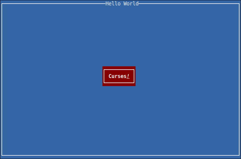
Pressing the Curses! button will exit the program and print the quit message to the terminal, which should have cleanly cleared the screen and restored the terminal to shell control again.
Commands
CTK includes a number of command programs for the purpose of enabling a better developer experience or as a means of having a necessity in creating new widgets and features.
go-dialog
go-dialog is a dialog replacement, fully implemented in CTK and takes advantage of Glade interface files for implementing the user interface.
$ go install github.com/go-curses/ctk/cmd/go-dialog
$ ./go-dialog --help
NAME:
   go-dialog - display dialog boxes from shell scripts

USAGE:
   go-dialog [global options] command [command options] [arguments...]

VERSION:
   0.0.1

COMMANDS:
   msgbox   display a message with an OK button, each string following msgbox is a new line and concatenated into the message
   yesno    display a yes/no prompt with a message (see msgbox)
   help, h  Shows a list of commands or help for one command

GLOBAL OPTIONS:
   --title value                     specify the dialog title text
   --print-maxsize                   print the width and height on stdout and exit (default: false)
   --back-title value                specify the window title text
   --help, -h, --usage               display command-line usage information (default: false)
   --version                         display the version (default: false)
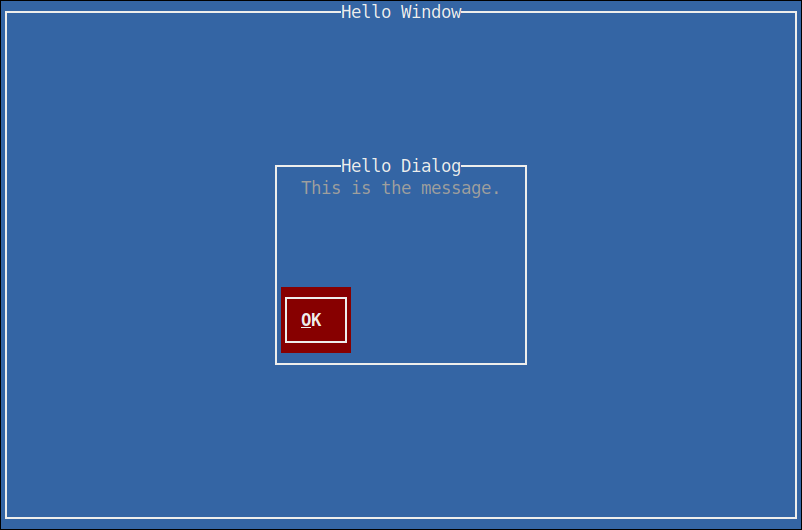
Display a message-box dialog (with the title of "Hello Dialog"), centered on top of a full-screen window (with the title "Hello Window"), displaying a message of "This is the message" and presenting a single button labelled "OK".
$ ./go-dialog \
   --back-title "Hello Window" \
   --title "Hello Dialog" \
   msgbox \
   "This is the message."
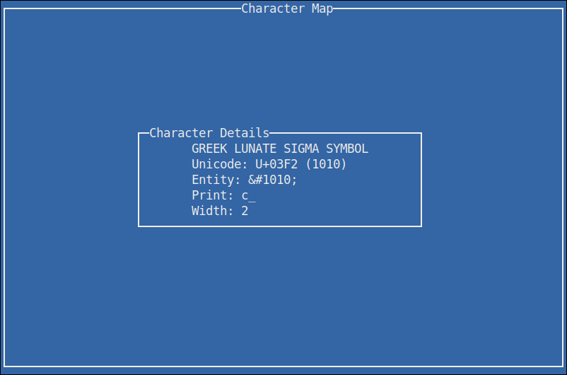
go-charmap
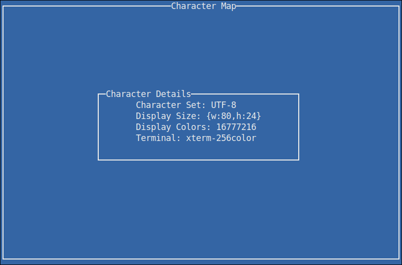
This is a simple character-set viewer called go-charmap.
$ go install github.com/go-curses/ctk/cmd/go-charmap
$ ./go-charmap --help
NAME:
   go-charmap - View the details of a character

USAGE:
   go-charmap [integer]

VERSION:
   0.0.1

DESCRIPTION:
   Get informational details for a specific character given in integer form.

COMMANDS:
   help, h  Shows a list of commands or help for one command

GLOBAL OPTIONS:
   --help, -h, --usage  display command-line usage information (default: false)
   --version            display the version (default: false)
Display information on the current terminal settings.
$ go-charmap
Display information on the lowercase sigma character.
$ go-charmap 1010
go-ctk
This is a weird one. go-ctk can do a number of things related to working
on the CTK project, some useful for normal developers. Particularly the
glade option, so that's the one we're going to talk about here.
The glade option for go-ctk enables the developer to test their Glade
interface files outside of their normal codebase, as a means of validating
whether their problems are in their code or with how CTK is handling the
Glade files.
For those not aware, Glade is the formal way to design user interfaces for actual GTK applications. Given that CTK is a curses implementation of GTK, it supports loading widgets and such from Glade interface files.
There are of course all sorts of undocumented and unknown caveats to the support of Glade and all it's configurable features at this time. It is an objective of CTK to formally support Glade as much as sensibly possible.
$ ./go-ctk help glade
NAME:
   go-ctk glade - preview glade interfaces

USAGE:
   go-ctk glade [command options] [arguments...]

DESCRIPTION:
   load the given .glade file and preview in CTK

OPTIONS:
   --window value, -W value   specify a named (glade "id" attribute) window to preview (default: main-window)
   --dialog value, -D value   specify a named (glade "id" attribute) dialog to preview (default: main-dialog)
   --no-dialog-transient, -n  when rendering ctk.Dialog types, do not set the transient-for to a default window and use the dialog itself as a top-level window (default: false)
There are two example glade files in the examples directory. This
example command will load the builder-dialog.glade file and if
all is working as it should, display a window with a dialog containing
some lorem ipsum text and two buttons, a yes and a no.
For this to work however, it's important to note that within glade
we need to set the id on the window and dialog objects. go-ctk
defaults to "main-window" and "main-dialog", which the example files
use. That's the purpose to the --window and --dialog command-line
options.
$ ./go-ctk glade ./examples/builder-dialog.glade
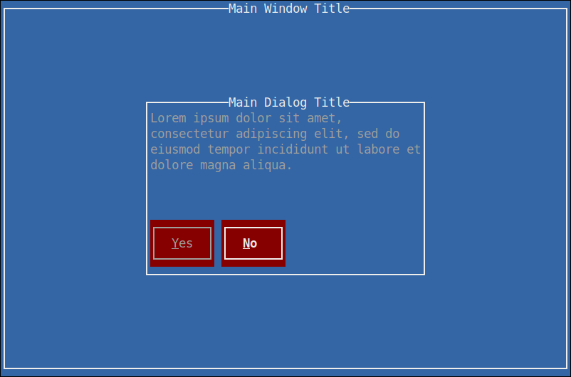
Pressing either of the buttons will exit the viewer and print out which button was pressed.
button pressed: ctk-button-2194440b-86b2-4386-a5a1-984bfec916e6 "Yes"
Running the unit tests
Normal go testing mechanics work.
$ go test -v
=== RUN   TestAdjustment

  ... (per-test output, trimmed for brevity) ...

--- PASS: TestWidget (0.00s)
PASS
ok  	github.com/go-curses/ctk	(0.018s)
Makefile
Included is a Makefile that has a number of useful build targets, as shown in the usage help text.
$ make help
usage: make [target]

qa targets:
  vet         - run go vet command
  test        - perform all available tests
  cover       - perform all available tests with coverage report

cleanup targets:
  clean       - cleans package and built files
  clean-logs  - cleans *.log from the project

go.mod helpers:
  local       - add go.mod local CDK package replacements
  unlocal     - remove go.mod local CDK package replacements

build targets:
  examples    - builds all examples
  build       - build the go-ctk command
  build-all   - build all commands
  dev         - build demo-app with profiling

run targets:
  run         - run the dev build (sanely handle crashes)
  profile.cpu - run the dev build and profile CPU
  profile.mem - run the dev build and profile memory
Versioning
The current API is unstable and subject to change dramatically.
License
This project is licensed under the Apache License, Version 2.0 - see the LICENSE.md file for details.
Acknowledgments
 Documentation
Documentation
Overview 
Package ctk is a curses-based graphical user interface library modeled after the GTK API.
The purpose of this project is to provide a similar API to the actual GTK project and instead of interacting with an X11 server, the Curses Tool Kit interacts with a terminal display, managed by the Curses Development Kit.
CTK Type Hierarchy
Object
  |- Adjustment
  `- Widget
     |- Container
     |  |- Bin
     |  |  |- Button
     |  |  |- EventBox
     |  |  |- Frame
     |  |  |- Viewport
     |  |  |  `- ScrolledViewport
     |  |  `- Window
     |  |     `- Dialog
     |  `- Box
     |     |- HBox
     |     |- VBox
     |     `- ButtonBox
     |        |- HButtonBox
     |        `- VButtonBox
     |- Misc
     |  |- Arrow
     |  `- Label
     |- Range
     |  |- Scale
     |  |  |- HScale
     |  |  `- VScale
     |  `- Scrollbar
     |     |- HScrollbar
     |     `- VScrollbar
     `- Sensitive
Index 
- Constants
- Variables
- func AddStockItems(items ...*StockItem)
- func BuilderRegisterConstructor(tag cdk.TypeTag, fn BuilderTranslationFn)
- func ValidStockId(id StockID) (ok bool)
- func WidgetDescend(widget Widget, fn WidgetIteratorFn) (rv cenums.EventFlag)
- func WidgetRecurseInvalidate(widget Widget)
- func WidgetRecurseSetWindow(widget Widget, window Window)
- func WithAppWindow(action AppFn, argv ...string) func()
- func WithArgvApplicationSignalStartup(startupFn ApplicationStartupFn) cdk.SignalListenerFn
- func WithArgvNoneSignal(fn func(), eventFlag cenums.EventFlag) cdk.SignalListenerFn
- func WithArgvNoneWithFlagsSignal(fn func() cenums.EventFlag) cdk.SignalListenerFn
- func WithArgvSignalEvent(fn SignalEventFn) cdk.SignalListenerFn
- func WithFakeWindow(fn WithFakeWindowFn) func()
- func WithFakeWindowOptions(w, h int, theme paint.Theme, fn WithFakeWindowFn) func()
- type AccelGroup
- type AccelGroupFindFunc
- type AccelGroups
- type AccelKey
- type AccelMap
- type Accelerator
- type Action
- type ActionEntry
- type ActionGroup
- type Activatable
- type Adjustment
- type Alignable
- type Alignment
- type AppFn
- type Application
- type ApplicationInitFn
- type ApplicationShutdownFn
- type ApplicationStartupFn
- type Arrow
- type Bin
- type Box
- type Buildable
- type Builder
- type BuilderElement
- type BuilderNode
- type BuilderTranslationFn
- type Button
- type ButtonBox
- type CAccelGroup
- func (a *CAccelGroup) AccelConnect(accelKey cdk.Key, accelMods cdk.ModMask, accelFlags enums.AccelFlags, ...) (id uuid.UUID)
- func (a *CAccelGroup) AccelDisconnect(id uuid.UUID) (removed bool)
- func (a *CAccelGroup) AccelGroupActivate(keyval cdk.Key, modifier cdk.ModMask) (activated bool)
- func (a *CAccelGroup) AcceleratorGetDefaultModMask() (value int)
- func (a *CAccelGroup) AcceleratorGetLabel(acceleratorKey cdk.Key, acceleratorMods cdk.ModMask) (value string)
- func (a *CAccelGroup) AcceleratorName(acceleratorKey cdk.Key, acceleratorMods cdk.ModMask) (value string)
- func (a *CAccelGroup) AcceleratorParse(accelerator string) (acceleratorKey cdk.Key, acceleratorMods cdk.ModMask)
- func (a *CAccelGroup) AcceleratorSetDefaultModMask(defaultModMask cdk.ModMask)
- func (a *CAccelGroup) AcceleratorValid(keyval cdk.Key, modifiers cdk.ModMask) (valid bool)
- func (a *CAccelGroup) Activate(accelKey cdk.Key, accelMods cdk.ModMask) (value bool)
- func (a *CAccelGroup) ConnectByPath(accelPath string, handle string, closure enums.GClosure)
- func (a *CAccelGroup) DisconnectKey(accelKey cdk.Key, accelMods cdk.ModMask) (removed bool)
- func (a *CAccelGroup) Find(findFunc AccelGroupFindFunc, data interface{}) (key *AccelKey)
- func (a *CAccelGroup) GetIsLocked() (locked bool)
- func (a *CAccelGroup) GetModifierMask() (value cdk.ModMask)
- func (a *CAccelGroup) Init() (already bool)
- func (a *CAccelGroup) LockGroup()
- func (a *CAccelGroup) Query(accelKey cdk.Key, accelMods cdk.ModMask) (entries []*CAccelGroupEntry)
- func (a *CAccelGroup) UnlockGroup()
- type CAccelGroupEntry
- type CAccelGroups
- func (a *CAccelGroups) Activate(object Object, accelKey cdk.Key, accelMods cdk.ModMask) (value bool)
- func (a *CAccelGroups) AddAccelGroup(object Object, accelGroup AccelGroup)
- func (a *CAccelGroups) FromObject(object Object) (groups []AccelGroup)
- func (a *CAccelGroups) RemoveAccelGroup(object Object, accelGroup AccelGroup)
- type CAccelKey
- type CAccelMap
- func (a *CAccelMap) AddEntry(accelPath string, accelKey cdk.Key, accelMods cdk.ModMask)
- func (a *CAccelMap) ChangeEntry(accelPath string, accelKey cdk.Key, accelMods cdk.ModMask, replace bool) (ok bool)
- func (a *CAccelMap) Init() (already bool)
- func (a *CAccelMap) Load(fileName string)
- func (a *CAccelMap) LoadFromString(accelMap string)
- func (a *CAccelMap) LockPath(accelPath string)
- func (a *CAccelMap) LookupEntry(accelPath string) (accelerator Accelerator, ok bool)
- func (a *CAccelMap) Save(fileName string)
- func (a *CAccelMap) SaveToString() (accelMap string)
- func (a *CAccelMap) UnlockPath(accelPath string)
- type CAccelerator
- func (a *CAccelerator) Configure(key cdk.Key, mods cdk.ModMask)
- func (a *CAccelerator) Init() (already bool)
- func (a *CAccelerator) IsLocked() (locked bool)
- func (a *CAccelerator) Key() (key cdk.Key)
- func (a *CAccelerator) LockAccel()
- func (a *CAccelerator) Match(key cdk.Key, mods cdk.ModMask) (match bool)
- func (a *CAccelerator) Mods() (mods cdk.ModMask)
- func (a *CAccelerator) Path() (path string)
- func (a *CAccelerator) Settings() (path string, key cdk.Key, mods cdk.ModMask)
- func (a *CAccelerator) UnlockAccel()
- func (a *CAccelerator) UnsetKeyMods()
- type CAction
- func (a *CAction) Activate()
- func (a *CAction) ConnectAccelerator()
- func (a *CAction) CreateMenu() (value Widget)
- func (a *CAction) CreateMenuItem() (value Widget)
- func (a *CAction) CreateToolItem() (value Widget)
- func (a *CAction) DisconnectAccelerator()
- func (a *CAction) GetAccelClosure() (value enums.GClosure)
- func (a *CAction) GetAccelPath() (value string)
- func (a *CAction) GetAlwaysShowImage() (value bool)
- func (a *CAction) GetIcon() (value rune)
- func (a *CAction) GetIconName() (value string)
- func (a *CAction) GetIsImportant() (value bool)
- func (a *CAction) GetLabel() (value string)
- func (a *CAction) GetName() (value string)
- func (a *CAction) GetProxies() (value []interface{})
- func (a *CAction) GetSensitive() (value bool)
- func (a *CAction) GetShortLabel() (value string)
- func (a *CAction) GetStockId() (value StockID)
- func (a *CAction) GetTooltip() (value string)
- func (a *CAction) GetVisible() (value bool)
- func (a *CAction) GetVisibleHorizontal() (value bool)
- func (a *CAction) GetVisibleVertical() (value bool)
- func (a *CAction) Init() (already bool)
- func (a *CAction) IsSensitive() (value bool)
- func (a *CAction) IsVisible() (value bool)
- func (a *CAction) SetAccelGroup(accelGroup AccelGroup)
- func (a *CAction) SetAccelPath(accelPath string)
- func (a *CAction) SetAlwaysShowImage(alwaysShow bool)
- func (a *CAction) SetIcon(icon rune)
- func (a *CAction) SetIconName(iconName string)
- func (a *CAction) SetIsImportant(isImportant bool)
- func (a *CAction) SetLabel(label string)
- func (a *CAction) SetSensitive(sensitive bool)
- func (a *CAction) SetShortLabel(shortLabel string)
- func (a *CAction) SetStockId(stockId StockID)
- func (a *CAction) SetTooltip(tooltip string)
- func (a *CAction) SetVisible(visible bool)
- func (a *CAction) SetVisibleHorizontal(visibleHorizontal bool)
- func (a *CAction) SetVisibleVertical(visibleVertical bool)
- func (a *CAction) UnblockActivate()
- type CActionGroup
- func (a *CActionGroup) AddAction(action Action)
- func (a *CActionGroup) AddActionWithAccel(action Action, accelerator string)
- func (a *CActionGroup) AddActions(entries []ActionEntry, nEntries int, userData interface{})
- func (a *CActionGroup) AddActionsFull(entries []ActionEntry, nEntries int, userData interface{}, ...)
- func (a *CActionGroup) AddRadioActions(entries []RadioActionEntry, nEntries int, value int, onChange enums.GCallback, ...)
- func (a *CActionGroup) AddRadioActionsFull(entries []RadioActionEntry, nEntries int, value int, onChange enums.GCallback, ...)
- func (a *CActionGroup) AddToggleActions(entries []ToggleActionEntry, nEntries int, userData interface{})
- func (a *CActionGroup) AddToggleActionsFull(entries []ToggleActionEntry, nEntries int, userData interface{}, ...)
- func (a *CActionGroup) GetAction(actionName string) (value Action)
- func (a *CActionGroup) GetName() (value string)
- func (a *CActionGroup) GetSensitive() (value bool)
- func (a *CActionGroup) GetVisible() (value bool)
- func (a *CActionGroup) Init() (already bool)
- func (a *CActionGroup) ListActions() (value []Action)
- func (a *CActionGroup) RemoveAction(action Action)
- func (a *CActionGroup) SetSensitive(sensitive bool)
- func (a *CActionGroup) SetTranslateFunc(fn TranslateFunc, data interface{}, notify GDestroyNotify)
- func (a *CActionGroup) SetTranslationDomain(domain string)
- func (a *CActionGroup) SetVisible(visible bool)
- func (a *CActionGroup) TranslateString(string string) (value string)
- type CAdjustment
- func (a *CAdjustment) Changed() cenums.EventFlag
- func (a *CAdjustment) ClampPage(upper, lower int)
- func (a *CAdjustment) Configure(value, lower, upper, stepIncrement, pageIncrement, pageSize int)
- func (a *CAdjustment) GetLower() (value int)
- func (a *CAdjustment) GetPageIncrement() (pageIncrement int)
- func (a *CAdjustment) GetPageSize() (pageSize int)
- func (a *CAdjustment) GetStepIncrement() (stepIncrement int)
- func (a *CAdjustment) GetUpper() (upper int)
- func (a *CAdjustment) GetValue() (value int)
- func (a *CAdjustment) Init() bool
- func (a *CAdjustment) Moot() bool
- func (a *CAdjustment) SetLower(lower int)
- func (a *CAdjustment) SetPageIncrement(pageIncrement int)
- func (a *CAdjustment) SetPageSize(pageSize int)
- func (a *CAdjustment) SetStepIncrement(stepIncrement int)
- func (a *CAdjustment) SetUpper(upper int)
- func (a *CAdjustment) SetValue(value int)
- func (a *CAdjustment) Settings() (value, lower, upper, stepIncrement, pageIncrement, pageSize int)
- func (a *CAdjustment) ShowByPolicy(policy enums.PolicyType) bool
- func (a *CAdjustment) ValueChanged() cenums.EventFlag
- type CAlignment
- func (a *CAlignment) Add(w Widget)
- func (a *CAlignment) Get() (xAlign, yAlign, xScale, yScale float64)
- func (a *CAlignment) GetPadding() (paddingTop, paddingBottom, paddingLeft, paddingRight int)
- func (a *CAlignment) Init() (already bool)
- func (a *CAlignment) Remove(w Widget)
- func (a *CAlignment) Set(xAlign, yAlign, xScale, yScale float64)
- func (a *CAlignment) SetPadding(paddingTop, paddingBottom, paddingLeft, paddingRight int)
- type CApplication
- type CArrow
- func (a *CArrow) GetArrowRune() (r rune, width int)
- func (a *CArrow) GetArrowRuneSet() (ars paint.ArrowRuneSet)
- func (a *CArrow) GetArrowType() (arrow enums.ArrowType)
- func (a *CArrow) GetSizeRequest() (width, height int)
- func (a *CArrow) Init() bool
- func (a *CArrow) SetArrowRuneSet(ars paint.ArrowRuneSet)
- func (a *CArrow) SetArrowType(arrow enums.ArrowType)
- func (a *CArrow) UnsetArrowRuneSet()
- type CBin
- type CBox
- func (b *CBox) Add(child Widget)
- func (b *CBox) Build(builder Builder, element *CBuilderElement) error
- func (b *CBox) GetFocusChain() (focusableWidgets []Widget, explicitlySet bool)
- func (b *CBox) GetHomogeneous() (value bool)
- func (b *CBox) GetOrientation() (orientation cenums.Orientation)
- func (b *CBox) GetSizeRequest() (width, height int)
- func (b *CBox) GetSpacing() (value int)
- func (b *CBox) Init() (already bool)
- func (b *CBox) PackEnd(child Widget, expand, fill bool, padding int)
- func (b *CBox) PackStart(child Widget, expand, fill bool, padding int)
- func (b *CBox) QueryChildPacking(child Widget) (expand bool, fill bool, padding int, packType enums.PackType)
- func (b *CBox) Remove(w Widget)
- func (b *CBox) ReorderChild(child Widget, position int)
- func (b *CBox) SetChildPacking(child Widget, expand bool, fill bool, padding int, packType enums.PackType)
- func (b *CBox) SetHomogeneous(homogeneous bool)
- func (b *CBox) SetOrientation(orientation cenums.Orientation)
- func (b *CBox) SetSpacing(spacing int)
- type CBuilder
- func (b *CBuilder) AddNamedSignalHandler(name string, fn cdk.SignalListenerFn)
- func (b *CBuilder) Build(element *CBuilderElement) (newObject interface{})
- func (b *CBuilder) BuildableTypeTags() map[string]cdk.TypeTag
- func (b *CBuilder) GetWidget(name string) (w interface{})
- func (b *CBuilder) GetWidgetsBuiltByType(tag cdk.CTypeTag) (widgets []interface{})
- func (b *CBuilder) Init() (already bool)
- func (b *CBuilder) LoadFromString(raw string) (topElement *CBuilderElement, err error)
- func (b *CBuilder) LookupNamedSignalHandler(name string) (fn cdk.SignalListenerFn)
- func (b *CBuilder) ParsePacking(packing *CBuilderElement) (expand, fill bool, padding int, packType enums.PackType)
- type CBuilderElement
- type CButton
- func (b *CButton) Activate() (value bool)
- func (b *CButton) Add(w Widget)
- func (b *CButton) Build(builder Builder, element *CBuilderElement) error
- func (b *CButton) CancelEvent()
- func (b *CButton) Clicked() cenums.EventFlag
- func (b *CButton) GetAlignment() (xAlign float64, yAlign float64)
- func (b *CButton) GetFocusChain() (focusableWidgets []Widget, explicitlySet bool)
- func (b *CButton) GetFocusOnClick() (value bool)
- func (b *CButton) GetImage() (value Widget, ok bool)
- func (b *CButton) GetImagePosition() (value enums.PositionType)
- func (b *CButton) GetLabel() (value string)
- func (b *CButton) GetPressed() bool
- func (b *CButton) GetRelief() (value enums.ReliefStyle)
- func (b *CButton) GetSizeRequest() (width, height int)
- func (b *CButton) GetUseMarkup() (enabled bool)
- func (b *CButton) GetUseStock() (value bool)
- func (b *CButton) GetUseUnderline() (enabled bool)
- func (b *CButton) GetWidgetAt(p *ptypes.Point2I) Widget
- func (b *CButton) Init() (already bool)
- func (b *CButton) SetAlignment(xAlign float64, yAlign float64)
- func (b *CButton) SetFocusOnClick(focusOnClick bool)
- func (b *CButton) SetImage(image Widget)
- func (b *CButton) SetImagePosition(position enums.PositionType)
- func (b *CButton) SetLabel(label string)
- func (b *CButton) SetPressed(pressed bool)
- func (b *CButton) SetRelief(newStyle enums.ReliefStyle)
- func (b *CButton) SetState(state enums.StateType)
- func (b *CButton) SetTheme(theme paint.Theme)
- func (b *CButton) SetUseMarkup(enabled bool)
- func (b *CButton) SetUseStock(useStock bool)
- func (b *CButton) SetUseUnderline(enabled bool)
- func (b *CButton) UnsetState(state enums.StateType)
- type CButtonBox
- func (b *CButtonBox) Add(w Widget)
- func (b *CButtonBox) Build(builder Builder, element *CBuilderElement) error
- func (b *CButtonBox) GetChildPrimary(w Widget) (isPrimary bool)
- func (b *CButtonBox) GetChildSecondary(w Widget) (isSecondary bool)
- func (b *CButtonBox) GetLayout() (value enums.ButtonBoxStyle)
- func (b *CButtonBox) Init() (already bool)
- func (b *CButtonBox) PackEnd(w Widget, expand, fill bool, padding int)
- func (b *CButtonBox) PackStart(w Widget, expand, fill bool, padding int)
- func (b *CButtonBox) Remove(w Widget)
- func (b *CButtonBox) SetChildPacking(child Widget, expand bool, fill bool, padding int, packType enums.PackType)
- func (b *CButtonBox) SetChildSecondary(child Widget, isSecondary bool)
- func (b *CButtonBox) SetLayout(layoutStyle enums.ButtonBoxStyle)
- func (b *CButtonBox) SetSpacing(spacing int)
- type CContainer
- func (c *CContainer) Add(w Widget)
- func (c *CContainer) AddWithProperties(widget Widget, argv ...interface{})
- func (c *CContainer) Build(builder Builder, element *CBuilderElement) error
- func (c *CContainer) ChildGet(child Widget, properties ...cdk.Property) (values []interface{})
- func (c *CContainer) ChildSet(child Widget, argv ...interface{})
- func (c *CContainer) ChildType() (value cdk.CTypeTag)
- func (c *CContainer) Destroy()
- func (c *CContainer) FindAllWidgetsAt(p *ptypes.Point2I) (found []Widget)
- func (c *CContainer) FindChildProperty(property cdk.Property) (value *cdk.CProperty)
- func (c *CContainer) FindWidgetAt(p *ptypes.Point2I) (found Widget)
- func (c *CContainer) GetBorderWidth() (value int)
- func (c *CContainer) GetChildProperty(child Widget, propertyName cdk.Property) (value interface{})
- func (c *CContainer) GetChildren() (children []Widget)
- func (c *CContainer) GetFocusChain() (focusableWidgets []Widget, explicitlySet bool)
- func (c *CContainer) GetFocusChild() (value Widget)
- func (c *CContainer) GetFocusHAdjustment() (value Adjustment)
- func (c *CContainer) GetFocusVAdjustment() (value Adjustment)
- func (c *CContainer) GetWidgetAt(p *ptypes.Point2I) Widget
- func (c *CContainer) HasChild(widget Widget) (present bool)
- func (c *CContainer) Init() (already bool)
- func (c *CContainer) InstallChildProperty(name cdk.Property, kind cdk.PropertyType, write bool, def interface{}) error
- func (c *CContainer) InvalidateAllChildren()
- func (c *CContainer) InvalidateChildren()
- func (c *CContainer) ListChildProperties() (properties []*cdk.CProperty)
- func (c *CContainer) Map()
- func (c *CContainer) Remove(w Widget)
- func (c *CContainer) RenderFreeze()
- func (c *CContainer) RenderThaw()
- func (c *CContainer) ResizeChildren()
- func (c *CContainer) SetBorderWidth(borderWidth int)
- func (c *CContainer) SetChildProperty(child Widget, propertyName cdk.Property, value interface{})
- func (c *CContainer) SetFocusChain(focusableWidgets []Widget)
- func (c *CContainer) SetFocusChild(child Widget)
- func (c *CContainer) SetFocusHAdjustment(adjustment Adjustment)
- func (c *CContainer) SetFocusVAdjustment(adjustment Adjustment)
- func (c *CContainer) SetWindow(w Window)
- func (c *CContainer) ShowAll()
- func (c *CContainer) Unmap()
- func (c *CContainer) UnsetFocusChain()
- type CDialog
- func (d *CDialog) Add(w Widget)
- func (d *CDialog) AddActionWidget(child Widget, responseId enums.ResponseType)
- func (d *CDialog) AddButton(buttonText string, responseId enums.ResponseType) (button Button)
- func (d *CDialog) AddButtons(argv ...interface{})
- func (d *CDialog) AddSecondaryActionWidget(child Widget, responseId enums.ResponseType)
- func (d *CDialog) Build(builder Builder, element *CBuilderElement) error
- func (d *CDialog) Destroy()
- func (d *CDialog) GetActionArea() (value ButtonBox)
- func (d *CDialog) GetContentArea() (value VBox)
- func (d *CDialog) GetDialogFlags() (flags enums.DialogFlags)
- func (d *CDialog) GetResponseForWidget(widget Widget) (value enums.ResponseType)
- func (d *CDialog) GetWidgetForResponse(responseId enums.ResponseType) (value Widget)
- func (d *CDialog) GetWindow() Window
- func (d *CDialog) Init() (already bool)
- func (d *CDialog) Response(responseId enums.ResponseType)
- func (d *CDialog) Run() (response chan enums.ResponseType)
- func (d *CDialog) RunFunc(fn func(response enums.ResponseType, argv ...interface{}), argv ...interface{})
- func (d *CDialog) SetDefaultResponse(responseId enums.ResponseType)
- func (d *CDialog) SetDialogFlags(flags enums.DialogFlags)
- func (d *CDialog) SetResponseSensitive(responseId enums.ResponseType, sensitive bool)
- func (d *CDialog) Show()
- func (d *CDialog) ShowAll()
- type CEntry
- func (l *CEntry) Activate() (value bool)
- func (l *CEntry) Build(builder Builder, element *CBuilderElement) error
- func (l *CEntry) CancelEvent()
- func (l *CEntry) CopyClipboard()
- func (l *CEntry) CutClipboard()
- func (l *CEntry) DeleteSelection()
- func (l *CEntry) DeleteText(startPos int, endPos int)
- func (l *CEntry) DeleteTextAndSetPosition(start, end, position int)
- func (l *CEntry) GetAttributes() (value paint.Style)
- func (l *CEntry) GetChars(startPos int, endPos int) (value string)
- func (l *CEntry) GetEditable() (value bool)
- func (l *CEntry) GetJustify() (value cenums.Justification)
- func (l *CEntry) GetLineWrap() (value bool)
- func (l *CEntry) GetLineWrapMode() (value cenums.WrapMode)
- func (l *CEntry) GetMaxWidthChars() (value int)
- func (l *CEntry) GetPosition() (value int)
- func (l *CEntry) GetSelectable() (value bool)
- func (l *CEntry) GetSelectionBounds() (startPos, endPos int, ok bool)
- func (l *CEntry) GetSingleLineMode() (value bool)
- func (l *CEntry) GetSizeRequest() (width, height int)
- func (l *CEntry) GetText() (value string)
- func (l *CEntry) GetWidthChars() (value int)
- func (l *CEntry) Init() (already bool)
- func (l *CEntry) InsertText(newText string, position int)
- func (l *CEntry) InsertTextAndSetPosition(newText string, index, position int)
- func (l *CEntry) PasteClipboard()
- func (l *CEntry) SelectRegion(startOffset int, endOffset int)
- func (l *CEntry) SetAttributes(attrs paint.Style)
- func (l *CEntry) SetEditable(isEditable bool)
- func (l *CEntry) SetJustify(justify cenums.Justification)
- func (l *CEntry) SetLineWrap(wrap bool)
- func (l *CEntry) SetLineWrapMode(wrapMode cenums.WrapMode)
- func (l *CEntry) SetMaxWidthChars(nChars int)
- func (l *CEntry) SetPosition(position int)
- func (l *CEntry) SetSelectable(setting bool)
- func (l *CEntry) SetSingleLineMode(singleLineMode bool)
- func (l *CEntry) SetText(text string)
- func (l *CEntry) SetWidthChars(nChars int)
- func (l *CEntry) Settings() (singleLineMode bool, lineWrapMode cenums.WrapMode, ...)
- type CEventBox
- func (b *CEventBox) Activate() (value bool)
- func (b *CEventBox) CancelEvent()
- func (b *CEventBox) GetAboveChild() (value bool)
- func (b *CEventBox) GetVisibleWindow() (value bool)
- func (b *CEventBox) Init() (already bool)
- func (b *CEventBox) ProcessEvent(evt cdk.Event) cenums.EventFlag
- func (b *CEventBox) SetAboveChild(aboveChild bool)
- func (b *CEventBox) SetVisibleWindow(visibleWindow bool)
- type CFakeWindow
- type CFrame
- func (f *CFrame) Add(w Widget)
- func (f *CFrame) GetFocusWithChild() (focusWithChild bool)
- func (f *CFrame) GetLabel() (value string)
- func (f *CFrame) GetLabelAlign() (xAlign float64, yAlign float64)
- func (f *CFrame) GetLabelWidget() (value Widget)
- func (f *CFrame) GetShadowType() (value enums.ShadowType)
- func (f *CFrame) GetSizeRequest() (width, height int)
- func (f *CFrame) GetWidgetAt(p *ptypes.Point2I) Widget
- func (f *CFrame) Init() (already bool)
- func (f *CFrame) IsFocus() bool
- func (f *CFrame) Remove(w Widget)
- func (f *CFrame) SetFocusWithChild(focusWithChild bool)
- func (f *CFrame) SetLabel(label string)
- func (f *CFrame) SetLabelAlign(xAlign float64, yAlign float64)
- func (f *CFrame) SetLabelWidget(widget Widget)
- func (f *CFrame) SetShadowType(shadowType enums.ShadowType)
- func (f *CFrame) SetWindow(w Window)
- type CHBox
- type CHButtonBox
- type CHScrollbar
- type CLabel
- func (l *CLabel) Build(builder Builder, element *CBuilderElement) error
- func (l *CLabel) GetAttributes() (value paint.Style)
- func (l *CLabel) GetCleanText() (text string)
- func (l *CLabel) GetClearText() (text string)
- func (l *CLabel) GetCurrentUri() (value string)
- func (l *CLabel) GetEllipsize() (value bool)
- func (l *CLabel) GetJustify() (value cenums.Justification)
- func (l *CLabel) GetLabel() (value string)
- func (l *CLabel) GetLineWrap() (value bool)
- func (l *CLabel) GetLineWrapMode() (value cenums.WrapMode)
- func (l *CLabel) GetMaxWidthChars() (value int)
- func (l *CLabel) GetMnemonicKeyVal() (value rune)
- func (l *CLabel) GetMnemonicWidget() (value Widget)
- func (l *CLabel) GetPlainText() (text string)
- func (l *CLabel) GetPlainTextInfo() (maxWidth, lineCount int)
- func (l *CLabel) GetPlainTextInfoAtWidth(width int) (maxWidth, lineCount int)
- func (l *CLabel) GetSelectable() (value bool)
- func (l *CLabel) GetSelectionBounds() (start int, end int, nonEmpty bool)
- func (l *CLabel) GetSingleLineMode() (value bool)
- func (l *CLabel) GetSizeRequest() (width, height int)
- func (l *CLabel) GetText() (value string)
- func (l *CLabel) GetTrackVisitedLinks() (value bool)
- func (l *CLabel) GetUseMarkup() (value bool)
- func (l *CLabel) GetUseUnderline() (value bool)
- func (l *CLabel) GetWidthChars() (value int)
- func (l *CLabel) Init() (already bool)
- func (l *CLabel) SelectRegion(startOffset int, endOffset int)
- func (l *CLabel) SetAttributes(attrs paint.Style)
- func (l *CLabel) SetEllipsize(mode bool)
- func (l *CLabel) SetJustify(justify cenums.Justification)
- func (l *CLabel) SetLabel(str string)
- func (l *CLabel) SetLineWrap(wrap bool)
- func (l *CLabel) SetLineWrapMode(wrapMode cenums.WrapMode)
- func (l *CLabel) SetMarkup(text string) (parseError error)
- func (l *CLabel) SetMarkupWithMnemonic(str string) (err error)
- func (l *CLabel) SetMaxWidthChars(nChars int)
- func (l *CLabel) SetMnemonicWidget(widget Widget)
- func (l *CLabel) SetSelectable(setting bool)
- func (l *CLabel) SetSingleLineMode(singleLineMode bool)
- func (l *CLabel) SetText(text string)
- func (l *CLabel) SetTextWithMnemonic(str string)
- func (l *CLabel) SetTrackVisitedLinks(trackLinks bool)
- func (l *CLabel) SetUseMarkup(setting bool)
- func (l *CLabel) SetUseUnderline(setting bool)
- func (l *CLabel) SetWidthChars(nChars int)
- func (l *CLabel) Settings() (singleLineMode bool, lineWrapMode cenums.WrapMode, ellipsize bool, ...)
- type CMisc
- type CObject
- func (o *CObject) Build(builder Builder, element *CBuilderElement) error
- func (o *CObject) CssSelector() (selector string)
- func (o *CObject) GetAllocation() (alloc ptypes.Rectangle)
- func (o *CObject) GetCssBool(name cdk.Property, state enums.StateType) (value bool, err error)
- func (o *CObject) GetCssColor(name cdk.Property, state enums.StateType) (value paint.Color, err error)
- func (o *CObject) GetCssFloat(name cdk.Property, state enums.StateType) (value float64, err error)
- func (o *CObject) GetCssInt(name cdk.Property, state enums.StateType) (value int, err error)
- func (o *CObject) GetCssProperties() (properties map[enums.StateType][]*CStyleProperty)
- func (o *CObject) GetCssProperty(name cdk.Property, state enums.StateType) (property *CStyleProperty)
- func (o *CObject) GetCssString(name cdk.Property, state enums.StateType) (value string, err error)
- func (o *CObject) GetCssValue(name cdk.Property, state enums.StateType) (value interface{})
- func (o *CObject) GetInvalidated() (invalidated bool)
- func (o *CObject) GetObjectAt(p *ptypes.Point2I) Object
- func (o *CObject) GetOrigin() (origin ptypes.Point2I)
- func (o *CObject) GetRegion() (region ptypes.Region)
- func (o *CObject) GetTextDirection() (direction enums.TextDirection)
- func (o *CObject) HasPoint(p *ptypes.Point2I) (contains bool)
- func (o *CObject) Init() (already bool)
- func (o *CObject) InstallCssProperty(name cdk.Property, state enums.StateType, kind cdk.PropertyType, write bool, ...) (err error)
- func (o *CObject) Invalidate() cenums.EventFlag
- func (o *CObject) ObjectInfo() string
- func (o *CObject) ProcessEvent(evt cdk.Event) cenums.EventFlag
- func (o *CObject) Resize() cenums.EventFlag
- func (o *CObject) SetAllocation(size ptypes.Rectangle)
- func (o *CObject) SetCssPropertyFromStyle(key, value string) (err error)
- func (o *CObject) SetInvalidated(invalidated bool)
- func (o *CObject) SetOrigin(x, y int)
- func (o *CObject) SetRegion(region ptypes.Region)
- func (o *CObject) SetTextDirection(direction enums.TextDirection)
- type CRadioAction
- type CRange
- func (r *CRange) GetAdjustment() (adjustment *CAdjustment)
- func (r *CRange) GetFillLevel() (value float64)
- func (r *CRange) GetFlippable() (value bool)
- func (r *CRange) GetIncrements() (step int, page int)
- func (r *CRange) GetInverted() (value bool)
- func (r *CRange) GetLowerStepperSensitivity() (value enums.SensitivityType)
- func (r *CRange) GetMinSliderLength() (length int)
- func (r *CRange) GetMinSliderSize() (value int)
- func (r *CRange) GetPageSize() (pageSize int)
- func (r *CRange) GetRange() (min, max int)
- func (r *CRange) GetRangeRect() (rangeRect ptypes.Rectangle)
- func (r *CRange) GetRestrictToFillLevel() (value bool)
- func (r *CRange) GetRoundDigits() (value int)
- func (r *CRange) GetShowFillLevel() (value bool)
- func (r *CRange) GetSliderLength() (length int)
- func (r *CRange) GetSliderRange() (sliderStart int, sliderEnd int)
- func (r *CRange) GetSliderSizeFixed() (value bool)
- func (r *CRange) GetStepperSize() (size int)
- func (r *CRange) GetStepperSpacing() (spacing int)
- func (r *CRange) GetTroughUnderSteppers() (underSteppers bool)
- func (r *CRange) GetUpperStepperSensitivity() (value enums.SensitivityType)
- func (r *CRange) GetValue() (value int)
- func (r *CRange) Init() (already bool)
- func (r *CRange) SetFillLevel(fillLevel float64)
- func (r *CRange) SetFlippable(flippable bool)
- func (r *CRange) SetIncrements(step int, page int)
- func (r *CRange) SetInverted(setting bool)
- func (r *CRange) SetLowerStepperSensitivity(sensitivity enums.SensitivityType)
- func (r *CRange) SetMinSliderLength(length int)
- func (r *CRange) SetMinSliderSize(minSize bool)
- func (r *CRange) SetPageSize(pageSize int)
- func (r *CRange) SetRange(min, max int)
- func (r *CRange) SetRestrictToFillLevel(restrictToFillLevel bool)
- func (r *CRange) SetRoundDigits(roundDigits int)
- func (r *CRange) SetShowFillLevel(showFillLevel bool)
- func (r *CRange) SetSliderLength(length int)
- func (r *CRange) SetSliderSizeFixed(sizeFixed bool)
- func (r *CRange) SetStepperSize(size int)
- func (r *CRange) SetStepperSpacing(spacing int)
- func (r *CRange) SetTroughUnderSteppers(underSteppers bool)
- func (r *CRange) SetUpperStepperSensitivity(sensitivity enums.SensitivityType)
- func (r *CRange) SetValue(value int)
- type CScrollbar
- func (s *CScrollbar) Backward(step int) cenums.EventFlag
- func (s *CScrollbar) BackwardPage() cenums.EventFlag
- func (s *CScrollbar) BackwardStep() cenums.EventFlag
- func (s *CScrollbar) CancelEvent()
- func (s *CScrollbar) Changed()
- func (s *CScrollbar) FindWidgetAt(p *ptypes.Point2I) Widget
- func (s *CScrollbar) Forward(step int) cenums.EventFlag
- func (s *CScrollbar) ForwardPage() cenums.EventFlag
- func (s *CScrollbar) ForwardStep() cenums.EventFlag
- func (s *CScrollbar) GetAllStepperRegions() (fwd, bwd, sFwd, sBwd ptypes.Region)
- func (s *CScrollbar) GetHasBackwardStepper() (hasBackwardStepper bool)
- func (s *CScrollbar) GetHasForwardStepper() (hasForwardStepper bool)
- func (s *CScrollbar) GetHasSecondaryBackwardStepper() (hasSecondaryBackwardStepper bool)
- func (s *CScrollbar) GetHasSecondaryForwardStepper() (hasSecondaryForwardStepper bool)
- func (s *CScrollbar) GetPageInfo() (page, pageSize int)
- func (s *CScrollbar) GetSizeRequest() (width, height int)
- func (s *CScrollbar) GetSliderRegion() (region ptypes.Region)
- func (s *CScrollbar) GetStepperRegions() (start, end ptypes.Region)
- func (s *CScrollbar) GetTroughRegion() (region ptypes.Region)
- func (s *CScrollbar) GetWidgetAt(p *ptypes.Point2I) Widget
- func (s *CScrollbar) Init() (already bool)
- func (s *CScrollbar) ScrollEnd() cenums.EventFlag
- func (s *CScrollbar) ScrollHome() cenums.EventFlag
- func (s *CScrollbar) SetHasBackwardStepper(hasBackwardStepper bool)
- func (s *CScrollbar) SetHasForwardStepper(hasForwardStepper bool)
- func (s *CScrollbar) SetHasSecondaryBackwardStepper(hasSecondaryBackwardStepper bool)
- func (s *CScrollbar) SetHasSecondaryForwardStepper(hasSecondaryForwardStepper bool)
- func (s *CScrollbar) SetState(state enums.StateType)
- func (s *CScrollbar) UnsetState(state enums.StateType)
- func (s *CScrollbar) ValueChanged()
- type CScrolledViewport
- func (s *CScrolledViewport) Add(w Widget)
- func (s *CScrolledViewport) AddWithViewport(child Widget)
- func (s *CScrolledViewport) Build(builder Builder, element *CBuilderElement) error
- func (s *CScrolledViewport) CancelEvent()
- func (s *CScrolledViewport) GetChild() Widget
- func (s *CScrolledViewport) GetHAdjustment() (value Adjustment)
- func (s *CScrolledViewport) GetHScrollbar() HScrollbar
- func (s *CScrolledViewport) GetPlacement() (value enums.CornerType)
- func (s *CScrolledViewport) GetPolicy() (hScrollbarPolicy enums.PolicyType, vScrollbarPolicy enums.PolicyType)
- func (s *CScrolledViewport) GetRegions() (c, h, v ptypes.Region)
- func (s *CScrolledViewport) GetShadowType() (value enums.ShadowType)
- func (s *CScrolledViewport) GetVAdjustment() (value Adjustment)
- func (s *CScrolledViewport) GetVScrollbar() VScrollbar
- func (s *CScrolledViewport) GetWidgetAt(p *ptypes.Point2I) Widget
- func (s *CScrolledViewport) Hide()
- func (s *CScrolledViewport) HorizontalShowByPolicy() (show bool)
- func (s *CScrolledViewport) Init() (already bool)
- func (s *CScrolledViewport) Remove(w Widget)
- func (s *CScrolledViewport) ScrollBottom()
- func (s *CScrolledViewport) ScrollTo(target Widget)
- func (s *CScrolledViewport) ScrollTop()
- func (s *CScrolledViewport) SetHAdjustment(hAdjustment Adjustment)
- func (s *CScrolledViewport) SetPlacement(windowPlacement enums.CornerType)
- func (s *CScrolledViewport) SetPolicy(hScrollbarPolicy enums.PolicyType, vScrollbarPolicy enums.PolicyType)
- func (s *CScrolledViewport) SetShadowType(t enums.ShadowType)
- func (s *CScrolledViewport) SetVAdjustment(vAdjustment Adjustment)
- func (s *CScrolledViewport) SetWindow(w Window)
- func (s *CScrolledViewport) Show()
- func (s *CScrolledViewport) UnsetPlacement()
- func (s *CScrolledViewport) VerticalShowByPolicy() (show bool)
- type CSeparator
- type CSettings
- func (s *CSettings) GetAlternativeButtonOrder() (value bool)
- func (s *CSettings) GetAlternativeSortArrows() (value bool)
- func (s *CSettings) GetColorPalette() (value string)
- func (s *CSettings) GetColorScheme() (value string)
- func (s *CSettings) GetCursorBlink() (value bool)
- func (s *CSettings) GetCursorBlinkTime() (value time.Duration)
- func (s *CSettings) GetCursorBlinkTimeout() (value time.Duration)
- func (s *CSettings) GetCursorThemeName() (value string)
- func (s *CSettings) GetDndDragThreshold() (value time.Duration)
- func (s *CSettings) GetDoubleClickDistance() (value int)
- func (s *CSettings) GetDoubleClickTime() (value time.Duration)
- func (s *CSettings) GetEnableAccels() (value bool)
- func (s *CSettings) GetEnableMnemonics() (value bool)
- func (s *CSettings) GetEnableTooltips() (value bool)
- func (s *CSettings) GetEntryPasswordHintTimeout() (value time.Duration)
- func (s *CSettings) GetEntrySelectOnFocus() (value bool)
- func (s *CSettings) GetErrorBell() (value bool)
- func (s *CSettings) GetFallbackIconTheme() (value string)
- func (s *CSettings) GetFileChooserBackend() (value string)
- func (s *CSettings) GetIconThemeName() (value string)
- func (s *CSettings) GetImModule() (value string)
- func (s *CSettings) GetImPreeditStyle() (value interface{})
- func (s *CSettings) GetImStatusStyle() (value interface{})
- func (s *CSettings) GetKeyThemeName() (value string)
- func (s *CSettings) GetKeynavCursorOnly() (value bool)
- func (s *CSettings) GetKeynavWrapAround() (value bool)
- func (s *CSettings) GetLabelSelectOnFocus() (value bool)
- func (s *CSettings) GetMenuBarAccel() (value string)
- func (s *CSettings) GetMenuBarPopupDelay() (value time.Duration)
- func (s *CSettings) GetMenuImages() (value bool)
- func (s *CSettings) GetMenuPopdownDelay() (value time.Duration)
- func (s *CSettings) GetMenuPopupDelay() (value time.Duration)
- func (s *CSettings) GetModules() (value string)
- func (s *CSettings) GetPrimaryButtonWarpsSlider() (value bool)
- func (s *CSettings) GetScrolledWindowPlacement() (value interface{})
- func (s *CSettings) GetShowInputMethodMenu() (value bool)
- func (s *CSettings) GetShowUnicodeMenu() (value bool)
- func (s *CSettings) GetThemeName() (value string)
- func (s *CSettings) GetTimeoutExpand() (value time.Duration)
- func (s *CSettings) GetTimeoutInitial() (value time.Duration)
- func (s *CSettings) GetTimeoutRepeat() (value time.Duration)
- func (s *CSettings) GetToolbarStyle() (value interface{})
- func (s *CSettings) GetTooltipBrowseModeTimeout() (value time.Duration)
- func (s *CSettings) GetTooltipBrowseTimeout() (value time.Duration)
- func (s *CSettings) GetTooltipTimeout() (value time.Duration)
- func (s *CSettings) GetTouchscreenMode() (value bool)
- func (s *CSettings) Init() (already bool)
- func (s *CSettings) LoadFromString(rc string) (err error)
- func (s *CSettings) SetCtkAlternativeButtonOrder(value bool)
- func (s *CSettings) SetCtkAlternativeSortArrows(value bool)
- func (s *CSettings) SetCtkColorPalette(value string)
- func (s *CSettings) SetCtkColorScheme(value string)
- func (s *CSettings) SetCtkCursorBlink(value bool)
- func (s *CSettings) SetCtkCursorBlinkTime(value time.Duration)
- func (s *CSettings) SetCtkCursorBlinkTimeout(value time.Duration)
- func (s *CSettings) SetCtkCursorThemeName(value string)
- func (s *CSettings) SetCtkDndDragThreshold(value time.Duration)
- func (s *CSettings) SetCtkDoubleClickDistance(value int)
- func (s *CSettings) SetCtkDoubleClickTime(value time.Duration)
- func (s *CSettings) SetCtkEnableAccels(value bool)
- func (s *CSettings) SetCtkEnableMnemonics(value bool)
- func (s *CSettings) SetCtkEnableTooltips(value bool)
- func (s *CSettings) SetCtkEntryPasswordHintTimeout(value time.Duration)
- func (s *CSettings) SetCtkEntrySelectOnFocus(value bool)
- func (s *CSettings) SetCtkErrorBell(value bool)
- func (s *CSettings) SetCtkFallbackIconTheme(value string)
- func (s *CSettings) SetCtkFileChooserBackend(value string)
- func (s *CSettings) SetCtkIconThemeName(value string)
- func (s *CSettings) SetCtkImModule(value string)
- func (s *CSettings) SetCtkImPreeditStyle(value interface{})
- func (s *CSettings) SetCtkImStatusStyle(value interface{})
- func (s *CSettings) SetCtkKeyThemeName(value string)
- func (s *CSettings) SetCtkKeynavCursorOnly(value bool)
- func (s *CSettings) SetCtkKeynavWrapAround(value bool)
- func (s *CSettings) SetCtkLabelSelectOnFocus(value bool)
- func (s *CSettings) SetCtkMenuBarAccel(value string)
- func (s *CSettings) SetCtkMenuBarPopupDelay(value time.Duration)
- func (s *CSettings) SetCtkMenuImages(value bool)
- func (s *CSettings) SetCtkMenuPopdownDelay(value time.Duration)
- func (s *CSettings) SetCtkMenuPopupDelay(value time.Duration)
- func (s *CSettings) SetCtkModules(value string)
- func (s *CSettings) SetCtkPrimaryButtonWarpsSlider(value bool)
- func (s *CSettings) SetCtkScrolledWindowPlacement(value interface{})
- func (s *CSettings) SetCtkShowInputMethodMenu(value bool)
- func (s *CSettings) SetCtkShowUnicodeMenu(value bool)
- func (s *CSettings) SetCtkThemeName(value string)
- func (s *CSettings) SetCtkTimeoutExpand(value time.Duration)
- func (s *CSettings) SetCtkTimeoutInitial(value time.Duration)
- func (s *CSettings) SetCtkTimeoutRepeat(value time.Duration)
- func (s *CSettings) SetCtkToolbarStyle(value interface{})
- func (s *CSettings) SetCtkTooltipBrowseModeTimeout(value time.Duration)
- func (s *CSettings) SetCtkTooltipBrowseTimeout(value time.Duration)
- func (s *CSettings) SetCtkTooltipTimeout(value time.Duration)
- func (s *CSettings) SetCtkTouchscreenMode(value bool)
- type CSpinner
- func (s *CSpinner) GetSizeRequest() (width, height int)
- func (s *CSpinner) GetSpinnerRune() (r rune)
- func (s *CSpinner) IncrementSpinner()
- func (s *CSpinner) Init() bool
- func (s *CSpinner) IsSpinning() (running bool)
- func (s *CSpinner) SetSpinnerRunes(runes ...rune)
- func (s *CSpinner) StartSpinning()
- func (s *CSpinner) StopSpinning()
- type CStyle
- func (s *CStyle) Init() (already bool)
- func (s *CStyle) PaintArrow(window Window, stateType enums.StateType, shadowType enums.ShadowType, ...)
- func (s *CStyle) PaintBox(window Window, stateType enums.StateType, shadowType enums.ShadowType, ...)
- func (s *CStyle) PaintBoxGap(window Window, stateType enums.StateType, shadowType enums.ShadowType, ...)
- func (s *CStyle) PaintCheck(window Window, stateType enums.StateType, shadowType enums.ShadowType, ...)
- func (s *CStyle) PaintDiamond(window Window, stateType enums.StateType, shadowType enums.ShadowType, ...)
- func (s *CStyle) PaintExpander(window Window, stateType enums.StateType, area ptypes.Rectangle, widget Widget, ...)
- func (s *CStyle) PaintExtension(window Window, stateType enums.StateType, shadowType enums.ShadowType, ...)
- func (s *CStyle) PaintFlatBox(window Window, stateType enums.StateType, shadowType enums.ShadowType, ...)
- func (s *CStyle) PaintFocus(window Window, stateType enums.StateType, area ptypes.Rectangle, widget Widget, ...)
- func (s *CStyle) PaintHandle(window Window, stateType enums.StateType, shadowType enums.ShadowType, ...)
- func (s *CStyle) PaintOption(window Window, stateType enums.StateType, shadowType enums.ShadowType, ...)
- func (s *CStyle) PaintPolygon(window Window, stateType enums.StateType, shadowType enums.ShadowType, ...)
- func (s *CStyle) PaintResizeGrip(window Window, stateType enums.StateType, area ptypes.Rectangle, widget Widget, ...)
- func (s *CStyle) PaintShadow(window Window, stateType enums.StateType, shadowType enums.ShadowType, ...)
- func (s *CStyle) PaintShadowGap(window Window, stateType enums.StateType, shadowType enums.ShadowType, ...)
- func (s *CStyle) PaintSlider(window Window, stateType enums.StateType, shadowType enums.ShadowType, ...)
- func (s *CStyle) PaintSpinner(window Window, stateType enums.StateType, area ptypes.Rectangle, widget Widget, ...)
- func (s *CStyle) PaintTab(window Window, stateType enums.StateType, shadowType enums.ShadowType, ...)
- func (s *CStyle) PaintVLine(window Window, stateType enums.StateType, area ptypes.Rectangle, widget Widget, ...)
- type CStyleProperty
- func (p *CStyleProperty) Buildable() bool
- func (p *CStyleProperty) Clone() *CStyleProperty
- func (p *CStyleProperty) Default() (def interface{})
- func (p *CStyleProperty) Name() cdk.Property
- func (p *CStyleProperty) ReadOnly() bool
- func (p *CStyleProperty) Set(value interface{}) error
- func (p *CStyleProperty) SetFromString(value string) error
- func (p *CStyleProperty) State() enums.StateType
- func (p *CStyleProperty) Type() cdk.PropertyType
- func (p *CStyleProperty) Value() (value interface{})
- type CToggleAction
- type CVBox
- type CVButtonBox
- type CVScrollbar
- type CViewport
- func (v *CViewport) GetBinWindow() (value Window)
- func (v *CViewport) GetHAdjustment() (adjustment Adjustment)
- func (v *CViewport) GetShadowType() (shadowType enums.ShadowType)
- func (v *CViewport) GetVAdjustment() (adjustment Adjustment)
- func (v *CViewport) GetViewWindow() (value Window)
- func (v *CViewport) Init() (already bool)
- func (v *CViewport) SetHAdjustment(adjustment Adjustment)
- func (v *CViewport) SetShadowType(shadowType enums.ShadowType)
- func (v *CViewport) SetVAdjustment(adjustment Adjustment)
- type CWidget
- func (w *CWidget) Activate() (value bool)
- func (w *CWidget) AddAccelerator(accelSignal string, accelGroup AccelGroup, accelKey int, ...)
- func (w *CWidget) AddEvents(events cdk.EventMask)
- func (w *CWidget) AddMnemonicLabel(label Widget)
- func (w *CWidget) CanActivateAccel(signalId int) (value bool)
- func (w *CWidget) CanDefault() bool
- func (w *CWidget) CanFocus() bool
- func (w *CWidget) ChildFocus(direction enums.DirectionType) (value bool)
- func (w *CWidget) ChildNotify(childProperty string)
- func (w *CWidget) ClassPath(pathLength int, path string, pathReversed string)
- func (w *CWidget) CssFullPath() (selector string)
- func (w *CWidget) CssState() (state enums.StateType)
- func (w *CWidget) Destroy()
- func (w *CWidget) Draw() cenums.EventFlag
- func (w *CWidget) ErrorBell()
- func (w *CWidget) FreezeChildNotify()
- func (w *CWidget) GetAllParents() (parents []Widget)
- func (w *CWidget) GetAncestor(widgetType cdk.CTypeTag) (value Widget)
- func (w *CWidget) GetAppPaintable() (value bool)
- func (w *CWidget) GetCanDefault() (value bool)
- func (w *CWidget) GetCanFocus() (value bool)
- func (w *CWidget) GetChildVisible() (value bool)
- func (w *CWidget) GetCompositeChildren() (composites []Widget)
- func (w *CWidget) GetCompositeName() (value string)
- func (w *CWidget) GetDefaultDirection() (value enums.TextDirection)
- func (w *CWidget) GetDirection() (value enums.TextDirection)
- func (w *CWidget) GetDisplay() (value cdk.Display)
- func (w *CWidget) GetEvents() (value cdk.EventMask)
- func (w *CWidget) GetFlags() enums.WidgetFlags
- func (w *CWidget) GetHasTooltip() (value bool)
- func (w *CWidget) GetHasWindow() (ok bool)
- func (w *CWidget) GetMapped() (value bool)
- func (w *CWidget) GetNoShowAll() (value bool)
- func (w *CWidget) GetParent() (value Widget)
- func (w *CWidget) GetParentWindow() (value Window)
- func (w *CWidget) GetPointer(x int, y int)
- func (w *CWidget) GetRealized() (value bool)
- func (w *CWidget) GetReceivesDefault() (value bool)
- func (w *CWidget) GetRegion() (region ptypes.Region)
- func (w *CWidget) GetRootWindow() (value Window)
- func (w *CWidget) GetScreen() (value cdk.Display)
- func (w *CWidget) GetSensitive() (value bool)
- func (w *CWidget) GetSizeRequest() (width, height int)
- func (w *CWidget) GetState() (value enums.StateType)
- func (w *CWidget) GetTheme() (theme paint.Theme)
- func (w *CWidget) GetThemeRequest() (theme paint.Theme)
- func (w *CWidget) GetTooltipMarkup() (value string)
- func (w *CWidget) GetTooltipText() (value string)
- func (w *CWidget) GetTooltipWindow() (value Window)
- func (w *CWidget) GetTopParent() (parent Widget)
- func (w *CWidget) GetToplevel() (value Widget)
- func (w *CWidget) GetVisible() (value bool)
- func (w *CWidget) GetWidgetAt(p *ptypes.Point2I) Widget
- func (w *CWidget) GetWindow() (window Window)
- func (w *CWidget) GrabDefault()
- func (w *CWidget) GrabEventFocus()
- func (w *CWidget) GrabFocus()
- func (w *CWidget) HasDefault() (value bool)
- func (w *CWidget) HasEventFocus() bool
- func (w *CWidget) HasFlags(f enums.WidgetFlags) bool
- func (w *CWidget) HasFocus() (value bool)
- func (w *CWidget) HasGrab() (value bool)
- func (w *CWidget) HasScreen() (value bool)
- func (w *CWidget) HasState(s enums.StateType) bool
- func (w *CWidget) Hide()
- func (w *CWidget) HideOnDelete() (value bool)
- func (w *CWidget) Init() (already bool)
- func (w *CWidget) Invalidate() cenums.EventFlag
- func (w *CWidget) IsAncestor(ancestor Widget) (value bool)
- func (w *CWidget) IsDefault() bool
- func (w *CWidget) IsDrawable() (value bool)
- func (w *CWidget) IsFocus() (value bool)
- func (w *CWidget) IsFocused() bool
- func (w *CWidget) IsMapped() (mapped bool)
- func (w *CWidget) IsParentFocused() bool
- func (w *CWidget) IsSensitive() bool
- func (w *CWidget) IsToplevel() (value bool)
- func (w *CWidget) IsVisible() bool
- func (w *CWidget) KeynavFailed(direction enums.DirectionType) (value bool)
- func (w *CWidget) LockDraw()
- func (w *CWidget) LockEvent()
- func (w *CWidget) Map()
- func (w *CWidget) MnemonicActivate(groupCycling bool) (value bool)
- func (w *CWidget) Path() (path string)
- func (w *CWidget) PopCompositeChild(child Widget)
- func (w *CWidget) PushCompositeChild(child Widget)
- func (w *CWidget) ReleaseEventFocus()
- func (w *CWidget) RemoveAccelerator(accelGroup AccelGroup, accelKey int, accelMods enums.ModifierType) (value bool)
- func (w *CWidget) RemoveMnemonicLabel(label Widget)
- func (w *CWidget) RenderFreeze()
- func (w *CWidget) RenderFrozen() bool
- func (w *CWidget) RenderThaw()
- func (w *CWidget) Reparent(parent Widget)
- func (w *CWidget) RequestDrawAndShow()
- func (w *CWidget) RequestDrawAndSync()
- func (w *CWidget) Resize() cenums.EventFlag
- func (w *CWidget) SendExpose(event cdk.Event) (value int)
- func (w *CWidget) SendFocusChange(event cdk.Event) (value bool)
- func (w *CWidget) SetAccelPath(accelPath string, accelGroup AccelGroup)
- func (w *CWidget) SetAppPaintable(appPaintable bool)
- func (w *CWidget) SetCanDefault(canDefault bool)
- func (w *CWidget) SetCanFocus(canFocus bool)
- func (w *CWidget) SetCompositeName(name string)
- func (w *CWidget) SetDefaultDirection(dir enums.TextDirection)
- func (w *CWidget) SetDirection(dir enums.TextDirection)
- func (w *CWidget) SetDoubleBuffered(doubleBuffered bool)
- func (w *CWidget) SetEvents(events cdk.EventMask)
- func (w *CWidget) SetFlags(v enums.WidgetFlags)
- func (w *CWidget) SetHasTooltip(hasTooltip bool)
- func (w *CWidget) SetMapped(mapped bool)
- func (w *CWidget) SetNoShowAll(noShowAll bool)
- func (w *CWidget) SetParent(parent Widget)
- func (w *CWidget) SetRealized(realized bool)
- func (w *CWidget) SetReceivesDefault(receivesDefault bool)
- func (w *CWidget) SetRedrawOnAllocate(redrawOnAllocate bool)
- func (w *CWidget) SetScrollAdjustments(hadjustment Adjustment, vadjustment Adjustment) (value bool)
- func (w *CWidget) SetSensitive(sensitive bool)
- func (w *CWidget) SetSizeRequest(width, height int)
- func (w *CWidget) SetState(state enums.StateType)
- func (w *CWidget) SetTheme(theme paint.Theme)
- func (w *CWidget) SetTooltipMarkup(markup string)
- func (w *CWidget) SetTooltipText(text string)
- func (w *CWidget) SetTooltipWindow(customWindow Window)
- func (w *CWidget) SetVisible(visible bool)
- func (w *CWidget) SetWindow(window Window)
- func (w *CWidget) Show()
- func (w *CWidget) SizeRequest() ptypes.Rectangle
- func (w *CWidget) TranslateCoordinates(destWidget Widget, srcX int, srcY int, destX int, destY int) (value bool)
- func (w *CWidget) UnlockDraw()
- func (w *CWidget) UnlockEvent()
- func (w *CWidget) Unmap()
- func (w *CWidget) Unparent()
- func (w *CWidget) UnsetFlags(v enums.WidgetFlags)
- func (w *CWidget) UnsetState(state enums.StateType)
- type CWindow
- func (w *CWindow) ActivateDefault() (value bool)
- func (w *CWindow) ActivateFocus() (value bool)
- func (w *CWindow) ActivateKey(event cdk.EventKey) (value bool)
- func (w *CWindow) ActivateMnemonic(keyval rune, modifier cdk.ModMask) (activated bool)
- func (w *CWindow) AddAccelGroup(accelGroup AccelGroup)
- func (w *CWindow) AddMnemonic(keyval rune, target Widget)
- func (w *CWindow) ApplyStylesTo(widget Widget)
- func (w *CWindow) Build(builder Builder, element *CBuilderElement) error
- func (w *CWindow) Deiconify()
- func (w *CWindow) Draw() cenums.EventFlag
- func (w *CWindow) ExportStylesToString() (css string)
- func (w *CWindow) FocusNext() cenums.EventFlag
- func (w *CWindow) FocusPrevious() cenums.EventFlag
- func (w *CWindow) Fullscreen()
- func (w *CWindow) GetAcceptFocus() (value bool)
- func (w *CWindow) GetDecorated() (value bool)
- func (w *CWindow) GetDefaultSize(width int, height int)
- func (w *CWindow) GetDefaultWidget() (value Widget)
- func (w *CWindow) GetDeletable() (value bool)
- func (w *CWindow) GetDestroyWithParent() (value bool)
- func (w *CWindow) GetDisplay() (dm cdk.Display)
- func (w *CWindow) GetEventFocus() (o cdk.Object)
- func (w *CWindow) GetFocus() (focus Widget)
- func (w *CWindow) GetFocusOnMap() (value bool)
- func (w *CWindow) GetMnemonicModifier() (value cdk.ModMask)
- func (w *CWindow) GetMnemonicsVisible() (value bool)
- func (w *CWindow) GetModal() (value bool)
- func (w *CWindow) GetNextFocus() (next Widget)
- func (w *CWindow) GetOpacity() (value float64)
- func (w *CWindow) GetPosition(rootX int, rootY int)
- func (w *CWindow) GetPreviousFocus() (previous Widget)
- func (w *CWindow) GetResizable() (value bool)
- func (w *CWindow) GetRole() (value string)
- func (w *CWindow) GetSize() (width, height int)
- func (w *CWindow) GetSkipPagerHint() (value bool)
- func (w *CWindow) GetSkipTaskbarHint() (value bool)
- func (w *CWindow) GetTitle() (value string)
- func (w *CWindow) GetTransientFor() (value Window)
- func (w *CWindow) GetTypeHint() (value enums.WindowTypeHint)
- func (w *CWindow) GetUrgencyHint() (value bool)
- func (w *CWindow) GetVBox() (vbox VBox)
- func (w *CWindow) GetWindowType() (value cenums.WindowType)
- func (w *CWindow) HasGroup() (value bool)
- func (w *CWindow) HasToplevelFocus() (focused bool)
- func (w *CWindow) Hide()
- func (w *CWindow) Iconify()
- func (w *CWindow) ImportStylesFromString(css string) (err error)
- func (w *CWindow) Init() (already bool)
- func (w *CWindow) IsActive() (active bool)
- func (w *CWindow) ListTopLevels() (value []Window)
- func (w *CWindow) Maximize()
- func (w *CWindow) Move(x int, y int)
- func (w *CWindow) ParseGeometry(geometry string) (value bool)
- func (w *CWindow) Present()
- func (w *CWindow) PresentWithTime(timestamp int)
- func (w *CWindow) PropagateKeyEvent(event cdk.EventKey) (value bool)
- func (w *CWindow) ReApplyStyles()
- func (w *CWindow) RemoveAccelGroup(accelGroup AccelGroup)
- func (w *CWindow) RemoveMnemonic(keyval rune, target Widget)
- func (w *CWindow) RemoveWidgetMnemonics(target Widget)
- func (w *CWindow) ReplaceStylesFromString(css string) (err error)
- func (w *CWindow) RequestDrawAndShow()
- func (w *CWindow) RequestDrawAndSync()
- func (w *CWindow) ReshowWithInitialSize()
- func (w *CWindow) SetAcceptFocus(setting bool)
- func (w *CWindow) SetAutoStartupNotification(setting bool)
- func (w *CWindow) SetDecorated(setting bool)
- func (w *CWindow) SetDefault(defaultWidget Widget)
- func (w *CWindow) SetDeletable(setting bool)
- func (w *CWindow) SetDestroyWithParent(setting bool)
- func (w *CWindow) SetDisplay(dm cdk.Display)
- func (w *CWindow) SetEventFocus(o cdk.Object)
- func (w *CWindow) SetFocus(focus Widget)
- func (w *CWindow) SetFocusOnMap(setting bool)
- func (w *CWindow) SetKeepAbove(setting bool)
- func (w *CWindow) SetKeepBelow(setting bool)
- func (w *CWindow) SetMnemonicModifier(modifier cdk.ModMask)
- func (w *CWindow) SetMnemonicsVisible(setting bool)
- func (w *CWindow) SetModal(modal bool)
- func (w *CWindow) SetOpacity(opacity float64)
- func (w *CWindow) SetPosition(position enums.WindowPosition)
- func (w *CWindow) SetResizable(resizable bool)
- func (w *CWindow) SetRole(role string)
- func (w *CWindow) SetSkipPagerHint(setting bool)
- func (w *CWindow) SetSkipTaskbarHint(setting bool)
- func (w *CWindow) SetStartupId(startupId string)
- func (w *CWindow) SetTitle(title string)
- func (w *CWindow) SetTransientFor(parent Window)
- func (w *CWindow) SetTypeHint(hint enums.WindowTypeHint)
- func (w *CWindow) SetUrgencyHint(setting bool)
- func (w *CWindow) SetWindowType(hint cenums.WindowType)
- func (w *CWindow) Show()
- func (w *CWindow) ShowAll()
- func (w *CWindow) Stick()
- func (w *CWindow) Unfullscreen()
- func (w *CWindow) Unmaximize()
- func (w *CWindow) Unstick()
- type Container
- type Dialog
- func MakeDialog() Dialog
- func NewButtonMenuDialog(title, message string, argv ...interface{}) (dialog Dialog)
- func NewDialog() (value Dialog)
- func NewDialogWithButtons(title string, parent Window, flags enums.DialogFlags, argv ...interface{}) (dialog Dialog)
- func NewMessageDialog(title, message string) (dialog Dialog)
- func NewYesNoDialog(title, message string, defaultNo bool) (dialog Dialog)
- type Drawable
- type Editable
- type Entry
- type EventBox
- type Frame
- type GDestroyNotify
- type HBox
- type HButtonBox
- type HScrollbar
- type Label
- type Misc
- type Object
- type Orientable
- type RadioAction
- type RadioActionEntry
- type Range
- type Scrollbar
- type ScrolledViewport
- type Sensitive
- type Separator
- type Settings
- type SignalEventFn
- type Spinner
- type StockID
- type StockItem
- type Style
- type StyleProperty
- type StyleSheetMedia
- type StyleSheetProperty
- type StyleSheetRule
- type StyleSheetSelector
- type ToggleAction
- type ToggleActionEntry
- type TranslateFunc
- type VBox
- type VButtonBox
- type VScrollbar
- type Viewport
- type Widget
- type WidgetIteratorFn
- type WidgetSlice
- type Window
- type WithFakeWindowFn
Constants 
const (
	TypeButton       cdk.CTypeTag    = "ctk-button"
	ButtonMonoTheme  paint.ThemeName = "button-mono"
	ButtonColorTheme paint.ThemeName = "button-color"
)
const (
	TypeEntry       cdk.CTypeTag    = "ctk-entry"
	EntryMonoTheme  paint.ThemeName = "entry-mono"
	EntryColorTheme paint.ThemeName = "entry-color"
)
const (
	TypeLabel       cdk.CTypeTag    = "ctk-label"
	LabelMonoTheme  paint.ThemeName = "label-mono"
	LabelColorTheme paint.ThemeName = "label-color"
)
const (
	SignalAllocation        cdk.Signal = "allocation"
	SignalCancelEvent       cdk.Signal = "cancel-event"
	SignalCdkEvent          cdk.Signal = "cdk-event"
	SignalDraw              cdk.Signal = cdk.SignalDraw
	SignalError             cdk.Signal = "error"
	SignalEventKey          cdk.Signal = "key-event"
	SignalEventMouse        cdk.Signal = "mouse-event"
	SignalEventPaste        cdk.Signal = "paste-event"
	SignalGainedEventFocus  cdk.Signal = "gained-event-focus"
	SignalGainedFocus       cdk.Signal = "gained-focus"
	SignalGrabEventFocus    cdk.Signal = "grab-event-focus"
	SignalHomogeneous       cdk.Signal = "homogeneous"
	SignalInvalidate        cdk.Signal = "invalidate"
	SignalInvalidateChanged cdk.Signal = "invalidate-changed"
	SignalLostEventFocus    cdk.Signal = "lost-event-focus"
	SignalLostFocus         cdk.Signal = "lost-focus"
	SignalName              cdk.Signal = "name"
	SignalOrigin            cdk.Signal = "origin"
	SignalPackEnd           cdk.Signal = "pack-end"
	SignalPackStart         cdk.Signal = "pack-start"
	SignalReleaseEventFocus cdk.Signal = "set-event-focus"
	SignalReorderChild      cdk.Signal = "reorder-child"
	SignalReparent          cdk.Signal = "reparent"
	SignalResize            cdk.Signal = "resize"
	SignalSetEventFocus     cdk.Signal = "set-event-focus"
	SignalSetFlags          cdk.Signal = "set-flags"
	SignalSetParent         cdk.Signal = "set-parent"
	SignalSetProperty       cdk.Signal = cdk.SignalSetProperty
	SignalSetSensitive      cdk.Signal = "set-sensitive"
	SignalSetSizeRequest    cdk.Signal = "set-size-request"
	SignalSetState          cdk.Signal = "set-state"
	SignalSetTheme          cdk.Signal = "set-theme"
	SignalSetWindow         cdk.Signal = "set-window"
	SignalShowAll           cdk.Signal = "show-all"
	SignalSpacing           cdk.Signal = "spacing"
	SignalTextDirection     cdk.Signal = "text-direction"
	SignalUnparent          cdk.Signal = "unparent"
	SignalUnsetFlags        cdk.Signal = "unset-flags"
	SignalUnsetState        cdk.Signal = "unset-state"
)
const (
	SignalSpinnerStart cdk.Signal = "spinner-start"
	SignalSpinnerTick  cdk.Signal = "spinner-tick"
	SignalSpinnerStop  cdk.Signal = "spinner-stop"
)
const (
	TypeWidget        cdk.CTypeTag    = "ctk-widget"
	TooltipColorStyle paint.StyleName = "tooltip-color"
	TooltipColorTheme paint.ThemeName = "tooltip-color"
)
const AlignmentDrawHandle = "alignment-draw-handler"
const AlignmentEventResizeHandle = "alignment-event-resize-handler"
const AlignmentGainedFocusHandle = "alignment-gained-focus-handler"
const AlignmentLostFocusHandle = "alignment-lost-focus-handler"
const ApplicationFocusedWindowHandle = "application-focused-window-handler"
const ApplicationMappedWindowHandle = "application-mapped-window-handler"
const ApplicationPluginShutdownHandle = "application-plugin-shutdown-handler"
const ApplicationPluginStartupHandle = "application-plugin-startup-handler"
const ApplicationSetupDisplayHandle = "application-setup-display-handler"
const ApplicationUnmappedWindowHandle = "application-unmapped-window-handler"
const ArrowDrawHandle = "arrow-draw-handler"
const ArrowResizeHandle = "arrow-resize-handler"
const BoxChildHideHandle = "box-child-hide-handler"
const BoxChildShowHandle = "box-child-show-handler"
const BoxDrawHandle = "box-draw-handler"
const BoxEnterHandle = "box-enter-handler"
const BoxInvalidateHandle = "box-invalidate-handler"
const BoxLeaveHandle = "box-leave-handler"
const BoxResizeHandle = "box-resize-handler"
const ButtonCdkEventHandle = "button-cdk-event-handler"
const ButtonDrawHandle = "button-draw-handler"
const ButtonGainedFocusHandle = "button-gained-focus-handler"
const ButtonInvalidateHandle = "button-invalidate-handler"
const ButtonLostFocusHandle = "button-lost-focus-handler"
const ButtonResizeHandle = "button-resize-handler"
const ButtonSetPropertyHandle = "button-set-property-handler"
const ButtonSetSensitiveHandle = "button-set-sensitive-handler"
const ContainerChildHideHandle = "container-child-hide-handler"
const ContainerChildShowHandle = "container-child-show-handler"
const ContainerGainedFocusHandle = "container-gained-focus-handler"
const ContainerLostFocusHandle = "container-lost-focus-handler"
const CssPropertyBackgroundColor cdk.Property = "background-color"
const CssPropertyBlink cdk.Property = "blink"
const CssPropertyBold cdk.Property = "bold"
const CssPropertyBorder cdk.Property = "border"
const CssPropertyBorderBackgroundColor cdk.Property = "border-background-color"
const CssPropertyBorderColor cdk.Property = "border-color"
const CssPropertyClass cdk.Property = "class"
const CssPropertyColor cdk.Property = "color"
const CssPropertyDim cdk.Property = "dim"
const CssPropertyHeight cdk.Property = "height"
const CssPropertyItalic cdk.Property = "italic"
const CssPropertyReverse cdk.Property = "reverse"
const CssPropertyStrike cdk.Property = "strike"
const CssPropertyUnderline cdk.Property = "underline"
const CssPropertyWidth cdk.Property = "width"
const DialogActivateHandle = "dialog-activate-handler"
const DialogDrawHandle = "dialog-draw-handler"
const DialogEventHandle = "dialog-event-handler"
const DialogInvalidateHandle = "dialog-invalidate-handler"
const DialogResizeHandle = "dialog-resize-handler"
const DialogResponseHandle = "dialog-response-handler"
const FrameChildGainedFocusHandle = "frame-child-gained-focus-handler"
const FrameChildLostFocusHandle = "frame-child-lost-focus-handler"
const FrameDrawHandle = "frame-draw-handler"
const FrameInvalidateHandle = "frame-invalidate-handler"
const FrameResizeHandle = "frame-resize-handler"
const LabelDrawHandle = "label-draw-handler"
const LabelEnterHandle = "label-mouse-enter-handler"
const LabelInvalidateHandle = "label-invalidate-handler"
const LabelLeaveHandle = "label-mouse-leave-handler"
const LabelResizeHandle = "label-resize-handler"
const PropertyAboveChild cdk.Property = "above-child"
Whether the event-trapping window of the eventbox is above the window of the child widget as opposed to below it. Flags: Read / Write Default value: FALSE
const PropertyAccelKey cdk.Property = "accel-key"
const PropertyAccelLocked cdk.Property = "accel-locked"
const PropertyAccelMods cdk.Property = "accel-mods"
const PropertyAccelPath cdk.Property = "accel-path"
const PropertyAcceptFocus cdk.Property = "accept-focus"
Whether the window should receive the input focus. Flags: Read / Write Default value: TRUE
const PropertyActionIcon cdk.Property = "action-icon"
The Icon displayed in the Action. Note that the stock icon is preferred, if the “stock-id” property holds the id of an existing stock icon. This is an appearance property and thus only applies if “use-action-appearance” is TRUE. Flags: Read / Write
const PropertyActionIconName cdk.Property = "icon-name"
The name of the icon from the icon theme. Note that the stock icon is preferred, if the “stock-id” property holds the id of an existing stock icon, and the GIcon is preferred if the “gicon” property is set. This is an appearance property and thus only applies if “use-action-appearance” is TRUE. Flags: Read / Write Default value: NULL
const PropertyActionLabel cdk.Property = "label"
The label used for menu items and buttons that activate this action. If the label is NULL, CTK uses the stock label specified via the stock-id property. This is an appearance property and thus only applies if “use-action-appearance” is TRUE. Flags: Read / Write Default value: NULL
const PropertyActionName cdk.Property = "name"
A unique name for the action. Flags: Read / Write / Construct Only Default value: NULL
const PropertyActionSensitive cdk.Property = "sensitive"
Whether the action is enabled. Flags: Read / Write Default value: TRUE
const PropertyActionVisible cdk.Property = "visible"
Whether the action is visible. Flags: Read / Write Default value: TRUE
const PropertyActive cdk.Property = "active"
If the toggle action should be active in or not. Flags: Read / Write Default value: FALSE
const PropertyAdjustment cdk.Property = "adjustment"
The Adjustment that contains the current value of this range object. Flags: Read / Write / Construct
const PropertyAlwaysShowImage cdk.Property = "always-show-image"
If TRUE, the action's menu item proxies will ignore the “gtk-menu-images” setting and always show their image, if available. Use this property if the menu item would be useless or hard to use without their image. Flags: Read / Write / Construct Default value: FALSE
const PropertyAppPaintable cdk.Property = "app-paintable"
Whether the application will paint directly on the widget. Flags: Read / Write Default value: FALSE
const PropertyArrowShadowType cdk.Property = "shadow-type"
Appearance of the shadow surrounding the arrow. Flags: Read / Write Default value: GTK_SHADOW_OUT
const PropertyArrowType cdk.Property = "arrow-type"
The direction the arrow should point. Flags: Read / Write Default value: GTK_ARROW_RIGHT
const PropertyAttributes cdk.Property = "attributes"
A list of style attributes to apply to the text of the label. Flags: Read / Write
const PropertyBorderWidth cdk.Property = "border-width"
The width of the empty border outside the containers children. Flags: Read / Write Allowed values: <= 65535 Default value: 0
const PropertyBottomPadding cdk.Property = "bottom-padding"
The padding to insert at the bottom of the widget. Flags: Read / Write Allowed values: <= G_MAXINT Default value: 0
const PropertyBoxChildExpand cdk.Property = "box-child--expand"
const PropertyBoxChildFill cdk.Property = "box-child--fill"
const PropertyBoxChildPackType cdk.Property = "box-child--pack-type"
const PropertyBoxChildPadding cdk.Property = "box-child--padding"
const PropertyButtonLabel cdk.Property = "label"
Text of the label widget inside the button, if the button contains a label widget. Flags: Read / Write / Construct Default value: NULL
const PropertyCanDefault cdk.Property = "can-default"
Whether the widget can be the default widget. Flags: Read / Write Default value: FALSE
const PropertyCanFocus cdk.Property = "can-focus"
Whether the widget can accept the input focus. Flags: Read / Write Default value: FALSE
const PropertyChild cdk.Property = "child"
Can be used to add a new child to the container. Flags: Write
const PropertyCompositeChild cdk.Property = "composite-child"
Whether the widget is part of a composite widget. Flags: Read Default value: FALSE
const PropertyCtkAlternativeButtonOrder cdk.Property = "ctk-alternative-button-order"
Whether buttons in dialogs should use the alternative button order. Flags: Read / Write Default value: FALSE
const PropertyCtkAlternativeSortArrows cdk.Property = "ctk-alternative-sort-arrows"
Controls the direction of the sort indicators in sorted list and tree views. By default an arrow pointing down means the column is sorted in ascending order. When set to TRUE, this order will be inverted. Flags: Read / Write Default value: FALSE
const PropertyCtkColorPalette cdk.Property = "ctk-color-palette"
Palette to use in the color selector. Flags: Read / Write Default value: "black:white:gray50:red:purple:blue:light blue:green:yellow:orange:lavender:brown:goldenrod4:dodger blue:pink:light green:gray10:gray30:gray75:gray90"
const PropertyCtkColorScheme cdk.Property = "ctk-color-scheme"
A palette of named colors for use in themes. The format of the string is Color names must be acceptable as identifiers in the color specifications must be in the format accepted by ColorParse. Note that due to the way the color tables from different sources are merged, color specifications will be converted to hexadecimal form when getting this property. Starting with CTK 2.12, the entries can alternatively be separated by ';' instead of newlines: Flags: Read / Write Default value: ""
const PropertyCtkCursorBlink cdk.Property = "ctk-cursor-blink"
Whether the cursor should blink. Also see the “ctk-cursor-blink-timeout” setting, which allows more flexible control over cursor blinking. Flags: Read / Write Default value: TRUE
const PropertyCtkCursorBlinkTime cdk.Property = "ctk-cursor-blink-time"
Length of the cursor blink cycle, in milliseconds. Flags: Read / Write Allowed values: >= 100 Default value: 1200
const PropertyCtkCursorBlinkTimeout cdk.Property = "ctk-cursor-blink-timeout"
Time after which the cursor stops blinking, in seconds. The timer is reset after each user interaction. Setting this to zero has the same effect as setting “ctk-cursor-blink” to FALSE. Flags: Read / Write Allowed values: >= 1 Default value: 2147483647
const PropertyCtkCursorThemeName cdk.Property = "ctk-cursor-theme-name"
Name of the cursor theme to use, or NULL to use the default theme. Flags: Read / Write Default value: NULL
const PropertyCtkDndDragThreshold cdk.Property = "ctk-dnd-drag-threshold"
Number of pixels the cursor can move before dragging. Flags: Read / Write Allowed values: >= 1 Default value: 8
const PropertyCtkDoubleClickDistance cdk.Property = "ctk-double-click-distance"
Maximum distance allowed between two clicks for them to be considered a double click (in pixels). Flags: Read / Write Allowed values: >= 0 Default value: 5
const PropertyCtkDoubleClickTime cdk.Property = "ctk-double-click-time"
Maximum time allowed between two clicks for them to be considered a double click (in milliseconds). Flags: Read / Write Allowed values: >= 0 Default value: 250
const PropertyCtkEnableAccels cdk.Property = "ctk-enable-accels"
Whether menu items should have visible accelerators which can be activated. Flags: Read / Write Default value: TRUE
const PropertyCtkEnableMnemonics cdk.Property = "ctk-enable-mnemonics"
Whether labels and menu items should have visible mnemonics which can be activated. Flags: Read / Write Default value: TRUE
const PropertyCtkEnableTooltips cdk.Property = "ctk-enable-tooltips"
Whether tooltips should be shown on widgets. Flags: Read / Write Default value: TRUE
const PropertyCtkEntryPasswordHintTimeout cdk.Property = "ctk-entry-password-hint-timeout"
How long to show the last input character in hidden entries. This value is in milliseconds. 0 disables showing the last char. 600 is a good value for enabling it. Flags: Read / Write Default value: 0
const PropertyCtkEntrySelectOnFocus cdk.Property = "ctk-entry-select-on-focus"
Whether to select the contents of an entry when it is focused. Flags: Read / Write Default value: TRUE
const PropertyCtkErrorBell cdk.Property = "ctk-error-bell"
When TRUE, keyboard navigation and other input-related errors will cause a beep. Since the error bell is implemented using WindowBeep, the windowing system may offer ways to configure the error bell in many ways, such as flashing the window or similar visual effects. Flags: Read / Write Default value: TRUE
const PropertyCtkFallbackIconTheme cdk.Property = "ctk-fallback-icon-theme"
Name of a icon theme to fall back to. Flags: Read / Write Default value: NULL
const PropertyCtkFileChooserBackend cdk.Property = "ctk-file-chooser-backend"
Name of the FileChooser backend to use by default. Flags: Read / Write Default value: NULL
const PropertyCtkIconThemeName cdk.Property = "ctk-icon-theme-name"
Name of icon theme to use. Flags: Read / Write Default value: "hicolor"
const PropertyCtkImModule cdk.Property = "ctk-im-module"
Which IM (input method) module should be used by default. This is the input method that will be used if the user has not explicitly chosen another input method from the IM context menu. This also can be a colon-separated list of input methods, which CTK will try in turn until it finds one available on the system. See IMContext and see the “ctk-show-input-method-menu” property. Flags: Read / Write Default value: NULL
const PropertyCtkImPreeditStyle cdk.Property = "ctk-im-preedit-style"
How to draw the input method preedit string. Flags: Read / Write Default value: ctk_IM_PREEDIT_CALLBACK
const PropertyCtkImStatusStyle cdk.Property = "ctk-im-status-style"
How to draw the input method statusbar. Flags: Read / Write Default value: ctk_IM_STATUS_CALLBACK
const PropertyCtkKeyThemeName cdk.Property = "ctk-key-theme-name"
Name of key theme RC file to load. Flags: Read / Write Default value: NULL
When TRUE, keyboard navigation should be able to reach all widgets by using the cursor keys only. Tab, Shift etc. keys can't be expected to be present on the used input device. Flags: Read / Write Default value: FALSE
When TRUE, some widgets will wrap around when doing keyboard navigation, such as menus, menubars and notebooks. Flags: Read / Write Default value: TRUE
const PropertyCtkLabelSelectOnFocus cdk.Property = "ctk-label-select-on-focus"
Whether to select the contents of a selectable label when it is focused. Flags: Read / Write Default value: TRUE
const PropertyCtkMenuBarAccel cdk.Property = "ctk-menu-bar-accel"
Keybinding to activate the menu bar. Flags: Read / Write Default value: "F10"
const PropertyCtkMenuBarPopupDelay cdk.Property = "ctk-menu-bar-popup-delay"
Delay before the submenus of a menu bar appear. Flags: Read / Write Allowed values: >= 0 Default value: 0
const PropertyCtkMenuImages cdk.Property = "ctk-menu-images"
Whether images should be shown in menus. Flags: Read / Write Default value: TRUE
const PropertyCtkMenuPopdownDelay cdk.Property = "ctk-menu-popdown-delay"
The time before hiding a submenu when the pointer is moving towards the submenu. Flags: Read / Write Allowed values: >= 0 Default value: 1000
const PropertyCtkMenuPopupDelay cdk.Property = "ctk-menu-popup-delay"
Minimum time the pointer must stay over a menu item before the submenu appear. Flags: Read / Write Allowed values: >= 0 Default value: 225
const PropertyCtkModules cdk.Property = "ctk-modules"
List of currently active ctk modules. Flags: Read / Write Default value: NULL
const PropertyCtkPrimaryButtonWarpsSlider cdk.Property = "ctk-primary-button-warps-slider"
Whether a click in a Range trough should scroll to the click position or scroll by a single page in the respective direction. Flags: Read / Write Default value: FALSE
const PropertyCtkScrolledWindowPlacement cdk.Property = "ctk-scrolled-window-placement"
Where the contents of scrolled windows are located with respect to the scrollbars, if not overridden by the scrolled window's own placement. Flags: Read / Write Default value: ctk_CORNER_TOP_LEFT
const PropertyCtkShowInputMethodMenu cdk.Property = "ctk-show-input-method-menu"
Whether the context menus of entries and text views should offer to change the input method. Flags: Read / Write Default value: TRUE
const PropertyCtkShowUnicodeMenu cdk.Property = "ctk-show-unicode-menu"
Whether the context menus of entries and text views should offer to insert control characters. Flags: Read / Write Default value: TRUE
const PropertyCtkThemeName cdk.Property = "ctk-theme-name"
Name of theme RC file to load. Flags: Read / Write Default value: "Raleigh"
const PropertyCtkTimeoutExpand cdk.Property = "ctk-timeout-expand"
Expand value for timeouts, when a widget is expanding a new region. Flags: Read / Write Allowed values: >= 0 Default value: 500
const PropertyCtkTimeoutInitial cdk.Property = "ctk-timeout-initial"
Starting value for timeouts, when button is pressed. Flags: Read / Write Allowed values: >= 0 Default value: 200
const PropertyCtkTimeoutRepeat cdk.Property = "ctk-timeout-repeat"
Repeat value for timeouts, when button is pressed. Flags: Read / Write Allowed values: >= 0 Default value: 20
const PropertyCtkToolbarStyle cdk.Property = "ctk-toolbar-style"
Whether default toolbars have text only, text and icons, icons only, etc. Flags: Read / Write Default value: ctk_TOOLBAR_BOTH
const PropertyCtkTooltipBrowseModeTimeout cdk.Property = "ctk-tooltip-browse-mode-timeout"
Amount of time, in milliseconds, after which the browse mode will be disabled. See “ctk-tooltip-browse-timeout” for more information about browse mode. Flags: Read / Write Allowed values: >= 0 Default value: 500
const PropertyCtkTooltipBrowseTimeout cdk.Property = "ctk-tooltip-browse-timeout"
Controls the time after which tooltips will appear when browse mode is enabled, in milliseconds. Browse mode is enabled when the mouse pointer moves off an object where a tooltip was currently being displayed. If the mouse pointer hits another object before the browse mode timeout expires (see “ctk-tooltip-browse-mode-timeout”), it will take the amount of milliseconds specified by this setting to popup the tooltip for the new object. Flags: Read / Write Allowed values: >= 0 Default value: 60
const PropertyCtkTooltipTimeout cdk.Property = "ctk-tooltip-timeout"
Time, in milliseconds, after which a tooltip could appear if the cursor is hovering on top of a widget. Flags: Read / Write Allowed values: >= 0 Default value: 500
const PropertyCtkTouchscreenMode cdk.Property = "ctk-touchscreen-mode"
When TRUE, there are no motion notify events delivered on this screen, and widgets can't use the pointer hovering them for any essential functionality. Flags: Read / Write Default value: FALSE
const PropertyCurrentValue cdk.Property = "current-value"
The value property of the currently active member of the group to which this action belongs. Flags: Read / Write Default value: 0
const PropertyCursorPosition cdk.Property = "cursor-position"
The current position of the insertion cursor in chars. Flags: Read Allowed values: >= 0 Default value: 0
const PropertyDebug cdk.Property = cdk.PropertyDebug
const PropertyDebugChildren cdk.Property = "debug-children"
const PropertyDecorated cdk.Property = "decorated"
Whether the window should be decorated by the window manager. Flags: Read / Write Default value: TRUE
const PropertyDefaultHeight cdk.Property = "default-height"
The default height of the window, used when initially showing the window. Flags: Read / Write Allowed values: >= -1 Default value: -1
const PropertyDefaultWidth cdk.Property = "default-width"
The default width of the window, used when initially showing the window. Flags: Read / Write Allowed values: >= -1 Default value: -1
const PropertyDeletable cdk.Property = "deletable"
Whether the window frame should have a close button. Flags: Read / Write Default value: TRUE
const PropertyDestroyWithParent cdk.Property = "destroy-with-parent"
If this window should be destroyed when the parent is destroyed. Flags: Read / Write Default value: FALSE
const PropertyDoubleBuffered cdk.Property = "double-buffered"
Whether or not the widget is double buffered. Flags: Read / Write Default value: TRUE
const PropertyDrawAsRadio cdk.Property = "draw-as-radio"
Whether the proxies for this action look like radio action proxies. This is an appearance property and thus only applies if “use-action-appearance” is TRUE. Flags: Read / Write Default value: FALSE
const PropertyEditable cdk.Property = "editable"
const PropertyEllipsize cdk.Property = "ellipsize"
The preferred place to ellipsize the string, if the label does not have enough room to display the entire string, specified as a bool. Flags: Read / Write Default value: false
const PropertyEvents cdk.Property = "events"
The event mask that decides what kind of Events this widget gets. Flags: Read / Write Default value: GDK_STRUCTURE_MASK
const PropertyExtensionEvents cdk.Property = "extension-events"
The mask that decides what kind of extension events this widget gets. Flags: Read / Write Default value: GDK_EXTENSION_EVENTS_NONE
const PropertyFillLevel cdk.Property = "fill-level"
The fill level (e.g. prebuffering of a network stream). See SetFillLevel. Flags: Read / Write Default value: 1.79769e+308
const PropertyFocusOnClick cdk.Property = "focus-on-click"
Whether the button grabs focus when it is clicked with the mouse. Flags: Read / Write Default value: TRUE
const PropertyFocusOnMap cdk.Property = "focus-on-map"
Whether the window should receive the input focus when mapped. Flags: Read / Write Default value: TRUE
const PropertyFocusedWidget = "focused-widget"
const PropertyGravity cdk.Property = "gravity"
The window gravity of the window. See Move and Gravity for more details about window gravity. Flags: Read / Write Default value: GDK_GRAVITY_NORTH_WEST
const PropertyGroup cdk.Property = "group"
Sets a new group for a radio action. Flags: Write
const PropertyHAdjustment cdk.Property = "h-adjustment"
The Adjustment for the horizontal position. Flags: Read / Write / Construct
const PropertyHScrollbarPolicy cdk.Property = "h-scrollbar-policy"
When the horizontal scrollbar is displayed. Flags: Read / Write Default value: GTK_POLICY_ALWAYS
const PropertyHandler cdk.Property = "handler"
const PropertyHasDefault cdk.Property = "has-default"
Whether the widget is the default widget. Flags: Read / Write Default value: FALSE
const PropertyHasFocus cdk.Property = "has-focus"
Whether the widget has the input focus. Flags: Read / Write Default value: FALSE
const PropertyHasTooltip cdk.Property = "has-tooltip"
Enables or disables the emission of query-tooltip on widget . A value of TRUE indicates that widget can have a tooltip, in this case the widget will be queried using query-tooltip to determine whether it will provide a tooltip or not. Note that setting this property to TRUE for the first time will change the event masks of the Windows of this widget to include leave-notify and motion-notify events. This cannot and will not be undone when the property is set to FALSE again. Flags: Read / Write Default value: FALSE
const PropertyHasToplevelFocus cdk.Property = "has-toplevel-focus"
Whether the input focus is within this Window. Flags: Read Default value: FALSE
const PropertyHeightRequest cdk.Property = "height-request"
Override for height request of the widget, or -1 if natural request should be used. Flags: Read / Write Allowed values: >= -1 Default value: -1
const PropertyHideIfEmpty cdk.Property = "hide-if-empty"
When TRUE, empty menu proxies for this action are hidden. Flags: Read / Write Default value: TRUE
const PropertyHomogeneous cdk.Property = "homogeneous"
Whether the children should all be the same size. Flags: Read / Write Default value: FALSE
const PropertyID cdk.Property = "id"
const PropertyIcon cdk.Property = "icon"
Icon for this window. Flags: Read / Write
const PropertyIconName cdk.Property = "icon-name"
The :icon-name property specifies the name of the themed icon to use as the window icon. See IconTheme for more details. Flags: Read / Write Default value: NULL
const PropertyImage cdk.Property = "image"
Child widget to appear next to the button text. Flags: Read / Write
const PropertyImagePosition cdk.Property = "image-position"
The position of the image relative to the text inside the button. Flags: Read / Write Default value: GTK_POS_LEFT
const PropertyInverted cdk.Property = "inverted"
Invert direction slider moves to increase range value. Flags: Read / Write Default value: FALSE
const PropertyIsActive cdk.Property = "is-active"
Whether the toplevel is the current active window. Flags: Read Default value: FALSE
const PropertyIsFocus cdk.Property = "is-focus"
Whether the widget is the focus widget within the toplevel. Flags: Read / Write Default value: FALSE
const PropertyIsImportant cdk.Property = "is-important"
Whether the action is considered important. When TRUE, toolitem proxies for this action show text in GTK_TOOLBAR_BOTH_HORIZ mode. Flags: Read / Write Default value: FALSE
const PropertyIsLocked cdk.Property = "is-locked"
Is the accel group locked. Flags: Read Default value: FALSE
const PropertyJustify cdk.Property = "justify"
The alignment of the lines in the text of the label relative to each other. This does NOT affect the alignment of the label within its allocation. See Misc::xAlign for that. Flags: Read / Write Default value: cenums.JUSTIFY_LEFT
const PropertyLabel cdk.Property = "label"
The text of the label. Flags: Read / Write Default value: ""
const PropertyLabelUseUnderline cdk.Property = "use-underline"
If set, an underline in the text indicates the next character should be used for the mnemonic accelerator key. Flags: Read / Write Default value: FALSE
const PropertyLabelWidget cdk.Property = "label-widget"
A widget to display in place of the usual frame label. Flags: Read / Write
const PropertyLabelXAlign cdk.Property = "label-x-align"
The horizontal alignment of the label. Flags: Read / Write Allowed values: [0,1] Default value: 0
const PropertyLabelYAlign cdk.Property = "label-y-align"
The vertical alignment of the label. Flags: Read / Write Allowed values: [0,1] Default value: 0.5
const PropertyLayoutStyle cdk.Property = "layout-style"
How to lay out the buttons in the box. Possible values are: default, spread, edge, start and end. Flags: Read / Write Default value: GTK_BUTTONBOX_DEFAULT_STYLE
const PropertyLeftPadding cdk.Property = "left-padding"
The padding to insert at the left of the widget. Flags: Read / Write Allowed values: <= G_MAXINT Default value: 0
const PropertyLower cdk.Property = "lower"
The minimum value of the adjustment. Flags: Read / Write Default value: 0
const PropertyLowerStepperSensitivity cdk.Property = "lower-stepper-sensitivity"
The sensitivity policy for the stepper that points to the adjustment's lower side. Flags: Read / Write Default value: GTK_SENSITIVITY_AUTO
const PropertyMaxWidthChars cdk.Property = "max-width-chars"
The desired maximum width of the label, in characters. If this property is set to -1, the width will be calculated automatically, otherwise the label will request space for no more than the requested number of characters. If the “width-chars” property is set to a positive value, then the "max-width-chars" property is ignored. Flags: Read / Write Allowed values: >= -1 Default value: -1
const PropertyMnemonicKeyVal cdk.Property = "mnemonic-key-val"
The mnemonic accelerator key for this label. Flags: Read Default value: 16777215
const PropertyMnemonicWidget cdk.Property = "mnemonic-widget"
The widget to be activated when the label's mnemonic key is pressed. Flags: Read / Write
const PropertyMnemonicsVisible cdk.Property = "mnemonics-visible"
Whether mnemonics are currently visible in this window. Flags: Read / Write Default value: TRUE
const PropertyModal cdk.Property = "modal"
If TRUE, the window is modal (other windows are not usable while this one is up). Flags: Read / Write Default value: FALSE
const PropertyModifierMask cdk.Property = "modifier-mask"
Modifier Mask. Flags: Read Default value: GDK_SHIFT_MASK | GDK_CONTROL_MASK | GDK_MOD1_MASK | GDK_SUPER_MASK | GDK_HYPER_MASK | GDK_META_MASK
const PropertyName cdk.Property = "name"
The name of the widget. Flags: Read / Write Default value: NULL
const PropertyNoShowAll cdk.Property = "no-show-all"
Whether ShowAll should not affect this widget. Flags: Read / Write Default value: FALSE
const PropertyOpacity cdk.Property = "opacity"
The requested opacity of the window. See SetOpacity for more details about window opacity. Flags: Read / Write Allowed values: [0,1] Default value: 1
const PropertyOrientation cdk.Property = "orientation"
The orientation of the orientable. Flags: Read / Write Default value: ORIENTATION_HORIZONTAL
const PropertyPageIncrement cdk.Property = "page-increment"
The page increment of the adjustment. Flags: Read / Write Default value: 0
const PropertyPageSize cdk.Property = "page-size"
The page size of the adjustment. Note that the page-size is irrelevant and should be set to zero if the adjustment is used for a simple scalar value, e.g. in a SpinButton. Flags: Read / Write Default value: 0
const PropertyParent cdk.Property = "parent"
The parent widget of this widget. Must be a Container widget. Flags: Read / Write
const PropertyRadioActionValue cdk.Property = "value"
The value is an arbitrary integer which can be used as a convenient way to determine which action in the group is currently active in an ::activate or ::changed signal handler. See GetCurrentValue and RadioActionEntry for convenient ways to get and set this property. Flags: Read / Write Default value: 0
const PropertyReceivesDefault cdk.Property = "receives-default"
If TRUE, the widget will receive the default action when it is focused. Flags: Read / Write Default value: FALSE
const PropertyRelatedAction cdk.Property = "related-action"
The action that this activatable will activate and receive updates from for various states and possibly appearance. Flags: Read / Write
const PropertyRelief cdk.Property = "relief"
The border relief style. Flags: Read / Write Default value: GTK_RELIEF_NORMAL
const PropertyResizable cdk.Property = "resizable"
If TRUE, users can resize the window. Flags: Read / Write Default value: TRUE
const PropertyResizeMode cdk.Property = "resize-mode"
Specify how resize events are handled. Flags: Read / Write Default value: GTK_RESIZE_PARENT
const PropertyRestrictToFillLevel cdk.Property = "restrict-to-fill-level"
The restrict-to-fill-level property controls whether slider movement is restricted to an upper boundary set by the fill level. See SetRestrictToFillLevel. Flags: Read / Write Default value: TRUE
const PropertyRightPadding cdk.Property = "right-padding"
The padding to insert at the right of the widget. Flags: Read / Write Allowed values: <= G_MAXINT Default value: 0
const PropertyRole cdk.Property = "role"
Unique identifier for the window to be used when restoring a session. Flags: Read / Write Default value: NULL
const PropertyRoundDigits cdk.Property = "round-digits"
The number of digits to round the value to when it changes, or -1. See “change-value”. Flags: Read / Write Allowed values: >= -1 Default value: -1
const PropertyScreen cdk.Property = "screen"
The screen where this window will be displayed. Flags: Read / Write
const PropertyScrolledViewportShadowType cdk.Property = "viewport-shadow-type"
Style of bevel around the contents. Flags: Read / Write Default value: GTK_SHADOW_NONE
const PropertySelectable cdk.Property = "selectable"
Whether the label text can be selected with the mouse. Flags: Read / Write Default value: FALSE
const PropertySelectionBound cdk.Property = "selection-bound"
The position of the opposite end of the selection from the cursor in chars. Flags: Read Allowed values: >= 0 Default value: 0
const PropertySensitive cdk.Property = "sensitive"
Whether the widget responds to input. Flags: Read / Write Default value: TRUE
const PropertyShadow cdk.Property = "shadow"
Deprecated property, use shadow_type instead. Flags: Read / Write Default value: GTK_SHADOW_ETCHED_IN
const PropertyShadowType cdk.Property = "shadow-type"
Appearance of the frame border. Flags: Read / Write Default value: GTK_SHADOW_ETCHED_IN
const PropertyShortLabel cdk.Property = "short-label"
A shorter label that may be used on toolbar buttons. This is an appearance property and thus only applies if “use-action-appearance” is TRUE. Flags: Read / Write Default value: NULL
const PropertyShowFillLevel cdk.Property = "show-fill-level"
The show-fill-level property controls whether fill level indicator graphics are displayed on the trough. See SetShowFillLevel. Flags: Read / Write Default value: FALSE
const PropertySingleLineMode cdk.Property = "single-line-mode"
Whether the label is in single line mode. In single line mode, the height of the label does not depend on the actual text, it is always set to ascent + descent of the font. This can be an advantage in situations where resizing the label because of text changes would be distracting, e.g. in a statusbar. Flags: Read / Write Default value: FALSE
const PropertySkipPagerHint cdk.Property = "skip-pager-hint"
TRUE if the window should not be in the pager. Flags: Read / Write Default value: FALSE
const PropertySkipTaskbarHint cdk.Property = "skip-taskbar-hint"
TRUE if the window should not be in the task bar. Flags: Read / Write Default value: FALSE
const PropertySpacing cdk.Property = "spacing"
The amount of space between children. Flags: Read / Write Allowed values: >= 0 Default value: 0
const PropertyStartupId cdk.Property = "startup-id"
The :startup-id is a write-only property for setting window's startup notification identifier. See SetStartupId for more details. Flags: Write Default value: NULL
const PropertyStepIncrement cdk.Property = "step-increment"
The step increment of the adjustment. Flags: Read / Write Default value: 0
const PropertyStockId cdk.Property = "stock-id"
The stock icon displayed in widgets representing this action. This is an appearance property and thus only applies if “use-action-appearance” is TRUE. Flags: Read / Write Default value: NULL
const PropertyStyle cdk.Property = "style"
The style of the widget, which contains information about how it will look (colors etc). Flags: Read / Write
const PropertySwapped cdk.Property = "swapped"
const PropertyText cdk.Property = "text"
const PropertyTitle cdk.Property = "title"
The title of the window. Flags: Read / Write Default value: NULL
const PropertyTooltip cdk.Property = "tooltip"
A tooltip for this action. Flags: Read / Write Default value: NULL
const PropertyTooltipMarkup cdk.Property = "tooltip-markup"
Sets the text of tooltip to be the given string, which is marked up with the Tango text markup language. Also see TooltipSetMarkup. This is a convenience property which will take care of getting the tooltip shown if the given string is not NULL: has-tooltip will automatically be set to TRUE and there will be taken care of query-tooltip in the default signal handler. Flags: Read / Write Default value: NULL
const PropertyTooltipText cdk.Property = "tooltip-text"
Sets the text of tooltip to be the given string. Also see TooltipSetText. This is a convenience property which will take care of getting the tooltip shown if the given string is not NULL: has-tooltip will automatically be set to TRUE and there will be taken care of query-tooltip in the default signal handler. Flags: Read / Write Default value: NULL
const PropertyTopPadding cdk.Property = "top-padding"
The padding to insert at the top of the widget. Flags: Read / Write Allowed values: <= G_MAXINT Default value: 0
const PropertyTrackVisitedLinks cdk.Property = "track-visited-links"
Set this property to TRUE to make the label track which links have been clicked. It will then apply the ::visited-link-color color, instead of ::link-color. Flags: Read / Write Default value: TRUE
const PropertyTransientFor cdk.Property = "transient-for"
The transient parent of the window. See SetTransientFor for more details about transient windows. Flags: Read / Write / Construct
const PropertyTypeHint cdk.Property = "type-hint"
Hint to help the desktop environment understand what kind of window this is and how to treat it. Flags: Read / Write Default value: GDK_WINDOW_TYPE_HINT_NORMAL
const PropertyUpdatePolicy cdk.Property = "update-policy"
How the range should be updated on the screen. Flags: Read / Write Default value: GTK_UPDATE_CONTINUOUS
const PropertyUpper cdk.Property = "upper"
The maximum value of the adjustment. Note that values will be restricted by upper - page-size if the page-size property is nonzero. Flags: Read / Write Default value: 0
const PropertyUpperStepperSensitivity cdk.Property = "upper-stepper-sensitivity"
The sensitivity policy for the stepper that points to the adjustment's upper side. Flags: Read / Write Default value: GTK_SENSITIVITY_AUTO
const PropertyUrgencyHint cdk.Property = "urgency-hint"
TRUE if the window should be brought to the user's attention. Flags: Read / Write Default value: FALSE
const PropertyUseActionAppearance cdk.Property = "use-action-appearance"
Whether this activatable should reset its layout and appearance when setting the related action or when the action changes appearance. See the Action documentation directly to find which properties should be ignored by the Activatable when this property is FALSE. Flags: Read / Write Default value: TRUE
const PropertyUseMarkup cdk.Property = "use-markup"
The text of the label includes XML markup. See pango_parse_markup. Flags: Read / Write Default value: FALSE
const PropertyUseStock cdk.Property = "use-stock"
If set, the label is used to pick a stock item instead of being displayed. Flags: Read / Write / Construct Default value: FALSE
const PropertyUseUnderline cdk.Property = "use-underline"
If set, an underline in the text indicates the next character should be used for the mnemonic accelerator key. Flags: Read / Write / Construct Default value: FALSE
const PropertyVAdjustment cdk.Property = "v-adjustment"
The Adjustment for the vertical position. Flags: Read / Write / Construct
const PropertyVScrollbarPolicy cdk.Property = "vscrollbar-policy"
When the vertical scrollbar is displayed. Flags: Read / Write Default value: GTK_POLICY_ALWAYS
const PropertyValue cdk.Property = "value"
The value of the adjustment. Flags: Read / Write Default value: 0
const PropertyViewportHAdjustment cdk.Property = "hadjustment"
The Adjustment that determines the values of the horizontal position for this viewport. Flags: Read / Write / Construct
const PropertyViewportShadowType cdk.Property = "shadow-type"
Determines how the shadowed box around the viewport is drawn. Flags: Read / Write Default value: GTK_SHADOW_IN
const PropertyViewportVAdjustment cdk.Property = "vadjustment"
The Adjustment that determines the values of the vertical position for this viewport. Flags: Read / Write / Construct
const PropertyVisible cdk.Property = "visible"
Whether the widget is visible. Flags: Read / Write Default value: FALSE
const PropertyVisibleHorizontal cdk.Property = "visible-horizontal"
Whether the toolbar item is visible when the toolbar is in a horizontal orientation. Flags: Read / Write Default value: TRUE
const PropertyVisibleOverflown cdk.Property = "visible-overflown"
When TRUE, toolitem proxies for this action are represented in the toolbar overflow menu. Flags: Read / Write Default value: TRUE
const PropertyVisibleVertical cdk.Property = "visible-vertical"
Whether the toolbar item is visible when the toolbar is in a vertical orientation. Flags: Read / Write Default value: TRUE
const PropertyVisibleWindow cdk.Property = "visible-window"
Whether the event box is visible, as opposed to invisible and only used to trap events. Flags: Read / Write Default value: TRUE
const PropertyWidthChars cdk.Property = "width-chars"
The desired width of the label, in characters. If this property is set to -1, the width will be calculated automatically, otherwise the label will request either 3 characters or the property value, whichever is greater. If the "width-chars" property is set to a positive value, then the “max-width-chars” property is ignored. Flags: Read / Write Allowed values: >= -1 Default value: -1
const PropertyWidthRequest cdk.Property = "width-request"
Override for width request of the widget, or -1 if natural request should be used. Flags: Read / Write Allowed values: >= -1 Default value: -1
const PropertyWindow cdk.Property = "window"
The widget's window if it is realized, NULL otherwise. Flags: Read
const PropertyWindowPlacement cdk.Property = "window-placement"
Where the contents are located with respect to the scrollbars. This property only takes effect if "window-placement-set" is TRUE. Flags: Read / Write Default value: GTK_CORNER_TOP_LEFT
const PropertyWindowPlacementSet cdk.Property = "window-placement-set"
Whether "window-placement" should be used to determine the location of the contents with respect to the scrollbars. Otherwise, the "gtk-scrolled-window-placement" setting is used. Flags: Read / Write Default value: FALSE
const PropertyWindowPosition cdk.Property = "window-position"
The initial position of the window. Flags: Read / Write Default value: GTK_WIN_POS_NONE
const PropertyWindowType = cdk.PropertyWindowType
The type of the window. Flags: Read / Write / Construct Only Default value: GTK_WINDOW_TOPLEVEL
const PropertyWrap cdk.Property = "wrap"
If set, wrap lines if the text becomes too wide. Flags: Read / Write Default value: FALSE
const PropertyWrapMode cdk.Property = "wrap-mode"
If line wrapping is on (see the “wrap” property) this controls how the line wrapping is done. The default is PANGO_WRAP_WORD, which means wrap on word boundaries. Flags: Read / Write Default value: PANGO_WRAP_WORD
const PropertyXAlign cdk.Property = "x-align"
Horizontal position of child in available space. 0.0 is left aligned, 1.0 is right aligned. Flags: Read / Write Allowed values: [0,1] Default value: 0.5
const PropertyXPad cdk.Property = "x-pad"
The amount of space to add on the left and right of the widget, in pixels. Flags: Read / Write Allowed values: >= 0 Default value: 0
const PropertyXScale cdk.Property = "x-scale"
If available horizontal space is bigger than needed for the child, how much of it to use for the child. 0.0 means none, 1.0 means all. Flags: Read / Write Allowed values: [0,1] Default value: 1
const PropertyYAlign cdk.Property = "y-align"
Vertical position of child in available space. 0.0 is top aligned, 1.0 is bottom aligned. Flags: Read / Write Allowed values: [0,1] Default value: 0.5
const PropertyYPad cdk.Property = "y-pad"
The amount of space to add on the top and bottom of the widget, in pixels. Flags: Read / Write Allowed values: >= 0 Default value: 0
const PropertyYScale cdk.Property = "y-scale"
If available vertical space is bigger than needed for the child, how much of it to use for the child. 0.0 means none, 1.0 means all. Flags: Read / Write Allowed values: [0,1] Default value: 1
const ScrollbarDrawHandle = "scrollbar-draw-handler"
const ScrollbarEventHandle = "scrollbar-event-handler"
const ScrollbarResizeHandle = "scrollbar-resize-handler"
const ScrolledViewportDrawHandle = "scrolled-viewport-draw-handler"
const ScrolledViewportEventHandle = "scrolled-viewport-event-handler"
const ScrolledViewportGainedFocusHandle = "scrolled-viewport-gained-focus-handler"
const ScrolledViewportInvalidateHandle = "scrolled-viewport-invalidate-handler"
const ScrolledViewportLostFocusHandle = "scrolled-viewport-lost-focus-handler"
const ScrolledViewportResizeHandle = "scrolled-viewport-resize-handler"
const ScrolledViewportWindowFocusHandle = "scrolled-viewport-window-focus-handler"
const SeparatorDrawHandle = "separator-draw-handle"
const SignalAccelActivate cdk.Signal = "accel-activate"
The accel-activate signal is an implementation detail of AccelGroup and not meant to be used by applications.
const SignalAccelChanged cdk.Signal = "accel-changed"
The accel-changed signal is emitted when a CAccelGroupEntry is added to or removed from the accel group. Widgets like AccelLabel which display an associated accelerator should connect to this signal, and rebuild their visual representation if the accel_closure is theirs. Listener function arguments:
keyval int	the accelerator keyval
modifier cdk.ModMask	the modifier combination of the accelerator
accelClosure GClosure	the GClosure of the accelerator
const SignalAccelClosuresChanged cdk.Signal = "accel-closures-changed"
const SignalActionActivate cdk.Signal = "activate"
The "activate" signal is emitted when the action is activated.
const SignalActivate cdk.Signal = "activate"
const SignalActivateCurrentLink cdk.Signal = "activate-current-link"
A keybinding signal which gets emitted when the user activates a link in the label. Applications may also emit the signal with g_signal_emit_by_name if they need to control activation of URIs programmatically. The default bindings for this signal are all forms of the Enter key.
const SignalActivateDefault cdk.Signal = "activate-default"
The ::activate-default signal is a which gets emitted when the user activates the default widget of window .
const SignalActivateFocus cdk.Signal = "activate-focus"
The ::activate-focus signal is a which gets emitted when the user activates the currently focused widget of window .
const SignalActivateLink cdk.Signal = "activate-link"
The signal which gets emitted to activate a URI. Applications may connect to it to override the default behaviour, which is to call ShowUri.
const SignalAdd cdk.Signal = "add"
Listener function arguments:
widget Widget
const SignalAdjustBounds cdk.Signal = "adjust-bounds"
Listener function arguments:
arg1 float64
const SignalButtonPressEvent cdk.Signal = "button-press-event"
The ::button-press-event signal will be emitted when a button (typically from a mouse) is pressed. To receive this signal, the Window associated to the widget needs to enable the GDK_BUTTON_PRESS_MASK mask. This signal will be sent to the grab widget if there is one.
const SignalButtonReleaseEvent cdk.Signal = "button-release-event"
The ::button-release-event signal will be emitted when a button (typically from a mouse) is released. To receive this signal, the Window associated to the widget needs to enable the GDK_BUTTON_RELEASE_MASK mask. This signal will be sent to the grab widget if there is one.
const SignalCanActivateAccel cdk.Signal = "can-activate-accel"
Determines whether an accelerator that activates the signal identified by signal_id can currently be activated. This signal is present to allow applications and derived widgets to override the default Widget handling for determining whether an accelerator can be activated.
const SignalChangeValue cdk.Signal = "change-value"
The ::change-value signal is emitted when a scroll action is performed on a range. It allows an application to determine the type of scroll event that occurred and the resultant new value. The application can handle the event itself and return TRUE to prevent further processing. Or, by returning FALSE, it can pass the event to other handlers until the default CTK handler is reached. The value parameter is unrounded. An application that overrides the ::change-value signal is responsible for clamping the value to the desired number of decimal digits; the default CTK handler clamps the value based on “round_digits”. It is not possible to use delayed update policies in an overridden ::change-value handler.
const SignalChanged cdk.Signal = "changed"
const SignalChangedText cdk.Signal = "changed"
The ::changed signal is emitted at the end of a single user-visible operation on the contents of the Editable. E.g., a paste operation that replaces the contents of the selection will cause only one signal emission (even though it is implemented by first deleting the selection, then inserting the new content, and may cause multiple ::notify::text signals to be emitted).
const SignalCheckResize cdk.Signal = "check-resize"
const SignalChildNotify cdk.Signal = "child-notify"
The ::child-notify signal is emitted for each changed on an object. The signal's detail holds the property name. Listener function arguments:
pspec GParamSpec the GParamSpec of the changed child property
const SignalClampPage cdk.Signal = "clamp-page"
const SignalClicked cdk.Signal = "clicked"
Emitted when the button has been activated (pressed and released).
const SignalClientEvent cdk.Signal = "client-event"
The ::client-event will be emitted when the widget 's window receives a message (via a ClientMessage event) from another application.
const SignalClose cdk.Signal = "close"
The ::close signal is a which gets emitted when the user uses a keybinding to close the dialog. The default binding for this signal is the Escape key.
const SignalCompositedChanged cdk.Signal = "composited-changed"
The ::composited-changed signal is emitted when the composited status of widget s screen changes. See ScreenIsComposited.
const SignalConfigure cdk.Signal = "configure"
const SignalConfigureEvent cdk.Signal = "configure-event"
The ::configure-event signal will be emitted when the size, position or stacking of the widget 's window has changed. To receive this signal, the Window associated to the widget needs to enable the GDK_STRUCTURE_MASK mask. GDK will enable this mask automatically for all new windows.
const SignalConnectProxy cdk.Signal = "connect-proxy"
The ::connect-proxy signal is emitted after connecting a proxy to an action in the group. Note that the proxy may have been connected to a different action before. This is intended for simple customizations for which a custom action class would be too clumsy, e.g. showing tooltips for menuitems in the statusbar. UIManager proxies the signal and provides global notification just before any action is connected to a proxy, which is probably more convenient to use. Listener function arguments:
action Action	the action
proxy Widget	the proxy
const SignalCopyClipboard cdk.Signal = "copy-clipboard"
The ::copy-clipboard signal is a which gets emitted to copy the selection to the clipboard. The default binding for this signal is Ctrl-c.
const SignalDamageEvent cdk.Signal = "damage-event"
Emitted when a redirected window belonging to widget gets drawn into. The region/area members of the event shows what area of the redirected drawable was drawn into.
const SignalDeleteEvent cdk.Signal = "delete-event"
The ::delete-event signal is emitted if a user requests that a toplevel window is closed. The default handler for this signal destroys the window. Connecting HideOnDelete to this signal will cause the window to be hidden instead, so that it can later be shown again without reconstructing it.
const SignalDeleteText cdk.Signal = "delete-text"
This signal is emitted when text is deleted from the widget by the user. The default handler for this signal will normally be responsible for deleting the text, so by connecting to this signal and then stopping the signal with g_signal_stop_emission, it is possible to modify the range of deleted text, or prevent it from being deleted entirely. The start_pos and end_pos parameters are interpreted as for DeleteText. Listener function arguments:
startPos int	the starting position
endPos int	the end position
const SignalDestroyEvent cdk.Signal = "destroy-event"
The ::destroy-event signal is emitted when a Window is destroyed. You rarely get this signal, because most widgets disconnect themselves from their window before they destroy it, so no widget owns the window at destroy time. To receive this signal, the Window associated to the widget needs to enable the GDK_STRUCTURE_MASK mask. GDK will enable this mask automatically for all new windows.
const SignalDirectionChanged cdk.Signal = "direction-changed"
The ::direction-changed signal is emitted when the text direction of a widget changes. Listener function arguments:
previousDirection TextDirection the previous text direction of widget
const SignalDisconnectProxy cdk.Signal = "disconnect-proxy"
The ::disconnect-proxy signal is emitted after disconnecting a proxy from an action in the group. UIManager proxies the signal and provides global notification just before any action is connected to a proxy, which is probably more convenient to use. Listener function arguments:
action Action	the action
proxy Widget	the proxy
const SignalDragBegin cdk.Signal = "drag-begin"
The ::drag-begin signal is emitted on the drag source when a drag is started. A typical reason to connect to this signal is to set up a custom drag icon with DragSourceSetIcon. Note that some widgets set up a drag icon in the default handler of this signal, so you may have to use g_signal_connect_after to override what the default handler did. Listener function arguments:
dragContext DragContext the drag context
const SignalDragDataDelete cdk.Signal = "drag-data-delete"
The ::drag-data-delete signal is emitted on the drag source when a drag with the action GDK_ACTION_MOVE is successfully completed. The signal handler is responsible for deleting the data that has been dropped. What "delete" means depends on the context of the drag operation. Listener function arguments:
dragContext DragContext the drag context
const SignalDragDataGet cdk.Signal = "drag-data-get"
The ::drag-data-get signal is emitted on the drag source when the drop site requests the data which is dragged. It is the responsibility of the signal handler to fill data with the data in the format which is indicated by info . See SelectionDataSet and SelectionDataSetText. Listener function arguments:
dragContext DragContext the drag context
data SelectionData      the GtkSelectionData to be filled with the dragged data
info int        the info that has been registered with the target in the GtkTargetList
time int        the timestamp at which the data was requested
const SignalDragDataReceived cdk.Signal = "drag-data-received"
The ::drag-data-received signal is emitted on the drop site when the dragged data has been received. If the data was received in order to determine whether the drop will be accepted, the handler is expected to call DragStatus and not finish the drag. If the data was received in response to a drag-drop signal (and this is the last target to be received), the handler for this signal is expected to process the received data and then call DragFinish, setting the success parameter depending on whether the data was processed successfully. The handler may inspect and modify drag_context->action before calling DragFinish, e.g. to implement GDK_ACTION_ASK as shown in the following example: Listener function arguments:
dragContext DragContext the drag context
x int   where the drop happened
y int   where the drop happened
data SelectionData      the received data
info int        the info that has been registered with the target in the GtkTargetList
time int        the timestamp at which the data was received
const SignalDragDrop cdk.Signal = "drag-drop"
The ::drag-drop signal is emitted on the drop site when the user drops the data onto the widget. The signal handler must determine whether the cursor position is in a drop zone or not. If it is not in a drop zone, it returns FALSE and no further processing is necessary. Otherwise, the handler returns TRUE. In this case, the handler must ensure that DragFinish is called to let the source know that the drop is done. The call to DragFinish can be done either directly or in a drag-data-received handler which gets triggered by calling DragGetData to receive the data for one or more of the supported targets.
const SignalDragEnd cdk.Signal = "drag-end"
The ::drag-end signal is emitted on the drag source when a drag is finished. A typical reason to connect to this signal is to undo things done in drag-begin. Listener function arguments:
dragContext DragContext the drag context
const SignalDragFailed cdk.Signal = "drag-failed"
The ::drag-failed signal is emitted on the drag source when a drag has failed. The signal handler may hook custom code to handle a failed DND operation based on the type of error, it returns TRUE is the failure has been already handled (not showing the default "drag operation failed" animation), otherwise it returns FALSE.
const SignalDragLeave cdk.Signal = "drag-leave"
The ::drag-leave signal is emitted on the drop site when the cursor leaves the widget. A typical reason to connect to this signal is to undo things done in drag-motion, e.g. undo highlighting with DragUnhighlight Listener function arguments:
dragContext DragContext the drag context
time int        the timestamp of the motion event
const SignalDragMotion cdk.Signal = "drag-motion"
The drag-motion signal is emitted on the drop site when the user moves the cursor over the widget during a drag. The signal handler must determine whether the cursor position is in a drop zone or not. If it is not in a drop zone, it returns FALSE and no further processing is necessary. Otherwise, the handler returns TRUE. In this case, the handler is responsible for providing the necessary information for displaying feedback to the user, by calling DragStatus. If the decision whether the drop will be accepted or rejected can't be made based solely on the cursor position and the type of the data, the handler may inspect the dragged data by calling DragGetData and defer the DragStatus call to the drag-data-received handler. Note that you cannot not pass GTK_DEST_DEFAULT_DROP, GTK_DEST_DEFAULT_MOTION or GTK_DEST_DEFAULT_ALL to DragDestSet when using the drag-motion signal that way. Also note that there is no drag-enter signal. The drag receiver has to keep track of whether he has received any drag-motion signals since the last drag-leave and if not, treat the drag-motion signal as an "enter" signal. Upon an "enter", the handler will typically highlight the drop site with DragHighlight.
const SignalEnter cdk.Signal = "enter"
Emitted when the pointer enters the button.
const SignalEnterNotifyEvent cdk.Signal = "enter-notify-event"
The ::enter-notify-event will be emitted when the pointer enters the widget 's window. To receive this signal, the Window associated to the widget needs to enable the GDK_ENTER_NOTIFY_MASK mask. This signal will be sent to the grab widget if there is one.
const SignalEvent cdk.Signal = "event"
The CTK main loop will emit three signals for each GDK event delivered to a widget: one generic ::event signal, another, more specific, signal that matches the type of event delivered (e.g. key-press-event) and finally a generic event-after signal.
const SignalEventAfter cdk.Signal = "event-after"
After the emission of the event signal and (optionally) the second more specific signal, ::event-after will be emitted regardless of the previous two signals handlers return values. Listener function arguments:
event Event the GdkEvent which triggered this signal
const SignalExposeEvent cdk.Signal = "expose-event"
The ::expose-event signal is emitted when an area of a previously obscured Window is made visible and needs to be redrawn. GTK_NO_WINDOW widgets will get a synthesized event from their parent widget. To receive this signal, the Window associated to the widget needs to enable the GDK_EXPOSURE_MASK mask. Note that the ::expose-event signal has been replaced by a ::draw signal in CTK 3. The CTK 3 migration guide for hints on how to port from ::expose-event to ::draw.
const SignalFocus cdk.Signal = "focus"
const SignalFocusChanged cdk.Signal = "focus-changed"
Listener function arguments:
widget Widget
const SignalFocusInEvent cdk.Signal = "focus-in-event"
The ::focus-in-event signal will be emitted when the keyboard focus enters the widget 's window. To receive this signal, the Window associated to the widget needs to enable the GDK_FOCUS_CHANGE_MASK mask.
const SignalFocusOutEvent cdk.Signal = "focus-out-event"
The ::focus-out-event signal will be emitted when the keyboard focus leaves the widget 's window. To receive this signal, the Window associated to the widget needs to enable the GDK_FOCUS_CHANGE_MASK mask.
const SignalFrameEvent cdk.Signal = "frame-event"
const SignalGetThemeRequest = "get-theme-request"
const SignalGrabBrokenEvent cdk.Signal = "grab-broken-event"
Emitted when a pointer or keyboard grab on a window belonging to widget gets broken. On X11, this happens when the grab window becomes unviewable (i.e. it or one of its ancestors is unmapped), or if the same application grabs the pointer or keyboard again.
const SignalGrabFocus cdk.Signal = "grab-focus"
const SignalGrabNotify cdk.Signal = "grab-notify"
The ::grab-notify signal is emitted when a widget becomes shadowed by a CTK grab (not a pointer or keyboard grab) on another widget, or when it becomes unshadowed due to a grab being removed. A widget is shadowed by a GrabAdd when the topmost grab widget in the grab stack of its window group is not its ancestor. Listener function arguments:
wasGrabbed bool FALSE if the widget becomes shadowed, TRUE if it becomes unshadowed
const SignalHide cdk.Signal = "hide"
const SignalHierarchyChanged cdk.Signal = "hierarchy-changed"
The ::hierarchy-changed signal is emitted when the anchored state of a widget changes. A widget is anchored when its toplevel ancestor is a Window. This signal is emitted when a widget changes from un-anchored to anchored or vice-versa.
const SignalInsertText cdk.Signal = "insert-text"
This signal is emitted when text is inserted into the widget by the user. The default handler for this signal will normally be responsible for inserting the text, so by connecting to this signal and then stopping the signal with g_signal_stop_emission, it is possible to modify the inserted text, or prevent it from being inserted entirely. Listener function arguments:
newText string	the new text to insert
newTextLength int	the length of the new text, in bytes, or -1 if new_text is nul-terminated
position interface{}	the position, in characters, at which to insert the new text. this is an in-out parameter.  After the signal emission is finished, it should point after the newly inserted text.
const SignalKeyPressEvent cdk.Signal = "key-press-event"
The ::key-press-event signal is emitted when a key is pressed. To receive this signal, the Window associated to the widget needs to enable the GDK_KEY_PRESS_MASK mask. This signal will be sent to the grab widget if there is one.
const SignalKeyReleaseEvent cdk.Signal = "key-release-event"
The ::key-release-event signal is emitted when a key is pressed. To receive this signal, the Window associated to the widget needs to enable the GDK_KEY_RELEASE_MASK mask. This signal will be sent to the grab widget if there is one.
Gets emitted if keyboard navigation fails. See KeynavFailed for details.
const SignalKeysChanged cdk.Signal = "keys-changed"
The ::keys-changed signal gets emitted when the set of accelerators or mnemonics that are associated with window changes.
const SignalLeave cdk.Signal = "leave"
Emitted when the pointer leaves the button.
const SignalLeaveNotifyEvent cdk.Signal = "leave-notify-event"
The ::leave-notify-event will be emitted when the pointer leaves the widget 's window. To receive this signal, the Window associated to the widget needs to enable the GDK_LEAVE_NOTIFY_MASK mask. This signal will be sent to the grab widget if there is one.
const SignalMap cdk.Signal = "map"
const SignalMapEvent cdk.Signal = "map-event"
The ::map-event signal will be emitted when the widget 's window is mapped. A window is mapped when it becomes visible on the screen. To receive this signal, the Window associated to the widget needs to enable the GDK_STRUCTURE_MASK mask. GDK will enable this mask automatically for all new windows.
const SignalMnemonicActivate cdk.Signal = "mnemonic-activate"
const SignalMotionNotifyEvent cdk.Signal = "motion-notify-event"
The ::motion-notify-event signal is emitted when the pointer moves over the widget's Window. To receive this signal, the Window associated to the widget needs to enable the GDK_POINTER_MOTION_MASK mask. This signal will be sent to the grab widget if there is one.
const SignalMoveCursor cdk.Signal = "move-cursor"
The ::move-cursor signal is a which gets emitted when the user initiates a cursor movement. If the cursor is not visible in entry , this signal causes the viewport to be moved instead. Applications should not connect to it, but may emit it with g_signal_emit_by_name if they need to control the cursor programmatically. The default bindings for this signal come in two variants, the variant with the Shift modifier extends the selection, the variant without the Shift modifer does not. There are too many key combinations to list them all here. Listener function arguments:
step MovementStep	the granularity of the move, as a GtkMovementStep
count int	the number of step units to move
extendSelection bool	TRUE if the move should extend the selection
const SignalMoveFocus cdk.Signal = "move-focus"
Listener function arguments:
direction DirectionType
const SignalMoveFocusOut cdk.Signal = "move-focus-out"
Listener function arguments:
arg1 DirectionType
const SignalMoveSlider cdk.Signal = "move-slider"
Virtual function that moves the slider. Used for keybindings. Listener function arguments:
step ScrollType how to move the slider
const SignalNoExposeEvent cdk.Signal = "no-expose-event"
The ::no-expose-event will be emitted when the widget 's window is drawn as a copy of another Drawable (with DrawDrawable or WindowCopyArea) which was completely unobscured. If the source window was partially obscured EventExpose events will be generated for those areas.
const SignalParentSet cdk.Signal = "parent-set"
The ::parent-set signal is emitted when a new parent has been set on a widget.
const SignalPopCompositeChild cdk.Signal = "pop-composite-child"
const SignalPopulatePopup cdk.Signal = "populate-popup"
The ::populate-popup signal gets emitted before showing the context menu of the label. Note that only selectable labels have context menus. If you need to add items to the context menu, connect to this signal and append your menuitems to the menu . Listener function arguments:
menu Menu the menu that is being populated
const SignalPopupMenu cdk.Signal = "popup-menu"
This signal gets emitted whenever a widget should pop up a context menu. This usually happens through the standard key binding mechanism; by pressing a certain key while a widget is focused, the user can cause the widget to pop up a menu. For example, the Entry widget creates a menu with clipboard commands. See the section called Implement Widget::popup_menu for an example of how to use this signal.
const SignalPostActivate cdk.Signal = "post-activate"
The ::post-activate signal is emitted just after the action in the action_group is activated This is intended for UIManager to proxy the signal and provide global notification just after any action is activated. Listener function arguments:
action Action the action
const SignalPreActivate cdk.Signal = "pre-activate"
The ::pre-activate signal is emitted just before the action in the action_group is activated This is intended for UIManager to proxy the signal and provide global notification just before any action is activated. Listener function arguments:
action Action the action
const SignalPressed cdk.Signal = "pressed"
Emitted when the button is pressed.
const SignalPropertyNotifyEvent cdk.Signal = "property-notify-event"
The ::property-notify-event signal will be emitted when a property on the widget 's window has been changed or deleted. To receive this signal, the Window associated to the widget needs to enable the GDK_PROPERTY_CHANGE_MASK mask.
const SignalProximityInEvent cdk.Signal = "proximity-in-event"
To receive this signal the Window associated to the widget needs to enable the GDK_PROXIMITY_IN_MASK mask. This signal will be sent to the grab widget if there is one.
const SignalProximityOutEvent cdk.Signal = "proximity-out-event"
To receive this signal the Window associated to the widget needs to enable the GDK_PROXIMITY_OUT_MASK mask. This signal will be sent to the grab widget if there is one.
const SignalPushCompositeChild cdk.Signal = "push-composite-child"
const SignalQueryTooltip cdk.Signal = "query-tooltip"
Emitted when has-tooltip is TRUE and the gtk-tooltip-timeout has expired with the cursor hovering "above" widget ; or emitted when widget got focus in keyboard mode. Using the given coordinates, the signal handler should determine whether a tooltip should be shown for widget . If this is the case TRUE should be returned, FALSE otherwise. Note that if keyboard_mode is TRUE, the values of x and y are undefined and should not be used. The signal handler is free to manipulate tooltip with the therefore destined function calls.
const SignalRadioActionChanged cdk.Signal = "changed"
The ::changed signal is emitted on every member of a radio group when the active member is changed. The signal gets emitted after the ::activate signals for the previous and current active members.
const SignalRealize cdk.Signal = "realize"
const SignalReleased cdk.Signal = "released"
Emitted when the button is released.
const SignalRemove cdk.Signal = "remove"
Listener function arguments:
widget Widget
const SignalResponse cdk.Signal = "response"
Emitted when an action widget is clicked, the dialog receives a delete event, or the application programmer calls Response. On a delete event, the response ID is GTK_RESPONSE_DELETE_EVENT. Otherwise, it depends on which action widget was clicked. Listener function arguments:
responseId int the response ID
const SignalScreenChanged cdk.Signal = "screen-changed"
The ::screen-changed signal gets emitted when the screen of a widget has changed. Listener function arguments:
previousScreen Screen the previous screen, or NULL if the widget was not associated with a screen before.
const SignalScrollChild cdk.Signal = "scroll-child"
The ::scroll-child signal is a which gets emitted when a keybinding that scrolls is pressed. The horizontal or vertical adjustment is updated which triggers a signal that the scrolled windows child may listen to and scroll itself.
const SignalScrollEvent cdk.Signal = "scroll-event"
The ::scroll-event signal is emitted when a button in the 4 to 7 range is pressed. Wheel mice are usually configured to generate button press events for buttons 4 and 5 when the wheel is turned. To receive this signal, the Window associated to the widget needs to enable the GDK_BUTTON_PRESS_MASK mask. This signal will be sent to the grab widget if there is one.
const SignalSelectionClearEvent cdk.Signal = "selection-clear-event"
The ::selection-clear-event signal will be emitted when the the widget 's window has lost ownership of a selection.
const SignalSelectionGet cdk.Signal = "selection-get"
Listener function arguments:
data SelectionData
info int
time int
const SignalSelectionNotifyEvent cdk.Signal = "selection-notify-event"
const SignalSelectionReceived cdk.Signal = "selection-received"
Listener function arguments:
data SelectionData
time int
const SignalSelectionRequestEvent cdk.Signal = "selection-request-event"
The ::selection-request-event signal will be emitted when another client requests ownership of the selection owned by the widget 's window.
const SignalSetCtkAlternativeButtonOrder cdk.Signal = "ctk-alternative-button-order"
const SignalSetCtkAlternativeSortArrows cdk.Signal = "ctk-alternative-sort-arrows"
const SignalSetCtkColorPalette cdk.Signal = "ctk-color-palette"
const SignalSetCtkColorScheme cdk.Signal = "ctk-color-scheme"
const SignalSetCtkCursorBlink cdk.Signal = "ctk-cursor-blink"
const SignalSetCtkCursorBlinkTime cdk.Signal = "ctk-cursor-blink-time"
const SignalSetCtkCursorBlinkTimeout cdk.Signal = "ctk-cursor-blink-timeout"
const SignalSetCtkCursorThemeName cdk.Signal = "ctk-cursor-theme-name"
const SignalSetCtkDndDragThreshold cdk.Signal = "ctk-dnd-drag-threshold"
const SignalSetCtkDoubleClickDistance cdk.Signal = "ctk-double-click-distance"
const SignalSetCtkDoubleClickTime cdk.Signal = "ctk-double-click-time"
const SignalSetCtkEnableAccels cdk.Signal = "ctk-enable-accels"
const SignalSetCtkEnableMnemonics cdk.Signal = "ctk-enable-mnemonics"
const SignalSetCtkEnableTooltips cdk.Signal = "ctk-enable-tooltips"
const SignalSetCtkEntryPasswordHintTimeout cdk.Signal = "ctk-entry-password-hint-timeout"
const SignalSetCtkEntrySelectOnFocus cdk.Signal = "ctk-entry-select-on-focus"
const SignalSetCtkErrorBell cdk.Signal = "ctk-error-bell"
const SignalSetCtkFallbackIconTheme cdk.Signal = "ctk-fallback-icon-theme"
const SignalSetCtkFileChooserBackend cdk.Signal = "ctk-file-chooser-backend"
const SignalSetCtkIconThemeName cdk.Signal = "ctk-icon-theme-name"
const SignalSetCtkImModule cdk.Signal = "ctk-im-module"
const SignalSetCtkImPreeditStyle cdk.Signal = "ctk-im-preedit-style"
const SignalSetCtkImStatusStyle cdk.Signal = "ctk-im-status-style"
const SignalSetCtkKeyThemeName cdk.Signal = "ctk-key-theme-name"
const SignalSetCtkLabelSelectOnFocus cdk.Signal = "ctk-label-select-on-focus"
const SignalSetCtkMenuBarAccel cdk.Signal = "ctk-menu-bar-accel"
const SignalSetCtkMenuBarPopupDelay cdk.Signal = "ctk-menu-bar-popup-delay"
const SignalSetCtkMenuImages cdk.Signal = "ctk-menu-images"
const SignalSetCtkMenuPopdownDelay cdk.Signal = "ctk-menu-popdown-delay"
const SignalSetCtkMenuPopupDelay cdk.Signal = "ctk-menu-popup-delay"
const SignalSetCtkModules cdk.Signal = "ctk-modules"
const SignalSetCtkPrimaryButtonWarpsSlider cdk.Signal = "ctk-primary-button-warps-slider"
const SignalSetCtkScrolledWindowPlacement cdk.Signal = "ctk-scrolled-window-placement"
const SignalSetCtkShowInputMethodMenu cdk.Signal = "ctk-show-input-method-menu"
const SignalSetCtkShowUnicodeMenu cdk.Signal = "ctk-show-unicode-menu"
const SignalSetCtkThemeName cdk.Signal = "ctk-theme-name"
const SignalSetCtkTimeoutExpand cdk.Signal = "ctk-timeout-expand"
const SignalSetCtkTimeoutInitial cdk.Signal = "ctk-timeout-initial"
const SignalSetCtkTimeoutRepeat cdk.Signal = "ctk-timeout-repeat"
const SignalSetCtkToolbarStyle cdk.Signal = "ctk-toolbar-style"
const SignalSetCtkTooltipBrowseModeTimeout cdk.Signal = "ctk-tooltip-browse-mode-timeout"
const SignalSetCtkTooltipBrowseTimeout cdk.Signal = "ctk-tooltip-browse-timeout"
const SignalSetCtkTooltipTimeout cdk.Signal = "ctk-tooltip-timeout"
const SignalSetCtkTouchscreenMode cdk.Signal = "ctk-touchscreen-mode"
const SignalSetFocusChild cdk.Signal = "set-focus-child"
Listener function arguments:
widget Widget
const SignalSetLower cdk.Signal = "set-lower"
const SignalSetPageIncrement cdk.Signal = "set-page-increment"
const SignalSetPageSize cdk.Signal = "set-page-size"
const SignalSetScrollAdjustments cdk.Signal = "set-scroll-adjustments"
Set the scroll adjustments for the viewport. Usually scrolled containers like ScrolledWindow will emit this signal to connect two instances of Scrollbar to the scroll directions of the Viewport. Listener function arguments:
vertical Adjustment	the vertical GtkAdjustment
arg2 Adjustment
const SignalSetStepIncrement cdk.Signal = "set-step-increment"
const SignalSetUpper cdk.Signal = "set-upper"
const SignalSetValue cdk.Signal = "set-value"
const SignalShow cdk.Signal = "show"
const SignalShowHelp cdk.Signal = "show-help"
const SignalSizeAllocate cdk.Signal = "size-allocate"
Listener function arguments:
allocation Rectangle
const SignalSizeRequest cdk.Signal = "size-request"
Listener function arguments:
requisition Requisition
const SignalStateChanged cdk.Signal = "state-changed"
The ::state-changed signal is emitted when the widget state changes. See GetState. Listener function arguments:
state StateType the previous state
const SignalStyleSet cdk.Signal = "style-set"
The ::style-set signal is emitted when a new style has been set on a widget. Note that style-modifying functions like ModifyBase also cause this signal to be emitted. Listener function arguments:
previousStyle Style the previous style, or NULL if the widget just got its initial style.
const SignalToggled cdk.Signal = "toggled"
const SignalUnmap cdk.Signal = "unmap"
const SignalUnmapEvent cdk.Signal = "unmap-event"
The ::unmap-event signal will be emitted when the widget 's window is unmapped. A window is unmapped when it becomes invisible on the screen. To receive this signal, the Window associated to the widget needs to enable the GDK_STRUCTURE_MASK mask. GDK will enable this mask automatically for all new windows.
const SignalUnrealize cdk.Signal = "unrealize"
const SignalValueChanged cdk.Signal = "value-changed"
const SignalVisibilityNotifyEvent cdk.Signal = "visibility-notify-event"
The ::visibility-notify-event will be emitted when the widget 's window is obscured or unobscured. To receive this signal the Window associated to the widget needs to enable the GDK_VISIBILITY_NOTIFY_MASK mask.
const SignalWindowStateEvent cdk.Signal = "window-state-event"
The ::window-state-event will be emitted when the state of the toplevel window associated to the widget changes. To receive this signal the Window associated to the widget needs to enable the GDK_STRUCTURE_MASK mask. GDK will enable this mask automatically for all new windows.
const SpinnerDrawHandle = "spinner-draw-handler"
const SpinnerResizeHandle = "spinner-resize-handler"
const TextFieldDrawHandle = "text-field-draw-handler"
const TextFieldEventHandle = "text-field-event-handler"
const TextFieldGainedFocusHandle = "text-field-gained-focus-handler"
const TextFieldInvalidateHandle = "text-field-invalidate-handler"
const TextFieldLostFocusHandle = "text-field-lost-focus-handler"
const TextFieldResizeHandle = "text-field-resize-handler"
const TypeAccelGroup cdk.CTypeTag = "ctk-accel-group"
const TypeAccelMap cdk.CTypeTag = "ctk-accel-map"
const TypeAccelerator cdk.CTypeTag = "ctk-accelerator"
const TypeAction cdk.CTypeTag = "ctk-action"
const TypeActionGroup cdk.CTypeTag = "ctk-action-group"
CDK type-tag for ActionGroup objects
const TypeAdjustment cdk.CTypeTag = "ctk-adjustment"
const TypeAlignment cdk.CTypeTag = "ctk-alignment"
const TypeApplication cdk.CTypeTag = "ctk-application"
const TypeArrow cdk.CTypeTag = "ctk-arrow"
const TypeBin cdk.CTypeTag = "ctk-bin"
const TypeBox cdk.CTypeTag = "ctk-box"
const TypeBuilder cdk.CTypeTag = "ctk-builder"
const TypeButtonBox cdk.CTypeTag = "ctk-button-box"
const TypeContainer cdk.CTypeTag = "ctk-container"
const TypeDialog cdk.CTypeTag = "ctk-dialog"
const TypeEventBox cdk.CTypeTag = "ctk-event-box"
const TypeFakeWindow cdk.CTypeTag = "ctk-fake-window"
const TypeFrame cdk.CTypeTag = "ctk-frame"
const (
	TypeHBox cdk.CTypeTag = "ctk-h-box"
)
const TypeHButtonBox cdk.CTypeTag = "ctk-h-button-box"
const (
	TypeHScrollbar cdk.CTypeTag = "ctk-h-scrollbar"
)
const TypeMisc cdk.CTypeTag = "ctk-misc"
const TypeObject cdk.CTypeTag = "ctk-object"
const TypeRadioAction cdk.CTypeTag = "ctk-radio-action"
const TypeRange cdk.CTypeTag = "ctk-range"
const TypeScrollbar cdk.CTypeTag = "ctk-scrollbar"
const (
	TypeScrolledViewport cdk.CTypeTag = "ctk-scrolled-viewport"
)
const TypeSeparator cdk.CTypeTag = "ctk-separator"
const TypeSettings cdk.CTypeTag = "ctk-settings"
const TypeSpinner cdk.CTypeTag = "ctk-spinner"
const TypeStyle cdk.CTypeTag = "ctk-style"
const TypeToggleAction cdk.CTypeTag = "ctk-toggle-action"
const (
	TypeVBox cdk.CTypeTag = "ctk-v-box"
)
const TypeVButtonBox cdk.CTypeTag = "ctk-v-button-box"
const (
	TypeVScrollbar cdk.CTypeTag = "ctk-v-scrollbar"
)
const TypeViewport cdk.CTypeTag = "ctk-viewport"
const TypeWindow cdk.CTypeTag = "ctk-window"
const ViewportDrawHandle = "viewport-draw-handler"
const ViewportInvalidateHandle = "viewport-invalidate-handler"
const ViewportResizeHandle = "viewport-resize-handler"
const WidgetActivateHandle = "widget-activate-handler"
const WidgetEnterHandle = "widget-enter-handler"
const WidgetGainedFocusHandle = "widget-gained-focus-handler"
const WidgetLeaveHandle = "widget-leave-handler"
const WidgetLostFocusHandle = "widget-lost-focus-handler"
const WidgetTooltipWindowEventHandle = "widget-tooltip-window-event-handler"
const WindowDisplayFocusHandle = "window-display-focus-handler"
const WindowDrawHandle = "window-draw-handler"
const WindowEventHandle = "window-event-handler"
const WindowInvalidateHandle = "window-invalidate-handler"
const WindowResizeHandle = "window-resize-handler"
Variables 
var (
	ScrollbarMonoTheme  paint.ThemeName = "scrollbar-mono"
	ScrollbarColorTheme paint.ThemeName = "scrollbar-color"
)
var ApplicationPluginInitFnName = "CtkInit"
var ApplicationPluginShutdownFnName = "CtkShutdown"
var ApplicationPluginStartupFnName = "CtkStartup"
var DefaultStyles string
var ErrFallthrough = fmt.Errorf("fallthrough")
Functions 
func AddStockItems 
func AddStockItems(items ...*StockItem)
Registers each of the stock items in items. If an item already exists with the same stock ID as one of the items, the old item gets replaced.
func BuilderRegisterConstructor 
func BuilderRegisterConstructor(tag cdk.TypeTag, fn BuilderTranslationFn)
func ValidStockId ¶ added in v0.3.0
ValidStockId returns TRUE if the given StockID has been registered.
func WidgetDescend ¶ added in v0.4.7
func WidgetDescend(widget Widget, fn WidgetIteratorFn) (rv cenums.EventFlag)
func WidgetRecurseInvalidate ¶ added in v0.4.7
func WidgetRecurseInvalidate(widget Widget)
func WidgetRecurseSetWindow ¶ added in v0.4.7
func WithAppWindow ¶ added in v0.5.14
func WithArgvApplicationSignalStartup ¶ added in v0.4.0
func WithArgvApplicationSignalStartup(startupFn ApplicationStartupFn) cdk.SignalListenerFn
func WithArgvNoneSignal ¶ added in v0.4.0
func WithArgvNoneSignal(fn func(), eventFlag cenums.EventFlag) cdk.SignalListenerFn
func WithArgvNoneWithFlagsSignal ¶ added in v0.4.0
func WithArgvNoneWithFlagsSignal(fn func() cenums.EventFlag) cdk.SignalListenerFn
func WithArgvSignalEvent ¶ added in v0.4.2
func WithArgvSignalEvent(fn SignalEventFn) cdk.SignalListenerFn
func WithFakeWindow 
func WithFakeWindow(fn WithFakeWindowFn) func()
func WithFakeWindowOptions 
func WithFakeWindowOptions(w, h int, theme paint.Theme, fn WithFakeWindowFn) func()
Types 
type AccelGroup 
type AccelGroup interface {
	Object

	Init() (already bool)
	AccelConnect(accelKey cdk.Key, accelMods cdk.ModMask, accelFlags enums.AccelFlags, handle string, closure enums.GClosure) (id uuid.UUID)
	ConnectByPath(accelPath string, handle string, closure enums.GClosure)
	AccelGroupActivate(keyval cdk.Key, modifier cdk.ModMask) (activated bool)
	AccelDisconnect(id uuid.UUID) (removed bool)
	DisconnectKey(accelKey cdk.Key, accelMods cdk.ModMask) (removed bool)
	Query(accelKey cdk.Key, accelMods cdk.ModMask) (entries []*CAccelGroupEntry)
	Activate(accelKey cdk.Key, accelMods cdk.ModMask) (value bool)
	LockGroup()
	UnlockGroup()
	GetIsLocked() (locked bool)
	GetModifierMask() (value cdk.ModMask)
	Find(findFunc AccelGroupFindFunc, data interface{}) (key *AccelKey)
	AcceleratorValid(keyval cdk.Key, modifiers cdk.ModMask) (valid bool)
	AcceleratorParse(accelerator string) (acceleratorKey cdk.Key, acceleratorMods cdk.ModMask)
	AcceleratorName(acceleratorKey cdk.Key, acceleratorMods cdk.ModMask) (value string)
	AcceleratorGetLabel(acceleratorKey cdk.Key, acceleratorMods cdk.ModMask) (value string)
	AcceleratorSetDefaultModMask(defaultModMask cdk.ModMask)
	AcceleratorGetDefaultModMask() (value int)
}
AccelGroup Hierarchy:
Object
  +- AccelGroup
An AccelGroup represents a group of keyboard accelerators, typically attached to a toplevel Window (with Window.AddAccelGroup). Usually you won't need to create a AccelGroup directly; instead CTK automatically sets up the accelerators for your menus in the item factory's AccelGroup. Note that accelerators are different from mnemonics. Accelerators are shortcuts for activating a menu item; they appear alongside the menu item they're a shortcut for. For example "Ctrl+Q" might appear alongside the "Quit" menu item. Mnemonics are shortcuts for GUI elements such as text entries or buttons; they appear as underlined characters. Menu items can have both accelerators and mnemonics, of course. See: Label.NewWithMnemonic()
func MakeAccelGroup 
func MakeAccelGroup() AccelGroup
MakeAccelGroup is used by the Buildable system to construct a new AccelGroup.
func NewAccelGroup 
func NewAccelGroup() (value AccelGroup)
NewAccelGroup is the constructor for new AccelGroup instances.
type AccelGroupFindFunc 
type AccelGroups ¶ added in v0.3.0
type AccelGroups interface {
	Object

	AddAccelGroup(object Object, accelGroup AccelGroup)
	RemoveAccelGroup(object Object, accelGroup AccelGroup)
	Activate(object Object, accelKey cdk.Key, accelMods cdk.ModMask) (value bool)
	FromObject(object Object) (groups []AccelGroup)
}
func NewAccelGroups ¶ added in v0.3.0
func NewAccelGroups() (groups AccelGroups)
type AccelKey 
type AccelKey interface {
	GetKey() cdk.Key
	GetMods() cdk.ModMask
	GetFlags() enums.AccelFlags
	Match(key cdk.Key, mods cdk.ModMask) (match bool)
	String() (key string)
}
func NewAccelKey ¶ added in v0.3.2
type AccelMap ¶ added in v0.3.0
type AccelMap interface {
	Object

	Init() (already bool)
	AddEntry(accelPath string, accelKey cdk.Key, accelMods cdk.ModMask)
	LookupEntry(accelPath string) (accelerator Accelerator, ok bool)
	ChangeEntry(accelPath string, accelKey cdk.Key, accelMods cdk.ModMask, replace bool) (ok bool)
	Load(fileName string)
	LoadFromString(accelMap string)
	Save(fileName string)
	SaveToString() (accelMap string)
	LockPath(accelPath string)
	UnlockPath(accelPath string)
}
AccelMap Hierarchy:
	Object
   +- AccelMap
The AccelMap is the global accelerator mapping object. There is only one AccelMap instance for any given Display.
func GetAccelMap ¶ added in v0.3.0
func GetAccelMap() AccelMap
GetAccelMap is the getter for the current Application AccelMap singleton. Returns nil if there is no Application present for the current thread.
type Accelerator ¶ added in v0.3.0
type Accelerator interface {
	Object

	Init() (already bool)
	LockAccel()
	UnlockAccel()
	IsLocked() (locked bool)
	Path() (path string)
	Key() (key cdk.Key)
	Mods() (mods cdk.ModMask)
	Match(key cdk.Key, mods cdk.ModMask) (match bool)
	Settings() (path string, key cdk.Key, mods cdk.ModMask)
	Configure(key cdk.Key, mods cdk.ModMask)
	UnsetKeyMods()
}
func NewAccelerator ¶ added in v0.3.0
func NewDefaultAccelerator ¶ added in v0.3.0
func NewDefaultAccelerator(path string) Accelerator
type Action ¶ added in v0.3.0
type Action interface {
	Object

	Init() (already bool)
	GetName() (value string)
	IsSensitive() (value bool)
	GetSensitive() (value bool)
	SetSensitive(sensitive bool)
	IsVisible() (value bool)
	GetVisible() (value bool)
	SetVisible(visible bool)
	Activate()
	CreateMenuItem() (value Widget)
	CreateToolItem() (value Widget)
	CreateMenu() (value Widget)
	GetProxies() (value []interface{})
	ConnectAccelerator()
	DisconnectAccelerator()
	UnblockActivate()
	GetAlwaysShowImage() (value bool)
	SetAlwaysShowImage(alwaysShow bool)
	GetAccelPath() (value string)
	SetAccelPath(accelPath string)
	GetAccelClosure() (value enums.GClosure)
	SetAccelGroup(accelGroup AccelGroup)
	SetLabel(label string)
	GetLabel() (value string)
	SetShortLabel(shortLabel string)
	GetShortLabel() (value string)
	SetTooltip(tooltip string)
	GetTooltip() (value string)
	SetStockId(stockId StockID)
	GetStockId() (value StockID)
	SetIcon(icon rune)
	GetIcon() (value rune)
	SetIconName(iconName string)
	GetIconName() (value string)
	SetVisibleHorizontal(visibleHorizontal bool)
	GetVisibleHorizontal() (value bool)
	SetVisibleVertical(visibleVertical bool)
	GetVisibleVertical() (value bool)
	SetIsImportant(isImportant bool)
	GetIsImportant() (value bool)
}
Action Hierarchy:
Object
  +- Action
    +- ToggleAction
    +- RecentAction
Actions represent operations that the user can perform, along with some information how it should be presented in the interface. Each action provides methods to create icons, menu items and toolbar items representing itself. As well as the callback that is called when the action gets activated, the following also gets associated with the action: a name (not translated, for path lookup) a label (translated, for display) an accelerator whether label indicates a stock id a tooltip (optional, translated) a toolbar label (optional, shorter than label) The action will also have some state information: visible (shown/hidden) sensitive (enabled/disabled) Apart from regular actions, there are toggle actions, which can be toggled between two states and radio actions, of which only one in a group can be in the "active" state. Other actions can be implemented as Action subclasses. Each action can have one or more proxy menu item, toolbar button or other proxy widgets. Proxies mirror the state of the action (text label, tooltip, icon, visible, sensitive, etc), and should change when the action's state changes. When the proxy is activated, it should activate its action.
type ActionEntry ¶ added in v0.3.0
type ActionGroup ¶ added in v0.3.0
type ActionGroup interface {
	Object

	Init() (already bool)
	GetName() (value string)
	GetSensitive() (value bool)
	SetSensitive(sensitive bool)
	GetVisible() (value bool)
	SetVisible(visible bool)
	GetAction(actionName string) (value Action)
	ListActions() (value []Action)
	AddAction(action Action)
	AddActionWithAccel(action Action, accelerator string)
	RemoveAction(action Action)
	AddActions(entries []ActionEntry, nEntries int, userData interface{})
	AddActionsFull(entries []ActionEntry, nEntries int, userData interface{}, destroy GDestroyNotify)
	AddToggleActions(entries []ToggleActionEntry, nEntries int, userData interface{})
	AddToggleActionsFull(entries []ToggleActionEntry, nEntries int, userData interface{}, destroy GDestroyNotify)
	AddRadioActions(entries []RadioActionEntry, nEntries int, value int, onChange enums.GCallback, userData interface{})
	AddRadioActionsFull(entries []RadioActionEntry, nEntries int, value int, onChange enums.GCallback, userData interface{}, destroy GDestroyNotify)
	SetTranslateFunc(fn TranslateFunc, data interface{}, notify GDestroyNotify)
	SetTranslationDomain(domain string)
	TranslateString(string string) (value string)
}
ActionGroup Hierarchy:
Object
  +- ActionGroup
func MakeActionGroup ¶ added in v0.3.0
func MakeActionGroup() ActionGroup
MakeActionGroup is used by the Buildable system to construct a new ActionGroup.
func NewActionGroup ¶ added in v0.3.0
func NewActionGroup(name string) (value ActionGroup)
NewActionGroup is the constructor for new ActionGroup instances.
type Adjustment 
type Adjustment interface {
	Object

	GetValue() (value int)
	SetValue(value int)
	ClampPage(upper, lower int)
	Changed() cenums.EventFlag
	ValueChanged() cenums.EventFlag
	Settings() (value, lower, upper, stepIncrement, pageIncrement, pageSize int)
	Configure(value, lower, upper, stepIncrement, pageIncrement, pageSize int)
	GetLower() (value int)
	SetLower(lower int)
	GetUpper() (upper int)
	SetUpper(upper int)
	GetStepIncrement() (stepIncrement int)
	SetStepIncrement(stepIncrement int)
	GetPageIncrement() (pageIncrement int)
	SetPageIncrement(pageIncrement int)
	GetPageSize() (pageSize int)
	SetPageSize(pageSize int)
	Moot() bool
	ShowByPolicy(policy enums.PolicyType) bool
}
Adjustment Hierarchy:
Object
  +- Adjustment
The Adjustment CTK object is a means of managing the state of multiple widgets concurrently. By sharing the same Adjustment instance, one or more widgets can ensure that all related User Interface elements are reflecting the same values and constraints. The Adjustment consists of an integer value, with an upper and lower bounds, and pagination rendering features
func MakeAdjustment 
func MakeAdjustment() Adjustment
MakeAdjustment is used by the Buildable system to construct a new Adjustment.
func NewAdjustment 
func NewAdjustment(value, lower, upper, stepIncrement, pageIncrement, pageSize int) Adjustment
NewAdjustment is the constructor for new Adjustment instances.
type Alignable 
type Alignable interface {
	SetAlignment(xAlign float64, yAlign float64)
	GetAlignment() (xAlign float64, yAlign float64)
}
An Alignable Widget is one that implements the SetAlignment and GetAlignment methods for adjusting the positioning of the Widget. The Misc and Alignment types are the primary ones implementing this interface.
type Alignment 
type Alignment interface {
	Bin
	Buildable

	Get() (xAlign, yAlign, xScale, yScale float64)
	Set(xAlign, yAlign, xScale, yScale float64)
	GetPadding() (paddingTop, paddingBottom, paddingLeft, paddingRight int)
	SetPadding(paddingTop, paddingBottom, paddingLeft, paddingRight int)
}
Alignment Hierarchy:
Object
  +- Widget
    +- Container
      +- Bin
        +- Alignment
The Alignment widget controls the alignment and size of its child widget. It has four settings: xScale, yScale, xAlign, and yAlign. The scale settings are used to specify how much the child widget should expand to fill the space allocated to the Alignment. The values can range from 0 (meaning the child doesn't expand at all) to 1 (meaning the child expands to fill all of the available space). The alignment settings are used to place the child widget within the available area. The values range from 0 (top or left) to 1 (bottom or right). Of course, if the scale settings are both set to 1, the alignment settings have no effect. New Alignment instances can be created using NewAlignment.
func MakeAlignment 
func MakeAlignment() Alignment
MakeAlignment is used by the Buildable system to construct a new Alignment with default settings of: xAlign=0.5, yAlign=1.0, xScale=0.5, yScale=1.0
func NewAlignment 
NewAlignment is the constructor for new Alignment instances.
Parameters:
xAlign	the horizontal alignment of the child widget, from 0 (left) to 1 (right)
yAlign	the vertical alignment of the child widget, from 0 (top) to 1 (bottom)
xScale	the amount that the child widget expands horizontally to fill up unused space, from 0 to 1. A value of 0 indicates that the child widget should never expand. A value of 1 indicates that the child widget will expand to fill all of the space allocated for the Alignment
yScale	the amount that the child widget expands vertically to fill up unused space, from 0 to 1. The values are similar to xScale
type AppFn ¶ added in v0.4.0
type AppFn func(app Application)
type Application ¶ added in v0.4.0
type Application interface {
	cdk.Application

	AccelMap() (accelMap AccelMap)
	AccelGroup() (accelGroup AccelGroup)
}
Application Hierarchy:
Object
  +- Application
An Application is the CTK replacement for cdk.Application.
func ArgvApplicationSignalStartup ¶ added in v0.4.0
func ArgvApplicationSignalStartup(argv ...interface{}) (app Application, display cdk.Display, ctx context.Context, cancel context.CancelFunc, wg *sync.WaitGroup, ok bool)
func NewApplication ¶ added in v0.4.0
func NewApplication(name, usage, description, version, tag, title, ttyPath string) (app Application)
func NewApplicationFromPlugin ¶ added in v0.4.0
func NewApplicationFromPlugin(path string) (app Application, err error)
NewApplicationFromPlugin constructs an Application from a Go plugin shared object file. This file must export a number of variables and functions, as follows:
Variables
---------
 CtkName         the name of the program binary
 CtkUsage        brief summary of what the program is used for
 CtkDescription  long description of the program
 CtkVersion      the version number to report
 CtkTag          a machine tag name, ie: "tld.domain.name" ([-.a-zA-Z])
 CtkTitle        the user-visible name of the program
 CtkTtyPath      the unix tty device path for display capture

Functions
---------
 // early initialization stage
 Init(Application)
 // UI initialization stage
 Startup(Application, cdk.Display, context.Context, context.CancelFunc, *sync.WaitGroup) cenums.EventFlag
 // Application shutdown stage (display destroyed, logging still works, stdin/stdout restored)
 Shutdown() cenums.EventFlag
Two things must happen in the Startup function for CTK to correctly start rendering the user-interface. The first is to ensure that the function returns EVENT_PASS for the SignalStartup to complete. Returning EVENT_STOP will abort the entire startup process and immediately result in system shutdown. The second thing that must happen for startup to complete is that Application.NotifyStartupComplete must be called before returning EVENT_PASS. This will notify the Application and enable the Display to begin rending to the Screen instance.
type ApplicationInitFn ¶ added in v0.4.0
type ApplicationInitFn = func(app Application)
type ApplicationShutdownFn ¶ added in v0.4.0
type ApplicationStartupFn ¶ added in v0.4.0
type Arrow 
type Arrow interface {
	Misc
	Buildable

	GetArrowType() (arrow enums.ArrowType)
	SetArrowType(arrow enums.ArrowType)
	GetArrowRune() (r rune, width int)
	GetArrowRuneSet() (ars paint.ArrowRuneSet)
	SetArrowRuneSet(ars paint.ArrowRuneSet)
}
Arrow Hierarchy:
Object
  +- Widget
    +- Misc
      +- Arrow
The Arrow Widget should be used to draw simple arrows that need to point in one of the four cardinal directions (up, down, left, or right). The style of the arrow can be one of shadow in, shadow out, etched in, or etched out. Note that these directions and style types may be amended in versions of CTK to come. Arrow will fill any space allotted to it, but since it is inherited from Misc, it can be padded and/or aligned, to fill exactly the space the programmer desires. Arrows are created with a call to NewArrow. The direction or style of an arrow can be changed after creation by using Set.
type Bin 
Bin Hierarchy:
Object
  +- Widget
    +- Container
      +- Bin
        +- Window
        +- Alignment
        +- Frame
        +- Button
        +- Item
        +- ComboBox
        +- EventBox
        +- Expander
        +- HandleBox
        +- ToolItem
        +- ScrolledWindow
        +- Viewport
The Bin Widget is a Container with just one child. It is not very useful itself, but it is useful for deriving subclasses, since it provides common code needed for handling a single child widget. Many CTK widgets are subclasses of Bin, including Window, Button, Frame or ScrolledWindow.
type Box 
type Box interface {
	Container
	Buildable
	Orientable

	GetHomogeneous() (value bool)
	SetHomogeneous(homogeneous bool)
	GetSpacing() (value int)
	SetSpacing(spacing int)
	PackStart(child Widget, expand, fill bool, padding int)
	PackEnd(child Widget, expand, fill bool, padding int)
	ReorderChild(child Widget, position int)
	QueryChildPacking(child Widget) (expand bool, fill bool, padding int, packType enums.PackType)
	SetChildPacking(child Widget, expand bool, fill bool, padding int, packType enums.PackType)
}
Box Hierarchy:
Object
  +- Widget
    +- Container
      +- Box
        +- ButtonBox
        +- VBox
        +- HBox
The Box Widget is a Container for organizing one or more child Widgets. A Box displays either a horizontal row or vertical column of the visible children contained within.
func MakeBox 
func MakeBox() (box Box)
MakeBox is used by the Buildable system to construct a new Box with default settings of: horizontal orientation, dynamically sized (not homogeneous) and no extra spacing.
func NewBox 
func NewBox(orientation cenums.Orientation, homogeneous bool, spacing int) Box
NewBox is the constructor for new Box instances.
Parameters:
orientation  the orientation of the Box vertically or horizontally
homogeneous  whether each child receives an equal size allocation or not
spacing      extra spacing to include between children
type Buildable 
type Buildable interface {
	Widget

	ListProperties() (known []cdk.Property)
	InitWithProperties(properties map[cdk.Property]string) (already bool, err error)
	Build(builder Builder, element *CBuilderElement) error
	SetProperties(properties map[cdk.Property]string) (err error)
	SetPropertyFromString(property cdk.Property, value string) (err error)
	Connect(signal cdk.Signal, handle string, c cdk.SignalListenerFn, data ...interface{})
}
type Builder 
type Builder interface {
	cdk.Object

	Init() (already bool)
	BuildableTypeTags() map[string]cdk.TypeTag
	LookupNamedSignalHandler(name string) (fn cdk.SignalListenerFn)
	AddNamedSignalHandler(name string, fn cdk.SignalListenerFn)
	GetWidget(name string) (w interface{})
	GetWidgetsBuiltByType(tag cdk.CTypeTag) (widgets []interface{})
	ParsePacking(packing *CBuilderElement) (expand, fill bool, padding int, packType enums.PackType)
	LoadFromString(raw string) (topElement *CBuilderElement, err error)
	Build(element *CBuilderElement) (newObject interface{})
}
func NewBuilder 
func NewBuilder() (builder Builder)
type BuilderElement 
type BuilderNode 
type BuilderNode struct {
	XMLName xml.Name
	Attrs   []xml.Attr    `xml:"-"`
	Content []byte        `xml:",innerxml"`
	Nodes   []BuilderNode `xml:",any"`
}
func (*BuilderNode) UnmarshalXML 
func (n *BuilderNode) UnmarshalXML(d *xml.Decoder, start xml.StartElement) error
type BuilderTranslationFn 
type Button 
type Button interface {
	Bin
	Activatable
	Alignable
	Buildable
	Sensitive

	Activate() (value bool)
	Clicked() cenums.EventFlag
	GetRelief() (value enums.ReliefStyle)
	SetRelief(newStyle enums.ReliefStyle)
	GetLabel() (value string)
	SetLabel(label string)
	GetUseStock() (value bool)
	SetUseStock(useStock bool)
	GetUseUnderline() (enabled bool)
	SetUseUnderline(enabled bool)
	GetUseMarkup() (enabled bool)
	SetUseMarkup(enabled bool)
	GetFocusOnClick() (value bool)
	SetFocusOnClick(focusOnClick bool)
	GetAlignment() (xAlign float64, yAlign float64)
	SetAlignment(xAlign float64, yAlign float64)
	GetImage() (value Widget, ok bool)
	SetImage(image Widget)
	GetImagePosition() (value enums.PositionType)
	SetImagePosition(position enums.PositionType)
	GetPressed() bool
	SetPressed(pressed bool)
	CancelEvent()
}
Button Hierarchy:
Object
  +- Widget
    +- Container
      +- Bin
        +- Button
          +- ToggleButton
          +- ColorButton
          +- FontButton
          +- LinkButton
          +- OptionMenu
          +- ScaleButton
The Button Widget is a Bin Container that represents a focusable Drawable Widget that is Sensitive to event interactions.
func MakeButton 
func MakeButton() Button
MakeButton is used by the Buildable system to construct a new Button with a default label that is empty.
func NewButton 
func NewButton() Button
NewButton is a constructor for new Button instances without a label Widget.
func NewButtonFromStock 
NewButtonFromStock creates a NewButtonWithLabel containing the text from a stock item. If stock_id is unknown, it will be treated as a mnemonic label (as for NewWithMnemonic).
Parameters:
stockId the name of the stock item
func NewButtonWithLabel 
NewButtonWithLabel will construct a NewButton with a NewLabel, pre-configured for a centered placement within the new Button instance, taking care to avoid focus complications and default event handling.
Parameters:
label the text of the button
func NewButtonWithMnemonic 
NewButtonWithMnemonic creates a NewButtonWithLabel. If the characters in the label are preceded by an underscore, they are underlined. If you need a literal underscore character in a label, use '__' (two underscores). The first underlined character represents a keyboard accelerator called a mnemonic. Pressing Alt and that key activates the button.
Parameters:
label the text of the button
func NewButtonWithWidget 
NewButtonWithWidget creates a NewButton with the given Widget as the Button's child.
type ButtonBox 
type ButtonBox interface {
	Box
	Buildable
	Orientable

	GetLayout() (value enums.ButtonBoxStyle)
	SetLayout(layoutStyle enums.ButtonBoxStyle)
	GetChildPrimary(w Widget) (isPrimary bool)
	GetChildSecondary(w Widget) (isSecondary bool)
	SetChildSecondary(child Widget, isSecondary bool)
	SetChildPacking(child Widget, expand bool, fill bool, padding int, packType enums.PackType)
}
ButtonBox Hierarchy:
Object
  +- Widget
    +- Container
      +- Box
        +- ButtonBox
          +- HButtonBox
          +- VButtonBox
The ButtonBox Widget is a Box Container that has a primary and a secondary grouping of its Widget children. These are typically used by the Dialog Widget to implement the action buttons.
func MakeButtonBox 
func MakeButtonBox() ButtonBox
MakeButtonBox is used by the Buildable system to construct a new horizontal homogeneous ButtonBox with no spacing between the Widget children.
func NewButtonBox 
func NewButtonBox(orientation cenums.Orientation, homogeneous bool, spacing int) ButtonBox
NewButtonBox is a constructor for new Box instances.
type CAccelGroup 
type CAccelGroup struct {
	CObject
	// contains filtered or unexported fields
}
The CAccelGroup structure implements the AccelGroup interface and is exported to facilitate type embedding with custom implementations. No member variables are exported as the interface methods are the only intended means of interacting with AccelGroup objects.
func (*CAccelGroup) AccelConnect 
func (a *CAccelGroup) AccelConnect(accelKey cdk.Key, accelMods cdk.ModMask, accelFlags enums.AccelFlags, handle string, closure enums.GClosure) (id uuid.UUID)
AccelConnect installs an accelerator in this group. When accel_group is being activated in response to a call to AccelGroupsActivate, closure will be invoked if the accel_key and accel_mods from AccelGroupsActivate match those of this connection. The signature used for the closure is that of AccelGroupActivate. Note that, due to implementation details, a single closure can only be connected to one accelerator group.
Parameters:
accelKey	key value of the accelerator
accelMods	modifier combination of the accelerator
accelFlags	a flag mask to configure this accelerator
handle	string to tag the closure for later use
closure	code to be executed upon accelerator activation
func (*CAccelGroup) AccelDisconnect 
func (a *CAccelGroup) AccelDisconnect(id uuid.UUID) (removed bool)
AccelDisconnect removes an accelerator previously installed through Connect.
Parameters:
accelGroup	the accelerator group to remove an accelerator from
closure	handle for the closure code to remove
func (*CAccelGroup) AccelGroupActivate 
AccelGroupActivate queries for entries matching the given keyval and modifier, then calling Closure functions for each entry found until one of them returns TRUE or the list of entries is exhausted, returning FALSE.
Parameters:
accelKey	key value of the accelerator
accelMods	modifier combination of the accelerator
func (*CAccelGroup) AcceleratorGetDefaultModMask 
func (a *CAccelGroup) AcceleratorGetDefaultModMask() (value int)
AcceleratorGetDefaultModMask returns the value set by AcceleratorSetDefaultModMask.
Parameters:
returns the default accelerator modifier mask
func (*CAccelGroup) AcceleratorGetLabel 
func (a *CAccelGroup) AcceleratorGetLabel(acceleratorKey cdk.Key, acceleratorMods cdk.ModMask) (value string)
AcceleratorGetLable converts an accelerator keyval and modifier mask into a string which can be used to represent the accelerator to the user.
Parameters:
acceleratorKey	accelerator keyval
acceleratorMods	accelerator modifier mask
func (*CAccelGroup) AcceleratorName 
func (a *CAccelGroup) AcceleratorName(acceleratorKey cdk.Key, acceleratorMods cdk.ModMask) (value string)
AcceleratorName converts an accelerator keyval and modifier mask into a string parseable by AcceleratorParse. For example, if you pass in cdk.KeySmallQ and CONTROL_MASK, this function returns "<Control>q". If you need to display accelerators in the user interface, see AcceleratorGetLabel.
Parameters:
acceleratorKey	accelerator keyval
acceleratorMods	accelerator modifier mask
func (*CAccelGroup) AcceleratorParse 
func (a *CAccelGroup) AcceleratorParse(accelerator string) (acceleratorKey cdk.Key, acceleratorMods cdk.ModMask)
AcceleratorParse parses a string representing an accelerator. The format looks like "<Control>a" or "<Shift><Alt>F1". The parser is fairly liberal and allows lower or upper case, and also abbreviations such as "<Ctl>" and "<Ctrl>". Key names are parsed using KeyvalFromName. For character keys the name is not the symbol, but the lowercase name, e.g. one would use "<Ctrl>minus" instead of "<Ctrl>-". If the parse fails, accelerator_key and accelerator_mods will be set to 0 (zero).
Parameters:
accelerator string representing an accelerator
func (*CAccelGroup) AcceleratorSetDefaultModMask 
func (a *CAccelGroup) AcceleratorSetDefaultModMask(defaultModMask cdk.ModMask)
AcceleratorSetDefaultMask updates the modifiers that will be considered significant for keyboard accelerators. The default mod mask is CONTROL_MASK | SHIFT_MASK | MOD1_MASK | SUPER_MASK | HYPER_MASK | META_MASK, that is, Control, Shift, Alt, Super, Hyper and Meta. Other modifiers will by default be ignored by AccelGroup. You must include at least the three modifiers Control, Shift and Alt in any value you pass to this function. The default mod mask should be changed on application startup, before using any accelerator groups.
Parameters:
defaultModMask accelerator modifier mask
func (*CAccelGroup) AcceleratorValid 
AcceleratorValid determines whether a given keyval and modifier mask constitute a valid keyboard accelerator.
Parameters:
keyval	a GDK keyval
modifiers	modifier mask
func (*CAccelGroup) Activate 
Activate finds the first accelerator in accel_group that matches accel_key and accel_mods, and activates it.
Parameters:
accelKey	accelerator keyval from a key event
accelMods	keyboard state mask from a key event
func (*CAccelGroup) ConnectByPath 
func (a *CAccelGroup) ConnectByPath(accelPath string, handle string, closure enums.GClosure)
ConnectByPath installs an accelerator in this group, using an accelerator path to look up the appropriate key and modifiers (see AccelMapAddEntry). When accel_group is being activated in response to a call to AccelGroupsActivate, closure will be invoked if the accel_key and accel_mods from AccelGroupsActivate match the key and modifiers for the path.
Parameters:
accelPath	path used for determining key and modifiers.
handle 	string to tag the closure for later use
closure	code to be executed upon accelerator activation
func (*CAccelGroup) DisconnectKey 
DisconnectKey removes an accelerator previously installed through Connect.
Parameters:
accelKey	key value of the accelerator
accelMods	modifier combination of the accelerator
func (*CAccelGroup) Find 
func (a *CAccelGroup) Find(findFunc AccelGroupFindFunc, data interface{}) (key *AccelKey)
Find finds the first entry in an accelerator group for which find_func returns TRUE and returns its AccelKey.
Parameters:
findFunc	a function to filter the entries of accel_group
data	arbitrary data to pass to find_func
func (*CAccelGroup) GetIsLocked 
func (a *CAccelGroup) GetIsLocked() (locked bool)
GetIsLocked checks if the group is locked or not. Locks are added and removed using LockGroup and UnlockGroup.
func (*CAccelGroup) GetModifierMask 
func (a *CAccelGroup) GetModifierMask() (value cdk.ModMask)
GetModifierMask returns a cdk.ModMask representing the mask for this accel_group. For example, CONTROL_MASK, SHIFT_MASK, etc.
func (*CAccelGroup) Init 
func (a *CAccelGroup) Init() (already bool)
Init initializes an AccelGroup object. This must be called at least once to set up the necessary defaults and allocate any memory structures. Calling this more than once is safe though unnecessary. Only the first call will result in any effect upon the AccelGroup instance. Init is used in the NewAccelGroup constructor and only necessary when implementing a derivative AccelGroup type.
func (*CAccelGroup) LockGroup ¶ added in v0.3.0
func (a *CAccelGroup) LockGroup()
LockGroup locks the given accelerator group. Locking an accelerator group prevents the accelerators contained within it to be changed during runtime. Refer o AccelMap.ChangeEntry() about runtime accelerator changes. If called more than once, accel_group remains locked until UnlockGroup has been called an equivalent number of times.
func (*CAccelGroup) Query 
func (a *CAccelGroup) Query(accelKey cdk.Key, accelMods cdk.ModMask) (entries []*CAccelGroupEntry)
Query searches an accelerator group for all entries matching accel_key and accel_mods.
Parameters:
accelGroup	the accelerator group to query
accelKey	key value of the accelerator
accelMods	modifier combination of the accelerator
func (*CAccelGroup) UnlockGroup ¶ added in v0.3.0
func (a *CAccelGroup) UnlockGroup()
UnlockGroup releases the last call to LockGroup.
type CAccelGroupEntry ¶ added in v0.3.0
func NewCAccelGroupEntry ¶ added in v0.3.2
func NewCAccelGroupEntry(accelerator AccelKey, handle string, closure enums.GClosure) (age *CAccelGroupEntry)
type CAccelGroups ¶ added in v0.3.0
type CAccelGroups struct {
	CObject
}
func (*CAccelGroups) AddAccelGroup ¶ added in v0.3.0
func (a *CAccelGroups) AddAccelGroup(object Object, accelGroup AccelGroup)
func (*CAccelGroups) FromObject ¶ added in v0.3.0
func (a *CAccelGroups) FromObject(object Object) (groups []AccelGroup)
func (*CAccelGroups) RemoveAccelGroup ¶ added in v0.3.0
func (a *CAccelGroups) RemoveAccelGroup(object Object, accelGroup AccelGroup)
type CAccelKey ¶ added in v0.3.0
func (*CAccelKey) GetFlags ¶ added in v0.3.0
func (a *CAccelKey) GetFlags() enums.AccelFlags
type CAccelMap ¶ added in v0.3.0
type CAccelMap struct {
	CObject
	// contains filtered or unexported fields
}
The CAccelMap structure implements the AccelMap interface and is exported to facilitate type embedding with custom implementations. No member variables are exported as the interface methods are the only intended means of interacting with AccelMap objects.
func (*CAccelMap) AddEntry ¶ added in v0.3.0
AddEntry registers a new accelerator with the global accelerator map. This method should only be called once per accel_path with the canonical accel_key and accel_mods for this path. To change the accelerator during runtime programmatically, use AccelMap.ChangeEntry(). The accelerator path must consist of "<WINDOWTYPE>/Category1/Category2/.../Action", where <WINDOWTYPE> should be a unique application-specific identifier, that corresponds to the kind of window the accelerator is being used in, e.g. "Gimp-Image", "Abiword-Document" or "Gnumeric-Settings". The Category1/.../Action portion is most appropriately chosen by the action the accelerator triggers, i.e. for accelerators on menu items, choose the item's menu path, e.g. "File/Save As", "Image/View/Zoom" or "Edit/Select All". So a full valid accelerator path may look like: "<Gimp-Toolbox>/File/Dialogs/Tool Options...".
Parameters
accel_path	valid accelerator path
accel_key	the accelerator key
accel_mods	the accelerator modifiers
func (*CAccelMap) ChangeEntry ¶ added in v0.3.0
func (a *CAccelMap) ChangeEntry(accelPath string, accelKey cdk.Key, accelMods cdk.ModMask, replace bool) (ok bool)
ChangeEntry updates the accel_key and accel_mods currently associated with accel_path. Due to conflicts with other accelerators, a change may not always be possible, replace indicates whether other accelerators may be deleted to resolve such conflicts. A change will only occur if all conflicts could be resolved (which might not be the case if conflicting accelerators are locked). Successful changes are indicated by a TRUE return value.
Parameters
accel_path	a valid accelerator path
accel_key	the new accelerator key
accel_mods	the new accelerator modifiers
replace	TRUE if other accelerators may be deleted upon conflicts
func (*CAccelMap) Init ¶ added in v0.3.0
Init initializes an AccelMap object. This must be called at least once to set up the necessary defaults and allocate any memory structures. Calling this more than once is safe though unnecessary. Only the first call will result in any effect upon the AccelMap instance. Init is used in the NewAccelMap constructor and only necessary when implementing a derivative AccelMap type.
func (*CAccelMap) Load ¶ added in v0.3.0
Load parses a file previously saved with AccelMap.Save() for accelerator specifications, and propagates them accordingly.
Parameters
file_name a file containing accelerator specifications
func (*CAccelMap) LoadFromString ¶ added in v0.3.0
func (*CAccelMap) LockPath ¶ added in v0.3.0
LockPath locks the given accelerator path. If the accelerator map doesn't yet contain an entry for accel_path, a new one is created.
Locking an accelerator path prevents its accelerator from being changed during runtime. A locked accelerator path can be unlocked by AccelMap.UnlockPath(). Refer to AccelMap.ChangeEntry() for information about runtime accelerator changes.
If called more than once, accel_path remains locked until AccelMap.UnlockPath() has been called an equivalent number of times.
Note that locking of individual accelerator paths is independent of locking the AccelGroup containing them. For runtime accelerator changes to be possible both the accelerator path and its AccelGroup have to be unlocked.
Parameters
accel_path a valid accelerator path
func (*CAccelMap) LookupEntry ¶ added in v0.3.0
func (a *CAccelMap) LookupEntry(accelPath string) (accelerator Accelerator, ok bool)
LookupEntry returns the accelerator entry for accel_path.
Parameters
accel_path a valid accelerator path
func (*CAccelMap) Save ¶ added in v0.3.0
Save stores the current accelerator specifications (accelerator path, key and modifiers) to file_name. The file is written in a format suitable to be read back in by AccelMap.Load().
Parameters
file_name the name of the file to contain accelerator specifications
func (*CAccelMap) SaveToString ¶ added in v0.3.0
func (*CAccelMap) UnlockPath ¶ added in v0.3.0
UnlockPath undoes the last call to AccelMap.LockPath() on this accel_path. Refer to AccelMap.LockPath() for information about accelerator path locking.
Parameters
accel_path a valid accelerator path
type CAccelerator ¶ added in v0.3.0
type CAccelerator struct {
	CObject
	// contains filtered or unexported fields
}
func (*CAccelerator) Configure ¶ added in v0.3.0
func (a *CAccelerator) Configure(key cdk.Key, mods cdk.ModMask)
func (*CAccelerator) Init ¶ added in v0.3.0
func (a *CAccelerator) Init() (already bool)
func (*CAccelerator) IsLocked ¶ added in v0.3.0
func (a *CAccelerator) IsLocked() (locked bool)
func (*CAccelerator) Key ¶ added in v0.3.0
func (a *CAccelerator) Key() (key cdk.Key)
func (*CAccelerator) LockAccel ¶ added in v0.3.0
func (a *CAccelerator) LockAccel()
func (*CAccelerator) Mods ¶ added in v0.3.0
func (a *CAccelerator) Mods() (mods cdk.ModMask)
func (*CAccelerator) Path ¶ added in v0.3.0
func (a *CAccelerator) Path() (path string)
func (*CAccelerator) UnlockAccel ¶ added in v0.3.0
func (a *CAccelerator) UnlockAccel()
func (*CAccelerator) UnsetKeyMods ¶ added in v0.3.0
func (a *CAccelerator) UnsetKeyMods()
type CAction ¶ added in v0.3.0
type CAction struct {
	CObject
}
The CAction structure implements the Action interface and is exported to facilitate type embedding with custom implementations. No member variables are exported as the interface methods are the only intended means of interacting with Action objects
func (*CAction) Activate ¶ added in v0.3.0
func (a *CAction) Activate()
Emits the "activate" signal on the specified action, if it isn't insensitive. This gets called by the proxy widgets when they get activated. It can also be used to manually activate an action. Parameters:
action the action object
func (*CAction) ConnectAccelerator ¶ added in v0.3.0
func (a *CAction) ConnectAccelerator()
Installs the accelerator for action if action has an accel path and group. See SetAccelPath and SetAccelGroup Since multiple proxies may independently trigger the installation of the accelerator, the action counts the number of times this function has been called and doesn't remove the accelerator until DisconnectAccelerator has been called as many times.
func (*CAction) CreateMenu ¶ added in v0.3.0
If action provides a Menu widget as a submenu for the menu item or the toolbar item it creates, this function returns an instance of that menu. Returns:
the menu item provided by the action, or NULL.
[transfer none]
func (*CAction) CreateMenuItem ¶ added in v0.3.0
Creates a menu item widget that proxies for the given action. Parameters:
action the action object
Returns:
a menu item connected to the action.
[transfer none]
func (*CAction) CreateToolItem ¶ added in v0.3.0
Creates a toolbar item widget that proxies for the given action. Parameters:
action the action object
Returns:
a toolbar item connected to the action.
[transfer none]
func (*CAction) DisconnectAccelerator ¶ added in v0.3.0
func (a *CAction) DisconnectAccelerator()
Undoes the effect of one call to ConnectAccelerator.
func (*CAction) GetAccelClosure ¶ added in v0.3.0
Returns the accel closure for this action. Parameters:
action the action object
Returns:
the accel closure for this action.
func (*CAction) GetAccelPath ¶ added in v0.3.0
Returns the accel path for this action. Parameters:
action the action object
Returns:
the accel path for this action, or NULL if none is set. The
returned string is owned by CTK and must not be freed or
modified.
func (*CAction) GetAlwaysShowImage ¶ added in v0.3.0
Returns whether action 's menu item proxies will ignore the “gtk-menu-images” setting and always show their image, if available. Returns:
TRUE if the menu item proxies will always show their image
func (*CAction) GetIconName ¶ added in v0.3.0
GetIconName returns the icon name of the action.
func (*CAction) GetIsImportant ¶ added in v0.3.0
GetIsImportant returns whether action is important or not.
func (*CAction) GetName ¶ added in v0.3.0
Returns the name of the action. Parameters:
action the action object
Returns:
the name of the action. The string belongs to CTK and should
not be freed.
func (*CAction) GetProxies ¶ added in v0.3.0
func (a *CAction) GetProxies() (value []interface{})
Returns the proxy widgets for an action. See also WidgetGetAction. Parameters:
action the action object
Returns:
a GSList of proxy widgets. The list is owned by CTK and must
not be modified.
[element-type Widget][transfer none]
func (*CAction) GetSensitive ¶ added in v0.3.0
Returns whether the action itself is sensitive. Note that this doesn't necessarily mean effective sensitivity. See IsSensitive for that. Parameters:
action the action object
Returns:
TRUE if the action itself is sensitive.
func (*CAction) GetShortLabel ¶ added in v0.3.0
Gets the short label text of action . Returns:
the short label text.
func (*CAction) GetStockId ¶ added in v0.3.0
GetStockId returns the stock id of the action.
func (*CAction) GetTooltip ¶ added in v0.3.0
Gets the tooltip text of action . Returns:
the tooltip text
func (*CAction) GetVisible ¶ added in v0.3.0
Returns whether the action itself is visible. Note that this doesn't necessarily mean effective visibility. See IsSensitive for that. Parameters:
action the action object
Returns:
TRUE if the action itself is visible.
func (*CAction) GetVisibleHorizontal ¶ added in v0.3.0
GetVisibleHorizontal checks whether the action is visible when horizontal.
func (*CAction) GetVisibleVertical ¶ added in v0.3.0
GetVisibleVertical checks whether the action is visible when vertical.
func (*CAction) Init ¶ added in v0.3.0
Action object initialization. This must be called at least once to setup the necessary defaults and allocate any memory structures. Calling this more than once is safe though unnecessary. Only the first call will result in any effect upon the Action instance
func (*CAction) IsSensitive ¶ added in v0.3.0
Returns whether the action is effectively sensitive. Parameters:
action the action object
Returns:
TRUE if the action and its associated action group are both
sensitive.
func (*CAction) IsVisible ¶ added in v0.3.0
Returns whether the action is effectively visible. Parameters:
action the action object
Returns:
TRUE if the action and its associated action group are both
visible.
func (*CAction) SetAccelGroup ¶ added in v0.3.0
func (a *CAction) SetAccelGroup(accelGroup AccelGroup)
Sets the AccelGroup in which the accelerator for this action will be installed. Parameters:
action	the action object
accelGroup	a AccelGroup or NULL.
func (*CAction) SetAccelPath ¶ added in v0.3.0
Sets the accel path for this action. All proxy widgets associated with the action will have this accel path, so that their accelerators are consistent. Parameters:
action	the action object
accelPath	the accelerator path
func (*CAction) SetAlwaysShowImage ¶ added in v0.3.0
Sets whether action 's menu item proxies will ignore the “gtk-menu-images” setting and always show their image, if available. Use this if the menu item would be useless or hard to use without their image. Parameters:
alwaysShow TRUE if menuitem proxies should always show their image
func (*CAction) SetIcon ¶ added in v0.3.0
SetIcon updates the icon rune of the action.
Parameters:
icon the rune to set
func (*CAction) SetIconName ¶ added in v0.3.0
SetIconName updates the icon name on the action.
Parameters:
iconName the icon name to set
func (*CAction) SetIsImportant ¶ added in v0.3.0
SetIsImportant updates whether the action is important, this attribute is used primarily by toolbar items to decide whether to show a label or not.
Parameters:
isImportant TRUE to make the action important
func (*CAction) SetLabel ¶ added in v0.3.0
Sets the label of action . Parameters:
label the label text to set
func (*CAction) SetSensitive ¶ added in v0.3.0
Sets the ::sensitive property of the action to sensitive . Note that this doesn't necessarily mean effective sensitivity. See IsSensitive for that. Parameters:
action	the action object
sensitive	TRUE to make the action sensitive
func (*CAction) SetShortLabel ¶ added in v0.3.0
Sets a shorter label text on action . Parameters:
shortLabel the label text to set
func (*CAction) SetStockId ¶ added in v0.3.0
SetStockId updates the stock id on the action.
Parameters:
stockId the stock id
func (*CAction) SetTooltip ¶ added in v0.3.0
Sets the tooltip text on action Parameters:
tooltip the tooltip text
func (*CAction) SetVisible ¶ added in v0.3.0
Sets the ::visible property of the action to visible . Note that this doesn't necessarily mean effective visibility. See IsVisible for that. Parameters:
action	the action object
visible	TRUE to make the action visible
func (*CAction) SetVisibleHorizontal ¶ added in v0.3.0
SetVisibleHorizontal updates whether action is visible when horizontal.
Parameters:
visibleHorizontal whether the action is visible horizontally
func (*CAction) SetVisibleVertical ¶ added in v0.3.0
SetVisibleVertical updates whether action is visible when vertical.
Parameters:
visibleVertical whether the action is visible vertically
func (*CAction) UnblockActivate ¶ added in v0.3.0
func (a *CAction) UnblockActivate()
Reenable activation signals from the action
type CActionGroup ¶ added in v0.3.0
type CActionGroup struct {
	CObject
}
The CActionGroup structure implements the ActionGroup interface and is exported to facilitate type embedding with custom implementations. No member variables are exported as the interface methods are the only intended means of interacting with ActionGroup objects.
func (*CActionGroup) AddAction ¶ added in v0.3.0
func (a *CActionGroup) AddAction(action Action)
Adds an action object to the action group. Note that this function does not set up the accel path of the action, which can lead to problems if a user tries to modify the accelerator of a menuitem associated with the action. Therefore you must either set the accel path yourself with ActionSetAccelPath, or use AddActionWithAccel (..., NULL). Parameters:
actionGroup	the action group
action	an action
func (*CActionGroup) AddActionWithAccel ¶ added in v0.3.0
func (a *CActionGroup) AddActionWithAccel(action Action, accelerator string)
Adds an action object to the action group and sets up the accelerator. If accelerator is NULL, attempts to use the accelerator associated with the stock_id of the action. Accel paths are set to <Actions>/group-name/action-name. Parameters:
actionGroup	the action group
action	the action to add
accelerator	the accelerator for the action, in
the format understood by AcceleratorParse, or "" for no accelerator, or NULL to use the stock accelerator.
func (*CActionGroup) AddActions ¶ added in v0.3.0
func (a *CActionGroup) AddActions(entries []ActionEntry, nEntries int, userData interface{})
This is a convenience function to create a number of actions and add them to the action group. The "activate" signals of the actions are connected to the callbacks and their accel paths are set to <Actions>/group-name/action-name. Parameters:
actionGroup	the action group
entries	an array of action descriptions
nEntries	the number of entries
userData	data to pass to the action callbacks
func (*CActionGroup) AddActionsFull ¶ added in v0.3.0
func (a *CActionGroup) AddActionsFull(entries []ActionEntry, nEntries int, userData interface{}, destroy GDestroyNotify)
This variant of AddActions adds a GDestroyNotify callback for user_data . Parameters:
actionGroup	the action group
entries	an array of action descriptions
nEntries	the number of entries
userData	data to pass to the action callbacks
destroy	destroy notification callback for user_data
func (*CActionGroup) AddRadioActions ¶ added in v0.3.0
func (a *CActionGroup) AddRadioActions(entries []RadioActionEntry, nEntries int, value int, onChange enums.GCallback, userData interface{})
This is a convenience routine to create a group of radio actions and add them to the action group. The "changed" signal of the first radio action is connected to the on_change callback and the accel paths of the actions are set to <Actions>/group-name/action-name. Parameters:
actionGroup	the action group
entries	an array of radio action descriptions
nEntries	the number of entries
value	the value of the action to activate initially, or -1 if
no action should be activated
onChange	the callback to connect to the changed signal
userData	data to pass to the action callbacks
func (*CActionGroup) AddRadioActionsFull ¶ added in v0.3.0
func (a *CActionGroup) AddRadioActionsFull(entries []RadioActionEntry, nEntries int, value int, onChange enums.GCallback, userData interface{}, destroy GDestroyNotify)
This variant of AddRadioActions adds a GDestroyNotify callback for user_data . Parameters:
actionGroup	the action group
entries	an array of radio action descriptions
nEntries	the number of entries
value	the value of the action to activate initially, or -1 if
no action should be activated
onChange	the callback to connect to the changed signal
userData	data to pass to the action callbacks
destroy	destroy notification callback for user_data
func (*CActionGroup) AddToggleActions ¶ added in v0.3.0
func (a *CActionGroup) AddToggleActions(entries []ToggleActionEntry, nEntries int, userData interface{})
This is a convenience function to create a number of toggle actions and add them to the action group. The "activate" signals of the actions are connected to the callbacks and their accel paths are set to <Actions>/group-name/action-name. Parameters:
actionGroup	the action group
entries	an array of toggle action descriptions
nEntries	the number of entries
userData	data to pass to the action callbacks
func (*CActionGroup) AddToggleActionsFull ¶ added in v0.3.0
func (a *CActionGroup) AddToggleActionsFull(entries []ToggleActionEntry, nEntries int, userData interface{}, destroy GDestroyNotify)
This variant of AddToggleActions adds a GDestroyNotify callback for user_data . Parameters:
actionGroup	the action group
entries	an array of toggle action descriptions
nEntries	the number of entries
userData	data to pass to the action callbacks
destroy	destroy notification callback for user_data
func (*CActionGroup) GetAction ¶ added in v0.3.0
func (a *CActionGroup) GetAction(actionName string) (value Action)
Looks up an action in the action group by name. Parameters:
actionGroup	the action group
actionName	the name of the action
Returns:
the action, or NULL if no action by that name exists.
[transfer none]
func (*CActionGroup) GetName ¶ added in v0.3.0
func (a *CActionGroup) GetName() (value string)
Gets the name of the action group. Parameters:
actionGroup the action group
Returns:
the name of the action group.
func (*CActionGroup) GetSensitive ¶ added in v0.3.0
func (a *CActionGroup) GetSensitive() (value bool)
Returns TRUE if the group is sensitive. The constituent actions can only be logically sensitive (see ActionIsSensitive) if they are sensitive (see ActionGetSensitive) and their group is sensitive. Parameters:
actionGroup the action group
Returns:
TRUE if the group is sensitive.
func (*CActionGroup) GetVisible ¶ added in v0.3.0
func (a *CActionGroup) GetVisible() (value bool)
Returns TRUE if the group is visible. The constituent actions can only be logically visible (see ActionIsVisible) if they are visible (see ActionGetVisible) and their group is visible. Parameters:
actionGroup the action group
Returns:
TRUE if the group is visible.
func (*CActionGroup) Init ¶ added in v0.3.0
func (a *CActionGroup) Init() (already bool)
Init initializes an ActionGroup object. This must be called at least once to set up the necessary defaults and allocate any memory structures. Calling this more than once is safe though unnecessary. Only the first call will result in any effect upon the ActionGroup instance. Init is used in the NewActionGroup constructor and only necessary when implementing a derivative ActionGroup type.
func (*CActionGroup) ListActions ¶ added in v0.3.0
func (a *CActionGroup) ListActions() (value []Action)
Lists the actions in the action group. Parameters:
actionGroup the action group
Returns:
an allocated list of the action objects in the action group.
[element-type Action][transfer container]
func (*CActionGroup) RemoveAction ¶ added in v0.3.0
func (a *CActionGroup) RemoveAction(action Action)
Removes an action object from the action group. Parameters:
actionGroup	the action group
action	an action
func (*CActionGroup) SetSensitive ¶ added in v0.3.0
func (a *CActionGroup) SetSensitive(sensitive bool)
Changes the sensitivity of action_group Parameters:
actionGroup	the action group
sensitive	new sensitivity
func (*CActionGroup) SetTranslateFunc ¶ added in v0.3.0
func (a *CActionGroup) SetTranslateFunc(fn TranslateFunc, data interface{}, notify GDestroyNotify)
Sets a function to be used for translating the label and tooltip of ActionGroupEntrys added by AddActions. If you're using gettext, it is enough to set the translation domain with SetTranslationDomain. Parameters:
func	a TranslateFunc
data	data to be passed to func
and notify
notify a GDestroyNotify function to be called when action_group
is destroyed and when the translation function is changed again
func (*CActionGroup) SetTranslationDomain ¶ added in v0.3.0
func (a *CActionGroup) SetTranslationDomain(domain string)
Sets the translation domain and uses g_dgettext for translating the label and tooltip of ActionEntrys added by AddActions. If you're not using gettext for localization, see SetTranslateFunc. Parameters:
domain the translation domain to use for g_dgettext calls
func (*CActionGroup) SetVisible ¶ added in v0.3.0
func (a *CActionGroup) SetVisible(visible bool)
Changes the visible of action_group . Parameters:
actionGroup	the action group
visible	new visiblity
func (*CActionGroup) TranslateString ¶ added in v0.3.0
func (a *CActionGroup) TranslateString(string string) (value string)
Translates a string using the specified translate_func. This is mainly intended for language bindings. Parameters:
string a string
Returns:
the translation of string
type CAdjustment 
type CAdjustment struct {
	CObject
}
The CAdjustment structure implements the Adjustment interface and is exported to facilitate type embedding with custom implementations. No member variables are exported as the interface methods are the only intended means of interacting with Adjustment objects.
func (*CAdjustment) Changed 
func (a *CAdjustment) Changed() cenums.EventFlag
Changed emits a changed signal. The changed signal reflects that one or more of the configurable aspects have changed, excluding the actual value of the Adjustment. See: ValueChanged()
func (*CAdjustment) ClampPage 
func (a *CAdjustment) ClampPage(upper, lower int)
ClampPage is a convenience method to set both the upper and lower bounds without emitting multiple changed signals. This method emits a clamp-page signal initially and if the listeners return an EVENT_PASS then the new upper and lower bounds are applied and a call to Changed() is made.
Locking: write
func (*CAdjustment) Configure 
func (a *CAdjustment) Configure(value, lower, upper, stepIncrement, pageIncrement, pageSize int)
Configure updates all the configurable aspects of an Adjustment while emitting only a single changed and/or value-changed signal. The method emits a configure signal initially and if the listeners return an EVENT_PASS then applies all the changes and calls Changed() and/or ValueChanged() accordingly. The same effect of this method can be achieved by passing the changed and value-changed signal emissions for the Adjustment instance, making all the individual calls to the setter methods, resuming the changed and value-changed signals and finally calling the Changed() and/or ValueChanged() methods accordingly.
Parameters:
value	the new value
lower	the new minimum value
upper	the new maximum value
stepIncrement	the new step increment
pageIncrement	the new page increment
pageSize	the new page size
Locking: write
func (*CAdjustment) GetLower 
func (a *CAdjustment) GetLower() (value int)
GetLower returns the current lower bounds of the Adjustment.
Locking: read
func (*CAdjustment) GetPageIncrement 
func (a *CAdjustment) GetPageIncrement() (pageIncrement int)
GetPageIncrement returns the current page increment of the Adjustment. Adjustment values are intended to be increased or decreased by either a step or page amount. The page increment is the longer movement such as moving up or down half a page of text.
Locking: read
func (*CAdjustment) GetPageSize 
func (a *CAdjustment) GetPageSize() (pageSize int)
GetPageSize returns the page size of the Adjustment. Adjustment values are intended to be increased or decreased by either a step or page amount and having a separate Adjustment variable to track the end-user facing page size is beneficial. This value does not have to be the same as the page increment, however the page increment is in effect clamped to the page size of the Adjustment.
Locking: read
func (*CAdjustment) GetStepIncrement 
func (a *CAdjustment) GetStepIncrement() (stepIncrement int)
GetStepIncrement returns the current step increment of the Adjustment. Adjustment values are intended to be increased or decreased by either a step or page amount. The step increment is the shorter movement such as moving up or down a line of text.
Locking: read
func (*CAdjustment) GetUpper 
func (a *CAdjustment) GetUpper() (upper int)
GetUpper returns the current lower bounds of the Adjustment.
Locking: read
func (*CAdjustment) GetValue 
func (a *CAdjustment) GetValue() (value int)
GetValue returns the current value of the adjustment. See: SetValue()
Locking: read
func (*CAdjustment) Init 
func (a *CAdjustment) Init() bool
Init initializes an Adjustment object. This must be called at least once to set up the necessary defaults and allocate any memory structures. Calling this more than once is safe though unnecessary. Only the first call will result in any effect upon the Adjustment instance. Init is used in the NewAdjustment constructor and only necessary when implementing a derivative Adjustment type.
func (*CAdjustment) Moot 
func (a *CAdjustment) Moot() bool
Moot is a convenience method to return TRUE if the Adjustment object is in a "moot" state in which the values are irrelevant because the upper bounds is set to zero. Given an upper bounds of zero, the value and lower bounds are also clamped to zero and so on. Thus, this convenience method enables a Human readable understanding of why the upper bounds is being checked for a zero value (eliminates a useful magic value).
Locking: read
func (*CAdjustment) SetLower 
func (a *CAdjustment) SetLower(lower int)
SetLower updates the lower bounds of the Adjustment. This method emits a set-lower signal initially and if the listeners return an EVENT_PASS then the value is applied and a call to Changed() is made.
Locking: write
func (*CAdjustment) SetPageIncrement 
func (a *CAdjustment) SetPageIncrement(pageIncrement int)
SetPageIncrement updates the page increment of the Adjustment. This method emits a set-page-increment signal initially and if the listeners return an EVENT_PASS then the value is applied and a call to Changed() is made.
Locking: write
func (*CAdjustment) SetPageSize 
func (a *CAdjustment) SetPageSize(pageSize int)
SetPageSize updates the page size of the Adjustment. This method emits a set-page-size signal initially and if the listeners return an EVENT_PASS then the value is applied and a call to Changed() is made.
Locking: write
func (*CAdjustment) SetStepIncrement 
func (a *CAdjustment) SetStepIncrement(stepIncrement int)
SetStepIncrement updates the step increment of the Adjustment. This method emits a set-step-increment signal initially and if the listeners return an EVENT_PASS then the value is applied and a call to Changed() is made.
Locking: write
func (*CAdjustment) SetUpper 
func (a *CAdjustment) SetUpper(upper int)
SetUpper updates the upper bounds of the Adjustment. This method emits a set-upper signal initially and if the listeners return an EVENT_PASS then the value is applied and a call to Changed() is made.
Locking: write
func (*CAdjustment) SetValue 
func (a *CAdjustment) SetValue(value int)
SetValue updates the current value of the Adjustment. This method emits a set-value signal initially and if the listeners return an EVENT_PASS then the new value is applied and a call to ValueChanged() is made.
Locking: write
func (*CAdjustment) Settings 
func (a *CAdjustment) Settings() (value, lower, upper, stepIncrement, pageIncrement, pageSize int)
Settings is a convenience method to retrieve all the configurable Adjustment values in one statement.
Locking: read
func (*CAdjustment) ShowByPolicy 
func (a *CAdjustment) ShowByPolicy(policy enums.PolicyType) bool
ShowByPolicy is a convenience method that given a PolicyType, determines if the Widget using the Adjustment should be rendered or otherwise used to an end-user-facing effect. This method is primarily used by other Widgets as a convenient way to determine if they should show or hide their presence.
Locking: read
func (*CAdjustment) ValueChanged 
func (a *CAdjustment) ValueChanged() cenums.EventFlag
ValueChanged emits a value-changed signal. The value-changed signal reflects that the actual value of the Adjustment has changed.
type CAlignment 
type CAlignment struct {
	CBin
}
The CAlignment structure implements the Alignment interface and is exported to facilitate type embedding with custom implementations. No member variables are exported as the interface methods are the only intended means of interacting with Alignment objects.
func (*CAlignment) Add 
func (a *CAlignment) Add(w Widget)
Add will set the current child to the Widget instance given, connect two signal handlers for losing and gaining focus and finally resize the Alignment instance to accommodate the new child Widget.
Locking: write
func (*CAlignment) Get 
func (a *CAlignment) Get() (xAlign, yAlign, xScale, yScale float64)
Get is a convenience method to return the four main Alignment property values See: Set()
Locking: read
func (*CAlignment) GetPadding 
func (a *CAlignment) GetPadding() (paddingTop, paddingBottom, paddingLeft, paddingRight int)
GetPadding is a convenience method to return the four padding property values See: SetPadding()
Locking: read
func (*CAlignment) Init 
func (a *CAlignment) Init() (already bool)
Init initializes an Alignment object. This must be called at least once to set up the necessary defaults and allocate any memory structures. Calling this more than once is safe though unnecessary. Only the first call will result in any effect upon the Alignment instance. Init is used in the NewAlignment constructor and only necessary when implementing a derivative Alignment type.
func (*CAlignment) Remove 
func (a *CAlignment) Remove(w Widget)
Remove will remove the given Widget from the Alignment instance, disconnecting any connected focus signal handlers and finally resize the Alignment instance to accommodate the lack of content.
Locking: write
func (*CAlignment) Set 
func (a *CAlignment) Set(xAlign, yAlign, xScale, yScale float64)
Set is a convenience method to update the four main Alignment property values
Parameters:
xAlign	the horizontal alignment of the child widget, from 0 (left) to 1 (right)
yAlign	the vertical alignment of the child widget, from 0 (top) to 1 (bottom)
xScale	the amount that the child widget expands horizontally to fill up unused space, from 0 to 1. A value of 0 indicates that the child widget should never expand. A value of 1 indicates that the child widget will expand to fill all of the space allocated for the Alignment
yScale	the amount that the child widget expands vertically to fill up unused space, from 0 to 1. The values are similar to xScale
Locking: write
func (*CAlignment) SetPadding 
func (a *CAlignment) SetPadding(paddingTop, paddingBottom, paddingLeft, paddingRight int)
SetPadding is a convenience method to update the padding for the different sides of the widget. The padding adds blank space to the sides of the widget. For instance, this can be used to indent the child widget towards the right by adding padding on the left.
Parameters:
paddingTop	    the padding at the top of the widget
paddingBottom	the padding at the bottom of the widget
paddingLeft	    the padding at the left of the widget
paddingRight	the padding at the right of the widget.
Locking: write
type CApplication ¶ added in v0.4.0
type CApplication struct {
	cdk.CApplication
	// contains filtered or unexported fields
}
func (*CApplication) AccelGroup ¶ added in v0.4.0
func (app *CApplication) AccelGroup() (accelGroup AccelGroup)
func (*CApplication) AccelMap ¶ added in v0.4.0
func (app *CApplication) AccelMap() (accelMap AccelMap)
func (*CApplication) GetWindows ¶ added in v0.4.4
func (app *CApplication) GetWindows() (windows []Window)
func (*CApplication) Init ¶ added in v0.4.0
func (app *CApplication) Init() (already bool)
type CArrow 
type CArrow struct {
	CMisc
	// contains filtered or unexported fields
}
The CArrow structure implements the Arrow interface and is exported to facilitate type embedding with custom implementations. No member variables are exported as the interface methods are the only intended means of interacting with Arrow objects.
func (*CArrow) GetArrowRune 
GetArrowRune is a Curses-specific method for returning the go `rune` character and its byte width.
Locking: read
func (*CArrow) GetArrowRuneSet ¶ added in v0.5.0
func (a *CArrow) GetArrowRuneSet() (ars paint.ArrowRuneSet)
func (*CArrow) GetArrowType 
GetArrowType is a convenience method for returning the ArrowType property
Locking: read
func (*CArrow) GetSizeRequest 
GetSizeRequest returns the requested size of the Drawable Widget. This method is used by Container Widgets to resolve the surface space allocated for their child Widget instances.
Locking: read
func (*CArrow) Init 
Init initializes an Arrow object. This must be called at least once to set up the necessary defaults and allocate any memory structures. Calling this more than once is safe though unnecessary. Only the first call will result in any effect upon the Arrow instance. Init is used in the NewArrow constructor and only necessary when implementing a derivative Arrow type.
func (*CArrow) SetArrowRuneSet ¶ added in v0.5.0
func (a *CArrow) SetArrowRuneSet(ars paint.ArrowRuneSet)
func (*CArrow) SetArrowType 
SetArrowType is a convenience method for updating the ArrowType property
Parameters:
arrowType a valid ArrowType.
Locking: write
func (*CArrow) UnsetArrowRuneSet ¶ added in v0.5.0
func (a *CArrow) UnsetArrowRuneSet()
type CBin 
type CBin struct {
	CContainer
}
The CBin structure implements the Bin interface and is exported to facilitate type embedding with custom implementations. No member variables are exported as the interface methods are the only intended means of interacting with Bin objects.
func (*CBin) Add 
Add the given widget to the Bin, if the Bin is full (has one child already) the given Widget replaces the existing Widget.
Locking: write
func (*CBin) GetChild 
GetChild is a convenience method to return the first child in the Bin Container. Returns the Widget or `nil` if the Bin contains no child widget.
Locking: read
func (*CBin) Init 
Init initializes a Bin object. This must be called at least once to set up the necessary defaults and allocate any memory structures. Calling this more than once is safe though unnecessary. Only the first call will result in any effect upon the Bin instance. Init is used in the NewBin constructor and only necessary when implementing a derivative Bin type.
type CBox 
type CBox struct {
	CContainer
}
The CBox structure implements the Box interface and is exported to facilitate type embedding with custom implementations. No member variables are exported as the interface methods are the only intended means of interacting with Box objects.
func (*CBox) Add 
Add the given Widget to the Box using PackStart() with default settings of: expand=false, fill=true and padding=0
Locking: write
func (*CBox) Build 
func (b *CBox) Build(builder Builder, element *CBuilderElement) error
Build provides customizations to the Buildable system for Box Widgets.
func (*CBox) GetFocusChain 
GetFocusChain retrieves the focus chain of the Box, if one has been set explicitly. If no focus chain has been explicitly set, CTK computes the focus chain based on the positions of the children, taking into account the child packing configuration.
Returns:
focusableWidgets	widgets in the focus chain.
explicitlySet       TRUE if the focus chain has been set explicitly.
Locking: read
func (*CBox) GetHomogeneous 
GetHomogeneous is a convenience method for returning the homogeneous property value. See: SetHomogeneous()
Locking: read
func (*CBox) GetOrientation 
func (b *CBox) GetOrientation() (orientation cenums.Orientation)
GetOrientation is a convenience method for returning the orientation property value. See: SetOrientation()
Locking: read
func (*CBox) GetSizeRequest 
GetSizeRequest returns the requested size of the Drawable Widget. This method is used by Container Widgets to resolve the surface space allocated for their child Widget instances.
Locking: read
func (*CBox) GetSpacing 
GetSpacing is a convenience method for returning the spacing property value. See: SetSpacing()
Locking: read
func (*CBox) Init 
Init initializes a Box object. This must be called at least once to set up the necessary defaults and allocate any memory structures. Calling this more than once is safe though unnecessary. Only the first call will result in any effect upon the Box instance. Init is used in the NewBox constructor and only necessary when implementing a derivative Box type.
func (*CBox) PackEnd 
PackEnd adds child to box, packed with reference to the end of box. The child is packed after (away from end of) any other child packed with reference to the end of box.
Parameters 
child the Widget to be added to box expand TRUE if the new child is to be given extra space allocated to box.
The extra space will be divided evenly between all children of box
that use this option
fill TRUE if space given to child by the expand option is actually
allocated to child, rather than just padding it. This parameter
has no effect if expand is set to FALSE. A child is always
allocated the full height of an HBox and the full width of a VBox.
This option affects the other dimension
padding extra space in pixels to put between this child and its neighbors,
over and above the global amount specified by spacing property.
If child is a widget at one of the reference ends of box, then
padding pixels are also put between child and the reference edge of
box
Locking: write
func (*CBox) PackStart 
PackStart adds child to box, packed with reference to the start of box. The child is packed after any other child packed with reference to the start of box.
Parameters 
child the Widget to be added to box expand TRUE if the new child is to be given extra space allocated to box.
The extra space will be divided evenly between all children of box
that use this option
fill TRUE if space given to child by the expand option is actually
allocated to child, rather than just padding it. This parameter has
no effect if expand is set to FALSE. A child is always allocated
the full height of an HBox and the full width of a VBox. This
option affects the other dimension
padding extra space in pixels to put between this child and its neighbors,
over and above the global amount specified by spacing property.
If child is a widget at one of the reference ends of box , then
padding pixels are also put between child and the reference edge of
box
Locking: write
func (*CBox) QueryChildPacking 
func (b *CBox) QueryChildPacking(child Widget) (expand bool, fill bool, padding int, packType enums.PackType)
QueryChildPacking obtains information about how the child is packed into the Box. If the given child Widget is not contained within the Box an error is logged and the return values will all be their `nil` equivalents.
Parameters:
child the Widget of the child to query
Locking: read
func (*CBox) Remove 
Remove the given Widget from the Box Container, disconnecting any signal handlers in the process.
Locking: write
func (*CBox) ReorderChild 
ReorderChild moves the given child to a new position in the list of Box children. The list is the children field of Box, and contains both widgets packed PACK_START as well as widgets packed PACK_END, in the order that these widgets were added to the box. A widget's position in the Box children list determines where the widget is packed into box. A child widget at some position in the list will be packed just after all other widgets of the same packing type that appear earlier in the list. The children field is not exported and only the interface methods are able to manipulate the field.
Parameters:
child	    the Widget to move
position	the new position for child in the list of children of box starting from 0. If negative, indicates the end of the list
Locking: write
func (*CBox) SetChildPacking 
func (b *CBox) SetChildPacking(child Widget, expand bool, fill bool, padding int, packType enums.PackType)
SetChildPacking updates the information about how the child is packed into the Box. If the given child Widget is not contained within the Box an error is logged and no action is taken.
Parameters:
child	the Widget of the child to set
expand	the new value of the “expand” child property
fill	the new value of the “fill” child property
padding	the new value of the “padding” child property
packType	the new value of the “pack-type” child property
Locking: write
func (*CBox) SetHomogeneous 
SetHomogeneous is a convenience method for updating the homogeneous property of the Box instance, controlling whether or not all children of box are given equal space in the box.
Parameters:
homogeneous TRUE to create equal allotments, FALSE for variable allotments
Locking: write
func (*CBox) SetOrientation 
func (b *CBox) SetOrientation(orientation cenums.Orientation)
SetOrientation is a convenience method for updating the orientation property value.
Parameters:
orientation the desired cenums.Orientation to use
Locking: write
func (*CBox) SetSpacing 
SetSpacing is a convenience method to update the spacing property value.
Parameters:
spacing the number of characters to put between children
Locking: write
type CBuilder 
func (*CBuilder) AddNamedSignalHandler 
func (b *CBuilder) AddNamedSignalHandler(name string, fn cdk.SignalListenerFn)
func (*CBuilder) Build 
func (b *CBuilder) Build(element *CBuilderElement) (newObject interface{})
func (*CBuilder) GetWidgetsBuiltByType 
func (*CBuilder) LoadFromString 
func (b *CBuilder) LoadFromString(raw string) (topElement *CBuilderElement, err error)
func (*CBuilder) LookupNamedSignalHandler 
func (b *CBuilder) LookupNamedSignalHandler(name string) (fn cdk.SignalListenerFn)
func (*CBuilder) ParsePacking 
type CBuilderElement 
type CBuilderElement struct {
	TagName    string
	Content    string
	Builder    Builder
	Instance   interface{}
	Attributes map[string]string
	Properties map[string]string
	Signals    map[string]string
	Packing    map[string]string
	Children   []*CBuilderElement
}
func (*CBuilderElement) ApplyProperties 
func (b *CBuilderElement) ApplyProperties()
func (*CBuilderElement) ApplyProperty 
func (b *CBuilderElement) ApplyProperty(k, v string) (set bool)
func (*CBuilderElement) ApplySignal 
func (b *CBuilderElement) ApplySignal(k, v string)
func (*CBuilderElement) ApplySignals 
func (b *CBuilderElement) ApplySignals()
func (*CBuilderElement) String 
func (b *CBuilderElement) String() string
type CButton 
type CButton struct {
	CBin
	// contains filtered or unexported fields
}
The CButton structure implements the Button interface and is exported to facilitate type embedding with custom implementations. No member variables are exported as the interface methods are the only intended means of interacting with Button objects.
func (*CButton) Build 
func (b *CButton) Build(builder Builder, element *CBuilderElement) error
Build provides customizations to the Buildable system for Button Widgets.
func (*CButton) CancelEvent 
func (b *CButton) CancelEvent()
CancelEvent emits a cancel-event signal and if the signal handlers all return cenums.EVENT_PASS, then set the button as not pressed and release any event focus.
func (*CButton) GetAlignment 
GetAlignment is a convenience method for returning both the x and y alignment property values.
Parameters:
xAlign	horizontal alignment
yAlign	vertical alignment
func (*CButton) GetFocusChain 
GetFocusChain overloads the Container.GetFocusChain to always return the Button instance as the only item in the focus chain.
func (*CButton) GetFocusOnClick 
GetFocusOnClick is a convenience method to return the focus-on-click property value. This is whether the button grabs focus when it is clicked with the mouse. See: SetFocusOnClick()
func (*CButton) GetImage 
GetImage is a convenience method to return the image property value. See: SetImage()
func (*CButton) GetImagePosition 
func (b *CButton) GetImagePosition() (value enums.PositionType)
GetImagePosition is a convenience method to return the image-position property value. See: SetImagePosition()
Note that usage of this within CTK is unimplemented at this time
func (*CButton) GetLabel 
GetLabel returns the text from the label of the button, as set by SetLabel. If the child Widget is not a Label, the value of the button label property will be returned instead. See: SetLabel()
Locking: read
func (*CButton) GetPressed 
GetPressed returns TRUE if the Button is currently pressed, FALSE otherwise.
func (*CButton) GetRelief 
func (b *CButton) GetRelief() (value enums.ReliefStyle)
GetRelief is a convenience method for returning the relief property value See: SetRelief()
Locking: read
func (*CButton) GetSizeRequest 
GetSizeRequest returns the requested size of the Drawable Widget. This method is used by Container Widgets to resolve the surface space allocated for their child Widget instances.
func (*CButton) GetUseMarkup 
GetUseMarkup is a convenience method to return the use-markup property value. This is whether markup in the label text is rendered. See: SetUseMarkup()
func (*CButton) GetUseStock 
GetUseStock is a convenience method to return the use-stock property value. See: SetUseStock()
Locking: read
func (*CButton) GetUseUnderline 
GetUseUnderline is a convenience method to return the use-underline property value. This is whether an embedded underline in the button label indicates a mnemonic. See: SetUseUnderline()
func (*CButton) GetWidgetAt 
GetWidgetAt returns the Button instance if the position given is within the allocated size at the origin point of the Button. If the position given is not contained within the Button space, `nil` is returned.
func (*CButton) Init 
Init initializes a Button object. This must be called at least once to set up the necessary defaults and allocate any memory structures. Calling this more than once is safe though unnecessary. Only the first call will result in any effect upon the Button instance. Init is used in the NewButton constructor and only necessary when implementing a derivative Button type.
func (*CButton) SetAlignment 
SetAlignment is a convenience method for updating both the x and y alignment values. This property has no effect unless the child Widget implements the Alignable interface (ie: Misc based or Alignment Widget types).
Parameters:
xAlign	the horizontal position of the child, 0.0 is left aligned, 1.0 is right aligned
yAlign	the vertical position of the child, 0.0 is top aligned, 1.0 is bottom aligned
func (*CButton) SetFocusOnClick 
SetFocusOnClick is a convenience method for updating the focus-on-click property value. This is whether the button will grab focus when it is clicked with the mouse. Making mouse clicks not grab focus is useful in places like toolbars where you don't want the keyboard focus removed from the main area of the application.
Parameters:
focusOnClick whether the button grabs focus when clicked with the mouse
func (*CButton) SetImage 
SetImage is a convenience method to update the image property value.
Parameters:
image a widget to set as the image for the button
Note that usage of this within CTK is unimplemented at this time
func (*CButton) SetImagePosition 
func (b *CButton) SetImagePosition(position enums.PositionType)
SetImagePosition is a convenience method to update the image-position property value. This sets the position of the image relative to the text inside the button.
Parameters:
position the position
Note that usage of this within CTK is unimplemented at this time
func (*CButton) SetLabel 
SetLabel will update the text of the child Label of the button to the given text. This text is also used to select the stock item if SetUseStock is used. This will also clear any previously set labels.
Parameters:
label the Label text to apply
Locking: write
func (*CButton) SetPressed 
SetPressed is used to change the pressed state of the Button. If TRUE, the Button is flagged as pressed and a SignalPressed is emitted. If FALSE, the Button is flagged as not being pressed and a SignalReleased is emitted.
func (*CButton) SetRelief 
func (b *CButton) SetRelief(newStyle enums.ReliefStyle)
SetRelief is a convenience method for updating the relief property value
Note that usage of this within CTK is unimplemented at this time 
Locking: write
func (*CButton) SetUseMarkup 
SetUseMarkup is a convenience method to update the use-markup property value. If true, any Tango markup in the text of the button label will be rendered.
Parameters:
enabled TRUE if markup is rendered
func (*CButton) SetUseStock 
SetUseStock is a convenience method to update the use-stock property value. If TRUE, the label set on the button is used as a stock id to select the stock item for the button.
Parameters:
useStock TRUE if the button should use a stock item
func (*CButton) SetUseUnderline 
SetUseUnderline is a convenience method to update the use-underline property value and update the child Label settings. If true, an underline in the text of the button label indicates the next character should be used for the mnemonic accelerator key.
Parameters:
useUnderline TRUE if underlines in the text indicate mnemonics
func (*CButton) UnsetState ¶ added in v0.4.7
type CButtonBox 
type CButtonBox struct {
	CBox
}
The CButtonBox structure implements the ButtonBox interface and is exported to facilitate type embedding with custom implementations. No member variables are exported as the interface methods are the only intended means of interacting with ButtonBox objects.
func (*CButtonBox) Add 
func (b *CButtonBox) Add(w Widget)
Add is a convenience method for adding the given Widget to the primary group with default PackStart configuration of: expand=true, fill=true and padding=0
func (*CButtonBox) Build 
func (b *CButtonBox) Build(builder Builder, element *CBuilderElement) error
Build provides customizations to the Buildable system for ButtonBox Widgets.
func (*CButtonBox) GetChildPrimary 
func (b *CButtonBox) GetChildPrimary(w Widget) (isPrimary bool)
GetChildPrimary is a convenience method that returns TRUE if the given Widget is in the primary grouping and returns FALSE otherwise.
Parameters:
child a child of widget
func (*CButtonBox) GetChildSecondary 
func (b *CButtonBox) GetChildSecondary(w Widget) (isSecondary bool)
GetChildSecondary is a convenience method that returns TRUE if the given Widget is in the primary grouping and returns FALSE otherwise.
Parameters:
child a child of widget
func (*CButtonBox) GetLayout 
func (b *CButtonBox) GetLayout() (value enums.ButtonBoxStyle)
GetLayout is a convenience method for returning the layout-style property value as the ButtonBoxStyle type. See: SetLayout()
func (*CButtonBox) Init 
func (b *CButtonBox) Init() (already bool)
Init initializes a ButtonBox object. This must be called at least once to set up the necessary defaults and allocate any memory structures. Calling this more than once is safe though unnecessary. Only the first call will result in any effect upon the ButtonBox instance. Init is used in the NewButtonBox constructor and only necessary when implementing a derivative ButtonBox type.
func (*CButtonBox) PackEnd 
func (b *CButtonBox) PackEnd(w Widget, expand, fill bool, padding int)
PackEnd will add the given Widget to the secondary group with the given Box packing configuration.
func (*CButtonBox) PackStart 
func (b *CButtonBox) PackStart(w Widget, expand, fill bool, padding int)
PackStart will add the given Widget to the primary group with the given Box packing configuration.
func (*CButtonBox) Remove 
func (b *CButtonBox) Remove(w Widget)
Remove the given Widget from the ButtonBox
func (*CButtonBox) SetChildPacking 
func (b *CButtonBox) SetChildPacking(child Widget, expand bool, fill bool, padding int, packType enums.PackType)
SetChildPacking is a convenience method to set the packing configuration for the given child Widget of the ButtonBox, regardless of which grouping the Widget is in.
Parameters:
child	the Widget of the child to set
expand	the new value of the expand child property
fill	the new value of the fill child property
padding	the new value of the padding child property
packType	the new value of the pack-type child property
func (*CButtonBox) SetChildSecondary 
func (b *CButtonBox) SetChildSecondary(child Widget, isSecondary bool)
SetChildSecondary will ensure the given Widget is in the secondary grouping if the isSecondary argument is TRUE. If isSecondary is FALSE, this will ensure that the Widget is in the primary grouping.
Parameters:
child	a child of widget
secondary	TRUE, if the child appears in a secondary group
func (*CButtonBox) SetLayout 
func (b *CButtonBox) SetLayout(layoutStyle enums.ButtonBoxStyle)
SetLayout is a convenience method for updating the layout-style property for the ButtonBox. The normal expand and fill packing options are ignored in the context of a ButtonBox. The layout style instead defines the visual placement of the child widgets. The size request for each child determines it's allocation in the ButtonBox with the exception of the "expand" layout style in which the children are evenly allocated to consume all available space in the ButtonBox.
The different styles are as follows:
"start"      group Widgets from the starting edge
"end"        group Widgets from the ending edge
"center"     group Widgets together in the center, away from edges
"spread"     spread Widgets evenly and centered, away form edges
"edge"       spread Widgets evenly and centered, flush with edges
"expand"     expand all Widgets to evenly consume all available space
Note that usage of this within CTK is unimplemented at this time
func (*CButtonBox) SetSpacing ¶ added in v0.4.5
func (b *CButtonBox) SetSpacing(spacing int)
type CContainer 
type CContainer struct {
	CWidget
	// contains filtered or unexported fields
}
The CContainer structure implements the Container interface and is exported to facilitate type embedding with custom implementations. No member variables are exported as the interface methods are the only intended means of interacting with Container objects.
func (*CContainer) Add 
func (c *CContainer) Add(w Widget)
Add the given Widget to the container. Typically this is used for simple containers such as Window, Frame, or Button; for more complicated layout containers such as Box or Table, this function will pick default packing parameters that may not be correct. So consider functions such as Box.PackStart() and Table.Attach() as an alternative to Container.Add() in those cases. A Widget may be added to only one container at a time; you can't place the same widget inside two different containers. This method emits an add signal initially and if the listeners return cenums.EVENT_PASS then the change is applied.
Parameters:
widget a widget to be placed inside container
Locking: write
func (*CContainer) AddWithProperties 
func (c *CContainer) AddWithProperties(widget Widget, argv ...interface{})
AddWithProperties the given Widget to the Container, setting any given child properties at the same time. See: Add() and ChildSet()
Parameters:
widget	instance to be placed inside container
argv    list of property names and values
Locking: write
func (*CContainer) Build 
func (c *CContainer) Build(builder Builder, element *CBuilderElement) error
Build provides customizations to the Buildable system for Container Widgets.
func (*CContainer) ChildGet 
func (c *CContainer) ChildGet(child Widget, properties ...cdk.Property) (values []interface{})
ChildGet returns the values of one or more child properties for the given child.
Parameters:
child          a widget which is a child of container
properties...  one or more property names
Returns:
an array of property values, in the order of the property names given, and
if the property named is not found, a Go error is returned for that
position of property names given
Locking: read
func (*CContainer) ChildSet 
func (c *CContainer) ChildSet(child Widget, argv ...interface{})
ChildSet updates one or more child properties for the given child in the container.
Parameters:
	child	a widget which is a child of container
 argv    a list of property name and value pairs
Locking: write
func (*CContainer) ChildType 
func (c *CContainer) ChildType() (value cdk.CTypeTag)
ChildType returns the type of the children supported by the container. Note that this may return TYPE_NONE to indicate that no more children can be added, e.g. for a Paned which already has two children.
Returns:
tag a cdk.CTypeTag
Note that usage of this within CTK is unimplemented at this time 
Locking: read
func (*CContainer) Destroy ¶ added in v0.4.5
func (c *CContainer) Destroy()
func (*CContainer) FindAllWidgetsAt ¶ added in v0.5.0
func (c *CContainer) FindAllWidgetsAt(p *ptypes.Point2I) (found []Widget)
func (*CContainer) FindChildProperty 
func (c *CContainer) FindChildProperty(property cdk.Property) (value *cdk.CProperty)
FindChildProperty searches for a child property of a container by name.
Parameters:
property the name of the child property to find
Returns:
value the cdk.CProperty of the child property or nil if there is no child property with that name.
Locking: read
func (*CContainer) FindWidgetAt ¶ added in v0.4.5
func (c *CContainer) FindWidgetAt(p *ptypes.Point2I) (found Widget)
func (*CContainer) GetBorderWidth 
func (c *CContainer) GetBorderWidth() (value int)
GetBorderWidth retrieves the border width of the Container. See: SetBorderWidth()
Returns:
the current border width
Locking: read
Note that usage of this within CTK is unimplemented at this time
func (*CContainer) GetChildProperty 
func (c *CContainer) GetChildProperty(child Widget, propertyName cdk.Property) (value interface{})
GetChildProperty returns the value of a child property for the given child. Parameters:
child	a widget which is a child of container
propertyName	the name of the property to get
Returns:
the value stored in the given property, or nil if the property
Locking: read
func (*CContainer) GetChildren 
func (c *CContainer) GetChildren() (children []Widget)
GetChildren returns the container's non-internal children.
Returns:
children list of Widget children
Note that usage of this within CTK is unimplemented at this time 
Locking: read
func (*CContainer) GetFocusChain 
func (c *CContainer) GetFocusChain() (focusableWidgets []Widget, explicitlySet bool)
GetFocusChain retrieves the focus chain of the container, if one has been set explicitly. If no focus chain has been explicitly set, CTK computes the focus chain based on the positions of the children.
Returns:
focusableWidgets	widgets in the focus chain.
explicitlySet       TRUE if the focus chain has been set explicitly.
Locking: read
func (*CContainer) GetFocusChild 
func (c *CContainer) GetFocusChild() (value Widget)
GetFocusChild returns the current focus child widget inside container. This is not the currently focused widget. That can be obtained by calling Window.GetFocus().
Returns:
widget child which will receive the focus inside container when the container is focussed, or NULL if none is set
Note that usage of this within CTK is unimplemented at this time
func (*CContainer) GetFocusHAdjustment 
func (c *CContainer) GetFocusHAdjustment() (value Adjustment)
GetFocusHAdjustment retrieves the horizontal focus adjustment for the container. See: SetFocusHAdjustment()
Returns:
adjustment the horizontal focus adjustment, or NULL if none has been set
Note that usage of this within CTK is unimplemented at this time
func (*CContainer) GetFocusVAdjustment 
func (c *CContainer) GetFocusVAdjustment() (value Adjustment)
GetFocusVAdjustment retrieves the vertical focus adjustment for the container. See: SetFocusVAdjustment()
Returns:
adjustment the vertical focus adjustment, or NULL if none has been set
Note that usage of this within CTK is unimplemented at this time
func (*CContainer) GetWidgetAt 
func (c *CContainer) GetWidgetAt(p *ptypes.Point2I) Widget
GetWidgetAt is a wrapper around the Widget.GetWidgetAt() method that if the Container has the given Point2I within it's bounds, will return itself, or if there is a child Widget at the given Point2I will return the child Widget. If the Container does not have the given point within it's bounds, will return nil
Locking: read
func (*CContainer) HasChild ¶ added in v0.4.7
func (c *CContainer) HasChild(widget Widget) (present bool)
func (*CContainer) Init 
func (c *CContainer) Init() (already bool)
Init initializes a Container object. This must be called at least once to set up the necessary defaults and allocate any memory structures. Calling this more than once is safe though unnecessary. Only the first call will result in any effect upon the Container instance. Init is used in the NewContainer constructor and only necessary when implementing a derivative Container type.
func (*CContainer) InstallChildProperty 
func (c *CContainer) InstallChildProperty(name cdk.Property, kind cdk.PropertyType, write bool, def interface{}) error
InstallChildProperty adds a child property on a container.
Locking: write
func (*CContainer) InvalidateAllChildren ¶ added in v0.5.0
func (c *CContainer) InvalidateAllChildren()
func (*CContainer) InvalidateChildren ¶ added in v0.5.0
func (c *CContainer) InvalidateChildren()
func (*CContainer) ListChildProperties 
func (c *CContainer) ListChildProperties() (properties []*cdk.CProperty)
ListChildProperties returns all child properties of a Container.
Parameters:
properties list of *cdk.Property instances
Locking: read
func (*CContainer) Map ¶ added in v0.4.3
func (c *CContainer) Map()
func (*CContainer) Remove 
func (c *CContainer) Remove(w Widget)
Remove the given Widget from the Container. Widget must be inside Container. This method emits a remove signal initially and if the listeners return cenums.EVENT_PASS, the change is applied.
Parameters:
widget a current child of container
Locking: write
func (*CContainer) RenderFreeze ¶ added in v0.4.6
func (c *CContainer) RenderFreeze()
func (*CContainer) RenderThaw ¶ added in v0.4.6
func (c *CContainer) RenderThaw()
func (*CContainer) ResizeChildren ¶ added in v0.1.2
func (c *CContainer) ResizeChildren()
ResizeChildren will call Resize on each child Widget.
Locking: write
func (*CContainer) SetBorderWidth 
func (c *CContainer) SetBorderWidth(borderWidth int)
SetBorderWidth updates the border width of the Container. The border width of a container is the amount of space to leave around the outside of the container. The only exception to this is Window; because toplevel windows can't leave space outside, they leave the space inside. The border is added on all sides of the container. To add space to only one side, one approach is to create a Alignment widget, call Widget.SetSizeRequest to give it a size and place it on the side of the container as a spacer.
Parameters:
borderWidth amount of blank space to leave outside the container
Locking: write
Note that usage of this within CTK is unimplemented at this time
func (*CContainer) SetChildProperty 
func (c *CContainer) SetChildProperty(child Widget, propertyName cdk.Property, value interface{})
SetChildProperty updates a child property for the given child.
Parameters:
child	a widget which is a child of container
propertyName	the name of the property to set
value	the value to set the property to
Locking: write
func (*CContainer) SetFocusChain 
func (c *CContainer) SetFocusChain(focusableWidgets []Widget)
SetFocusChain updates a focus chain, overriding the one computed automatically by CTK. In principle each widget in the chain should be a descendant of the container, but this is not enforced by this method, since it's allowed to set the focus chain before you pack the widgets, or have a widget in the chain that isn't always packed. The necessary checks are done when the focus chain is actually traversed.
Parameters:
focusableWidgets the new focus chain.
Locking: write
func (*CContainer) SetFocusChild 
func (c *CContainer) SetFocusChild(child Widget)
SetFocusChild updates the focus child for the Container.
Parameters:
child a Widget, or `nil`
Note that usage of this within CTK is unimplemented at this time
func (*CContainer) SetFocusHAdjustment 
func (c *CContainer) SetFocusHAdjustment(adjustment Adjustment)
SetFocusHAdjustment hooks up an adjustment to focus handling in a container, so when a child of the container is focused, the adjustment is scrolled to show that widget. This function sets the horizontal alignment. See ScrolledWindow.GetHadjustment for a typical way of obtaining the adjustment and SetFocusVadjustment for setting the vertical adjustment.
Parameters:
adjustment an adjustment which should be adjusted when the focus is moved among the descendents of container
Note that usage of this within CTK is unimplemented at this time
func (*CContainer) SetFocusVAdjustment 
func (c *CContainer) SetFocusVAdjustment(adjustment Adjustment)
SetFocusVAdjustment hooks up an adjustment to focus handling in a container, so when a child of the container is focused, the adjustment is scrolled to show that widget. This function sets the vertical alignment. See ScrolledWindow.GetVAdjustment for a typical way of obtaining the adjustment and SetFocusHAdjustment for setting the horizontal adjustment.
Parameters:
adjustment an adjustment which should be adjusted when the focus is moved among the descendents of container
Note that usage of this within CTK is unimplemented at this time
func (*CContainer) SetWindow 
func (c *CContainer) SetWindow(w Window)
SetWindow sets the Container window field to the given Window and then does the same for each of the Widget children.
Locking: write
func (*CContainer) ShowAll 
func (c *CContainer) ShowAll()
ShowAll is a convenience method to call Show on the Container itself and then call ShowAll for all Widget children.
Locking: write
func (*CContainer) Unmap ¶ added in v0.4.3
func (c *CContainer) Unmap()
func (*CContainer) UnsetFocusChain 
func (c *CContainer) UnsetFocusChain()
UnsetFocusChain removes a focus chain explicitly set with SetFocusChain.
Locking: write
type CDialog 
type CDialog struct {
	CWindow
	// contains filtered or unexported fields
}
The CDialog structure implements the Dialog interface and is exported to facilitate type embedding with custom implementations. No member variables are exported as the interface methods are the only intended means of interacting with Dialog objects.
func (*CDialog) AddActionWidget 
func (d *CDialog) AddActionWidget(child Widget, responseId enums.ResponseType)
AddActionWidget adds the given activatable widget to the action area of a Dialog, connecting a signal handler that will emit the response signal on the Dialog when the widget is activated. The widget is appended to the end of the Dialog's action area. If you want to add a non-activatable widget, simply pack it into the action_area field of the Dialog struct.
Parameters:
child	an activatable widget
responseId	response ID for child
func (*CDialog) AddButton 
func (d *CDialog) AddButton(buttonText string, responseId enums.ResponseType) (button Button)
AddButton is a convenience method for AddActionWidget to create a Button with the given text (or a stock button, if button_text is a StockID) and set things up so that clicking the button will emit the response signal with the given ResponseType. The Button is appended to the end of the dialog's action area. The button widget is returned, but usually you don't need it.
Parameters:
buttonText	text of button, or stock ID
responseId	response ID for the button
func (*CDialog) AddButtons 
func (d *CDialog) AddButtons(argv ...interface{})
AddButtons is a convenience method for AddButton to create many buttons, in the same way as calling AddButton repeatedly. Each Button must have both ResponseType and label text provided.
Parameters:
argv response ID with label pairs
func (*CDialog) AddSecondaryActionWidget 
func (d *CDialog) AddSecondaryActionWidget(child Widget, responseId enums.ResponseType)
AddSecondaryActionWidget is the same as AddActionWidget with the exception of adding the given Widget to the secondary action Button grouping instead of the primary grouping as with AddActionWidget.
func (*CDialog) Build 
func (d *CDialog) Build(builder Builder, element *CBuilderElement) error
Build provides customizations to the Buildable system for Dialog Widgets.
func (*CDialog) Destroy 
func (d *CDialog) Destroy()
Destroy hides the Dialog, removes it from any transient Window associations, removes the Dialog from the Display and finally emits the destroy-event signal.
func (*CDialog) GetActionArea 
GetActionArea returns the action area ButtonBox of a Dialog instance.
func (*CDialog) GetContentArea 
GetContentArea returns the content area VBox of a Dialog instance.
func (*CDialog) GetDialogFlags ¶ added in v0.4.1
func (d *CDialog) GetDialogFlags() (flags enums.DialogFlags)
func (*CDialog) GetResponseForWidget 
func (d *CDialog) GetResponseForWidget(widget Widget) (value enums.ResponseType)
GetResponseForWidget is a convenience method for looking up the ResponseType associated with the given Widget in the Dialog action area. Returns ResponseNone if the Widget is not found in the action area of the Dialog.
Parameters:
widget a widget in the action area of dialog
func (*CDialog) GetWidgetForResponse 
func (d *CDialog) GetWidgetForResponse(responseId enums.ResponseType) (value Widget)
GetWidgetForResponse returns the last Widget Button that uses the given ResponseType in the action area of a Dialog.
Parameters:
responseId the response ID used by the dialog widget
func (*CDialog) Init 
Init initializes a Dialog object. This must be called at least once to set up the necessary defaults and allocate any memory structures. Calling this more than once is safe though unnecessary. Only the first call will result in any effect upon the Dialog instance. Init is used in the NewDialog constructor and only necessary when implementing a derivative Dialog type.
func (*CDialog) Response 
func (d *CDialog) Response(responseId enums.ResponseType)
Response emits the response signal with the given response ID. Used to indicate that the user has responded to the dialog in some way; typically either you or Run will be monitoring the ::response signal and take appropriate action.
Parameters:
responseId ResponseType identifier
func (*CDialog) Run 
func (d *CDialog) Run() (response chan enums.ResponseType)
Run in CTK, unlike the GTK equivalent, does not block the main thread. Run maintains its own internal main-loop process and returns a ResponseType channel so that once the user presses one of the action-buttons or closes the Dialog with ESC for example, the response channel can deliver the user-input to the Dialog calling code.
Before entering the recursive main loop, Run calls Show on the Dialog for you. Note that you still need to Show any children of the Dialog yourself. You can force Run to return at any time by calling Response to emit the ::response signal directly. Destroying the dialog during Run is a very bad idea, because your post-run code won't know whether the dialog was destroyed or not and there would likely be a closed-chan issue with the ResponseType channel.
After Run returns, you are responsible for hiding or destroying the dialog if you wish to do so.
func (*CDialog) RunFunc ¶ added in v0.5.0
func (d *CDialog) RunFunc(fn func(response enums.ResponseType, argv ...interface{}), argv ...interface{})
func (*CDialog) SetDefaultResponse 
func (d *CDialog) SetDefaultResponse(responseId enums.ResponseType)
SetDefaultResponse updates which action Widget is activated when the user presses the ENTER key without changing the focused Widget first. The last Widget in the Dialog's action area with the given ResponseType as the default widget for the dialog.
Parameters:
responseId a response ID
func (*CDialog) SetDialogFlags ¶ added in v0.4.1
func (d *CDialog) SetDialogFlags(flags enums.DialogFlags)
func (*CDialog) SetResponseSensitive 
func (d *CDialog) SetResponseSensitive(responseId enums.ResponseType, sensitive bool)
SetResponseSensitive calls Widget.SetSensitive for each widget in the Dialog's action area with the given Responsetype. A convenient way to sensitize/desensitize Dialog Buttons.
Parameters:
responseId	a response ID
setting	TRUE for sensitive
type CEntry ¶ added in v0.4.5
type CEntry struct {
	CMisc
	// contains filtered or unexported fields
}
The CTextField structure implements the Entry interface and is exported to facilitate type embedding with custom implementations. No member variables are exported as the interface methods are the only intended means of interacting with Entry objects.
func (*CEntry) Activate ¶ added in v0.4.5
Activate emits a SignalActivate, returning TRUE if the event was handled
func (*CEntry) Build ¶ added in v0.4.5
func (l *CEntry) Build(builder Builder, element *CBuilderElement) error
Build provides customizations to the Buildable system for Entry Widgets.
func (*CEntry) CancelEvent ¶ added in v0.4.5
func (l *CEntry) CancelEvent()
CancelEvent emits a cancel-event signal and if the signal handlers all return cenums.EVENT_PASS, then set the button as not pressed and release any event focus.
func (*CEntry) CopyClipboard ¶ added in v0.4.5
func (l *CEntry) CopyClipboard()
func (*CEntry) CutClipboard ¶ added in v0.4.5
func (l *CEntry) CutClipboard()
func (*CEntry) DeleteSelection ¶ added in v0.4.5
func (l *CEntry) DeleteSelection()
func (*CEntry) DeleteText ¶ added in v0.4.5
func (*CEntry) DeleteTextAndSetPosition ¶ added in v0.4.6
func (*CEntry) GetAttributes ¶ added in v0.4.5
GetAttributes returns the attribute list that was set on the label using SetAttributes, if any. This function does not reflect attributes that come from the Entry markup (see SetMarkup).
Locking: read
func (*CEntry) GetEditable ¶ added in v0.4.5
func (*CEntry) GetJustify ¶ added in v0.4.5
func (l *CEntry) GetJustify() (value cenums.Justification)
GetJustify returns the justification of the label. See: SetJustify()
Locking: read
func (*CEntry) GetLineWrap ¶ added in v0.4.5
GetLineWrap returns whether lines in the label are automatically wrapped. See: SetLineWrap()
Locking: read
func (*CEntry) GetLineWrapMode ¶ added in v0.4.5
GetLineWrapMode returns line wrap mode used by the label. See: SetLineWrapMode()
Locking: read
func (*CEntry) GetMaxWidthChars ¶ added in v0.4.5
GetMaxWidthChars retrieves the desired maximum width of label, in characters. See: SetWidthChars()
Locking: read
func (*CEntry) GetPosition ¶ added in v0.4.5
func (*CEntry) GetSelectable ¶ added in v0.4.5
GetSelectable returns the value set by SetSelectable.
Locking: read
func (*CEntry) GetSelectionBounds ¶ added in v0.4.5
func (*CEntry) GetSingleLineMode ¶ added in v0.4.5
GetSingleLineMode returns whether the label is in single line mode.
Locking: read
func (*CEntry) GetSizeRequest ¶ added in v0.4.5
GetSizeRequest returns the requested size of the Entry taking into account the label's content and any padding set.
Locking: read
func (*CEntry) GetText ¶ added in v0.4.5
GetText returns the text from a label widget, as displayed on the screen. This does not include any embedded underlines indicating mnemonics or Tango markup. See: GetLabel
Locking: read
func (*CEntry) GetWidthChars ¶ added in v0.4.5
GetWidthChars retrieves the desired width of label, in characters. See: SetWidthChars()
Locking: read
func (*CEntry) Init ¶ added in v0.4.5
Init initializes a Entry object. This must be called at least once to set up the necessary defaults and allocate any memory structures. Calling this more than once is safe though unnecessary. Only the first call will result in any effect upon the Entry instance. Init is used in the NewEntry constructor and only necessary when implementing a derivative Entry type.
func (*CEntry) InsertText ¶ added in v0.4.5
func (*CEntry) InsertTextAndSetPosition ¶ added in v0.4.6
func (*CEntry) PasteClipboard ¶ added in v0.4.5
func (l *CEntry) PasteClipboard()
func (*CEntry) SelectRegion ¶ added in v0.4.5
SelectRegion selects a range of characters in the label, if the label is selectable. If the label is not selectable, this function has no effect. If start_offset or end_offset are -1, then the end of the label will be substituted. See: SetSelectable()
Parameters:
startOffset	start offset (in characters not bytes)
endOffset	end offset (in characters not bytes)
func (*CEntry) SetAttributes ¶ added in v0.4.5
SetAttributes updates the attributes property to be the given paint.Style.
Parameters:
attrs a paint.Style
Locking: write
func (*CEntry) SetEditable ¶ added in v0.4.5
func (*CEntry) SetJustify ¶ added in v0.4.5
func (l *CEntry) SetJustify(justify cenums.Justification)
SetJustify updates the alignment of the lines in the text of the label relative to each other. JUSTIFY_LEFT is the default value when the widget is first created with New. If you instead want to set the alignment of the label as a whole, use SetAlignment instead.
SetJustify has no effect on labels containing only a single line.
Parameters:
jtype a Justification
Locking: write
func (*CEntry) SetLineWrap ¶ added in v0.4.5
SetLineWrap updates the line wrapping within the Entry widget. TRUE makes it break lines if text exceeds the widget's size. FALSE lets the text get cut off by the edge of the widget if it exceeds the widget size. Note that setting line wrapping to TRUE does not make the label wrap at its parent container's width, because CTK widgets conceptually can't make their requisition depend on the parent container's size. For a label that wraps at a specific position, set the label's width using SetSizeRequest.
Parameters:
wrap the setting
Locking: write
func (*CEntry) SetLineWrapMode ¶ added in v0.4.5
SetLineWrapMode updates the line wrapping if line-wrap is on (see SetLineWrap) this controls how the line wrapping is done. The default is WRAP_WORD which means wrap on word boundaries.
Parameters:
wrapMode the line wrapping mode
Locking: write
func (*CEntry) SetMaxWidthChars ¶ added in v0.4.5
SetMaxWidthChars updates the desired maximum width in characters of label to nChars.
Parameters:
nChars the new desired maximum width, in characters.
Locking: write
func (*CEntry) SetPosition ¶ added in v0.4.5
func (*CEntry) SetSelectable ¶ added in v0.4.5
SetSelectable updates the selectable property for the Entry. TextFields allow the user to select text from the label, for copy-and-paste.
Parameters:
setting TRUE to allow selecting text in the label
Note that usage of this within CTK is unimplemented at this time 
Locking: write
func (*CEntry) SetSingleLineMode ¶ added in v0.4.5
SetSingleLineMode updates whether the label is in single line mode.
Parameters:
singleLineMode TRUE if the label should be in single line mode
Locking: write
func (*CEntry) SetText ¶ added in v0.4.5
SetText updates the text within the Entry widget. It overwrites any text that was there before. This will also clear any previously set mnemonic accelerators.
Parameters:
text the text you want to set
Locking: write
func (*CEntry) SetWidthChars ¶ added in v0.4.5
SetWidthChars updates the desired width in characters of label to nChars.
Parameters:
nChars the new desired width, in characters.
Locking: write
type CEventBox 
type CEventBox struct {
	CBin
}
The CEventBox structure implements the EventBox interface and is exported to facilitate type embedding with custom implementations. No member variables are exported as the interface methods are the only intended means of interacting with EventBox objects.
func (*CEventBox) Activate 
Activate will emit an activate signal and return TRUE if the signal handlers return EVENT_STOP indicating that the event was in fact handled.
func (*CEventBox) CancelEvent 
func (b *CEventBox) CancelEvent()
CancelEvent will emit a cancel-event signal.
func (*CEventBox) GetAboveChild 
GetAboveChild returns whether the event box window is above or below the windows of its child. See: SetAboveChild()
func (*CEventBox) GetVisibleWindow 
GetVisibleWindow returns whether the event box has a visible window. See: SetVisibleWindow()
func (*CEventBox) Init 
Init initializes a EventBox object. This must be called at least once to set up the necessary defaults and allocate any memory structures. Calling this more than once is safe though unnecessary. Only the first call will result in any effect upon the EventBox instance. Init is used in the NewEventBox constructor and only necessary when implementing a derivative EventBox type.
func (*CEventBox) ProcessEvent 
ProcessEvent manages the processing of events, current this is just emitting a cdk-event signal and returning the result.
func (*CEventBox) SetAboveChild 
SetAboveChild updates whether the event box window is positioned above the windows of its child, as opposed to below it. If the window is above, all events inside the event box will go to the event box. If the window is below, events in windows of child widgets will first got to that widget, and then to its parents. The default is to keep the window below the child.
Parameters:
aboveChild TRUE if the event box window is above the windows of its child
func (*CEventBox) SetVisibleWindow 
SetVisibleWindow updates whether the event box uses a visible or invisible child window. The default is to use visible windows. In an invisible window event box, the window that the event box creates is a GDK_INPUT_ONLY window, which means that it is invisible and only serves to receive events. A visible window event box creates a visible (GDK_INPUT_OUTPUT) window that acts as the parent window for all the widgets contained in the event box. You should generally make your event box invisible if you just want to trap events. Creating a visible window may cause artifacts that are visible to the user. The main reason to create a non input-only event box is if you want to set the background to a different color or draw on it.
Parameters:
visibleWindow boolean value
type CFakeWindow 
type CFakeWindow struct {
	CWindow
}
func (*CFakeWindow) Init 
func (f *CFakeWindow) Init() (already bool)
type CFrame 
type CFrame struct {
	CBin
	// contains filtered or unexported fields
}
The CFrame structure implements the Frame interface and is exported to facilitate type embedding with custom implementations. No member variables are exported as the interface methods are the only intended means of interacting with Frame objects.
func (*CFrame) Add 
Add will add the given Widget to the Frame. As the Frame Widget is of Bin type, any previous child Widget is removed first.
Locking: write
func (*CFrame) GetFocusWithChild 
GetFocusWithChild returns true if the Frame is supposed to follow the focus of its child Widget or if it should follow its own focus. See: SetFocusWithChild()
Locking: read
func (*CFrame) GetLabel 
GetLabel returns the text in the label Widget, if the Widget is in fact of Label Widget type. If the label Widget is not an actual Label, the value of the Frame label property is returned.
Returns:
the text in the label, or NULL if there was no label widget or
the label widget was not a Label. This string is owned by
Locking: read
func (*CFrame) GetLabelAlign 
GetLabelAlign retrieves the X and Y alignment of the frame's label. If the label Widget is not of Label Widget type, then the values of the label-x-align and label-y-align properties are returned. See: SetLabelAlign()
Parameters:
xAlign	X alignment of frame's label
yAlign	Y alignment of frame's label
Locking: read
func (*CFrame) GetLabelWidget 
GetLabelWidget retrieves the label widget for the Frame. See: SetLabelWidget()
Locking: read
func (*CFrame) GetShadowType 
func (f *CFrame) GetShadowType() (value enums.ShadowType)
GetShadowType returns the shadow type of the frame. See: SetShadowType()
Locking: read
func (*CFrame) GetSizeRequest 
GetSizeRequest returns the requested size of the Frame, taking into account any children and their size requests.
func (*CFrame) Init 
Init initializes a Frame object. This must be called at least once to set up the necessary defaults and allocate any memory structures. Calling this more than once is safe though unnecessary. Only the first call will result in any effect upon the Frame instance. Init is used in the NewFrame constructor and only necessary when implementing a derivative Frame type.
func (*CFrame) IsFocus 
IsFocus is a convenience method for returning whether the child Widget is the focused Widget. If no child Widget exists, or the child Widget cannot be focused itself, then the return value is whether the Frame itself is the focused Widget.
Locking: read
func (*CFrame) SetFocusWithChild 
SetFocusWithChild updates whether the Frame's theme will reflect the focused state of the Frame's child Widget.
Locking: write
func (*CFrame) SetLabel 
SetLabel updates the text of the Label.
Parameters:
label the text to use as the label of the frame.
Locking: write
func (*CFrame) SetLabelAlign 
SetLabelAlign is a convenience method for setting the label-x-align and label-y-align properties of the Frame. The default values for a newly created frame are 0.0 and 0.5. If the label Widget is in fact of Label Widget type, SetAlignment with the given x and y alignment values.
Parameters:
xAlign	The position of the label along the top edge of the widget. A value
        of 0.0 represents left alignment; 1.0 represents right alignment.
yAlign	The y alignment of the label. A value of 0.0 aligns under the frame;
        1.0 aligns above the frame. If the values are exactly 0.0 or 1.0 the
        gap in the frame won't be painted because the label will be
        completely above or below the frame.
Locking: write
func (*CFrame) SetLabelWidget 
SetLabelWidget removes any existing Widget and replaces it with the given one. This is the widget that will appear embedded in the top edge of the frame as a title.
Parameters:
labelWidget the new label widget
Locking: write
func (*CFrame) SetShadowType 
func (f *CFrame) SetShadowType(shadowType enums.ShadowType)
SetShadowType updates the shadow-type property for the Frame.
Parameters:
type the new ShadowType
Note that usage of this within CTK is unimplemented at this time
type CHButtonBox 
type CHButtonBox struct {
	CButtonBox
}
func (*CHButtonBox) Init 
func (b *CHButtonBox) Init() bool
type CHScrollbar 
type CHScrollbar struct {
	CScrollbar
}
func (*CHScrollbar) Init 
func (s *CHScrollbar) Init() (already bool)
type CLabel 
type CLabel struct {
	CMisc
	// contains filtered or unexported fields
}
The CLabel structure implements the Label interface and is exported to facilitate type embedding with custom implementations. No member variables are exported as the interface methods are the only intended means of interacting with Label objects.
func (*CLabel) Build 
func (l *CLabel) Build(builder Builder, element *CBuilderElement) error
Build provides customizations to the Buildable system for Label Widgets.
func (*CLabel) GetAttributes 
GetAttributes returns the attribute list that was set on the label using SetAttributes, if any. This function does not reflect attributes that come from the Label markup (see SetMarkup).
Locking: read
func (*CLabel) GetCleanText 
GetCleanText filters the result of GetClearText to strip leading underscores.
Locking: read
func (*CLabel) GetClearText 
GetClearText returns the Label's text, stripped of markup.
Locking: read
func (*CLabel) GetCurrentUri 
GetCurrentUri returns the URI for the currently active link in the label. The active link is the one under the mouse pointer or, in a selectable label, the link in which the text cursor is currently positioned. This function is intended for use in a activate-link handler or for use in a query-tooltip handler.
Note that usage of this within CTK is unimplemented at this time 
Method stub, unimplemented
func (*CLabel) GetEllipsize 
GetEllipsize returns the ellipsizing state of the label. See: SetEllipsize()
Locking: read
func (*CLabel) GetJustify 
func (l *CLabel) GetJustify() (value cenums.Justification)
GetJustify returns the justification of the label. See: SetJustify()
Locking: read
func (*CLabel) GetLabel 
GetLabel returns the text from a label widget including any embedded underlines indicating mnemonics and Tango markup. See: GetText()
Locking: read
func (*CLabel) GetLineWrap 
GetLineWrap returns whether lines in the label are automatically wrapped. See: SetLineWrap()
Locking: read
func (*CLabel) GetLineWrapMode 
GetLineWrapMode returns line wrap mode used by the label. See: SetLineWrapMode()
Locking: read
func (*CLabel) GetMaxWidthChars 
GetMaxWidthChars retrieves the desired maximum width of label, in characters. See: SetWidthChars()
Locking: read
func (*CLabel) GetMnemonicKeyVal 
GetMnemonicKeyVal returns the mnemonic character in the Label text if the Label has been set so that it has an mnemonic key. Rhis function returns the keyval used for the mnemonic accelerator. If there is no mnemonic set up it returns `rune(0)`.
Returns:
value keyval usable for accelerators
Locking: read
func (*CLabel) GetMnemonicWidget 
GetMnemonicWidget retrieves the target of the mnemonic (keyboard shortcut) of this Label. See: SetMnemonicWidget()
Locking: read
func (*CLabel) GetPlainText 
GetPlainText returns the Label's text, stripped of markup and mnemonics.
Locking: read
func (*CLabel) GetPlainTextInfo 
GetPlainTextInfo returns the maximum line width and line count.
Locking: read
func (*CLabel) GetPlainTextInfoAtWidth 
GetPlainTextInfoAtWidth returns the maximum line width and line count, with the given width as an override to the value set with SetMaxWidthChars. This is used primarily for pre-rendering stages like Resize to determine the size allocations without having to render the actual text with Tango first.
Locking: read
func (*CLabel) GetSelectionBounds 
GetSelectionBounds returns the selected range of characters in the label, returning TRUE for nonEmpty if there's a selection.
Note that usage of this within CTK is unimplemented at this time 
Method stub, unimplemented
func (*CLabel) GetSingleLineMode 
GetSingleLineMode returns whether the label is in single line mode.
Locking: read
func (*CLabel) GetSizeRequest 
GetSizeRequest returns the requested size of the Label taking into account the label's content and any padding set.
Locking: read
func (*CLabel) GetText 
GetText returns the text from a label widget, as displayed on the screen. This does not include any embedded underlines indicating mnemonics or Tango markup. See: GetLabel
Locking: read
func (*CLabel) GetTrackVisitedLinks 
GetTrackVisitedLinks returns whether the label is currently keeping track of clicked links.
Returns:
TRUE if clicked links are remembered
Note that usage of this within CTK is unimplemented at this time 
Locking: read
func (*CLabel) GetUseMarkup 
GetUseMarkup returns whether the label's text is interpreted as marked up with the Tango text markup language. See: SetUseMarkup()
Locking: read
func (*CLabel) GetUseUnderline 
GetUseUnderline returns whether an embedded underline in the label indicates a mnemonic. See: SetUseUnderline()
Locking: read
func (*CLabel) GetWidthChars 
GetWidthChars retrieves the desired width of label, in characters. See: SetWidthChars()
Locking: read
func (*CLabel) Init 
Init initializes a Label object. This must be called at least once to set up the necessary defaults and allocate any memory structures. Calling this more than once is safe though unnecessary. Only the first call will result in any effect upon the Label instance. Init is used in the NewLabel constructor and only necessary when implementing a derivative Label type.
func (*CLabel) SelectRegion 
SelectRegion selects a range of characters in the label, if the label is selectable. If the label is not selectable, this function has no effect. If start_offset or end_offset are -1, then the end of the label will be substituted. See: SetSelectable()
Parameters:
startOffset	start offset (in characters not bytes)
endOffset	end offset (in characters not bytes)
Note that usage of this within CTK is unimplemented at this time 
Method stub, unimplemented
func (*CLabel) SetAttributes 
SetAttributes updates the attributes property to be the given paint.Style.
Parameters:
attrs a paint.Style
Locking: write
func (*CLabel) SetEllipsize 
SetEllipsize updates the mode used to ellipsize (add an ellipsis: "...") to the text if there is not enough space to render the entire string.
Parameters:
mode bool
Locking: write
func (*CLabel) SetJustify 
func (l *CLabel) SetJustify(justify cenums.Justification)
SetJustify updates the alignment of the lines in the text of the label relative to each other. JUSTIFY_LEFT is the default value when the widget is first created with New. If you instead want to set the alignment of the label as a whole, use SetAlignment instead.
SetJustify has no effect on labels containing only a single line.
Parameters:
jtype a Justification
Locking: write
func (*CLabel) SetLabel 
SetLabel updates the text of the label. The label is interpreted as including embedded underlines and/or Pango markup depending on the values of the use-underline and use-markup properties.
Parameters:
str the new text to set for the label
Locking: write
func (*CLabel) SetLineWrap 
SetLineWrap updates the line wrapping within the Label widget. TRUE makes it break lines if text exceeds the widget's size. FALSE lets the text get cut off by the edge of the widget if it exceeds the widget size. Note that setting line wrapping to TRUE does not make the label wrap at its parent container's width, because CTK widgets conceptually can't make their requisition depend on the parent container's size. For a label that wraps at a specific position, set the label's width using SetSizeRequest.
Parameters:
wrap the setting
Locking: write
func (*CLabel) SetLineWrapMode 
SetLineWrapMode updates the line wrapping if line-wrap is on (see SetLineWrap) this controls how the line wrapping is done. The default is WRAP_WORD which means wrap on word boundaries.
Parameters:
wrapMode the line wrapping mode
Locking: write
func (*CLabel) SetMarkup 
SetMarkup parses text which is marked up with the Tango text markup language, setting the Label's text and attribute list based on the parse results.
Parameters:
text a markup string (see Tango markup format)
Locking: write
func (*CLabel) SetMarkupWithMnemonic 
SetMarkupWithMnemonic parses str which is marked up with the Tango text markup language, setting the label's text and attribute list based on the parse results. If characters in str are preceded by an underscore, they are underlined indicating that they represent a keyboard accelerator called a mnemonic. The mnemonic key can be used to activate another widget, chosen automatically, or explicitly using SetMnemonicWidget.
Parameters:
str a markup string (see Pango markup format)
Locking: write
func (*CLabel) SetMaxWidthChars 
SetMaxWidthChars updates the desired maximum width in characters of label to nChars.
Parameters:
nChars the new desired maximum width, in characters.
Locking: write
func (*CLabel) SetMnemonicWidget 
SetMnemonicWidget updates the mnemonic-widget property with the given Widget. If the label has been set so that it has a mnemonic key (using i.e. SetMarkupWithMnemonic, SetTextWithMnemonic, NewWithMnemonic or the use-underline property) the label can be associated with a widget that is the target of the mnemonic. When the label is inside a widget (like a Button or a Notebook tab) it is automatically associated with the correct widget, but sometimes (i.e. when the target is a Entry next to the label) you need to set it explicitly using this function. The target widget will be accelerated by emitting the mnemonic-activate signal on it. The default handler for this signal will activate the widget if there are no mnemonic collisions and toggle focus between the colliding widgets otherwise.
Parameters:
widget the target Widget.
Note that usage of this within CTK is unimplemented at this time 
Locking: write
func (*CLabel) SetSelectable 
SetSelectable updates the selectable property for the Label. Labels allow the user to select text from the label, for copy-and-paste.
Parameters:
setting TRUE to allow selecting text in the label
Note that usage of this within CTK is unimplemented at this time 
Locking: write
func (*CLabel) SetSingleLineMode 
SetSingleLineMode updates whether the label is in single line mode.
Parameters:
singleLineMode TRUE if the label should be in single line mode
Locking: write
func (*CLabel) SetText 
SetText updates the text within the Label widget. It overwrites any text that was there before. This will also clear any previously set mnemonic accelerators.
Parameters:
text the text you want to set
Locking: write
func (*CLabel) SetTextWithMnemonic 
SetTextWithMnemonic updates the Label's text from the string str. If characters in str are preceded by an underscore, they are underlined indicating that they represent a keyboard accelerator called a mnemonic. The mnemonic key can be used to activate another widget, chosen automatically, or explicitly using SetMnemonicWidget.
Parameters:
str a string
Locking: write
func (*CLabel) SetTrackVisitedLinks 
SetTrackVisitedLinks updates whether the label should keep track of clicked links (and use a different color for them).
Parameters:
trackLinks TRUE to track visited links
Note that usage of this within CTK is unimplemented at this time 
Locking: write
func (*CLabel) SetUseMarkup 
SetUseMarkup updates whether the text of the label contains markup in Tango's text markup language. See: SetMarkup()
Parameters:
setting TRUE if the label's text should be parsed for markup.
Locking: write
func (*CLabel) SetUseUnderline 
SetUseUnderline updates the use-underline property for the Lable. If TRUE, an underline in the text indicates the next character should be used for the mnemonic accelerator key.
Parameters:
setting TRUE if underlines in the text indicate mnemonics
Locking: write
func (*CLabel) SetWidthChars 
SetWidthChars updates the desired width in characters of label to nChars.
Parameters:
nChars the new desired width, in characters.
Locking: write
func (*CLabel) Settings ¶ added in v0.2.2
func (l *CLabel) Settings() (singleLineMode bool, lineWrapMode cenums.WrapMode, ellipsize bool, justify cenums.Justification, maxWidthChars int)
Settings is a convenience method to return the interesting settings currently configured on the Label instance.
Locking: read
type CMisc 
type CMisc struct {
	CWidget
}
The CMisc structure implements the Misc interface and is exported to facilitate type embedding with custom implementations. No member variables are exported as the interface methods are the only intended means of interacting with Misc objects.
func (*CMisc) GetAlignment 
GetAlignment returns the X and Y alignment of the widget within its allocation. See: SetAlignment()
func (*CMisc) GetPadding 
GetPadding returns the padding in the X and Y directions of the widget. See: SetPadding()
func (*CMisc) Init 
Init initializes a Misc object. This must be called at least once to set up the necessary defaults and allocate any memory structures. Calling this more than once is safe though unnecessary. Only the first call will result in any effect upon the Misc instance. Init is used in the NewMisc constructor and only necessary when implementing a derivative Misc type.
func (*CMisc) SetAlignment 
SetAlignment is a convenience method to set the x-align and y-align properties of the Misc Widget.
func (*CMisc) SetPadding 
SetPadding is a convenience method to set x-pad and y-pad properties of the Misc Widget.
type CObject 
The CObject structure implements the Object interface and is exported to facilitate type embedding with custom implementations. No member variables are exported as the interface methods are the only intended means of interacting with Object objects.
func (*CObject) Build 
func (o *CObject) Build(builder Builder, element *CBuilderElement) error
Build provides customizations to the Buildable system for Object Widgets.
func (*CObject) CssSelector 
CssSelector returns a selector string identifying this exact Object instance.
func (*CObject) GetAllocation 
GetAllocation returns the current allocation size of the Object instance.
func (*CObject) GetCssBool 
GetCssBool is a convenience method to return a boolean value for the CSS property of the given name.
Note that usage of this within CTK is unimplemented at this time
func (*CObject) GetCssColor 
func (o *CObject) GetCssColor(name cdk.Property, state enums.StateType) (value paint.Color, err error)
GetCssColor is a convenience method to return a paint.Color value for the CSS property of the given name.
Note that usage of this within CTK is unimplemented at this time
func (*CObject) GetCssFloat 
GetCssFloat is a convenience method to return a float value for the CSS property of the given name.
Note that usage of this within CTK is unimplemented at this time
func (*CObject) GetCssInt 
GetCssInt is a convenience method to return a int value for the CSS property of the given name.
Note that usage of this within CTK is unimplemented at this time
func (*CObject) GetCssProperties 
func (o *CObject) GetCssProperties() (properties map[enums.StateType][]*CStyleProperty)
GetCssProperties returns all the installed CSS properties for the Object.
Note that usage of this within CTK is unimplemented at this time
func (*CObject) GetCssProperty 
func (o *CObject) GetCssProperty(name cdk.Property, state enums.StateType) (property *CStyleProperty)
GetCssProperty returns the cdk.Property instance of the property found with the name given, returning `nil` if no property by the name given is found.
Note that usage of this within CTK is unimplemented at this time
func (*CObject) GetCssString 
GetCssString is a convenience method to return a string value for the CSS property of the given name.
Note that usage of this within CTK is unimplemented at this time
func (*CObject) GetCssValue ¶ added in v0.1.2
GetCssValue returns the value of the property found with the same name as the given name.
Note that usage of this within CTK is unimplemented at this time
func (*CObject) GetInvalidated ¶ added in v0.4.7
func (*CObject) GetObjectAt 
GetObjectAt returns the Object's instance if the given point is within the Object's display space bounds. This method is mainly used by Window objects and other event processing Widgets that need to find a Widget by mouse-cursor coordinates for example. If this Object does not encompass the point given, it returns `nil`.
func (*CObject) GetRegion ¶ added in v0.4.1
GetRegion returns the current origin and allocation in a Region type.
func (*CObject) GetTextDirection 
func (o *CObject) GetTextDirection() (direction enums.TextDirection)
GetTextDirection returns the current text direction for this Object instance.
Note that usage of this within CTK is unimplemented at this time
func (*CObject) HasPoint 
HasPoint determines whether the given point is within the Object's display space bounds.
func (*CObject) Init 
Init initializes an Object instance. This must be called at least once to set up the necessary defaults and allocate any memory structures. Calling this more than once is safe though unnecessary. Only the first call will result in any effect upon the Object instance. Init is used in the NewObject constructor and only necessary when implementing a derivative Object type.
func (*CObject) InstallCssProperty 
func (o *CObject) InstallCssProperty(name cdk.Property, state enums.StateType, kind cdk.PropertyType, write bool, def interface{}) (err error)
InstallCssProperty installs a new cdk.Property in a secondary CSS-focused property list.
Note that usage of this within CTK is unimplemented at this time
func (*CObject) Invalidate 
Invalidate emits an invalidate signal, primarily used in other CTK types which are drawable and need an opportunity to invalidate the memphis surfaces so that the next CTK draw cycle can reflect the latest changes to the Object instance.
Locking: expected read/write
func (*CObject) ObjectInfo 
ObjectInfo is a convenience method to return a string identifying the Object instance with its type, unique identifier, name if set (see SetName()), the origin point and current size allocation.
func (*CObject) ProcessEvent 
ProcessEvent emits a cdk-event signal, primarily used to consume CDK events received such as mouse or key events in other CTK and custom types that embed CObject.
Locking: expected read/write
func (*CObject) Resize 
Resize emits a resize signal, primarily used to make adjustments or otherwise reallocate resources necessary for subsequent draw events.
Locking: read
func (*CObject) SetAllocation 
SetAllocation updates the allocated size of the Object instance. This method is only useful for custom CTK types that need to render Widget children. This method emits an allocation signal initially and if the listeners return EVENT_PASS the change is applied and constrained to a minimum width and height of zero.
func (*CObject) SetCssPropertyFromStyle ¶ added in v0.1.4
func (*CObject) SetInvalidated ¶ added in v0.4.7
func (*CObject) SetOrigin 
SetOrigin updates the origin of this instance in display space. This method emits an origin signal initially and if the listeners return EVENT_PASS then the change is applied.
Emits: SignalOrigin, Argv=[Object instance, new origin]
func (*CObject) SetRegion ¶ added in v0.4.1
SetRegion updates the origin and allocated size of the Object instance. This method is only useful for custom CTK types that need to render Widget children. This method uses SetOrigin and SetAllocation, both of which will emit corresponding signals.
func (*CObject) SetTextDirection 
func (o *CObject) SetTextDirection(direction enums.TextDirection)
SetTextDirection updates text direction for this Object instance. This method emits a text-direction signal initially and if the listeners return EVENT_PASS, the change is applied.
Note that usage of this within CTK is unimplemented at this time
type CRadioAction ¶ added in v0.3.0
type CRadioAction struct {
	CToggleAction
}
The CRadioAction structure implements the RadioAction interface and is exported to facilitate type embedding with custom implementations. No member variables are exported as the interface methods are the only intended means of interacting with RadioAction objects.
func (*CRadioAction) GetCurrentValue ¶ added in v0.3.0
func (r *CRadioAction) GetCurrentValue() (value int)
GetCurrentValue returns the value property of the currently active member of the group to which action belongs.
Returns:
The value of the currently active group member
func (*CRadioAction) GetGroup ¶ added in v0.3.0
func (r *CRadioAction) GetGroup() (value ActionGroup)
GetGroup returns the list representing the radio group for this object. Note that the returned list is only valid until the next change to the group.
Parameters:
action the action object
func (*CRadioAction) Init ¶ added in v0.3.0
func (r *CRadioAction) Init() (already bool)
Init initializes an RadioAction object. This must be called at least once to set up the necessary defaults and allocate any memory structures. Calling this more than once is safe though unnecessary. Only the first call will result in any effect upon the RadioAction instance. Init is used in the NewRadioAction constructor and only necessary when implementing a derivative RadioAction type.
func (*CRadioAction) SetCurrentValue ¶ added in v0.3.0
func (r *CRadioAction) SetCurrentValue(currentValue int)
SetCurrentValue updates the currently active group member to the member with value property current_value.
Parameters:
currentValue the new value
func (*CRadioAction) SetGroup ¶ added in v0.3.0
func (r *CRadioAction) SetGroup(group ActionGroup)
SetGroup updates the radio group for the radio action object.
Parameters:
group a list representing a radio group
type CRange 
type CRange struct {
	CWidget
	// contains filtered or unexported fields
}
The CRange structure implements the Range interface and is exported to facilitate type embedding with custom implementations. No member variables are exported as the interface methods are the only intended means of interacting with Range objects.
func (*CRange) GetAdjustment 
func (r *CRange) GetAdjustment() (adjustment *CAdjustment)
GetAdjustment returns the Adjustment which is the "model" object for Range. See: SetAdjustment()
func (*CRange) GetFillLevel 
GetFillLevel returns the current position of the fill level indicator.
func (*CRange) GetFlippable 
GetFlippable returns the value set by SetFlippable.
func (*CRange) GetIncrements 
GetIncrements returns the step and page sizes for the range. The step size is used when the user clicks the Scrollbar arrows or moves Scale via arrow keys. The page size is used for example when moving via Page Up or Page Down keys.
func (*CRange) GetInverted 
GetInverted returns the value set by SetInverted.
func (*CRange) GetLowerStepperSensitivity 
func (r *CRange) GetLowerStepperSensitivity() (value enums.SensitivityType)
GetLowerStepperSensitivity updates the sensitivity policy for the stepper that points to the 'lower' end of the Range's adjustment.
func (*CRange) GetMinSliderLength 
GetMinSliderLength returns the minimum slider length. This method is useful mainly for Range subclasses. See: SetMinSliderLength()
func (*CRange) GetMinSliderSize 
GetMinSliderSize returns the minimum slider size. This method is useful mainly for Range subclasses. See: SetMinSliderSize()
Note that usage of this within CTK is unimplemented at this time
func (*CRange) GetPageSize ¶ added in v0.4.5
func (*CRange) GetRangeRect 
GetRangeRect returns the area that contains the range's trough and its steppers, in widget->window coordinates. This function is useful mainly for Range subclasses.
Note that usage of this within CTK is unimplemented at this time
func (*CRange) GetRestrictToFillLevel 
GetRestricttoFillLevel returns whether the range is restricted to the fill level.
func (*CRange) GetRoundDigits 
GetRoundDigits returns the number of digits to round the value to when it changes.
func (*CRange) GetShowFillLevel 
GetShowFillLevel returns whether the range displays the fill level graphically.
func (*CRange) GetSliderLength 
GetSliderLength returns the length of the scrollbar or scale thumb.
func (*CRange) GetSliderRange 
GetSliderRange returns sliders range along the long dimension, in widget->window coordinates. This function is useful mainly for Range subclasses.
Note that usage of this within CTK is unimplemented at this time
func (*CRange) GetSliderSizeFixed 
GetSliderSizeFixed returns whether the slider size is fixed or not. This method is useful mainly for Range subclasses. See: SetSliderSizeFixed()
Note that usage of this within CTK is unimplemented at this time
func (*CRange) GetStepperSize 
GetStepperSize returns the length of step buttons at ends.
func (*CRange) GetStepperSpacing 
GetStepperSpacing returns the spacing between the stepper buttons and thumb. Note that setting this value to anything > 0 will automatically set the trough-under-steppers style property to TRUE as well. Also, stepper-spacing won't have any effect if there are no steppers.
func (*CRange) GetTroughUnderSteppers 
GetTroughUnderSteppers returns whether to draw the trough across the full length of the range or to exclude the steppers and their spacing. Note that setting the stepper-spacing style property to any value > 0 will automatically enable trough-under-steppers too.
func (*CRange) GetUpperStepperSensitivity 
func (r *CRange) GetUpperStepperSensitivity() (value enums.SensitivityType)
GetUpperStepperSensitivity updates the sensitivity policy for the stepper that points to the 'upper' end of the Range's adjustment.
func (*CRange) Init 
Init initializes a Range object. This must be called at least once to set up the necessary defaults and allocate any memory structures. Calling this more than once is safe though unnecessary. Only the first call will result in any effect upon the Range instance. Init is used in the NewRange constructor and only necessary when implementing a derivative Range type.
func (*CRange) SetFillLevel 
SetFillLevel updates the new position of the fill level indicator. The "fill level" is probably best described by its most prominent use case, which is an indicator for the amount of pre-buffering in a streaming media player. In that use case, the value of the range would indicate the current play position, and the fill level would be the position up to which the file/stream has been downloaded. This amount of pre-buffering can be displayed on the range's trough and is themeable separately from the trough. To enable fill level display, use SetShowFillLevel. The range defaults to not showing the fill level. Additionally, it's possible to restrict the range's slider position to values which area smaller than the fill level. This is controller by SetRestrictToFillLevel and is by default enabled.
Parameters:
fillLevel the new position of the fill level indicator
func (*CRange) SetFlippable 
SetFlippable updates whether a range is flippable. If the range is flippable, it will switch its direction if it is horizontal and its direction is TEXT_DIR_RTL. See: Widget.GetTextDirection()
Parameters:
flippable TRUE to make the range flippable
Note that usage of this within CTK is unimplemented at this time
func (*CRange) SetIncrements 
SetIncrements updates the step and page sizes for the range. The step size is used when the user clicks the Scrollbar arrows or moves Scale via arrow keys. The page size is used for example when moving via Page Up or Page Down keys.
Parameters:
step	step size
page	page size
func (*CRange) SetInverted 
SetInverted updates the inverted property value. Ranges normally move from lower to higher values as the slider moves from top to bottom or left to right. Inverted ranges have higher values at the top or on the right rather than on the bottom or left.
Parameters:
setting TRUE to invert the range
func (*CRange) SetLowerStepperSensitivity 
func (r *CRange) SetLowerStepperSensitivity(sensitivity enums.SensitivityType)
SetLowerStepperSensitivity updates the sensitivity policy for the stepper that points to the 'lower' end of the Range's adjustment.
Parameters:
sensitivity the lower stepper's sensitivity policy.
func (*CRange) SetMinSliderLength 
SetMinSliderLength updates the minimum size of the range's slider. This method is useful mainly for Range subclasses.
Parameters:
minSize The slider's minimum size
func (*CRange) SetMinSliderSize 
SetMinSliderSize updates the minimum size of the range's slider. This method is useful mainly for Range subclasses.
Parameters:
minSize The slider's minimum size
Note that usage of this within CTK is unimplemented at this time
func (*CRange) SetPageSize ¶ added in v0.4.5
func (*CRange) SetRange 
SetRange updates the allowable values in the Range, and clamps the range value to be between min and max. (If the range has a non-zero page size, it is clamped between min and max - page-size.)
Parameters:
min	minimum range value
max	maximum range value
func (*CRange) SetRestrictToFillLevel 
SetRestrictToFillLevel updates whether the slider is restricted to the fill level. See: SetFillLevel()
Parameters:
restrictToFillLevel Whether the fill level restricts slider movement.
func (*CRange) SetRoundDigits 
SetRoundDigits updates the number of digits to round the value to when it changes.
Parameters:
roundDigits the precision in digits, or -1
func (*CRange) SetShowFillLevel 
SetShowFillLevel updates whether a graphical fill level is show on the trough. See: SetFillLevel()
Parameters:
showFillLevel Whether a fill level indicator graphics is shown.
func (*CRange) SetSliderLength 
SetSliderLength updates the length of the scrollbar or scale thumb. Sets fixed slider length to true. Set to -1 for variable slider length.
func (*CRange) SetSliderSizeFixed 
SetSliderSizeFixed updates whether the range's slider has a fixed size, or a size that depends on it's adjustment's page size. This function is useful mainly for Range subclasses.
Parameters:
sizeFixed TRUE to make the slider size constant
Note that usage of this within CTK is unimplemented at this time
func (*CRange) SetStepperSize 
SetStepperSize updates the length of step buttons at ends.
func (*CRange) SetStepperSpacing 
SetStepperSpacing updates the spacing between the stepper buttons and thumb. Note that setting this value to anything > 0 will automatically set the trough-under-steppers style property to TRUE as well. Also, stepper-spacing won't have any effect if there are no steppers.
func (*CRange) SetTroughUnderSteppers 
SetTroughUnderSteppers updates whether to draw the trough across the full length of the range or to exclude the steppers and their spacing. Note that setting the stepper-spacing style property to any value > 0 will automatically enable trough-under-steppers too.
func (*CRange) SetUpperStepperSensitivity 
func (r *CRange) SetUpperStepperSensitivity(sensitivity enums.SensitivityType)
SetUpperStepperSensitivity updates the sensitivity policy for the stepper that points to the 'upper' end of the Range's adjustment.
Parameters:
sensitivity the upper stepper's sensitivity policy.
type CScrollbar 
type CScrollbar struct {
	CRange
	// contains filtered or unexported fields
}
The CScrollbar structure implements the Scrollbar interface and is exported to facilitate type embedding with custom implementations. No member variables are exported as the interface methods are the only intended means of interacting with Scrollbar objects.
func (*CScrollbar) Backward 
func (s *CScrollbar) Backward(step int) cenums.EventFlag
Backward updates the scrollbar in a backward direction by the given step count. Returns EVENT_STOP if changes were made, EVENT_PASS otherwise.
Locking: write
func (*CScrollbar) BackwardPage 
func (s *CScrollbar) BackwardPage() cenums.EventFlag
BackwardPage updates the scrollbar in a backward direction by the configured page increment amount. Returns EVENT_STOP if changes were made, EVENT_PASS otherwise.
Locking: write
func (*CScrollbar) BackwardStep 
func (s *CScrollbar) BackwardStep() cenums.EventFlag
BackwardStep updates the scrollbar in a backward direction by the configured step increment amount. Returns EVENT_STOP if changes were made, EVENT_PASS otherwise.
Locking: write
func (*CScrollbar) CancelEvent 
func (s *CScrollbar) CancelEvent()
func (*CScrollbar) Changed 
func (s *CScrollbar) Changed()
func (*CScrollbar) FindWidgetAt ¶ added in v0.4.5
func (s *CScrollbar) FindWidgetAt(p *ptypes.Point2I) Widget
func (*CScrollbar) Forward 
func (s *CScrollbar) Forward(step int) cenums.EventFlag
Forward updates the scrollbar in a forward direction by the given step count. Returns EVENT_STOP if changes were made, EVENT_PASS otherwise.
Locking: write
func (*CScrollbar) ForwardPage 
func (s *CScrollbar) ForwardPage() cenums.EventFlag
ForwardPage updates the scrollbar in a forward direction by the configured page increment amount. Returns EVENT_STOP if changes were made, EVENT_PASS otherwise.
Locking: write
func (*CScrollbar) ForwardStep 
func (s *CScrollbar) ForwardStep() cenums.EventFlag
ForwardStep updates the scrollbar in a forward direction by the configured step increment amount. Returns EVENT_STOP if changes were made, EVENT_PASS otherwise.
Locking: write
func (*CScrollbar) GetAllStepperRegions 
func (s *CScrollbar) GetAllStepperRegions() (fwd, bwd, sFwd, sBwd ptypes.Region)
func (*CScrollbar) GetHasBackwardStepper 
func (s *CScrollbar) GetHasBackwardStepper() (hasBackwardStepper bool)
GetHasBackwardStepper returns whether to display the standard backward arrow button. See: SetHasBackwardStepper()
Locking: read
func (*CScrollbar) GetHasForwardStepper 
func (s *CScrollbar) GetHasForwardStepper() (hasForwardStepper bool)
GetHasForwardStepper returns whether to display the standard forward arrow button.
Locking: read
func (*CScrollbar) GetHasSecondaryBackwardStepper 
func (s *CScrollbar) GetHasSecondaryBackwardStepper() (hasSecondaryBackwardStepper bool)
GetHasSecondaryBackwardStepper returns whether to display a second backward arrow button on the opposite end of the scrollbar.
Locking: read
func (*CScrollbar) GetHasSecondaryForwardStepper 
func (s *CScrollbar) GetHasSecondaryForwardStepper() (hasSecondaryForwardStepper bool)
GetHasSecondaryForwardStepper returns whether to display a second backward arrow button on the opposite end of the scrollbar.
Locking: read
func (*CScrollbar) GetPageInfo ¶ added in v0.4.5
func (s *CScrollbar) GetPageInfo() (page, pageSize int)
func (*CScrollbar) GetSizeRequest 
func (s *CScrollbar) GetSizeRequest() (width, height int)
func (*CScrollbar) GetSliderRegion 
func (s *CScrollbar) GetSliderRegion() (region ptypes.Region)
func (*CScrollbar) GetStepperRegions 
func (s *CScrollbar) GetStepperRegions() (start, end ptypes.Region)
func (*CScrollbar) GetTroughRegion 
func (s *CScrollbar) GetTroughRegion() (region ptypes.Region)
func (*CScrollbar) GetWidgetAt 
func (s *CScrollbar) GetWidgetAt(p *ptypes.Point2I) Widget
func (*CScrollbar) Init 
func (s *CScrollbar) Init() (already bool)
Init initializes a Scrollbar object. This must be called at least once to set up the necessary defaults and allocate any memory structures. Calling this more than once is safe though unnecessary. Only the first call will result in any effect upon the Scrollbar instance. Init is used in the NewScrollbar constructor and only necessary when implementing a derivative Scrollbar type.
func (*CScrollbar) ScrollEnd ¶ added in v0.4.6
func (s *CScrollbar) ScrollEnd() cenums.EventFlag
func (*CScrollbar) ScrollHome ¶ added in v0.4.6
func (s *CScrollbar) ScrollHome() cenums.EventFlag
func (*CScrollbar) SetHasBackwardStepper 
func (s *CScrollbar) SetHasBackwardStepper(hasBackwardStepper bool)
SetHasBackwardStepper updates whether to display the standard backward arrow button.
Locking: write
func (*CScrollbar) SetHasForwardStepper 
func (s *CScrollbar) SetHasForwardStepper(hasForwardStepper bool)
SetHasForwardStepper updates whether to display the standard forward arrow button.
Locking: write
func (*CScrollbar) SetHasSecondaryBackwardStepper 
func (s *CScrollbar) SetHasSecondaryBackwardStepper(hasSecondaryBackwardStepper bool)
SetHasSecondaryBackwardStepper updates whether to display a second backward arrow button on the opposite end of the scrollbar.
Locking: write
func (*CScrollbar) SetHasSecondaryForwardStepper 
func (s *CScrollbar) SetHasSecondaryForwardStepper(hasSecondaryForwardStepper bool)
SetHasSecondaryForwardStepper updates whether to display a second backward arrow button on the opposite end of the scrollbar.
Locking: write
func (*CScrollbar) SetState ¶ added in v0.4.7
func (s *CScrollbar) SetState(state enums.StateType)
func (*CScrollbar) UnsetState ¶ added in v0.4.7
func (s *CScrollbar) UnsetState(state enums.StateType)
func (*CScrollbar) ValueChanged 
func (s *CScrollbar) ValueChanged()
type CScrolledViewport 
type CScrolledViewport struct {
	CViewport
	// contains filtered or unexported fields
}
func (*CScrolledViewport) Add 
func (s *CScrolledViewport) Add(w Widget)
func (*CScrolledViewport) AddWithViewport 
func (s *CScrolledViewport) AddWithViewport(child Widget)
Used to add children without native scrolling capabilities. This is simply a convenience function; it is equivalent to adding the unscrollable child to a viewport, then adding the viewport to the scrolled window. If a child has native scrolling, use ContainerAdd instead of this function. The viewport scrolls the child by moving its Window, and takes the size of the child to be the size of its toplevel Window. This will be very wrong for most widgets that support native scrolling; for example, if you add a widget such as TreeView with a viewport, the whole widget will scroll, including the column headings. Thus, widgets with native scrolling support should not be used with the Viewport proxy. A widget supports scrolling natively if the set_scroll_adjustments_signal field in WidgetClass is non-zero, i.e. has been filled in with a valid signal identifier. Parameters:
child the widget you want to scroll
func (*CScrolledViewport) Build 
func (s *CScrolledViewport) Build(builder Builder, element *CBuilderElement) error
func (*CScrolledViewport) CancelEvent 
func (s *CScrolledViewport) CancelEvent()
func (*CScrolledViewport) GetChild 
func (s *CScrolledViewport) GetChild() Widget
func (*CScrolledViewport) GetHAdjustment 
func (s *CScrolledViewport) GetHAdjustment() (value Adjustment)
Returns the horizontal scrollbar's adjustment, used to connect the horizontal scrollbar to the child widget's horizontal scroll functionality. Returns:
the horizontal Adjustment.
func (*CScrolledViewport) GetHScrollbar 
func (s *CScrolledViewport) GetHScrollbar() HScrollbar
func (*CScrolledViewport) GetPlacement 
func (s *CScrolledViewport) GetPlacement() (value enums.CornerType)
Gets the placement of the contents with respect to the scrollbars for the scrolled window. See SetPlacement. Returns:
the current placement value.
See also SetPlacement and
UnsetPlacement.
func (*CScrolledViewport) GetPolicy 
func (s *CScrolledViewport) GetPolicy() (hScrollbarPolicy enums.PolicyType, vScrollbarPolicy enums.PolicyType)
Retrieves the current policy values for the horizontal and vertical scrollbars. See SetPolicy. Parameters:
hScrollbarPolicy location to store the policy
for the horizontal scrollbar, or NULL.
vScrollbarPolicy location to store the policy
for the vertical scrollbar, or NULL.
func (*CScrolledViewport) GetRegions 
func (s *CScrolledViewport) GetRegions() (c, h, v ptypes.Region)
Returns a CDK Region for each of the viewport child space, horizontal and vertical scrollbar spaces.
func (*CScrolledViewport) GetShadowType 
func (s *CScrolledViewport) GetShadowType() (value enums.ShadowType)
Gets the shadow type of the scrolled window. See SetShadowType. Returns:
the current shadow type
func (*CScrolledViewport) GetVAdjustment 
func (s *CScrolledViewport) GetVAdjustment() (value Adjustment)
Returns the vertical scrollbar's adjustment, used to connect the vertical scrollbar to the child widget's vertical scroll functionality. Returns:
the vertical Adjustment.
func (*CScrolledViewport) GetVScrollbar 
func (s *CScrolledViewport) GetVScrollbar() VScrollbar
func (*CScrolledViewport) GetWidgetAt 
func (s *CScrolledViewport) GetWidgetAt(p *ptypes.Point2I) Widget
func (*CScrolledViewport) Hide 
func (s *CScrolledViewport) Hide()
func (*CScrolledViewport) HorizontalShowByPolicy 
func (s *CScrolledViewport) HorizontalShowByPolicy() (show bool)
func (*CScrolledViewport) Init 
func (s *CScrolledViewport) Init() (already bool)
func (*CScrolledViewport) Remove 
func (s *CScrolledViewport) Remove(w Widget)
func (*CScrolledViewport) ScrollBottom ¶ added in v0.5.0
func (s *CScrolledViewport) ScrollBottom()
func (*CScrolledViewport) ScrollTo ¶ added in v0.4.7
func (s *CScrolledViewport) ScrollTo(target Widget)
func (*CScrolledViewport) ScrollTop ¶ added in v0.5.0
func (s *CScrolledViewport) ScrollTop()
func (*CScrolledViewport) SetHAdjustment 
func (s *CScrolledViewport) SetHAdjustment(hAdjustment Adjustment)
Sets the Adjustment for the horizontal scrollbar. Parameters:
hAdjustment horizontal scroll adjustment
func (*CScrolledViewport) SetPlacement 
func (s *CScrolledViewport) SetPlacement(windowPlacement enums.CornerType)
Sets the placement of the contents with respect to the scrollbars for the scrolled window. The default is GTK_CORNER_TOP_LEFT, meaning the child is in the top left, with the scrollbars underneath and to the right. Other values in CornerType are GTK_CORNER_TOP_RIGHT, GTK_CORNER_BOTTOM_LEFT, and GTK_CORNER_BOTTOM_RIGHT. See also GetPlacement and UnsetPlacement. Parameters:
windowPlacement position of the child window
func (*CScrolledViewport) SetPolicy 
func (s *CScrolledViewport) SetPolicy(hScrollbarPolicy enums.PolicyType, vScrollbarPolicy enums.PolicyType)
Sets the scrollbar policy for the horizontal and vertical scrollbars. The policy determines when the scrollbar should appear; it is a value from the PolicyType enumeration. If GTK_POLICY_ALWAYS, the scrollbar is always present; if GTK_POLICY_NEVER, the scrollbar is never present; if GTK_POLICY_AUTOMATIC, the scrollbar is present only if needed (that is, if the slider part of the bar would be smaller than the trough - the display is larger than the page size). Parameters:
hScrollbarPolicy        policy for horizontal bar
vScrollbarPolicy        policy for vertical bar
func (*CScrolledViewport) SetShadowType 
func (s *CScrolledViewport) SetShadowType(t enums.ShadowType)
Changes the type of shadow drawn around the contents of scrolled_window . Parameters:
type kind of shadow to draw around scrolled window contents
func (*CScrolledViewport) SetVAdjustment 
func (s *CScrolledViewport) SetVAdjustment(vAdjustment Adjustment)
Sets the Adjustment for the vertical scrollbar. Parameters:
vAdjustment vertical scroll adjustment
func (*CScrolledViewport) SetWindow ¶ added in v0.4.7
func (s *CScrolledViewport) SetWindow(w Window)
func (*CScrolledViewport) Show 
func (s *CScrolledViewport) Show()
func (*CScrolledViewport) UnsetPlacement 
func (s *CScrolledViewport) UnsetPlacement()
Unsets the placement of the contents with respect to the scrollbars for the scrolled window. If no window placement is set for a scrolled window, it obeys the "gtk-scrolled-window-placement" XSETTING. See also SetPlacement and GetPlacement.
func (*CScrolledViewport) VerticalShowByPolicy 
func (s *CScrolledViewport) VerticalShowByPolicy() (show bool)
type CSeparator ¶ added in v0.4.5
type CSeparator struct {
	CBin
}
The CSeparator structure implements the Separator interface and is exported to facilitate type embedding with custom implementations. No member variables are exported as the interface methods are the only intended means of interacting with Separator objects.
func (*CSeparator) GetOrientation ¶ added in v0.4.5
func (s *CSeparator) GetOrientation() (orientation cenums.Orientation)
GetOrientation is a convenience method for returning the orientation property value. See: SetOrientation()
Locking: read
func (*CSeparator) Init ¶ added in v0.4.5
func (s *CSeparator) Init() (already bool)
Init initializes a Separator object. This must be called at least once to set up the necessary defaults and allocate any memory structures. Calling this more than once is safe though unnecessary. Only the first call will result in any effect upon the Separator instance. Init is used in the NewSeparator constructor and only necessary when implementing a derivative Separator type.
func (*CSeparator) SetOrientation ¶ added in v0.4.5
func (s *CSeparator) SetOrientation(orientation cenums.Orientation)
SetOrientation is a convenience method for updating the orientation property value.
Parameters:
orientation the desired cenums.Orientation to use
Locking: write
type CSettings ¶ added in v0.3.0
type CSettings struct {
	CObject
}
The CSettings structure implements the Settings interface and is exported to facilitate type embedding with custom implementations. No member variables are exported as the interface methods are the only intended means of interacting with Settings objects
func (*CSettings) GetAlternativeButtonOrder ¶ added in v0.3.0
func (*CSettings) GetAlternativeSortArrows ¶ added in v0.3.0
func (*CSettings) GetColorPalette ¶ added in v0.3.0
func (*CSettings) GetColorScheme ¶ added in v0.3.0
func (*CSettings) GetCursorBlink ¶ added in v0.3.0
func (*CSettings) GetCursorBlinkTime ¶ added in v0.3.0
func (*CSettings) GetCursorBlinkTimeout ¶ added in v0.3.0
func (*CSettings) GetCursorThemeName ¶ added in v0.3.0
func (*CSettings) GetDndDragThreshold ¶ added in v0.3.0
func (*CSettings) GetDoubleClickDistance ¶ added in v0.3.0
func (*CSettings) GetDoubleClickTime ¶ added in v0.3.0
func (*CSettings) GetEnableAccels ¶ added in v0.3.0
func (*CSettings) GetEnableMnemonics ¶ added in v0.3.0
func (*CSettings) GetEnableTooltips ¶ added in v0.3.0
func (*CSettings) GetEntryPasswordHintTimeout ¶ added in v0.3.0
func (*CSettings) GetEntrySelectOnFocus ¶ added in v0.3.0
func (*CSettings) GetErrorBell ¶ added in v0.3.0
func (*CSettings) GetFallbackIconTheme ¶ added in v0.3.0
func (*CSettings) GetFileChooserBackend ¶ added in v0.3.0
func (*CSettings) GetIconThemeName ¶ added in v0.3.0
func (*CSettings) GetImModule ¶ added in v0.3.0
func (*CSettings) GetImPreeditStyle ¶ added in v0.3.0
func (s *CSettings) GetImPreeditStyle() (value interface{})
func (*CSettings) GetImStatusStyle ¶ added in v0.3.0
func (s *CSettings) GetImStatusStyle() (value interface{})
func (*CSettings) GetKeyThemeName ¶ added in v0.3.0
func (*CSettings) GetKeynavCursorOnly ¶ added in v0.3.0
func (*CSettings) GetKeynavWrapAround ¶ added in v0.3.0
func (*CSettings) GetLabelSelectOnFocus ¶ added in v0.3.0
func (*CSettings) GetMenuBarAccel ¶ added in v0.3.0
func (*CSettings) GetMenuBarPopupDelay ¶ added in v0.3.0
func (*CSettings) GetMenuImages ¶ added in v0.3.0
func (*CSettings) GetMenuPopdownDelay ¶ added in v0.3.0
func (*CSettings) GetMenuPopupDelay ¶ added in v0.3.0
func (*CSettings) GetModules ¶ added in v0.3.0
func (*CSettings) GetPrimaryButtonWarpsSlider ¶ added in v0.3.0
func (*CSettings) GetScrolledWindowPlacement ¶ added in v0.3.0
func (s *CSettings) GetScrolledWindowPlacement() (value interface{})
func (*CSettings) GetShowInputMethodMenu ¶ added in v0.3.0
func (*CSettings) GetShowUnicodeMenu ¶ added in v0.3.0
func (*CSettings) GetThemeName ¶ added in v0.3.0
func (*CSettings) GetTimeoutExpand ¶ added in v0.3.0
func (*CSettings) GetTimeoutInitial ¶ added in v0.3.0
func (*CSettings) GetTimeoutRepeat ¶ added in v0.3.0
func (*CSettings) GetToolbarStyle ¶ added in v0.3.0
func (s *CSettings) GetToolbarStyle() (value interface{})
func (*CSettings) GetTooltipBrowseModeTimeout ¶ added in v0.3.0
func (*CSettings) GetTooltipBrowseTimeout ¶ added in v0.3.0
func (*CSettings) GetTooltipTimeout ¶ added in v0.3.0
func (*CSettings) GetTouchscreenMode ¶ added in v0.3.0
func (*CSettings) Init ¶ added in v0.3.0
Settings object initialization. This must be called at least once to setup the necessary defaults and allocate any memory structures. Calling this more than once is safe though unnecessary. Only the first call will result in any effect upon the Settings instance
func (*CSettings) LoadFromString ¶ added in v0.3.0
LoadFromString parses the given string for key=value pairs, matching the CTK settings property names.
func (*CSettings) SetCtkAlternativeButtonOrder ¶ added in v0.3.0
func (*CSettings) SetCtkAlternativeSortArrows ¶ added in v0.3.0
func (*CSettings) SetCtkColorPalette ¶ added in v0.3.0
func (*CSettings) SetCtkColorScheme ¶ added in v0.3.0
func (*CSettings) SetCtkCursorBlink ¶ added in v0.3.0
func (*CSettings) SetCtkCursorBlinkTime ¶ added in v0.3.0
func (*CSettings) SetCtkCursorBlinkTimeout ¶ added in v0.3.0
func (*CSettings) SetCtkCursorThemeName ¶ added in v0.3.0
func (*CSettings) SetCtkDndDragThreshold ¶ added in v0.3.0
func (*CSettings) SetCtkDoubleClickDistance ¶ added in v0.3.0
func (*CSettings) SetCtkDoubleClickTime ¶ added in v0.3.0
func (*CSettings) SetCtkEnableAccels ¶ added in v0.3.0
func (*CSettings) SetCtkEnableMnemonics ¶ added in v0.3.0
func (*CSettings) SetCtkEnableTooltips ¶ added in v0.3.0
func (*CSettings) SetCtkEntryPasswordHintTimeout ¶ added in v0.3.0
func (*CSettings) SetCtkEntrySelectOnFocus ¶ added in v0.3.0
func (*CSettings) SetCtkErrorBell ¶ added in v0.3.0
func (*CSettings) SetCtkFallbackIconTheme ¶ added in v0.3.0
func (*CSettings) SetCtkFileChooserBackend ¶ added in v0.3.0
func (*CSettings) SetCtkIconThemeName ¶ added in v0.3.0
func (*CSettings) SetCtkImModule ¶ added in v0.3.0
func (*CSettings) SetCtkImPreeditStyle ¶ added in v0.3.0
func (s *CSettings) SetCtkImPreeditStyle(value interface{})
func (*CSettings) SetCtkImStatusStyle ¶ added in v0.3.0
func (s *CSettings) SetCtkImStatusStyle(value interface{})
func (*CSettings) SetCtkKeyThemeName ¶ added in v0.3.0
func (*CSettings) SetCtkKeynavCursorOnly ¶ added in v0.3.0
func (*CSettings) SetCtkKeynavWrapAround ¶ added in v0.3.0
func (*CSettings) SetCtkLabelSelectOnFocus ¶ added in v0.3.0
func (*CSettings) SetCtkMenuBarAccel ¶ added in v0.3.0
func (*CSettings) SetCtkMenuBarPopupDelay ¶ added in v0.3.0
func (*CSettings) SetCtkMenuImages ¶ added in v0.3.0
func (*CSettings) SetCtkMenuPopdownDelay ¶ added in v0.3.0
func (*CSettings) SetCtkMenuPopupDelay ¶ added in v0.3.0
func (*CSettings) SetCtkModules ¶ added in v0.3.0
func (*CSettings) SetCtkPrimaryButtonWarpsSlider ¶ added in v0.3.0
func (*CSettings) SetCtkScrolledWindowPlacement ¶ added in v0.3.0
func (s *CSettings) SetCtkScrolledWindowPlacement(value interface{})
func (*CSettings) SetCtkShowInputMethodMenu ¶ added in v0.3.0
func (*CSettings) SetCtkShowUnicodeMenu ¶ added in v0.3.0
func (*CSettings) SetCtkThemeName ¶ added in v0.3.0
func (*CSettings) SetCtkTimeoutExpand ¶ added in v0.3.0
func (*CSettings) SetCtkTimeoutInitial ¶ added in v0.3.0
func (*CSettings) SetCtkTimeoutRepeat ¶ added in v0.3.0
func (*CSettings) SetCtkToolbarStyle ¶ added in v0.3.0
func (s *CSettings) SetCtkToolbarStyle(value interface{})
func (*CSettings) SetCtkTooltipBrowseModeTimeout ¶ added in v0.3.0
func (*CSettings) SetCtkTooltipBrowseTimeout ¶ added in v0.3.0
func (*CSettings) SetCtkTooltipTimeout ¶ added in v0.3.0
func (*CSettings) SetCtkTouchscreenMode ¶ added in v0.3.0
type CSpinner ¶ added in v0.5.9
type CSpinner struct {
	CMisc
	// contains filtered or unexported fields
}
The CSpinner structure implements the Spinner interface and is exported to facilitate type embedding with custom implementations. No member variables are exported as the interface methods are the only intended means of interacting with Spinner objects.
func (*CSpinner) GetSizeRequest ¶ added in v0.5.9
GetSizeRequest returns the requested size of the Drawable Widget. This method is used by Container Widgets to resolve the surface space allocated for their child Widget instances.
Locking: read
func (*CSpinner) GetSpinnerRune ¶ added in v0.5.9
func (*CSpinner) IncrementSpinner ¶ added in v0.5.9
func (s *CSpinner) IncrementSpinner()
func (*CSpinner) Init ¶ added in v0.5.9
Init initializes a Spinner object. This must be called at least once to set up the necessary defaults and allocate any memory structures. Calling this more than once is safe though unnecessary. Only the first call will result in any effect upon the Spinner instance. Init is used in the NewSpinner constructor and only necessary when implementing a derivative Spinner type.
func (*CSpinner) IsSpinning ¶ added in v0.5.9
func (*CSpinner) SetSpinnerRunes ¶ added in v0.5.9
func (*CSpinner) StartSpinning ¶ added in v0.5.9
func (s *CSpinner) StartSpinning()
func (*CSpinner) StopSpinning ¶ added in v0.5.9
func (s *CSpinner) StopSpinning()
type CStyle 
type CStyle struct {
	CObject
}
The CStyle structure implements the Style interface and is exported to facilitate type embedding with custom implementations. No member variables are exported as the interface methods are the only intended means of interacting with Style objects
func (*CStyle) Init 
Style object initialization. This must be called at least once to setup the necessary defaults and allocate any memory structures. Calling this more than once is safe though unnecessary. Only the first call will result in any effect upon the Style instance
func (*CStyle) PaintArrow 
func (s *CStyle) PaintArrow(window Window, stateType enums.StateType, shadowType enums.ShadowType, area ptypes.Rectangle, widget Widget, detail string, arrowType enums.ArrowType, fill bool, x int, y int, width int, height int)
Draws an arrow in the given rectangle on window using the given parameters. arrow_type determines the direction of the arrow. Parameters:
window	a Window
stateType	a state
shadowType	the type of shadow to draw
area	clip rectangle, or NULL if the
output should not be clipped.
widget	the widget.
detail	a style detail.
arrowType	the type of arrow to draw
fill	TRUE if the arrow tip should be filled
x	x origin of the rectangle to draw the arrow in
y	y origin of the rectangle to draw the arrow in
width	width of the rectangle to draw the arrow in
height	height of the rectangle to draw the arrow in
func (*CStyle) PaintBox 
func (s *CStyle) PaintBox(window Window, stateType enums.StateType, shadowType enums.ShadowType, area ptypes.Rectangle, widget Widget, detail string, x int, y int, width int, height int)
Draws a box on window with the given parameters. Parameters:
window	a Window
stateType	a state
shadowType	the type of shadow to draw
area	clip rectangle, or NULL if the
output should not be clipped.
widget	the widget.
detail	a style detail.
x	x origin of the box
y	y origin of the box
width	the width of the box
height	the height of the box
func (*CStyle) PaintBoxGap 
func (s *CStyle) PaintBoxGap(window Window, stateType enums.StateType, shadowType enums.ShadowType, area ptypes.Rectangle, widget Widget, detail string, x int, y int, width int, height int, gapSide enums.PositionType, gapX int, gapWidth int)
Draws a box in window using the given style and state and shadow type, leaving a gap in one side. Parameters:
window	a Window
stateType	a state
shadowType	type of shadow to draw
area	clip rectangle, or NULL if the
output should not be clipped.
widget	the widget.
detail	a style detail.
x	x origin of the rectangle
y	y origin of the rectangle
width	width of the rectangle
height	width of the rectangle
gapSide	side in which to leave the gap
gapX	starting position of the gap
gapWidth	width of the gap
func (*CStyle) PaintCheck 
func (s *CStyle) PaintCheck(window Window, stateType enums.StateType, shadowType enums.ShadowType, area ptypes.Rectangle, widget Widget, detail string, x int, y int, width int, height int)
Draws a check button indicator in the given rectangle on window with the given parameters. Parameters:
window	a Window
stateType	a state
shadowType	the type of shadow to draw
area	clip rectangle, or NULL if the
output should not be clipped.
widget	the widget.
detail	a style detail.
x	x origin of the rectangle to draw the check in
y	y origin of the rectangle to draw the check in
width	the width of the rectangle to draw the check in
height	the height of the rectangle to draw the check in
func (*CStyle) PaintDiamond 
func (s *CStyle) PaintDiamond(window Window, stateType enums.StateType, shadowType enums.ShadowType, area ptypes.Rectangle, widget Widget, detail string, x int, y int, width int, height int)
Draws a diamond in the given rectangle on window using the given parameters. Parameters:
window	a Window
stateType	a state
shadowType	the type of shadow to draw
area	clip rectangle, or NULL if the
output should not be clipped.
widget	the widget.
detail	a style detail.
x	x origin of the rectangle to draw the diamond in
y	y origin of the rectangle to draw the diamond in
width	width of the rectangle to draw the diamond in
height	height of the rectangle to draw the diamond in
func (*CStyle) PaintExpander 
func (s *CStyle) PaintExpander(window Window, stateType enums.StateType, area ptypes.Rectangle, widget Widget, detail string, x int, y int, expanderStyle enums.ExpanderStyle)
Draws an expander as used in TreeView. x and y specify the center the expander. The size of the expander is determined by the "expander-size" style property of widget . (If widget is not specified or doesn't have an "expander-size" property, an unspecified default size will be used, since the caller doesn't have sufficient information to position the expander, this is likely not useful.) The expander is expander_size pixels tall in the collapsed position and expander_size pixels wide in the expanded position. Parameters:
window	a Window
stateType	a state
area	clip rectangle, or NULL if the
output should not be clipped.
widget	the widget.
detail	a style detail.
x	the x position to draw the expander at
y	the y position to draw the expander at
expanderStyle	the style to draw the expander in; determines
whether the expander is collapsed, expanded, or in an intermediate state.
func (*CStyle) PaintExtension 
func (s *CStyle) PaintExtension(window Window, stateType enums.StateType, shadowType enums.ShadowType, area ptypes.Rectangle, widget Widget, detail string, x int, y int, width int, height int, gapSide enums.PositionType)
Draws an extension, i.e. a notebook tab. Parameters:
window a Window stateType a state shadowType type of shadow to draw area clip rectangle, or NULL if the
output should not be clipped.
widget the widget. detail a style detail. x x origin of the extension y y origin of the extension width width of the extension height width of the extension gapSide the side on to which the extension is attached
func (*CStyle) PaintFlatBox 
func (s *CStyle) PaintFlatBox(window Window, stateType enums.StateType, shadowType enums.ShadowType, area ptypes.Rectangle, widget Widget, detail string, x int, y int, width int, height int)
Draws a flat box on window with the given parameters. Parameters:
window a Window stateType a state shadowType the type of shadow to draw area clip rectangle, or NULL if the
output should not be clipped.
widget the widget. detail a style detail. x x origin of the box y y origin of the box width the width of the box height the height of the box
func (*CStyle) PaintFocus 
func (s *CStyle) PaintFocus(window Window, stateType enums.StateType, area ptypes.Rectangle, widget Widget, detail string, x int, y int, width int, height int)
Draws a focus indicator around the given rectangle on window using the given style. Parameters:
window a Window stateType a state area clip rectangle, or NULL if the
output should not be clipped.
widget the widget. detail a style detail. x the x origin of the rectangle around which to draw a focus indicator y the y origin of the rectangle around which to draw a focus indicator width the width of the rectangle around which to draw a focus indicator height the height of the rectangle around which to draw a focus indicator
func (*CStyle) PaintHandle 
func (s *CStyle) PaintHandle(window Window, stateType enums.StateType, shadowType enums.ShadowType, area ptypes.Rectangle, widget Widget, detail string, x int, y int, width int, height int, orientation cenums.Orientation)
Draws a handle as used in HandleBox and Paned. Parameters:
window a Window stateType a state shadowType type of shadow to draw area clip rectangle, or NULL if the
output should not be clipped.
widget the widget. detail a style detail. x x origin of the handle y y origin of the handle width with of the handle height height of the handle orientation the orientation of the handle
func (*CStyle) PaintOption 
func (s *CStyle) PaintOption(window Window, stateType enums.StateType, shadowType enums.ShadowType, area ptypes.Rectangle, widget Widget, detail string, x int, y int, width int, height int)
Draws a radio button indicator in the given rectangle on window with the given parameters. Parameters:
window a Window stateType a state shadowType the type of shadow to draw area clip rectangle, or NULL if the
output should not be clipped.
widget the widget. detail a style detail. x x origin of the rectangle to draw the option in y y origin of the rectangle to draw the option in width the width of the rectangle to draw the option in height the height of the rectangle to draw the option in
func (*CStyle) PaintPolygon 
func (s *CStyle) PaintPolygon(window Window, stateType enums.StateType, shadowType enums.ShadowType, area ptypes.Rectangle, widget Widget, detail string, points []ptypes.Point2I, nPoints int, fill bool)
Draws a polygon on window with the given parameters. Parameters:
window a Window stateType a state shadowType type of shadow to draw area clip rectangle, or NULL if the
output should not be clipped.
widget the widget. detail a style detail. points an array of Points nPoints length of points fill TRUE if the polygon should be filled
func (*CStyle) PaintResizeGrip 
func (s *CStyle) PaintResizeGrip(window Window, stateType enums.StateType, area ptypes.Rectangle, widget Widget, detail string, edge enums.WindowEdge, x int, y int, width int, height int)
Draws a resize grip in the given rectangle on window using the given parameters. Parameters:
window a Window stateType a state area clip rectangle, or NULL if the
output should not be clipped.
widget the widget. detail a style detail. edge the edge in which to draw the resize grip x the x origin of the rectangle in which to draw the resize grip y the y origin of the rectangle in which to draw the resize grip width the width of the rectangle in which to draw the resize grip height the height of the rectangle in which to draw the resize grip
func (*CStyle) PaintShadow 
func (s *CStyle) PaintShadow(window Window, stateType enums.StateType, shadowType enums.ShadowType, area ptypes.Rectangle, widget Widget, detail string, x int, y int, width int, height int)
Draws a shadow around the given rectangle in window using the given style and state and shadow type. Parameters:
window a Window stateType a state shadowType type of shadow to draw area clip rectangle or NULL if the
output should not be clipped.
widget the widget. detail a style detail. x x origin of the rectangle y y origin of the rectangle width width of the rectangle height width of the rectangle
func (*CStyle) PaintShadowGap 
func (s *CStyle) PaintShadowGap(window Window, stateType enums.StateType, shadowType enums.ShadowType, area ptypes.Rectangle, widget Widget, detail string, x int, y int, width int, height int, gapSide enums.PositionType, gapX int, gapWidth int)
Draws a shadow around the given rectangle in window using the given style and state and shadow type, leaving a gap in one side. Parameters:
window a Window stateType a state shadowType type of shadow to draw area clip rectangle, or NULL if the
output should not be clipped.
widget the widget. detail a style detail. x x origin of the rectangle y y origin of the rectangle width width of the rectangle height width of the rectangle gapSide side in which to leave the gap gapX starting position of the gap gapWidth width of the gap
func (*CStyle) PaintSlider 
func (s *CStyle) PaintSlider(window Window, stateType enums.StateType, shadowType enums.ShadowType, area ptypes.Rectangle, widget Widget, detail string, x int, y int, width int, height int, orientation cenums.Orientation)
Draws a slider in the given rectangle on window using the given style and orientation. Parameters:
window a Window stateType a state shadowType a shadow area clip rectangle, or NULL if the
output should not be clipped.
widget the widget. detail a style detail. x the x origin of the rectangle in which to draw a slider y the y origin of the rectangle in which to draw a slider width the width of the rectangle in which to draw a slider height the height of the rectangle in which to draw a slider orientation the orientation to be used
func (*CStyle) PaintSpinner 
func (s *CStyle) PaintSpinner(window Window, stateType enums.StateType, area ptypes.Rectangle, widget Widget, detail string, step int, x int, y int, width int, height int)
Draws a spinner on window using the given parameters. Parameters:
window a Window stateType a state area clip rectangle, or NULL if the
output should not be clipped.
widget the widget (may be NULL). detail a style detail (may be NULL). step the nth step, a value between 0 and “num-steps” x the x origin of the rectangle in which to draw the spinner y the y origin of the rectangle in which to draw the spinner width the width of the rectangle in which to draw the spinner height the height of the rectangle in which to draw the spinner
func (*CStyle) PaintTab 
func (s *CStyle) PaintTab(window Window, stateType enums.StateType, shadowType enums.ShadowType, area ptypes.Rectangle, widget Widget, detail string, x int, y int, width int, height int)
Draws an option menu tab (i.e. the up and down pointing arrows) in the given rectangle on window using the given parameters. Parameters:
window a Window stateType a state shadowType the type of shadow to draw area clip rectangle, or NULL if the
output should not be clipped.
widget the widget. detail a style detail. x x origin of the rectangle to draw the tab in y y origin of the rectangle to draw the tab in width the width of the rectangle to draw the tab in height the height of the rectangle to draw the tab in
func (*CStyle) PaintVLine 
func (s *CStyle) PaintVLine(window Window, stateType enums.StateType, area ptypes.Rectangle, widget Widget, detail string, y1 int, y2 int, x int)
Draws a vertical line from (x , y1_ ) to (x , y2_ ) in window using the given style and state. Parameters:
window a Window stateType a state area rectangle to which the output is clipped, or NULL if the
output should not be clipped.
widget the widget. detail a style detail. y1 the starting y coordinate y2 the ending y coordinate x the x coordinate
type CStyleProperty ¶ added in v0.1.4
func NewStyleProperty ¶ added in v0.1.4
func NewStyleProperty(name cdk.Property, state enums.StateType, kind cdk.PropertyType, write bool, buildable bool, def interface{}) (property *CStyleProperty)
func (*CStyleProperty) Buildable ¶ added in v0.1.4
func (p *CStyleProperty) Buildable() bool
func (*CStyleProperty) Clone ¶ added in v0.1.4
func (p *CStyleProperty) Clone() *CStyleProperty
func (*CStyleProperty) Default ¶ added in v0.1.4
func (p *CStyleProperty) Default() (def interface{})
func (*CStyleProperty) Name ¶ added in v0.1.4
func (p *CStyleProperty) Name() cdk.Property
func (*CStyleProperty) ReadOnly ¶ added in v0.1.4
func (p *CStyleProperty) ReadOnly() bool
func (*CStyleProperty) Set ¶ added in v0.1.4
func (p *CStyleProperty) Set(value interface{}) error
func (*CStyleProperty) SetFromString ¶ added in v0.1.4
func (p *CStyleProperty) SetFromString(value string) error
func (*CStyleProperty) State ¶ added in v0.1.4
func (p *CStyleProperty) State() enums.StateType
func (*CStyleProperty) Type ¶ added in v0.1.4
func (p *CStyleProperty) Type() cdk.PropertyType
func (*CStyleProperty) Value ¶ added in v0.1.4
func (p *CStyleProperty) Value() (value interface{})
type CToggleAction ¶ added in v0.3.0
type CToggleAction struct {
CAction
}
The CToggleAction structure implements the ToggleAction interface and is exported to facilitate type embedding with custom implementations. No member variables are exported as the interface methods are the only intended means of interacting with ToggleAction objects.
func (*CToggleAction) GetActive ¶ added in v0.3.0
func (t *CToggleAction) GetActive() (value bool)
GetActive returns the checked state of the toggle action.
Parameters:
action the action object
func (*CToggleAction) GetDrawAsRadio ¶ added in v0.3.0
func (t *CToggleAction) GetDrawAsRadio() (value bool)
GetDrawAsRadio returns whether the action should have proxies like a radio action.
Parameters:
action the action object
func (*CToggleAction) Init ¶ added in v0.3.0
func (t *CToggleAction) Init() (already bool)
Init initializes an ToggleAction object. This must be called at least once to set up the necessary defaults and allocate any memory structures. Calling this more than once is safe though unnecessary. Only the first call will result in any effect upon the ToggleAction instance. Init is used in the NewToggleAction constructor and only necessary when implementing a derivative ToggleAction type.
func (*CToggleAction) SetActive ¶ added in v0.3.0
func (t *CToggleAction) SetActive(isActive bool)
SetActive updates the checked state on the toggle action.
Parameters:
isActive whether the action should be checked or not
func (*CToggleAction) SetDrawAsRadio ¶ added in v0.3.0
func (t *CToggleAction) SetDrawAsRadio(drawAsRadio bool)
SetDrawAsRadio updates whether the action should have proxies like a radio action.
Parameters:
drawAsRadio whether the action should have proxies like a radio action
func (*CToggleAction) Toggled ¶ added in v0.3.0
func (t *CToggleAction) Toggled()
Toggled emits the "toggled" signal on the toggle action.
Parameters:
action the action object
type CVButtonBox 
type CVButtonBox struct {
CButtonBox
}
func (*CVButtonBox) Init 
func (b *CVButtonBox) Init() bool
type CVScrollbar 
type CVScrollbar struct {
CScrollbar
}
func (*CVScrollbar) Init 
func (v *CVScrollbar) Init() (already bool)
type CViewport 
type CViewport struct {
CBin
// contains filtered or unexported fields
}
The CViewport structure implements the Viewport interface and is exported to facilitate type embedding with custom implementations. No member variables are exported as the interface methods are the only intended means of interacting with Viewport objects.
func (*CViewport) GetBinWindow 
GetBinWindow returns the bin window of the Viewport.
Note that usage of this within CTK is unimplemented at this time
func (*CViewport) GetHAdjustment 
func (v *CViewport) GetHAdjustment() (adjustment Adjustment)
GetHAdjustment returns the horizontal adjustment of the viewport. See: SetHAdjustment()
func (*CViewport) GetShadowType 
func (v *CViewport) GetShadowType() (shadowType enums.ShadowType)
GetShadowType returns the shadow type of the Viewport. See: SetShadowType()
Note that usage of this within CTK is unimplemented at this time
func (*CViewport) GetVAdjustment 
func (v *CViewport) GetVAdjustment() (adjustment Adjustment)
GetVAdjustment returns the vertical adjustment of the viewport. See: SetVAdjustment()
func (*CViewport) GetViewWindow 
GetViewWindow returns the view window of the Viewport.
Note that usage of this within CTK is unimplemented at this time
func (*CViewport) Init 
Init initializes a Viewport object. This must be called at least once to set up the necessary defaults and allocate any memory structures. Calling this more than once is safe though unnecessary. Only the first call will result in any effect upon the Viewport instance. Init is used in the NewViewport constructor and only necessary when implementing a derivative Viewport type.
func (*CViewport) SetHAdjustment 
func (v *CViewport) SetHAdjustment(adjustment Adjustment)
SetHAdjustment replaces the horizontal adjustment of the viewport with the given adjustment.
func (*CViewport) SetShadowType 
func (v *CViewport) SetShadowType(shadowType enums.ShadowType)
SetShadowType updates the shadow type of the viewport.
Note that usage of this within CTK is unimplemented at this time
func (*CViewport) SetVAdjustment 
func (v *CViewport) SetVAdjustment(adjustment Adjustment)
SetHAdjustment replaces the horizontal adjustment of the viewport with the given adjustment.
type CWidget 
type CWidget struct {
CObject
// contains filtered or unexported fields
}
The CWidget structure implements the Widget interface and is exported to facilitate type embedding with custom implementations. No member variables are exported as the interface methods are the only intended means of interacting with Widget objects.
func (*CWidget) Activate 
For widgets that can be "activated" (buttons, menu items, etc.) this function activates them. Activation is what happens when you press Enter on a widget during key navigation. If widget isn't activatable, the function returns FALSE. Returns:
TRUE if the widget was activatable
func (*CWidget) AddAccelerator 
func (w *CWidget) AddAccelerator(accelSignal string, accelGroup AccelGroup, accelKey int, accelMods enums.ModifierType, accelFlags enums.AccelFlags)
Installs an accelerator for this widget in accel_group that causes accel_signal to be emitted if the accelerator is activated. The accel_group needs to be added to the widget's toplevel via WindowAddAccelGroup, and the signal must be of type G_RUN_ACTION. Accelerators added through this function are not user changeable during runtime. If you want to support accelerators that can be changed by the user, use AccelMapAddEntry and SetAccelPath or MenuItemSetAccelPath instead. Parameters:
widget widget to install an accelerator on accelSignal widget signal to emit on accelerator activation accelGroup accel group for this widget, added to its toplevel accelKey GDK keyval of the accelerator accelMods modifier key combination of the accelerator accelFlags flag accelerators, e.g. GTK_ACCEL_VISIBLE
Method stub, unimplemented
func (*CWidget) AddEvents 
Adds the events in the bitfield events to the event mask for widget . See SetEvents for details. Parameters:
events an event mask, see EventMask
func (*CWidget) AddMnemonicLabel 
Adds a widget to the list of mnemonic labels for this widget. (See ListMnemonicLabels). Note the list of mnemonic labels for the widget is cleared when the widget is destroyed, so the caller must make sure to update its internal state at this point as well, by using a connection to the destroy signal or a weak notifier.
func (*CWidget) CanActivateAccel 
Determines whether an accelerator that activates the signal identified by signal_id can currently be activated. This is done by emitting the can-activate-accel signal on widget ; if the signal isn't overridden by a handler or in a derived widget, then the default check is that the widget must be sensitive, and the widget and all its ancestors mapped. Parameters:
signalId the ID of a signal installed on widget
Returns:
TRUE if the accelerator can be activated.
Method stub, unimplemented
func (*CWidget) CanDefault 
Returns TRUE if the Widget instance IsSensitive() and the CAN_DEFAULT flag is set, returns FALSE otherwise
func (*CWidget) CanFocus 
Returns TRUE if the Widget instance has the CAN_FOCUS flag, FALSE otherwise
func (*CWidget) ChildFocus 
func (w *CWidget) ChildFocus(direction enums.DirectionType) (value bool)
This function is used by custom widget implementations; if you're writing an app, you'd use GrabFocus to move the focus to a particular widget, and ContainerSetFocusChain to change the focus tab order. So you may want to investigate those functions instead. ChildFocus is called by containers as the user moves around the window using keyboard shortcuts. direction indicates what kind of motion is taking place (up, down, left, right, tab forward, tab backward). ChildFocus emits the focus signal; widgets override the default handler for this signal in order to implement appropriate focus behavior. The default ::focus handler for a widget should return TRUE if moving in direction left the focus on a focusable location inside that widget, and FALSE if moving in direction moved the focus outside the widget. If returning TRUE, widgets normally call GrabFocus to place the focus accordingly; if returning FALSE, they don't modify the current focus location. This function replaces ContainerFocus from CTK 1.2. It was necessary to check that the child was visible, sensitive, and focusable before calling ContainerFocus. ChildFocus returns FALSE if the widget is not currently in a focusable state, so there's no need for those checks. Parameters:
direction direction of focus movement
Returns:
TRUE if focus ended up inside widget
func (*CWidget) ChildNotify 
Emits a child-notify signal for the on widget . This is the analogue of g_object_notify for child properties. Parameters:
childProperty the name of a child property installed on the
class of widget 's parent
func (*CWidget) ClassPath 
Same as Path, but always uses the name of a widget's type, never uses a custom name set with SetName. Parameters:
pathLength location to store the length of the class path, or NULL. path location to store the class path as an allocated string, or NULL. pathReversed location to store the reverse class path as an allocated
string, or NULL.
func (*CWidget) CssFullPath ¶ added in v0.1.4
CssFullPath returns a CSS selector rule for the Widget which includes the parent hierarchy in type form.
func (*CWidget) Destroy 
func (w *CWidget) Destroy()
Destroy a widget. Equivalent to DestroyObject. When a widget is destroyed, it will break any references it holds to other objects. If the widget is inside a container, the widget will be removed from the container. If the widget is a toplevel (derived from Window), it will be removed from the list of toplevels, and the reference CTK holds to it will be removed. Removing a widget from its container or the list of toplevels results in the widget being finalized, unless you've added additional references to the widget with g_object_ref. In most cases, only toplevel widgets (windows) require explicit destruction, because when you destroy a toplevel its children will be destroyed as well.
func (*CWidget) Draw 
Emits a draw signal, primarily used to render canvases and cause end-user facing display updates. Signal listeners can draw to the Canvas and return EVENT_STOP to cause those changes to be composited upon the larger display canvas
Emits: SignalDraw, Argv=[Object instance, canvas]
func (*CWidget) ErrorBell 
func (w *CWidget) ErrorBell()
Notifies the user about an input-related error on this widget. If the gtk-error-bell setting is TRUE, it calls WindowBeep, otherwise it does nothing. Note that the effect of WindowBeep can be configured in many ways, depending on the windowing backend and the desktop environment or window manager that is used.
func (*CWidget) FreezeChildNotify 
func (w *CWidget) FreezeChildNotify()
Stops emission of child-notify signals on widget . The signals are queued until ThawChildNotify is called on widget . This is the analogue of g_object_freeze_notify for child properties.
func (*CWidget) GetAllParents ¶ added in v0.5.0
func (*CWidget) GetAncestor 
Gets the first ancestor of widget with type widget_type . For example, GetAncestor (widget, GTK_TYPE_BOX) gets the first Box that's an ancestor of widget . No reference will be added to the returned widget; it should not be unreferenced. See note about checking for a toplevel Window in the docs for GetToplevel. Note that unlike IsAncestor, GetAncestor considers widget to be an ancestor of itself. Parameters:
widgetType ancestor type
Returns:
the ancestor widget, or NULL if not found.
func (*CWidget) GetAppPaintable 
Determines whether the application intends to draw on the widget in an expose-event handler. See SetAppPaintable Returns:
TRUE if the widget is app paintable
func (*CWidget) GetCanDefault 
Determines whether widget can be a default widget. See SetCanDefault. Returns:
TRUE if widget can be a default widget, FALSE otherwise
func (*CWidget) GetCanFocus 
Determines whether widget can own the input focus. See SetCanFocus. Returns:
TRUE if widget can own the input focus, FALSE otherwise
func (*CWidget) GetChildVisible 
Gets the value set with SetChildVisible. If you feel a need to use this function, your code probably needs reorganization. This function is only useful for container implementations and never should be called by an application. Returns:
TRUE if the widget is mapped with the parent.
func (*CWidget) GetCompositeChildren ¶ added in v0.4.5
func (*CWidget) GetCompositeName 
Obtains the composite name of a widget.
func (*CWidget) GetDefaultDirection 
func (w *CWidget) GetDefaultDirection() (value enums.TextDirection)
Obtains the current default reading direction. See SetDefaultDirection. Returns:
the current default direction.
func (*CWidget) GetDirection 
func (w *CWidget) GetDirection() (value enums.TextDirection)
Gets the reading direction for a particular widget. See SetDirection. Returns:
the reading direction for the widget.
func (*CWidget) GetDisplay 
Get the Display for the toplevel window associated with this widget. This function can only be called after the widget has been added to a widget hierarchy with a Window at the top. In general, you should only create display specific resources when a widget has been realized, and you should free those resources when the widget is unrealized. Returns:
the Display for the toplevel for this widget.
func (*CWidget) GetEvents 
Returns the event mask for the widget (a bitfield containing flags from the EventMask enumeration). These are the events that the widget will receive. Returns:
event mask for widget
func (*CWidget) GetFlags 
func (w *CWidget) GetFlags() enums.WidgetFlags
Returns the current flags for the Widget instance
func (*CWidget) GetHasTooltip 
Returns the current value of the has-tooltip property. See Widget:has-tooltip for more information. Returns:
current value of has-tooltip on widget .
func (*CWidget) GetHasWindow 
Determines whether widget has a Window of its own. See SetHasWindow. Returns:
TRUE if widget has a window, FALSE otherwise
func (*CWidget) GetMapped 
Whether the widget is mapped. Returns:
TRUE if the widget is mapped, FALSE otherwise.
func (*CWidget) GetNoShowAll 
Returns the current value of the Widget:no-show-all property, which determines whether calls to ShowAll and HideAll will affect this widget. Returns:
the current value of the "no-show-all" property.
func (*CWidget) GetParent 
Returns the parent container of widget . Returns:
the parent container of widget , or NULL.
func (*CWidget) GetParentWindow 
Gets widget's parent window. Returns:
the parent window of widget.
func (*CWidget) GetPointer 
Obtains the location of the mouse pointer in widget coordinates. Widget coordinates are a bit odd; for historical reasons, they are defined as widget->window coordinates for widgets that are not GTK_NO_WINDOW widgets, and are relative to widget->allocation.x , widget->allocation.y for widgets that are GTK_NO_WINDOW widgets. Parameters:
x return location for the X coordinate, or NULL. y return location for the Y coordinate, or NULL.
func (*CWidget) GetRealized 
Determines whether widget is realized. Returns:
TRUE if widget is realized, FALSE otherwise
func (*CWidget) GetReceivesDefault 
Determines whether widget is alyways treated as default widget withing its toplevel when it has the focus, even if another widget is the default. See SetReceivesDefault. Returns:
TRUE if widget acts as default widget when focussed, FALSE otherwise
func (*CWidget) GetRegion ¶ added in v0.4.3
GetRegion returns the current origin and allocation in a Region type, taking any positive SizeRequest set.
func (*CWidget) GetRootWindow 
Get the root window where this widget is located. This function can only be called after the widget has been added to a widget hierarchy with Window at the top. The root window is useful for such purposes as creating a popup Window associated with the window. In general, you should only create display specific resources when a widget has been realized, and you should free those resources when the widget is unrealized. Returns:
the Window root window for the toplevel for this widget.
func (*CWidget) GetScreen 
Get the Screen from the toplevel window associated with this widget. This function can only be called after the widget has been added to a widget hierarchy with a Window at the top. In general, you should only create screen specific resources when a widget has been realized, and you should free those resources when the widget is unrealized. Returns:
the Screen for the toplevel for this widget.
func (*CWidget) GetSensitive 
Returns the widget's sensitivity (in the sense of returning the value that has been set using SetSensitive). The effective sensitivity of a widget is however determined by both its own and its parent widget's sensitivity. See IsSensitive. Returns:
TRUE if the widget is sensitive
func (*CWidget) GetSizeRequest 
Gets the size request that was explicitly set for the widget using SetSizeRequest. A value of -1 stored in width or height indicates that that dimension has not been set explicitly and the natural requisition of the widget will be used intead. See SetSizeRequest. To get the size a widget will actually use, call SizeRequest instead of this function. Parameters:
width return location for width, or NULL. height return location for height, or NULL.
func (*CWidget) GetState 
Returns the widget's state. See SetState. Returns:
the state of the widget.
func (*CWidget) GetThemeRequest 
GetThemeRequest returns the current theme, adjusted for Widget state and accounting for any PARENT_SENSITIVE conditions. This method is primarily useful in drawable Widget types during Invalidate() and Draw() stages of the Widget lifecycle. This method emits an initial get-theme-request signal with a pointer to the theme instance to be modified as there are no return values for signal listeners. If the signal listeners return EVENT_STOP, the theme instance is returned without modification. If the signal listeners return EVENT_PASS, this method will perform the changes to the theme instance mentioned above.
func (*CWidget) GetTooltipMarkup 
Gets the contents of the tooltip for widget . Returns:
the tooltip text, or NULL. You should free the returned string with g_free when done.
func (*CWidget) GetTooltipText 
Gets the contents of the tooltip for widget . Returns:
the tooltip text, or NULL. You should free the returned string with g_free when done.
func (*CWidget) GetTooltipWindow 
Returns the Window of the current tooltip. This can be the Window created by default, or the custom tooltip window set using SetTooltipWindow. Returns:
The Window of the current tooltip.
func (*CWidget) GetTopParent 
Returns the top-most parent in the Widget instance's parent hierarchy. Returns nil if the Widget has no parent container
func (*CWidget) GetToplevel 
This function returns the topmost widget in the container hierarchy widget is a part of. If widget has no parent widgets, it will be returned as the topmost widget. No reference will be added to the returned widget; it should not be unreferenced. Note the difference in behavior vs. GetAncestor; GetAncestor (widget, GTK_TYPE_WINDOW) would return NULL if widget wasn't inside a toplevel window, and if the window was inside a Window-derived widget which was in turn inside the toplevel Window. While the second case may seem unlikely, it actually happens when a Plug is embedded inside a Socket within the same application. To reliably find the toplevel Window, use GetToplevel and check if the TOPLEVEL flags is set on the result. Returns:
the topmost ancestor of widget , or widget itself if there's no ancestor.
func (*CWidget) GetVisible 
Determines whether the widget is visible. Note that this doesn't take into account whether the widget's parent is also visible or the widget is obscured in any way. See SetVisible. Returns:
TRUE if the widget is visible
func (*CWidget) GetWidgetAt 
A wrapper around the Object.GetObjectAt() method, only returning Widget instance types or nil otherwise
func (*CWidget) GetWindow 
Returns the widget's window if it is realized, NULL otherwise Returns:
widget 's window.
Returns the Window instance associated with this Widget instance, nil otherwise
func (*CWidget) GrabDefault 
func (w *CWidget) GrabDefault()
Causes widget to become the default widget. widget must have the GTK_CAN_DEFAULT flag set; typically you have to set this flag yourself by calling SetCanDefault (widget , TRUE). The default widget is activated when the user presses Enter in a window. Default widgets must be activatable, that is, Activate should affect them.
func (*CWidget) GrabEventFocus 
func (w *CWidget) GrabEventFocus()
GrabEventFocus will attempt to set the Widget as the Window event focus handler. This method emits a grab-event-focus signal and if the listeners all return EVENT_PASS, the changes are applied.
Note that this method needs to be implemented within each Drawable that can be focused because of the golang interface system losing the concrete struct when a Widget interface reference is passed as a generic interface{} argument.
func (*CWidget) GrabFocus 
func (w *CWidget) GrabFocus()
Causes widget to have the keyboard focus for the Window it's inside. widget must be a focusable widget, such as a Entry; something like Frame won't work. More precisely, it must have the GTK_CAN_FOCUS flag set. Use SetCanFocus to modify that flag. The widget also needs to be realized and mapped. This is indicated by the related signals. Grabbing the focus immediately after creating the widget will likely fail and cause critical warnings. If the Widget instance CanFocus() then take the focus of the associated Window. Any previously focused Widget will emit a lost-focus signal and the newly focused Widget will emit a gained-focus signal. This method emits a grab-focus signal initially and if the listeners return EVENT_PASS, the changes are applied
Emits: SignalGrabFocus, Argv=[Widget instance] Emits: SignalLostFocus, Argv=[Previous focus Widget instance], From=Previous focus Widget instance Emits: SignalGainedFocus, Argv=[Widget instance, previous focus Widget instance]
func (*CWidget) HasDefault 
Determines whether widget is the current default widget within its toplevel. See SetCanDefault. Returns:
TRUE if widget is the current default widget within its toplevel, FALSE otherwise
func (*CWidget) HasEventFocus 
func (*CWidget) HasFlags 
func (w *CWidget) HasFlags(f enums.WidgetFlags) bool
Returns TRUE if the Widget instance has the given flag, FALSE otherwise
func (*CWidget) HasFocus 
Determines if the widget has the global input focus. See IsFocus for the difference between having the global input focus, and only having the focus within a toplevel. Returns:
TRUE if the widget has the global input focus.
func (*CWidget) HasGrab 
Determines whether the widget is currently grabbing events, so it is the only widget receiving input events (keyboard and mouse). See also GrabAdd. Returns:
TRUE if the widget is in the grab_widgets stack
func (*CWidget) HasScreen 
Checks whether there is a Screen is associated with this widget. All toplevel widgets have an associated screen, and all widgets added into a hierarchy with a toplevel window at the top. Returns:
TRUE if there is a Screen associcated with the widget.
func (*CWidget) HasState 
HasState returns TRUE if the Widget has the given StateType, FALSE otherwise. Passing StateNone will always return FALSE.
func (*CWidget) Hide 
func (w *CWidget) Hide()
Hide reverses the effects of Show, causing the widget to be hidden (invisible to the user).
func (*CWidget) HideOnDelete 
Utility function; intended to be connected to the delete-event signal on a Window. The function calls Hide on its argument, then returns TRUE. If connected to ::delete-event, the result is that clicking the close button for a window (on the window frame, top right corner usually) will hide but not destroy the window. By default, CTK destroys windows when ::delete-event is received. Returns:
TRUE
func (*CWidget) Init 
Init initializes a Widget object. This must be called at least once to set up the necessary defaults and allocate any memory structures. Calling this more than once is safe though unnecessary. Only the first call will result in any effect upon the Widget instance. Init is used in the NewWidget constructor and only necessary when implementing a derivative Widget type.
func (*CWidget) Invalidate ¶ added in v0.4.7
func (*CWidget) IsAncestor 
Determines whether widget is somewhere inside ancestor , possibly with intermediate containers. Returns:
TRUE if ancestor contains widget as a child, grandchild, great grandchild, etc.
func (*CWidget) IsDefault 
Returns TRUE if the Widget instance CanDefault() and the HAS_DEFAULT flag is set, returns FALSE otherwise
func (*CWidget) IsDrawable 
Determines whether widget can be drawn to. A widget can be drawn to if it is mapped and visible. Returns:
TRUE if widget is drawable, FALSE otherwise
Returns TRUE if the APP_PAINTABLE flag is set, FALSE otherwise
func (*CWidget) IsFocus 
Determines if the widget is the focus widget within its toplevel. (This does not mean that the HAS_FOCUS flag is necessarily set; HAS_FOCUS will only be set if the toplevel widget additionally has the global input focus.) Returns:
TRUE if the widget is the focus widget.
Returns TRUE if the Widget instance is currently the focus of it's parent Window, FALSE otherwise
func (*CWidget) IsFocused 
Returns TRUE if the Widget instance or it's parent are the current focus of the associated Window
func (*CWidget) IsParentFocused 
If the Widget instance is PARENT_SENSITIVE and one of it's parents are the focus for the associated Window, return TRUE and FALSE otherwise
func (*CWidget) IsSensitive 
Returns the widget's effective sensitivity, which means it is sensitive itself and also its parent widget is sensitive Returns:
TRUE if the widget is effectively sensitive
func (*CWidget) IsToplevel 
Determines whether widget is a toplevel widget. Currently only Window and Invisible are toplevel widgets. Toplevel widgets have no parent widget. Returns:
TRUE if widget is a toplevel, FALSE otherwise
func (*CWidget) KeynavFailed 
func (w *CWidget) KeynavFailed(direction enums.DirectionType) (value bool)
This function should be called whenever keyboard navigation within a single widget hits a boundary. The function emits the keynav-failed signal on the widget and its return value should be interpreted in a way similar to the return value of ChildFocus: When TRUE is returned, stay in the widget, the failed keyboard navigation is Ok and/or there is nowhere we can/should move the focus to. When FALSE is returned, the caller should continue with keyboard navigation outside the widget, e.g. by calling ChildFocus on the widget's toplevel. The default ::keynav-failed handler returns TRUE for GTK_DIR_TAB_FORWARD and GTK_DIR_TAB_BACKWARD. For the other values of DirectionType, it looks at the gtk-keynav-cursor-only setting and returns FALSE if the setting is TRUE. This way the entire user interface becomes cursor-navigatable on input devices such as mobile phones which only have cursor keys but no tab key. Whenever the default handler returns TRUE, it also calls ErrorBell to notify the user of the failed keyboard navigation. A use case for providing an own implementation of ::keynav-failed (either by connecting to it or by overriding it) would be a row of Entry widgets where the user should be able to navigate the entire row with the cursor keys, as e.g. known from user interfaces that require entering license keys. Parameters:
direction direction of focus movement
Returns:
TRUE if stopping keyboard navigation is fine, FALSE if the emitting widget should try to handle the keyboard navigation attempt in its parent container(s).
func (*CWidget) MnemonicActivate ¶ added in v0.1.4
Emits the mnemonic-activate signal. The default handler for this signal activates the widget if group_cycling is FALSE, and just grabs the focus if group_cycling is TRUE. Parameters:
groupCycling TRUE if there are other widgets with the same mnemonic
Returns:
TRUE if the signal has been handled
func (*CWidget) Path 
Obtains the full path to widget . The path is simply the name of a widget and all its parents in the container hierarchy, separated by periods. The name of a widget comes from GetName. Paths are used to apply styles to a widget in gtkrc configuration files. Widget names are the type of the widget by default (e.g. "Button") or can be set to an application-specific value with SetName. By setting the name of a widget, you allow users or theme authors to apply styles to that specific widget in their gtkrc file. path_reversed_p fills in the path in reverse order, i.e. starting with widget 's name instead of starting with the name of widget 's outermost ancestor. Parameters:
pathLength location to store length of the path, or NULL. path location to store allocated path string, or NULL. pathReversed location to store allocated reverse path string, or NULL.
func (*CWidget) PopCompositeChild 
func (*CWidget) PushCompositeChild 
func (*CWidget) ReleaseEventFocus 
func (w *CWidget) ReleaseEventFocus()
func (*CWidget) RemoveAccelerator 
func (w *CWidget) RemoveAccelerator(accelGroup AccelGroup, accelKey int, accelMods enums.ModifierType) (value bool)
Removes an accelerator from widget , previously installed with AddAccelerator. Parameters:
widget widget to install an accelerator on accelGroup accel group for this widget accelKey GDK keyval of the accelerator accelMods modifier key combination of the accelerator returns whether an accelerator was installed and could be removed
Method stub, unimplemented
func (*CWidget) RemoveMnemonicLabel 
Removes a widget from the list of mnemonic labels for this widget. (See ListMnemonicLabels). The widget must have previously been added to the list with AddMnemonicLabel.
func (*CWidget) RenderFreeze ¶ added in v0.4.6
func (w *CWidget) RenderFreeze()
func (*CWidget) RenderFrozen ¶ added in v0.4.6
func (*CWidget) RenderThaw ¶ added in v0.4.6
func (w *CWidget) RenderThaw()
func (*CWidget) Reparent 
Move the Widget to the given container, removing itself first from any other container that was currently holding it. This method emits a reparent signal initially and if the listeners return EVENT_PAS, the change is applied Parameters:
newParent a Container to move the widget into
Emits: SignalReparent, Argv=[Widget instance, new parent]
func (*CWidget) RequestDrawAndShow ¶ added in v0.4.7
func (w *CWidget) RequestDrawAndShow()
func (*CWidget) RequestDrawAndSync ¶ added in v0.4.7
func (w *CWidget) RequestDrawAndSync()
func (*CWidget) SendExpose 
Very rarely-used function. This function is used to emit an expose event signals on a widget. This function is not normally used directly. The only time it is used is when propagating an expose event to a child NO_WINDOW widget, and that is normally done using ContainerPropagateExpose. If you want to force an area of a window to be redrawn, use WindowInvalidateRect or WindowInvalidateRegion. To cause the redraw to be done immediately, follow that call with a call to WindowProcessUpdates. Parameters:
event a expose Event
Returns:
return from the event signal emission (TRUE if the event was handled)
func (*CWidget) SendFocusChange 
Sends the focus change event to widget This function is not meant to be used by applications. The only time it should be used is when it is necessary for a Widget to assign focus to a widget that is semantically owned by the first widget even though it's not a direct child - for instance, a search entry in a floating window similar to the quick search in TreeView. An example of its usage is: Parameters:
event a Event of type GDK_FOCUS_CHANGE
Returns:
the return value from the event signal emission: TRUE if the event was handled, and FALSE otherwise
func (*CWidget) SetAccelPath 
func (w *CWidget) SetAccelPath(accelPath string, accelGroup AccelGroup)
Given an accelerator group, accel_group , and an accelerator path, accel_path , sets up an accelerator in accel_group so whenever the key binding that is defined for accel_path is pressed, widget will be activated. This removes any accelerators (for any accelerator group) installed by previous calls to SetAccelPath. Associating accelerators with paths allows them to be modified by the user and the modifications to be saved for future use. (See AccelMapSave.) This function is a low level function that would most likely be used by a menu creation system like UIManager. If you use UIManager, setting up accelerator paths will be done automatically. Even when you you aren't using UIManager, if you only want to set up accelerators on menu items MenuItemSetAccelPath provides a somewhat more convenient interface. Note that accel_path string will be stored in a GQuark. Therefore, if you pass a static string, you can save some memory by interning it first with g_intern_static_string. Parameters:
accelPath path used to look up the accelerator. accelGroup a AccelGroup.
Method stub, unimplemented
func (*CWidget) SetAppPaintable 
Sets whether the application intends to draw on the widget in an expose-event handler. This is a hint to the widget and does not affect the behavior of the CTK core; many widgets ignore this flag entirely. For widgets that do pay attention to the flag, such as EventBox and Window, the effect is to suppress default themed drawing of the widget's background. (Children of the widget will still be drawn.) The application is then entirely responsible for drawing the widget background. Note that the background is still drawn when the widget is mapped. If this is not suitable (e.g. because you want to make a transparent window using an RGBA visual), you can work around this by doing: Parameters:
appPaintable TRUE if the application will paint on the widget
func (*CWidget) SetCanDefault 
Specifies whether widget can be a default widget. See GrabDefault for details about the meaning of "default". Parameters:
canDefault whether or not widget
can be a default widget.
func (*CWidget) SetCanFocus 
Specifies whether widget can own the input focus. See GrabFocus for actually setting the input focus on a widget. Parameters:
canFocus whether or not widget
can own the input focus.
func (*CWidget) SetCompositeName 
Sets a widgets composite name. The widget must be a composite child of its parent; see PushCompositeChild. Parameters:
name the name to set
func (*CWidget) SetDefaultDirection 
func (w *CWidget) SetDefaultDirection(dir enums.TextDirection)
Sets the default reading direction for widgets where the direction has not been explicitly set by SetDirection. Parameters:
dir the new default direction. This cannot be
GTK_TEXT_DIR_NONE.
func (*CWidget) SetDirection 
func (w *CWidget) SetDirection(dir enums.TextDirection)
Sets the reading direction on a particular widget. This direction controls the primary direction for widgets containing text, and also the direction in which the children of a container are packed. The ability to set the direction is present in order so that correct localization into languages with right-to-left reading directions can be done. Generally, applications will let the default reading direction present, except for containers where the containers are arranged in an order that is explicitely visual rather than logical (such as buttons for text justification). If the direction is set to GTK_TEXT_DIR_NONE, then the value set by SetDefaultDirection will be used. Parameters:
dir the new direction
func (*CWidget) SetDoubleBuffered 
Widgets are double buffered by default; you can use this function to turn off the buffering. "Double buffered" simply means that WindowBeginPaintRegion and WindowEndPaint are called automatically around expose events sent to the widget. WindowBeginPaint diverts all drawing to a widget's window to an offscreen buffer, and WindowEndPaint draws the buffer to the screen. The result is that users see the window update in one smooth step, and don't see individual graphics primitives being rendered. In very simple terms, double buffered widgets don't flicker, so you would only use this function to turn off double buffering if you had special needs and really knew what you were doing. Note: if you turn off double-buffering, you have to handle expose events, since even the clearing to the background color or pixmap will not happen automatically (as it is done in WindowBeginPaint). Parameters:
doubleBuffered TRUE to double-buffer a widget
func (*CWidget) SetEvents 
Sets the event mask (see EventMask) for a widget. The event mask determines which events a widget will receive. Keep in mind that different widgets have different default event masks, and by changing the event mask you may disrupt a widget's functionality, so be careful. This function must be called while a widget is unrealized. Consider AddEvents for widgets that are already realized, or if you want to preserve the existing event mask. This function can't be used with GTK_NO_WINDOW widgets; to get events on those widgets, place them inside a EventBox and receive events on the event box. Parameters:
events event mask
func (*CWidget) SetFlags 
func (w *CWidget) SetFlags(v enums.WidgetFlags)
Sets the given flags on the Widget instance. This method emits a set-flags signal initially and if the listeners return EVENT_PASS, the change is applied
Emits: SignalSetFlags, Argv=[Widget instance, given flags to set]
func (*CWidget) SetHasTooltip 
Sets the has-tooltip property on widget to has_tooltip . See Widget:has-tooltip for more information. Parameters:
hasTooltip whether or not widget
has a tooltip.
func (*CWidget) SetMapped 
Marks the widget as being realized. This function should only ever be called in a derived widget's "map" or "unmap" implementation. Parameters:
mapped TRUE to mark the widget as mapped
func (*CWidget) SetNoShowAll 
Sets the no-show-all property, which determines whether calls to ShowAll and HideAll will affect this widget. This is mostly for use in constructing widget hierarchies with externally controlled visibility, see UIManager. Parameters:
noShowAll the new value for the "no-show-all" property
func (*CWidget) SetParent 
This function is useful only when implementing subclasses of Container. Sets the container as the parent of widget , and takes care of some details such as updating the state and style of the child to reflect its new location. The opposite function is Unparent. Parameters:
parent parent container
func (*CWidget) SetRealized 
Marks the widget as being realized. This function should only ever be called in a derived widget's "realize" or "unrealize" implementation. Parameters:
realized TRUE to mark the widget as realized
func (*CWidget) SetReceivesDefault 
Specifies whether widget will be treated as the default widget within its toplevel when it has the focus, even if another widget is the default. See GrabDefault for details about the meaning of "default". Parameters:
receivesDefault whether or not widget
can be a default widget.
func (*CWidget) SetRedrawOnAllocate 
Sets whether the entire widget is queued for drawing when its size allocation changes. By default, this setting is TRUE and the entire widget is redrawn on every size change. If your widget leaves the upper left unchanged when made bigger, turning this setting off will improve performance. Note that for NO_WINDOW widgets setting this flag to FALSE turns off all allocation on resizing: the widget will not even redraw if its position changes; this is to allow containers that don't draw anything to avoid excess invalidations. If you set this flag on a NO_WINDOW widget that does draw on widget->window , you are responsible for invalidating both the old and new allocation of the widget when the widget is moved and responsible for invalidating regions newly when the widget increases size. Parameters:
redrawOnAllocate if TRUE, the entire widget will be redrawn
when it is allocated to a new size. Otherwise, only the new portion of the widget will be redrawn.
func (*CWidget) SetScrollAdjustments 
func (w *CWidget) SetScrollAdjustments(hadjustment Adjustment, vadjustment Adjustment) (value bool)
For widgets that support scrolling, sets the scroll adjustments and returns TRUE. For widgets that don't support scrolling, does nothing and returns FALSE. Widgets that don't support scrolling can be scrolled by placing them in a Viewport, which does support scrolling. Parameters:
hadjustment an adjustment for horizontal scrolling, or NULL. vadjustment an adjustment for vertical scrolling, or NULL.
Returns:
TRUE if the widget supports scrolling
func (*CWidget) SetSensitive 
Sets the sensitivity of a widget. A widget is sensitive if the user can interact with it. Insensitive widgets are "grayed out" and the user can't interact with them. Insensitive widgets are known as "inactive", "disabled", or "ghosted" in some other toolkits. Parameters:
sensitive TRUE to make the widget sensitive
Emits: SignalSetSensitive, Argv=[Widget instance, given sensitive bool]
func (*CWidget) SetSizeRequest 
Sets the minimum size of a widget; that is, the widget's size request will be width by height . You can use this function to force a widget to be either larger or smaller than it normally would be. In most cases, WindowSetDefaultSize is a better choice for toplevel windows than this function; setting the default size will still allow users to shrink the window. Setting the size request will force them to leave the window at least as large as the size request. When dealing with window sizes, WindowSetGeometryHints can be a useful function as well. Note the inherent danger of setting any fixed size - themes, translations into other languages, different fonts, and user action can all change the appropriate size for a given widget. So, it's basically impossible to hardcode a size that will always be correct. The size request of a widget is the smallest size a widget can accept while still functioning well and drawing itself correctly. However in some strange cases a widget may be allocated less than its requested size, and in many cases a widget may be allocated more space than it requested. If the size request in a given direction is -1 (unset), then the "natural" size request of the widget will be used instead. Widgets can't actually be allocated a size less than 1 by 1, but you can pass 0,0 to this function to mean "as small as possible." Parameters:
width width widget should request, or -1 to unset height height widget should request, or -1 to unset
Emits: SignalSetSizeRequest, Argv=[Widget instance, given size]
func (*CWidget) SetState 
SetState used in widget implementations. Sets the state of a widget (insensitive, prelighted, etc). Usually you should set the state using wrapper functions such as SetSensitive. If the state given is StateNone, this will reset the state flags to only StateNormal. This method emits a set-state signal initially and if the listeners return EVENT_PASS, the change is applied.
Parameters:
state new state for widget
func (*CWidget) SetTheme 
Set the Theme for the Widget instance. This will also refresh the requested theme. A request theme is a transient theme, based on the actually set theme and adjusted for focus. If the given theme is equivalent to the current theme then no action is taken. After verifying that the given theme is different, this method emits a set-theme signal and if the listeners return EVENT_PASS, the changes are applied and the Widget.Invalidate() method is called
func (*CWidget) SetTooltipMarkup 
Sets markup as the contents of the tooltip, which is marked up with the Tango text markup language. This function will take care of setting Widget:has-tooltip to TRUE and of the default handler for the Widget::query-tooltip signal. See also the Widget:tooltip-markup property and TooltipSetMarkup. Parameters:
markup the contents of the tooltip for widget
, or NULL.
func (*CWidget) SetTooltipText 
Sets text as the contents of the tooltip. This function will take care of setting Widget:has-tooltip to TRUE and of the default handler for the Widget::query-tooltip signal. See also the Widget:tooltip-text property and TooltipSetText. Parameters:
text the contents of the tooltip for widget
func (*CWidget) SetTooltipWindow 
Replaces the default, usually yellow, window used for displaying tooltips with custom_window . CTK will take care of showing and hiding custom_window at the right moment, to behave likewise as the default tooltip window. If custom_window is NULL, the default tooltip window will be used. If the custom window should have the default theming it needs to have the name "gtk-tooltip", see SetName. Parameters:
customWindow a Window, or NULL.
func (*CWidget) SetVisible 
Sets the visibility state of widget . Note that setting this to TRUE doesn't mean the widget is actually viewable, see GetVisible. This function simply calls Show or Hide but is nicer to use when the visibility of the widget depends on some condition. Parameters:
visible whether the widget should be shown or not
func (*CWidget) SetWindow 
Sets a widget's window. This function should only be used in a widget's Widget::realize implementation. The window passed is usually either new window created with WindowNew, or the window of its parent widget as returned by GetParentWindow. Widgets must indicate whether they will create their own Window by calling SetHasWindow. This is usually done in the widget's init function. Parameters:
window a Window
Emits: SignalSetWindow, Argv=[Widget instance, given window]
Locking: write [indirect]
func (*CWidget) Show 
func (w *CWidget) Show()
Show flags a widget to be displayed. Any widget that isn't shown will not appear on the screen. If you want to show all the widgets in a container, it's easier to call ShowAll on the container, instead of individually showing the widgets. Remember that you have to show the containers containing a widget, in addition to the widget itself, before it will appear onscreen. When a toplevel container is shown, it is immediately realized and mapped; other shown widgets are realized and mapped when their toplevel container is realized and mapped.
func (*CWidget) SizeRequest 
Returns the currently requested size
func (*CWidget) TranslateCoordinates 
func (w *CWidget) TranslateCoordinates(destWidget Widget, srcX int, srcY int, destX int, destY int) (value bool)
Translate coordinates relative to src_widget 's allocation to coordinates relative to dest_widget 's allocations. In order to perform this operation, both widgets must be realized, and must share a common toplevel. Parameters:
srcX X position relative to src_widget srcY Y position relative to src_widget destX location to store X position relative to dest_widget
.
destY location to store Y position relative to dest_widget
. Returns:
FALSE if either widget was not realized, or there was no common ancestor. In this case, nothing is stored in *dest_x and *dest_y . Otherwise TRUE.
func (*CWidget) UnlockDraw ¶ added in v0.4.1
func (w *CWidget) UnlockDraw()
func (*CWidget) UnlockEvent ¶ added in v0.4.1
func (w *CWidget) UnlockEvent()
func (*CWidget) Unparent 
func (w *CWidget) Unparent()
Unparent is only for use in widget implementations. Should be called by implementations of the remove method on Container, to dissociate a child from the container.
func (*CWidget) UnsetFlags 
func (w *CWidget) UnsetFlags(v enums.WidgetFlags)
Removes the given flags from the Widget instance. This method emits an unset-flags signal initially and if the listeners return EVENT_PASS, the change is applied
Emits: SignalUnsetFlags, Argv=[Widget instance, given flags to unset]
func (*CWidget) UnsetState 
UnsetState clears the given state bitmask from the Widget instance. If the given state is StateNone, no action is taken. This method emits an unset-state signal initially and if the listeners return EVENT_PASS, the change is applied.
type CWindow 
type CWindow struct {
CBin
// contains filtered or unexported fields
}
The CWindow structure implements the Window interface and is exported to facilitate type embedding with custom implementations. No member variables are exported as the interface methods are the only intended means of interacting with Window objects.
func (*CWindow) ActivateDefault 
Activates the default widget for the window, unless the current focused widget has been configured to receive the default action (see WidgetSetReceivesDefault), in which case the focused widget is activated. Returns:
TRUE if a widget got activated.
func (*CWindow) ActivateFocus 
Activates the current focused widget within the window. Returns:
TRUE if a widget got activated.
func (*CWindow) ActivateKey 
Activates mnemonics and accelerators for this Window. This is normally called by the default ::key_press_event handler for toplevel windows, however in some cases it may be useful to call this directly when overriding the standard key handling for a toplevel window. Parameters:
event a EventKey
Returns:
TRUE if a mnemonic or accelerator was found and activated.
func (*CWindow) ActivateMnemonic ¶ added in v0.3.2
Activates the targets associated with the mnemonic. Parameters:
keyval the mnemonic modifier the modifiers returns TRUE if the activation is done.
func (*CWindow) AddAccelGroup 
func (w *CWindow) AddAccelGroup(accelGroup AccelGroup)
AddAccelGroup associates accel_group with window, such that calling AccelGroupsActivate on the window will activate accelerators in accel_group.
Parameters:
accelGroup a AccelGroup
func (*CWindow) AddMnemonic 
Adds a mnemonic to this window. Parameters:
keyval the mnemonic target the widget that gets activated by the mnemonic
func (*CWindow) ApplyStylesTo ¶ added in v0.1.4
func (*CWindow) Build 
func (w *CWindow) Build(builder Builder, element *CBuilderElement) error
Build provides customizations to the Buildable system for Window Widgets.
func (*CWindow) Deiconify 
func (w *CWindow) Deiconify()
Asks to deiconify (i.e. unminimize) the specified window . Note that you shouldn't assume the window is definitely deiconified afterward, because other entities (e.g. the user or window manager) could iconify it again before your code which assumes deiconification gets to run. You can track iconification via the "window-state-event" signal on Widget.
func (*CWindow) ExportStylesToString ¶ added in v0.2.2
func (*CWindow) FocusPrevious 
func (*CWindow) Fullscreen 
func (w *CWindow) Fullscreen()
Asks to place window in the fullscreen state. Note that you shouldn't assume the window is definitely full screen afterward, because other entities (e.g. the user or window manager) could unfullscreen it again, and not all window managers honor requests to fullscreen windows. But normally the window will end up fullscreen. Just don't write code that crashes if not. You can track the fullscreen state via the "window-state-event" signal on Widget.
func (*CWindow) GetAcceptFocus 
Gets the value set by SetAcceptFocus. Returns:
TRUE if window should receive the input focus
func (*CWindow) GetDecorated 
Returns whether the window has been set to have decorations such as a title bar via SetDecorated. Returns:
TRUE if the window has been set to have decorations
func (*CWindow) GetDefaultSize 
Gets the default size of the window. A value of -1 for the width or height indicates that a default size has not been explicitly set for that dimension, so the "natural" size of the window will be used. Parameters:
width location to store the default width, or NULL. height location to store the default height, or NULL.
func (*CWindow) GetDefaultWidget 
Returns the default widget for window . See SetDefault for more details. Returns:
the default widget, or NULL if there is none. [transfer none]
func (*CWindow) GetDeletable 
Returns whether the window has been set to have a close button via SetDeletable. Returns:
TRUE if the window has been set to have a close button
func (*CWindow) GetDestroyWithParent 
Returns whether the window will be destroyed with its transient parent. See SetDestroyWithParent. Returns:
TRUE if the window will be destroyed with its transient parent.
func (*CWindow) GetDisplay 
func (*CWindow) GetEventFocus 
func (*CWindow) GetFocus 
Retrieves the current focused widget within the window. Note that this is the widget that would have the focus if the toplevel window focused; if the toplevel window is not focused then WidgetHasFocus (widget) will not be TRUE for the widget. Returns:
the currently focused widget, or NULL if there is none. [transfer none]
func (*CWindow) GetFocusOnMap 
Gets the value set by SetFocusOnMap. Returns:
TRUE if window should receive the input focus when mapped.
func (*CWindow) GetMnemonicModifier 
Returns the mnemonic modifier for this window. See SetMnemonicModifier. Returns:
the modifier mask used to activate mnemonics on this window.
func (*CWindow) GetMnemonicsVisible 
func (*CWindow) GetModal 
Returns whether the window is modal. See SetModal. Returns:
TRUE if the window is set to be modal and establishes a grab when shown
func (*CWindow) GetNextFocus 
func (*CWindow) GetOpacity 
Fetches the requested opacity for this window. See SetOpacity. Returns:
the requested opacity for this window.
func (*CWindow) GetPosition 
This function returns the position you need to pass to Move to keep window in its current position. This means that the meaning of the returned value varies with window gravity. See Move for more details. If you haven't changed the window gravity, its gravity will be GDK_GRAVITY_NORTH_WEST. This means that GetPosition gets the position of the top-left corner of the window manager frame for the window. Move sets the position of this same top-left corner. GetPosition is not 100% reliable because the X Window System does not specify a way to obtain the geometry of the decorations placed on a window by the window manager. Thus CTK is using a "best guess" that works with most window managers. Moreover, nearly all window managers are historically broken with respect to their handling of window gravity. So moving a window to its current position as returned by GetPosition tends to result in moving the window slightly. Window managers are slowly getting better over time. If a window has gravity GDK_GRAVITY_STATIC the window manager frame is not relevant, and thus GetPosition will always produce accurate results. However you can't use static gravity to do things like place a window in a corner of the screen, because static gravity ignores the window manager decorations. If you are saving and restoring your application's window positions, you should know that it's impossible for applications to do this without getting it somewhat wrong because applications do not have sufficient knowledge of window manager state. The Correct Mechanism is to support the session management protocol (see the "GnomeClient" object in the GNOME libraries for example) and allow the window manager to save your window sizes and positions. Parameters:
rootX return location for X coordinate of gravity-determined reference point. rootY return location for Y coordinate of gravity-determined reference point.
func (*CWindow) GetPreviousFocus 
func (*CWindow) GetResizable 
GetResizable returns the value set by SetResizable.
func (*CWindow) GetRole 
Returns the role of the window. See SetRole for further explanation. Returns:
the role of the window if set, or NULL. The returned is owned by the widget and must not be modified or freed.
func (*CWindow) GetSize 
Obtains the current size of window . If window is not onscreen, it returns the size CTK will suggest to the window manager for the initial window size (but this is not reliably the same as the size the window manager will actually select). The size obtained by GetSize is the last size received in a EventConfigure, that is, CTK uses its locally-stored size, rather than querying the X server for the size. As a result, if you call Resize then immediately call GetSize, the size won't have taken effect yet. After the window manager processes the resize request, CTK receives notification that the size has changed via a configure event, and the size of the window gets updated. Note 1: Nearly any use of this function creates a race condition, because the size of the window may change between the time that you get the size and the time that you perform some action assuming that size is the current size. To avoid race conditions, connect to "configure-event" on the window and adjust your size-dependent state to match the size delivered in the EventConfigure. Note 2: The returned size does not include the size of the window manager decorations (aka the window frame or border). Those are not drawn by CTK and CTK has no reliable method of determining their size. Note 3: If you are getting a window size in order to position the window onscreen, there may be a better way. The preferred way is to simply set the window's semantic type with SetTypeHint, which allows the window manager to e.g. center dialogs. Also, if you set the transient parent of dialogs with SetTransientFor window managers will often center the dialog over its parent window. It's much preferred to let the window manager handle these things rather than doing it yourself, because all apps will behave consistently and according to user prefs if the window manager handles it. Also, the window manager can take the size of the window decorations/border into account, while your application cannot. In any case, if you insist on application-specified window positioning, there's still a better way than doing it yourself - SetPosition will frequently handle the details for you. Parameters:
width return location for width, or NULL. height return location for height, or NULL.
func (*CWindow) GetSkipPagerHint 
Gets the value set by SetSkipPagerHint. Returns:
TRUE if window shouldn't be in pager
func (*CWindow) GetSkipTaskbarHint 
Gets the value set by SetSkipTaskbarHint Returns:
TRUE if window shouldn't be in taskbar
func (*CWindow) GetTitle 
Retrieves the title of the window. See SetTitle. Returns:
the title of the window, or NULL if none has been set explicitely. The returned string is owned by the widget and must not be modified or freed.
func (*CWindow) GetTransientFor 
Fetches the transient parent for this window. See SetTransientFor. Returns:
the transient parent for this window, or NULL if no transient parent has been set. [transfer none]
func (*CWindow) GetTypeHint ¶ added in v0.4.2
func (w *CWindow) GetTypeHint() (value enums.WindowTypeHint)
Gets the type hint for this window. See SetTypeHint. Returns:
the type hint for window .
func (*CWindow) GetUrgencyHint 
Gets the value set by SetUrgencyHint Returns:
TRUE if window is urgent
func (*CWindow) GetWindowType ¶ added in v0.4.2
func (w *CWindow) GetWindowType() (value cenums.WindowType)
GetWindowType returns the type of the window. See: enums.WindowType.
func (*CWindow) HasGroup 
Returns whether window has an explicit window group. Returns:
TRUE if window has an explicit window group. Since 2.22
func (*CWindow) HasToplevelFocus 
Returns whether the input focus is within this Window. For real toplevel windows, this is identical to IsActive, but for embedded windows, like Plug, the results will differ. Returns:
TRUE if the input focus is within this Window
func (*CWindow) Iconify 
func (w *CWindow) Iconify()
Asks to iconify (i.e. minimize) the specified window . Note that you shouldn't assume the window is definitely iconified afterward, because other entities (e.g. the user or window manager) could deiconify it again, or there may not be a window manager in which case iconification isn't possible, etc. But normally the window will end up iconified. Just don't write code that crashes if not. It's permitted to call this function before showing a window, in which case the window will be iconified before it ever appears onscreen. You can track iconification via the "window-state-event" signal on Widget.
func (*CWindow) ImportStylesFromString ¶ added in v0.4.2
func (*CWindow) Init 
Init initializes a Window object. This must be called at least once to set up the necessary defaults and allocate any memory structures. Calling this more than once is safe though unnecessary. Only the first call will result in any effect upon the Window instance. Init is used in the NewWindow constructor and only necessary when implementing a derivative Window type.
func (*CWindow) IsActive 
Returns whether the window is part of the current active toplevel. (That is, the toplevel window receiving keystrokes.) The return value is TRUE if the window is active toplevel itself, but also if it is, say, a Plug embedded in the active toplevel. You might use this function if you wanted to draw a widget differently in an active window from a widget in an inactive window. See HasToplevelFocus Returns:
TRUE if the window part of the current active window.
func (*CWindow) ListTopLevels 
Returns a list of all existing toplevel windows. The widgets in the list are not individually referenced. If you want to iterate through the list and perform actions involving callbacks that might destroy the widgets, you must call g_list_foreach (result, (GFunc)g_object_ref, NULL) first, and then unref all the widgets afterwards. Returns:
list of toplevel widgets. [element-type Widget][transfer container]
func (*CWindow) Maximize 
func (w *CWindow) Maximize()
Asks to maximize window , so that it becomes full-screen. Note that you shouldn't assume the window is definitely maximized afterward, because other entities (e.g. the user or window manager) could unmaximize it again, and not all window managers support maximization. But normally the window will end up maximized. Just don't write code that crashes if not. It's permitted to call this function before showing a window, in which case the window will be maximized when it appears onscreen initially. You can track maximization via the "window-state-event" signal on Widget.
func (*CWindow) Move 
Asks the window manager to move window to the given position. Window managers are free to ignore this; most window managers ignore requests for initial window positions (instead using a user-defined placement algorithm) and honor requests after the window has already been shown. Note the position is the position of the gravity-determined reference point for the window. The gravity determines two things: first, the location of the reference point in root window coordinates; and second, which point on the window is positioned at the reference point. By default the gravity is GDK_GRAVITY_NORTH_WEST, so the reference point is simply the x , y supplied to Move. The top-left corner of the window decorations (aka window frame or border) will be placed at x , y . Therefore, to position a window at the top left of the screen, you want to use the default gravity (which is GDK_GRAVITY_NORTH_WEST) and move the window to 0,0. To position a window at the bottom right corner of the screen, you would set GDK_GRAVITY_SOUTH_EAST, which means that the reference point is at x + the window width and y + the window height, and the bottom-right corner of the window border will be placed at that reference point. So, to place a window in the bottom right corner you would first set gravity to south east, then write: Move (window, ScreenWidth - window_width, ScreenHeight - window_height) (note that this example does not take multi-head scenarios into account). The Extended Window Manager Hints specification at http://www.freedesktop.org/Standards/wm-spec has a nice table of gravities in the "implementation notes" section. The GetPosition documentation may also be relevant. Parameters:
x X coordinate to move window to y Y coordinate to move window to
func (*CWindow) ParseGeometry 
Parses a standard X Window System geometry string - see the manual page for X (type 'man X') for details on this. ParseGeometry does work on all CTK ports including Win32 but is primarily intended for an X environment. If either a size or a position can be extracted from the geometry string, ParseGeometry returns TRUE and calls SetDefaultSize and/or Move to resize/move the window. If ParseGeometry returns TRUE, it will also set the GDK_HINT_USER_POS and/or GDK_HINT_USER_SIZE hints indicating to the window manager that the size/position of the window was user-specified. This causes most window managers to honor the geometry. Note that for ParseGeometry to work as expected, it has to be called when the window has its "final" size, i.e. after calling WidgetShowAll on the contents and SetGeometryHints on the window. Parameters:
geometry geometry string
Returns:
TRUE if string was parsed successfully
func (*CWindow) Present 
func (w *CWindow) Present()
Presents a window to the user. This may mean raising the window in the stacking order, deiconifying it, moving it to the current desktop, and/or giving it the keyboard focus, possibly dependent on the user's platform, window manager, and preferences. If window is hidden, this function calls WidgetShow as well. This function should be used when the user tries to open a window that's already open. Say for example the preferences dialog is currently open, and the user chooses Preferences from the menu a second time; use Present to move the already-open dialog where the user can see it. If you are calling this function in response to a user interaction, it is preferable to use PresentWithTime.
func (*CWindow) PresentWithTime 
Presents a window to the user in response to a user interaction. If you need to present a window without a timestamp, use Present. See Present for details. Parameters:
timestamp the timestamp of the user interaction (typically a
button or key press event) which triggered this call
func (*CWindow) PropagateKeyEvent 
Propagate a key press or release event to the focus widget and up the focus container chain until a widget handles event . This is normally called by the default ::key_press_event and ::key_release_event handlers for toplevel windows, however in some cases it may be useful to call this directly when overriding the standard key handling for a toplevel window. Parameters:
event a EventKey
Returns:
TRUE if a widget in the focus chain handled the event.
func (*CWindow) ReApplyStyles ¶ added in v0.5.0
func (w *CWindow) ReApplyStyles()
func (*CWindow) RemoveAccelGroup 
func (w *CWindow) RemoveAccelGroup(accelGroup AccelGroup)
RemoveAccelGroup reverses the effects of AddAccelGroup.
Parameters:
accelGroup a AccelGroup
func (*CWindow) RemoveMnemonic 
Removes a mnemonic from this window. Parameters:
keyval the mnemonic target the widget that gets activated by the mnemonic
func (*CWindow) RemoveWidgetMnemonics 
Removes all mnemonics from this window for the target Widget. Parameters:
target the widget that gets activated by the mnemonic
func (*CWindow) ReplaceStylesFromString ¶ added in v0.1.4
func (*CWindow) RequestDrawAndShow ¶ added in v0.4.7
func (w *CWindow) RequestDrawAndShow()
func (*CWindow) RequestDrawAndSync ¶ added in v0.4.7
func (w *CWindow) RequestDrawAndSync()
func (*CWindow) ReshowWithInitialSize 
func (w *CWindow) ReshowWithInitialSize()
Hides window , then reshows it, resetting the default size and position of the window. Used by GUI builders only.
func (*CWindow) SetAcceptFocus 
Windows may set a hint asking the desktop environment not to receive the input focus. This function sets this hint. Parameters:
setting TRUE to let this window receive input focus
func (*CWindow) SetAutoStartupNotification 
By default, after showing the first Window, CTK calls NotifyStartupComplete. Call this function to disable the automatic startup notification. You might do this if your first window is a splash screen, and you want to delay notification until after your real main window has been shown, for example. In that example, you would disable startup notification temporarily, show your splash screen, then re-enable it so that showing the main window would automatically result in notification. Parameters:
setting TRUE to automatically do startup notification
func (*CWindow) SetDecorated 
By default, windows are decorated with a title bar, resize controls, etc. Some window managers allow CTK to disable these decorations, creating a borderless window. If you set the decorated property to FALSE using this function, CTK will do its best to convince the window manager not to decorate the window. Depending on the system, this function may not have any effect when called on a window that is already visible, so you should call it before calling Show. On Windows, this function always works, since there's no window manager policy involved. Parameters:
setting TRUE to decorate the window
func (*CWindow) SetDefault 
The default widget is the widget that's activated when the user presses Enter in a dialog (for example). This function sets or unsets the default widget for a Window about. When setting (rather than unsetting) the default widget it's generally easier to call WidgetGrabFocus on the widget. Before making a widget the default widget, you must set the GTK_CAN_DEFAULT flag on the widget you'd like to make the default using GTK_WIDGET_SET_FLAGS. Parameters:
defaultWidget widget to be the default, or NULL to unset the
default widget for the toplevel.
func (*CWindow) SetDeletable 
By default, windows have a close button in the window frame. Some disable this button. If you set the deletable property to FALSE using this function, CTK will do its best to convince the window manager not to show a close button. Depending on the system, this function may not have any effect when called on a window that is already visible, so you should call it before calling Show. On Windows, this function always works, since there's no window manager policy involved. Parameters:
setting TRUE to decorate the window as deletable
func (*CWindow) SetDestroyWithParent 
If setting is TRUE, then destroying the transient parent of window will also destroy window itself. This is useful for dialogs that shouldn't persist beyond the lifetime of the main window they're associated with, for example. Parameters:
setting whether to destroy window
with its transient parent
func (*CWindow) SetDisplay 
func (*CWindow) SetEventFocus 
func (*CWindow) SetFocus 
If focus is not the current focus widget, and is focusable, sets it as the focus widget for the window. If focus is NULL, unsets the focus widget for this window. To set the focus to a particular widget in the toplevel, it is usually more convenient to use WidgetGrabFocus instead of this function.
Parameters:
focus widget to be the new focus widget, or NULL to unset
func (*CWindow) SetFocusOnMap 
Windows may set a hint asking the desktop environment not to receive the input focus when the window is mapped. This function sets this hint. Parameters:
setting TRUE to let this window receive input focus on map
func (*CWindow) SetKeepAbove 
Asks to keep window above, so that it stays on top. Note that you shouldn't assume the window is definitely above afterward, because other entities (e.g. the user or window manager) could not keep it above, and not all window managers support keeping windows above. But normally the window will end kept above. Just don't write code that crashes if not. It's permitted to call this function before showing a window, in which case the window will be kept above when it appears onscreen initially. You can track the above state via the "window-state-event" signal on Widget. Note that, according to the Extended Window Manager Hints specification, the above state is mainly meant for user preferences and should not be used by applications e.g. for drawing attention to their dialogs. Parameters:
setting whether to keep window
above other windows
func (*CWindow) SetKeepBelow 
Asks to keep window below, so that it stays in bottom. Note that you shouldn't assume the window is definitely below afterward, because other entities (e.g. the user or window manager) could not keep it below, and not all window managers support putting windows below. But normally the window will be kept below. Just don't write code that crashes if not. It's permitted to call this function before showing a window, in which case the window will be kept below when it appears onscreen initially. You can track the below state via the "window-state-event" signal on Widget. Note that, according to the Extended Window Manager Hints specification, the above state is mainly meant for user preferences and should not be used by applications e.g. for drawing attention to their dialogs. Parameters:
setting whether to keep window
below other windows
func (*CWindow) SetMnemonicModifier 
Sets the mnemonic modifier for this window. Parameters:
modifier the modifier mask used to activate
mnemonics on this window.
func (*CWindow) SetMnemonicsVisible 
Sets the mnemonics-visible property. Parameters:
setting the new value
func (*CWindow) SetModal 
Sets a window modal or non-modal. Modal windows prevent interaction with other windows in the same application. To keep modal dialogs on top of main application windows, use SetTransientFor to make the dialog transient for the parent; most window managers will then disallow lowering the dialog below the parent. Parameters:
modal whether the window is modal
func (*CWindow) SetOpacity 
Request the windowing system to make window partially transparent, with opacity 0 being fully transparent and 1 fully opaque. (Values of the opacity parameter are clamped to the [0,1] range.) On X11 this has any effect only on X screens with a compositing manager running. See WidgetIsComposited. On Windows it should work always. Note that setting a window's opacity after the window has been shown causes it to flicker once on Windows. Parameters:
opacity desired opacity, between 0 and 1
func (*CWindow) SetPosition 
func (w *CWindow) SetPosition(position enums.WindowPosition)
Sets a position constraint for this window. If the old or new constraint is GTK_WIN_POS_CENTER_ALWAYS, this will also cause the window to be repositioned to satisfy the new constraint. Parameters:
position a position constraint.
func (*CWindow) SetResizable 
SetResizable updates whether the user can resize a window. Windows are user resizable by default.
Parameters:
resizable TRUE if the user can resize this window
func (*CWindow) SetRole 
This function is only useful on X11, not with other CTK targets. In combination with the window title, the window role allows a same" window when an application is restarted. So for example you might set the "toolbox" role on your app's toolbox window, so that when the user restarts their session, the window manager can put the toolbox back in the same place. If a window already has a unique title, you don't need to set the role, since the WM can use the title to identify the window when restoring the session. Parameters:
role unique identifier for the window to be used when restoring a session
func (*CWindow) SetSkipPagerHint 
Windows may set a hint asking the desktop environment not to display the window in the pager. This function sets this hint. (A "pager" is any desktop navigation tool such as a workspace switcher that displays a thumbnail representation of the windows on the screen.) Parameters:
setting TRUE to keep this window from appearing in the pager
func (*CWindow) SetSkipTaskbarHint 
Windows may set a hint asking the desktop environment not to display the window in the task bar. This function sets this hint. Parameters:
setting TRUE to keep this window from appearing in the task bar
func (*CWindow) SetStartupId 
Startup notification identifiers are used by desktop environment to track application startup, to provide user feedback and other features. This function changes the corresponding property on the underlying Window. Normally, startup identifier is managed automatically and you should only use this function in special cases like transferring focus from other processes. You should use this function before calling Present or any equivalent function generating a window map event. This function is only useful on X11, not with other CTK targets. Parameters:
startupId a string with startup-notification identifier
func (*CWindow) SetTitle 
SetTitle updates the title of the Window. The title of a window will be displayed in its title bar; on the X Window System, the title bar is rendered by the window manager, so exactly how the title appears to users may vary according to a user's exact configuration. The title should help a user distinguish this window from other windows they may have open. A good title might include the application name and current document filename, for example.
Parameters:
title text for the title of the window
func (*CWindow) SetTransientFor 
Dialog windows should be set transient for the main application window they were spawned from. This allows window managers to e.g. keep the dialog on top of the main window, or center the dialog over the main window. DialogNewWithButtons and other convenience functions in CTK will sometimes call SetTransientFor on your behalf. Passing NULL for parent unsets the current transient window. On Windows, this function puts the child window on top of the parent, much as the window manager would have done on X. Parameters:
parent parent window, or NULL.
func (*CWindow) SetTypeHint ¶ added in v0.4.2
func (w *CWindow) SetTypeHint(hint enums.WindowTypeHint)
By setting the type hint for the window, you allow the window manager to decorate and handle the window in a way which is suitable to the function of the window in your application. This function should be called before the window becomes visible. DialogNewWithButtons and other convenience functions in CTK will sometimes call SetTypeHint on your behalf. Parameters:
hint the window type
func (*CWindow) SetUrgencyHint 
Windows may set a hint asking the desktop environment to draw the users attention to the window. This function sets this hint. Parameters:
setting TRUE to mark this window as urgent
func (*CWindow) SetWindowType ¶ added in v0.4.2
func (w *CWindow) SetWindowType(hint cenums.WindowType)
SetWindowType updates the type of the window. See: enums.WindowType
func (*CWindow) Stick 
func (w *CWindow) Stick()
Asks to stick window , which means that it will appear on all user desktops. Note that you shouldn't assume the window is definitely stuck afterward, because other entities (e.g. the user or window manager) could unstick it again, and some window managers do not support sticking windows. But normally the window will end up stuck. Just don't write code that crashes if not. It's permitted to call this function before showing a window. You can track stickiness via the "window-state-event" signal on Widget.
func (*CWindow) Unfullscreen 
func (w *CWindow) Unfullscreen()
Asks to toggle off the fullscreen state for window . Note that you shouldn't assume the window is definitely not full screen afterward, because other entities (e.g. the user or window manager) could fullscreen it again, and not all window managers honor requests to unfullscreen windows. But normally the window will end up restored to its normal state. Just don't write code that crashes if not. You can track the fullscreen state via the "window-state-event" signal on Widget.
func (*CWindow) Unmaximize 
func (w *CWindow) Unmaximize()
Asks to unmaximize window . Note that you shouldn't assume the window is definitely unmaximized afterward, because other entities (e.g. the user or window manager) could maximize it again, and not all window managers honor requests to unmaximize. But normally the window will end up unmaximized. Just don't write code that crashes if not. You can track maximization via the "window-state-event" signal on Widget.
func (*CWindow) Unstick 
func (w *CWindow) Unstick()
Asks to unstick window , which means that it will appear on only one of the user's desktops. Note that you shouldn't assume the window is definitely unstuck afterward, because other entities (e.g. the user or window manager) could stick it again. But normally the window will end up stuck. Just don't write code that crashes if not. You can track stickiness via the "window-state-event" signal on Widget.
type Container 
type Container interface {
Widget
ShowAll()
Add(w Widget)
AddWithProperties(widget Widget, argv ...interface{})
Remove(w Widget)
ResizeChildren()
ChildType() (value cdk.CTypeTag)
GetChildren() (children []Widget)
HasChild(widget Widget) (present bool)
GetFocusChild() (value Widget)
SetFocusChild(child Widget)
GetFocusVAdjustment() (value Adjustment)
SetFocusVAdjustment(adjustment Adjustment)
GetFocusHAdjustment() (value Adjustment)
SetFocusHAdjustment(adjustment Adjustment)
ChildGet(child Widget, properties ...cdk.Property) (values []interface{})
ChildSet(child Widget, argv ...interface{})
GetChildProperty(child Widget, propertyName cdk.Property) (value interface{})
SetChildProperty(child Widget, propertyName cdk.Property, value interface{})
GetBorderWidth() (value int)
SetBorderWidth(borderWidth int)
GetFocusChain() (focusableWidgets []Widget, explicitlySet bool)
SetFocusChain(focusableWidgets []Widget)
UnsetFocusChain()
FindChildProperty(property cdk.Property) (value *cdk.CProperty)
InstallChildProperty(name cdk.Property, kind cdk.PropertyType, write bool, def interface{}) error
ListChildProperties() (properties []*cdk.CProperty)
FindAllWidgetsAt(p *ptypes.Point2I) (found []Widget)
FindWidgetAt(p *ptypes.Point2I) (found Widget)
}
Container Hierarchy:
Object
+- Widget
+- Container
+- Bin
+- Box
+- CList
+- Fixed
+- Paned
+- IconView
+- Layout
+- List
+- MenuShell
+- Notebook
+- Socket
+- Table
+- TextView
+- Toolbar
+- ToolItemGroup
+- ToolPalette
+- Tree
+- TreeView
In the Curses Tool Kit, the Container interface is an extension of the CTK Widget interface and for all intents and purposes, this is the base class for any CTK type that will contain other widgets. The Container also supports the tracking of focus and default widgets by maintaining two chain-list types: FocusChain and DefaultChain.
Note that currently CTK only supports the FocusChain
func NewContainer ¶ added in v0.1.2
func NewContainer() Container
NewContainer is the constructor for new Container instances.
type Dialog 
type Dialog interface {
Window
Buildable
Run() (response chan enums.ResponseType)
RunFunc(fn func(response enums.ResponseType, argv ...interface{}), argv ...interface{})
Response(responseId enums.ResponseType)
GetDialogFlags() (flags enums.DialogFlags)
SetDialogFlags(flags enums.DialogFlags)
AddButton(buttonText string, responseId enums.ResponseType) (button Button)
AddButtons(argv ...interface{})
AddActionWidget(child Widget, responseId enums.ResponseType)
AddSecondaryActionWidget(child Widget, responseId enums.ResponseType)
SetDefaultResponse(responseId enums.ResponseType)
SetResponseSensitive(responseId enums.ResponseType, sensitive bool)
GetResponseForWidget(widget Widget) (value enums.ResponseType)
GetWidgetForResponse(responseId enums.ResponseType) (value Widget)
GetActionArea() (value ButtonBox)
GetContentArea() (value VBox)
}
Dialog Hierarchy:
Object
+- Widget
+- Container
+- Bin
+- Window
+- Dialog
+- AboutDialog
+- ColorSelectionDialog
+- FileChooserDialog
+- FileSelection
+- FontSelectionDialog
+- InputDialog
+- MessageDialog
+- PageSetupUnixDialog
+- PrintUnixDialog
+- RecentChooserDialog
The Dialog Widget is a Window with actionable Buttons, typically intended to be used as a transient for another Window rather than a Window on its own.
func MakeDialog 
func MakeDialog() Dialog
MakeDialog is used by the Buildable system to construct a new Dialog.
func NewButtonMenuDialog ¶ added in v0.5.0
func NewDialog 
func NewDialog() (value Dialog)
NewDialog is the constructor for new Dialog instances.
func NewDialogWithButtons 
func NewDialogWithButtons(title string, parent Window, flags enums.DialogFlags, argv ...interface{}) (dialog Dialog)
NewDialogWithButtons creates a new Dialog with title, transient parent, a bitmask of DialogFlags and a variadic list of paired items. The items are the button ResponseType paired with a Button label string (which can be a ctk.StockID for access to the stock Buttons in CTK).
The `flags` argument can be used to make the dialog modal (ctk.DialogModal) and/or to have it destroyed along with its transient parent (ctk.DialogDestroyWithParent).
If the user clicks one of these Dialog Buttons, the Dialog will emit the response signal with the corresponding response ID. Buttons are from left to right, so the first button in the list will be the leftmost button in the Dialog.
Parameters:
title label for the dialog parent Transient parent of the dialog, or `nil` flags from DialogFlags argv response ID with label pairs
func NewMessageDialog ¶ added in v0.5.0
func NewYesNoDialog ¶ added in v0.5.0
type Drawable 
type Drawable interface {
Hide()
Show()
ShowAll()
IsVisible() bool
HasPoint(p *ptypes.Point2I) bool
GetWidgetAt(p *ptypes.Point2I) (instance interface{})
GetSizeRequest() (size ptypes.Rectangle)
SetSizeRequest(x, y int)
GetTheme() (theme paint.Theme)
SetTheme(theme paint.Theme)
GetThemeRequest() (theme paint.Theme)
GetOrigin() (origin ptypes.Point2I)
SetOrigin(x, y int)
GetAllocation() (alloc ptypes.Rectangle)
SetAllocation(alloc ptypes.Rectangle)
Invalidate() enums.EventFlag
Resize() enums.EventFlag
Draw() enums.EventFlag
}
type Editable ¶ added in v0.4.4
type Editable interface {
// Selects a region of text. The characters that are selected are those
// characters at positions from start_pos up to, but not including end_pos .
// If end_pos is negative, then the the characters selected are those
// characters from start_pos to the end of the text. Note that positions are
// specified in characters, not bytes.
// Parameters:
// startPos start of region
// endPos end of region
SelectRegion(startPos int, endPos int)
// Retrieves the selection bound of the editable. start_pos will be filled
// with the start of the selection and end_pos with end. If no text was
// selected both will be identical and FALSE will be returned. Note that
// positions are specified in characters, not bytes.
// Parameters:
// startPos location to store the starting position, or NULL.
// endPos location to store the end position, or NULL.
// Returns:
// TRUE if an area is selected, FALSE otherwise
GetSelectionBounds() (startPos, endPos int, value bool)
// Inserts new_text_length bytes of new_text into the contents of the widget,
// at position position . Note that the position is in characters, not in
// bytes. The function updates position to point after the newly inserted
// text.
// Parameters:
// newText the text to append
// newTextLength the length of the text in bytes, or -1
// position location of the position text will be inserted at.
InsertText(newText string, position int)
// Deletes a sequence of characters. The characters that are deleted are
// those characters at positions from start_pos up to, but not including
// end_pos . If end_pos is negative, then the the characters deleted are
// those from start_pos to the end of the text. Note that the positions are
// specified in characters, not bytes.
// Parameters:
// startPos start position
// endPos end position
DeleteText(startPos int, endPos int)
// Retrieves a sequence of characters. The characters that are retrieved are
// those characters at positions from start_pos up to, but not including
// end_pos . If end_pos is negative, then the the characters retrieved are
// those characters from start_pos to the end of the text. Note that
// positions are specified in characters, not bytes.
// Parameters:
// startPos start of text
// endPos end of text
// Returns:
// a pointer to the contents of the widget as a string. This
// string is allocated by the Editable implementation and
// should be freed by the caller.
GetChars(startPos int, endPos int) (value string)
// Removes the contents of the currently selected content in the editable and
// puts it on the clipboard.
CutClipboard()
// Copies the contents of the currently selected content in the editable and
// puts it on the clipboard.
CopyClipboard()
// Pastes the content of the clipboard to the current position of the cursor
// in the editable.
PasteClipboard()
// Deletes the currently selected text of the editable. This call doesn't do
// anything if there is no selected text.
DeleteSelection()
// Sets the cursor position in the editable to the given value. The cursor is
// displayed before the character with the given (base 0) index in the
// contents of the editable. The value must be less than or equal to the
// number of characters in the editable. A value of -1 indicates that the
// position should be set after the last character of the editable. Note that
// position is in characters, not in bytes.
// Parameters:
// position the position of the cursor
SetPosition(position int)
// Retrieves the current position of the cursor relative to the start of the
// content of the editable. Note that this position is in characters, not in
// bytes.
// Returns:
// the cursor position
GetPosition() (value int)
// Determines if the user can edit the text in the editable widget or not.
// Parameters:
// isEditable TRUE if the user is allowed to edit the text
// in the widget
SetEditable(isEditable bool)
// Retrieves whether editable is editable. See SetEditable.
// Returns:
// TRUE if editable is editable.
GetEditable() (value bool)
}
Editable Hierarchy:
CInterface +- Editable
type Entry ¶ added in v0.4.5
type Entry interface {
Misc
Alignable
Buildable
Editable
Sensitive
SetText(text string)
SetAttributes(attrs paint.Style)
SetJustify(justify cenums.Justification)
SetWidthChars(nChars int)
SetMaxWidthChars(nChars int)
SetLineWrap(wrap bool)
SetLineWrapMode(wrapMode cenums.WrapMode)
GetSelectable() (value bool)
GetText() (value string)
SelectRegion(startOffset int, endOffset int)
SetSelectable(setting bool)
GetAttributes() (value paint.Style)
GetJustify() (value cenums.Justification)
GetWidthChars() (value int)
GetMaxWidthChars() (value int)
GetLineWrap() (value bool)
GetLineWrapMode() (value cenums.WrapMode)
GetSingleLineMode() (value bool)
SetSingleLineMode(singleLineMode bool)
Settings() (singleLineMode bool, lineWrapMode cenums.WrapMode, justify cenums.Justification, maxWidthChars int)
}
Entry Hierarchy:
Object
+- Widget
+- Misc
+- Entry
+- AccelLabel
+- TipsQuery
The Entry Widget presents text to the end user.
type EventBox 
type EventBox interface {
Bin
Buildable
Sensitive
SetAboveChild(aboveChild bool)
GetAboveChild() (value bool)
SetVisibleWindow(visibleWindow bool)
GetVisibleWindow() (value bool)
}
EventBox Hierarchy:
Object
+- Widget
+- Container
+- Bin
+- EventBox
The EventBox Widget is used to capture Widget events (mouse, keyboard) without needing having any defined user-interface.
func MakeEventBox 
func MakeEventBox() EventBox
MakeEventBox is used by the Buildable system to construct a new EventBox.
func NewEventBox 
func NewEventBox() (value EventBox)
NewEventBox is the constructor for new EventBox instances.
type Frame 
type Frame interface {
Bin
Buildable
GetLabel() (value string)
SetLabel(label string)
GetLabelWidget() (value Widget)
SetLabelWidget(labelWidget Widget)
GetLabelAlign() (xAlign float64, yAlign float64)
SetLabelAlign(xAlign float64, yAlign float64)
GetShadowType() (value enums.ShadowType)
SetShadowType(shadowType enums.ShadowType)
GetFocusWithChild() (focusWithChild bool)
SetFocusWithChild(focusWithChild bool)
}
Frame Hierarchy:
Object
+- Widget
+- Container
+- Bin
+- Frame
+- AspectFrame
The Frame Widget wraps other Widgets with a border and optional title label.
func MakeFrame 
func MakeFrame() Frame
MakeFrame is used by the Buildable system to construct a new Frame.
func NewFrameWithWidget 
NewFrameWithWidget will construct a new Frame with the given widget instead of the default Label.
type GDestroyNotify ¶ added in v0.3.0
type GDestroyNotify = func(data interface{})
type HButtonBox 
type HButtonBox interface {
ButtonBox
}
func MakeHButtonBox 
func MakeHButtonBox() HButtonBox
func NewHButtonBox 
func NewHButtonBox(homogeneous bool, spacing int) HButtonBox
type HScrollbar 
type HScrollbar interface {
Scrollbar
}
func MakeHScrollbar 
func MakeHScrollbar() HScrollbar
func NewHScrollbar 
func NewHScrollbar() HScrollbar
type Label 
type Label interface {
Misc
Alignable
Buildable
SetText(text string)
SetAttributes(attrs paint.Style)
SetMarkup(text string) (parseError error)
SetMarkupWithMnemonic(str string) (err error)
SetJustify(justify cenums.Justification)
SetEllipsize(mode bool)
SetWidthChars(nChars int)
SetMaxWidthChars(nChars int)
SetLineWrap(wrap bool)
SetLineWrapMode(wrapMode cenums.WrapMode)
GetMnemonicKeyVal() (value rune)
GetSelectable() (value bool)
GetText() (value string)
SelectRegion(startOffset int, endOffset int)
SetMnemonicWidget(widget Widget)
SetSelectable(setting bool)
SetTextWithMnemonic(str string)
GetAttributes() (value paint.Style)
GetJustify() (value cenums.Justification)
GetEllipsize() (value bool)
GetWidthChars() (value int)
GetMaxWidthChars() (value int)
GetLabel() (value string)
GetLineWrap() (value bool)
GetLineWrapMode() (value cenums.WrapMode)
GetMnemonicWidget() (value Widget)
GetSelectionBounds() (start int, end int, nonEmpty bool)
GetUseMarkup() (value bool)
GetUseUnderline() (value bool)
GetSingleLineMode() (value bool)
SetLabel(str string)
SetUseMarkup(setting bool)
SetUseUnderline(setting bool)
SetSingleLineMode(singleLineMode bool)
GetCurrentUri() (value string)
SetTrackVisitedLinks(trackLinks bool)
GetTrackVisitedLinks() (value bool)
Settings() (singleLineMode bool, lineWrapMode cenums.WrapMode, ellipsize bool, justify cenums.Justification, maxWidthChars int)
GetClearText() (text string)
GetPlainText() (text string)
GetCleanText() (text string)
GetPlainTextInfo() (maxWidth, lineCount int)
GetPlainTextInfoAtWidth(width int) (maxWidth, lineCount int)
}
Label Hierarchy:
Object
+- Widget
+- Misc
+- Label
+- AccelLabel
+- TipsQuery
The Label Widget presents text to the end user.
func MakeLabel 
func MakeLabel() Label
MakeLabel is used by the Buildable system to construct a new Label.
func NewLabelWithMarkup 
NewLabelWithMarkup creates a new Label, containing the text given and if the text contains Tango markup, the rendered text will display accordingly.
func NewLabelWithMnemonic 
NewLabelWithMnemonic creates a new Label, containing the text given. If characters in the string are preceded by an underscore, they are underlined. If you need a literal underscore character in a label, use '__' (two underscores). The first underlined character represents a keyboard accelerator called a mnemonic. The mnemonic key can be used to activate another widget, chosen automatically, or explicitly using SetMnemonicWidget. If SetMnemonicWidget is not called, then the first activatable ancestor of the Label will be chosen as the mnemonic widget. For instance, if the label is inside a button or menu item, the button or menu item will automatically become the mnemonic widget and be activated by the mnemonic.
Parameters:
label text, with an underscore in front of the mnemonic character
type Misc 
type Misc interface {
Widget
Buildable
GetAlignment() (xAlign float64, yAlign float64)
SetAlignment(xAlign float64, yAlign float64)
GetPadding() (xPad int, yPad int)
SetPadding(xPad int, yPad int)
}
Misc Hierarchy:
Object
+- Widget
+- Misc
+- Label
+- Arrow
+- Image
+- Pixmap
The Misc Widget is intended primarily as a base type for other Widget implementations where there is a necessity for alignment and padding properties.
type Object 
type Object interface {
cdk.Object
Build(builder Builder, element *CBuilderElement) error
ObjectInfo() string
SetOrigin(x, y int)
GetOrigin() (origin ptypes.Point2I)
SetAllocation(size ptypes.Rectangle)
GetRegion() (region ptypes.Region)
SetRegion(region ptypes.Region)
GetAllocation() (alloc ptypes.Rectangle)
GetObjectAt(p *ptypes.Point2I) Object
HasPoint(p *ptypes.Point2I) (contains bool)
Invalidate() cenums.EventFlag
SetInvalidated(invalidated bool)
GetInvalidated() (invalidated bool)
ProcessEvent(evt cdk.Event) cenums.EventFlag
Resize() cenums.EventFlag
GetTextDirection() (direction enums.TextDirection)
SetTextDirection(direction enums.TextDirection)
CssSelector() (selector string)
InstallCssProperty(name cdk.Property, state enums.StateType, kind cdk.PropertyType, write bool, def interface{}) (err error)
SetCssPropertyFromStyle(key, value string) (err error)
GetCssProperty(name cdk.Property, state enums.StateType) (property *CStyleProperty)
GetCssProperties() (properties map[enums.StateType][]*CStyleProperty)
GetCssValue(name cdk.Property, state enums.StateType) (value interface{})
GetCssBool(name cdk.Property, state enums.StateType) (value bool, err error)
GetCssString(name cdk.Property, state enums.StateType) (value string, err error)
GetCssInt(name cdk.Property, state enums.StateType) (value int, err error)
GetCssFloat(name cdk.Property, state enums.StateType) (value float64, err error)
GetCssColor(name cdk.Property, state enums.StateType) (value paint.Color, err error)
}
Object in the Curses Tool Kit, is an extension of the CDK Object type and for all intents and purposes, this is the base class for any CTK type with no other CTK type embedding a CDK type directly.
type Orientable 
type Orientable interface {
GetOrientation() (orientation enums.Orientation)
SetOrientation(orientation enums.Orientation)
}
type RadioAction ¶ added in v0.3.0
type RadioAction interface {
ToggleAction
GetGroup() (value ActionGroup)
SetGroup(group ActionGroup)
GetCurrentValue() (value int)
SetCurrentValue(currentValue int)
}
RadioAction Hierarchy:
Object
+- Action
+- ToggleAction
+- RadioAction
func MakeRadioAction ¶ added in v0.3.0
func MakeRadioAction() RadioAction
MakeRadioAction is used by the Buildable system to construct a new RadioAction.
func NewRadioAction ¶ added in v0.3.0
func NewRadioAction(name string, label string, tooltip string, stockId string, value int) (r RadioAction)
NewRadioAction is the constructor for new RadioAction instances.
type RadioActionEntry ¶ added in v0.3.0
type Range 
type Range interface {
Widget
GetFillLevel() (value float64)
GetRestrictToFillLevel() (value bool)
GetShowFillLevel() (value bool)
SetFillLevel(fillLevel float64)
SetRestrictToFillLevel(restrictToFillLevel bool)
SetShowFillLevel(showFillLevel bool)
GetAdjustment() (adjustment *CAdjustment)
GetInverted() (value bool)
SetInverted(setting bool)
SetIncrements(step int, page int)
SetPageSize(pageSize int)
SetRange(min, max int)
GetValue() (value int)
SetValue(value int)
GetRoundDigits() (value int)
SetRoundDigits(roundDigits int)
GetLowerStepperSensitivity() (value enums.SensitivityType)
SetLowerStepperSensitivity(sensitivity enums.SensitivityType)
GetUpperStepperSensitivity() (value enums.SensitivityType)
SetUpperStepperSensitivity(sensitivity enums.SensitivityType)
GetFlippable() (value bool)
SetFlippable(flippable bool)
GetMinSliderSize() (value int)
GetRangeRect() (rangeRect ptypes.Rectangle)
GetSliderRange() (sliderStart int, sliderEnd int)
GetSliderSizeFixed() (value bool)
SetMinSliderSize(minSize bool)
SetSliderSizeFixed(sizeFixed bool)
GetIncrements() (step int, page int)
GetPageSize() (pageSize int)
GetRange() (min, max int)
GetMinSliderLength() (length int)
SetMinSliderLength(length int)
GetSliderLength() (length int)
SetSliderLength(length int)
GetStepperSize() (size int)
SetStepperSize(size int)
GetStepperSpacing() (spacing int)
SetStepperSpacing(spacing int)
GetTroughUnderSteppers() (underSteppers bool)
SetTroughUnderSteppers(underSteppers bool)
}
Range Hierarchy:
Object
+- Widget
+- Range
+- Scale
+- Scrollbar
The Range Widget is used to manage the position of things within some range of values. Scrollbar and Scale are two examples.
type Scrollbar 
type Scrollbar interface {
Range
GetHasBackwardStepper() (hasBackwardStepper bool)
SetHasBackwardStepper(hasBackwardStepper bool)
GetHasForwardStepper() (hasForwardStepper bool)
SetHasForwardStepper(hasForwardStepper bool)
GetHasSecondaryBackwardStepper() (hasSecondaryBackwardStepper bool)
SetHasSecondaryBackwardStepper(hasSecondaryBackwardStepper bool)
GetHasSecondaryForwardStepper() (hasSecondaryForwardStepper bool)
SetHasSecondaryForwardStepper(hasSecondaryForwardStepper bool)
Forward(step int) cenums.EventFlag
ForwardStep() cenums.EventFlag
ForwardPage() cenums.EventFlag
Backward(step int) cenums.EventFlag
BackwardStep() cenums.EventFlag
BackwardPage() cenums.EventFlag
FindWidgetAt(p *ptypes.Point2I) Widget
ValueChanged()
Changed()
CancelEvent()
GetAllStepperRegions() (fwd, bwd, sFwd, sBwd ptypes.Region)
GetStepperRegions() (start, end ptypes.Region)
GetTroughRegion() (region ptypes.Region)
GetSliderRegion() (region ptypes.Region)
}
Scrollbar Hierarchy:
Object
+- Widget
+- Range
+- Scrollbar
+- HScrollbar
+- VScrollbar
The Scrollbar Widget is a Range Widget that draws steppers and sliders.
type ScrolledViewport 
type ScrolledViewport interface {
Viewport
GetHAdjustment() (value Adjustment)
GetVAdjustment() (value Adjustment)
SetPolicy(hScrollbarPolicy enums.PolicyType, vScrollbarPolicy enums.PolicyType)
AddWithViewport(child Widget)
SetPlacement(windowPlacement enums.CornerType)
UnsetPlacement()
SetShadowType(t enums.ShadowType)
SetHAdjustment(hAdjustment Adjustment)
SetVAdjustment(vAdjustment Adjustment)
GetPlacement() (value enums.CornerType)
GetPolicy() (hScrollbarPolicy enums.PolicyType, vScrollbarPolicy enums.PolicyType)
GetShadowType() (value enums.ShadowType)
VerticalShowByPolicy() (show bool)
HorizontalShowByPolicy() (show bool)
GetHScrollbar() HScrollbar
GetVScrollbar() VScrollbar
CancelEvent()
GetRegions() (c, h, v ptypes.Region)
ScrollTop()
ScrollBottom()
ScrollTo(child Widget)
}
ScrolledViewport Hierarchy:
Object
+- Widget
+- Container
+- Bin
+- ScrolledViewport
func MakeScrolledViewport 
func MakeScrolledViewport() ScrolledViewport
func NewScrolledViewport 
func NewScrolledViewport() ScrolledViewport
type Separator ¶ added in v0.4.5
type Separator interface {
Bin
Buildable
Orientable
}
Separator Hierarchy:
Object
+- Widget
+- Container
+- Bin
+- Separator
The Separator Widget is used to capture Widget events (mouse, keyboard) without needing having any defined user-interface.
func MakeSeparator ¶ added in v0.4.5
func MakeSeparator() Separator
MakeSeparator is used by the Buildable system to construct a new Separator.
func NewSeparator ¶ added in v0.4.5
func NewSeparator() (value Separator)
NewSeparator is the constructor for new Separator instances.
type Settings ¶ added in v0.3.0
type Settings interface {
Object
LoadFromString(rc string) (err error)
GetAlternativeButtonOrder() (value bool)
GetAlternativeSortArrows() (value bool)
GetColorPalette() (value string)
GetColorScheme() (value string)
GetCursorBlink() (value bool)
GetCursorBlinkTime() (value time.Duration)
GetCursorBlinkTimeout() (value time.Duration)
GetCursorThemeName() (value string)
GetDndDragThreshold() (value time.Duration)
GetDoubleClickDistance() (value int)
GetDoubleClickTime() (value time.Duration)
GetEnableAccels() (value bool)
GetEnableMnemonics() (value bool)
GetEnableTooltips() (value bool)
GetEntryPasswordHintTimeout() (value time.Duration)
GetEntrySelectOnFocus() (value bool)
GetErrorBell() (value bool)
GetFallbackIconTheme() (value string)
GetFileChooserBackend() (value string)
GetIconThemeName() (value string)
GetImModule() (value string)
GetImPreeditStyle() (value interface{})
GetImStatusStyle() (value interface{})
GetKeyThemeName() (value string)
GetLabelSelectOnFocus() (value bool)
GetMenuBarAccel() (value string)
GetMenuBarPopupDelay() (value time.Duration)
GetMenuImages() (value bool)
GetMenuPopdownDelay() (value time.Duration)
GetMenuPopupDelay() (value time.Duration)
GetModules() (value string)
GetPrimaryButtonWarpsSlider() (value bool)
GetScrolledWindowPlacement() (value interface{})
GetShowInputMethodMenu() (value bool)
GetShowUnicodeMenu() (value bool)
GetThemeName() (value string)
GetTimeoutExpand() (value time.Duration)
GetTimeoutInitial() (value time.Duration)
GetTimeoutRepeat() (value time.Duration)
GetToolbarStyle() (value interface{})
GetTooltipBrowseModeTimeout() (value time.Duration)
GetTooltipBrowseTimeout() (value time.Duration)
GetTooltipTimeout() (value time.Duration)
GetTouchscreenMode() (value bool)
SetCtkAlternativeButtonOrder(value bool)
SetCtkAlternativeSortArrows(value bool)
SetCtkColorPalette(value string)
SetCtkColorScheme(value string)
SetCtkCursorBlink(value bool)
SetCtkCursorBlinkTime(value time.Duration)
SetCtkCursorBlinkTimeout(value time.Duration)
SetCtkCursorThemeName(value string)
SetCtkDndDragThreshold(value time.Duration)
SetCtkDoubleClickDistance(value int)
SetCtkDoubleClickTime(value time.Duration)
SetCtkEnableAccels(value bool)
SetCtkEnableMnemonics(value bool)
SetCtkEnableTooltips(value bool)
SetCtkEntryPasswordHintTimeout(value time.Duration)
SetCtkEntrySelectOnFocus(value bool)
SetCtkErrorBell(value bool)
SetCtkFallbackIconTheme(value string)
SetCtkFileChooserBackend(value string)
SetCtkIconThemeName(value string)
SetCtkImModule(value string)
SetCtkImPreeditStyle(value interface{})
SetCtkImStatusStyle(value interface{})
SetCtkKeyThemeName(value string)
SetCtkLabelSelectOnFocus(value bool)
SetCtkMenuBarAccel(value string)
SetCtkMenuBarPopupDelay(value time.Duration)
SetCtkMenuImages(value bool)
SetCtkMenuPopdownDelay(value time.Duration)
SetCtkMenuPopupDelay(value time.Duration)
SetCtkModules(value string)
SetCtkPrimaryButtonWarpsSlider(value bool)
SetCtkScrolledWindowPlacement(value interface{})
SetCtkShowInputMethodMenu(value bool)
SetCtkShowUnicodeMenu(value bool)
SetCtkThemeName(value string)
SetCtkTimeoutExpand(value time.Duration)
SetCtkTimeoutInitial(value time.Duration)
SetCtkTimeoutRepeat(value time.Duration)
SetCtkToolbarStyle(value interface{})
SetCtkTooltipBrowseModeTimeout(value time.Duration)
SetCtkTooltipBrowseTimeout(value time.Duration)
SetCtkTooltipTimeout(value time.Duration)
SetCtkTouchscreenMode(value bool)
}
Settings Hierarchy:
Object +- Settings
func GetDefaultSettings ¶ added in v0.3.0
func GetDefaultSettings() (settings Settings)
type SignalEventFn ¶ added in v0.4.2
type Spinner ¶ added in v0.5.9
type Spinner interface {
Misc
Buildable
StartSpinning()
StopSpinning()
IsSpinning() (running bool)
IncrementSpinner()
GetSpinnerRune() (r rune)
SetSpinnerRunes(runes ...rune)
}
Spinner Hierarchy:
Object
+- Widget
+- Misc
+- Spinner
The Spinner Widget needs documentation.
func ArgvSpinnerEvents ¶ added in v0.5.10
ArgvSpinnerEvents is a convenience function of recasting the arguments for SignalSpinnerStart, SignalSpinnerTick and SignalSpinnerStop events emitted by Spinner widgets
func MakeSpinner ¶ added in v0.5.9
func MakeSpinner() Spinner
MakeSpinner is used by the Buildable system to construct a new Spinner with a default SpinnerType setting of SpinnerRight.
func NewSpinner ¶ added in v0.5.9
func NewSpinner() Spinner
NewSpinner is the constructor for new Spinner instances.
type StockID 
type StockID string
Stock items represent commonly-used menu or toolbar items such as "Open" or "Exit". Each stock item is identified by a stock ID; stock IDs are just strings, and constants such as StockOpen are provided to avoid typing mistakes in the strings. Applications can register their own stock items in addition to those built-in to CTK.
Each stock ID can be associated with a StockItem, which contains the user-visible label, keyboard accelerator, and translation domain of the menu or toolbar item; and/or with an icon stored in a GtkIconFactory. See IconFactory for more information on stock icons. The connection between a StockItem and stock icons is purely conventional (by virtue of using the same stock ID); it's possible to register a stock item but no icon, and vice versa. Stock icons may have a RTL variant which gets used for right-to-left locales.
const ( StockAbout StockID = "ctk-about" StockAdd StockID = "ctk-add" StockApply StockID = "ctk-apply" StockBold StockID = "ctk-bold" StockCancel StockID = "ctk-cancel" StockClear StockID = "ctk-clear" StockClose StockID = "ctk-close" StockConvert StockID = "ctk-convert" StockConnect StockID = "ctk-connect" StockCopy StockID = "ctk-copy" StockCut StockID = "ctk-cut" StockDelete StockID = "ctk-delete" StockDialogError StockID = "ctk-dialog-error" StockDialogInfo StockID = "ctk-dialog-info" StockDialogQuestion StockID = "ctk-dialog-question" StockDialogWarning StockID = "ctk-dialog-warning" StockDirectory StockID = "ctk-directory" StockDiscard StockID = "ctk-discard" StockDisconnect StockID = "ctk-disconnect" StockEdit StockID = "ctk-edit" StockExecute StockID = "ctk-execute" StockFile StockID = "ctk-file" StockFind StockID = "ctk-find" StockFindAndReplace StockID = "ctk-find-and-replace" StockGotoBottom StockID = "ctk-goto-bottom" StockGotoFirst StockID = "ctk-goto-first" StockGotoLast StockID = "ctk-goto-last" StockGotoTop StockID = "ctk-goto-top" StockGoBack StockID = "ctk-go-back" StockGoDown StockID = "ctk-go-down" StockGoForward StockID = "ctk-go-forward" StockGoUp StockID = "ctk-go-up" StockHelp StockID = "ctk-help" StockHome StockID = "ctk-home" StockIndent StockID = "ctk-indent" StockIndex StockID = "ctk-index" StockInfo StockID = "ctk-info" StockItalic StockID = "ctk-italic" StockJumpTo StockID = "ctk-jump-to" StockJustifyCenter StockID = "ctk-justify-center" StockJustifyFill StockID = "ctk-justify-fill" StockJustifyLeft StockID = "ctk-justify-left" StockJustifyRight StockID = "ctk-justify-right" StockMediaForward StockID = "ctk-media-forward" StockMediaNext StockID = "ctk-media-next" StockMediaPause StockID = "ctk-media-pause" StockMediaPlay StockID = "ctk-media-play" StockMediaPrevious StockID = "ctk-media-previous" StockMediaRecord StockID = "ctk-media-record" StockMediaRewind StockID = "ctk-media-rewind" StockMediaStop StockID = "ctk-media-stop" StockNew StockID = "ctk-new" StockNo StockID = "ctk-no" StockOk StockID = "ctk-ok" StockOpen StockID = "ctk-open" StockPaste StockID = "ctk-paste" StockPreferences StockID = "ctk-preferences" StockProperties StockID = "ctk-properties" StockQuit StockID = "ctk-quit" StockRedo StockID = "ctk-redo" StockRefresh StockID = "ctk-refresh" StockRemove StockID = "ctk-remove" StockRevertToSaved StockID = "ctk-revert-to-saved" StockSave StockID = "ctk-save" StockSaveAs StockID = "ctk-save-as" StockSelectAll StockID = "ctk-select-all" StockSelectColor StockID = "ctk-select-color" StockSelectFont StockID = "ctk-select-font" StockSortAscending StockID = "ctk-sort-ascending" StockSortDescending StockID = "ctk-sort-descending" StockStop StockID = "ctk-stop" StockStrikethrough StockID = "ctk-strikethrough" StockUndelete StockID = "ctk-undelete" StockUnderline StockID = "ctk-underline" StockUndo StockID = "ctk-undo" StockUnindent StockID = "ctk-unindent" StockYes StockID = "ctk-yes" StockZoom100 StockID = "ctk-zoom-100" StockZoomFit StockID = "ctk-zoom-fit" StockZoomIn StockID = "ctk-zoom-in" StockZoomOut StockID = "ctk-zoom-out" )
func ListStockIDs 
func ListStockIDs() (list []StockID)
Retrieves a list of all known stock IDs added to an IconFactory or registered with StockAdd().
type StockItem 
func LookupStockItem 
Retrieve a stock item by ID. Returns nil if item not found.
func LookupStockLabel 
type Style 
type Style interface {
Object
PaintArrow(window Window, stateType enums.StateType, shadowType enums.ShadowType, area ptypes.Rectangle, widget Widget, detail string, arrowType enums.ArrowType, fill bool, x int, y int, width int, height int)
PaintBox(window Window, stateType enums.StateType, shadowType enums.ShadowType, area ptypes.Rectangle, widget Widget, detail string, x int, y int, width int, height int)
PaintBoxGap(window Window, stateType enums.StateType, shadowType enums.ShadowType, area ptypes.Rectangle, widget Widget, detail string, x int, y int, width int, height int, gapSide enums.PositionType, gapX int, gapWidth int)
PaintCheck(window Window, stateType enums.StateType, shadowType enums.ShadowType, area ptypes.Rectangle, widget Widget, detail string, x int, y int, width int, height int)
PaintDiamond(window Window, stateType enums.StateType, shadowType enums.ShadowType, area ptypes.Rectangle, widget Widget, detail string, x int, y int, width int, height int)
PaintExtension(window Window, stateType enums.StateType, shadowType enums.ShadowType, area ptypes.Rectangle, widget Widget, detail string, x int, y int, width int, height int, gapSide enums.PositionType)
PaintFlatBox(window Window, stateType enums.StateType, shadowType enums.ShadowType, area ptypes.Rectangle, widget Widget, detail string, x int, y int, width int, height int)
PaintFocus(window Window, stateType enums.StateType, area ptypes.Rectangle, widget Widget, detail string, x int, y int, width int, height int)
PaintHandle(window Window, stateType enums.StateType, shadowType enums.ShadowType, area ptypes.Rectangle, widget Widget, detail string, x int, y int, width int, height int, orientation cenums.Orientation)
PaintOption(window Window, stateType enums.StateType, shadowType enums.ShadowType, area ptypes.Rectangle, widget Widget, detail string, x int, y int, width int, height int)
PaintPolygon(window Window, stateType enums.StateType, shadowType enums.ShadowType, area ptypes.Rectangle, widget Widget, detail string, points []ptypes.Point2I, nPoints int, fill bool)
PaintShadow(window Window, stateType enums.StateType, shadowType enums.ShadowType, area ptypes.Rectangle, widget Widget, detail string, x int, y int, width int, height int)
PaintShadowGap(window Window, stateType enums.StateType, shadowType enums.ShadowType, area ptypes.Rectangle, widget Widget, detail string, x int, y int, width int, height int, gapSide enums.PositionType, gapX int, gapWidth int)
PaintSlider(window Window, stateType enums.StateType, shadowType enums.ShadowType, area ptypes.Rectangle, widget Widget, detail string, x int, y int, width int, height int, orientation cenums.Orientation)
PaintSpinner(window Window, stateType enums.StateType, area ptypes.Rectangle, widget Widget, detail string, step int, x int, y int, width int, height int)
PaintTab(window Window, stateType enums.StateType, shadowType enums.ShadowType, area ptypes.Rectangle, widget Widget, detail string, x int, y int, width int, height int)
PaintVLine(window Window, stateType enums.StateType, area ptypes.Rectangle, widget Widget, detail string, y1 int, y2 int, x int)
PaintExpander(window Window, stateType enums.StateType, area ptypes.Rectangle, widget Widget, detail string, x int, y int, expanderStyle enums.ExpanderStyle)
PaintResizeGrip(window Window, stateType enums.StateType, area ptypes.Rectangle, widget Widget, detail string, edge enums.WindowEdge, x int, y int, width int, height int)
}
Style Hierarchy:
Object +- Style
type StyleProperty ¶ added in v0.1.4
type StyleProperty string
func (StyleProperty) String ¶ added in v0.1.4
func (p StyleProperty) String() string
type StyleSheetMedia 
type StyleSheetMedia struct {
Conditions string
Rules []*StyleSheetRule
}
func (StyleSheetMedia) String 
func (m StyleSheetMedia) String() string
type StyleSheetProperty 
func (StyleSheetProperty) String 
func (e StyleSheetProperty) String() string
type StyleSheetRule 
type StyleSheetRule struct {
Selector string
Properties []*StyleSheetProperty
}
func (StyleSheetRule) String 
func (r StyleSheetRule) String() string
type StyleSheetSelector 
type StyleSheetSelector struct {
Name string
Type string
Class string
State string
Parents []string
}
func (StyleSheetSelector) Match 
func (s StyleSheetSelector) Match(selector *StyleSheetSelector) (match bool)
func (StyleSheetSelector) String 
func (s StyleSheetSelector) String() string
type ToggleAction ¶ added in v0.3.0
type ToggleAction interface {
Action
Toggled()
SetActive(isActive bool)
GetActive() (value bool)
SetDrawAsRadio(drawAsRadio bool)
GetDrawAsRadio() (value bool)
}
ToggleAction Hierarchy:
Object
+- Action
+- ToggleAction
+- RadioAction
func MakeToggleAction ¶ added in v0.3.0
func MakeToggleAction() ToggleAction
MakeToggleAction is used by the Buildable system to construct a new ToggleAction.
func NewToggleAction ¶ added in v0.3.0
func NewToggleAction(name string, label string, tooltip string, stockId string) (value ToggleAction)
NewToggleAction is the constructor for new ToggleAction instances.
type ToggleActionEntry ¶ added in v0.3.0
type TranslateFunc ¶ added in v0.3.0
type VButtonBox 
type VButtonBox interface {
ButtonBox
}
func MakeVButtonBox 
func MakeVButtonBox() VButtonBox
func NewVButtonBox 
func NewVButtonBox(homogeneous bool, spacing int) VButtonBox
type VScrollbar 
type VScrollbar interface {
Scrollbar
}
func MakeVScrollbar 
func MakeVScrollbar() VScrollbar
func NewVScrollbar 
func NewVScrollbar() VScrollbar
type Viewport 
type Viewport interface {
Bin
GetHAdjustment() (adjustment Adjustment)
SetHAdjustment(adjustment Adjustment)
GetVAdjustment() (adjustment Adjustment)
SetVAdjustment(adjustment Adjustment)
GetShadowType() (shadowType enums.ShadowType)
SetShadowType(shadowType enums.ShadowType)
GetBinWindow() (value Window)
GetViewWindow() (value Window)
}
Viewport Hierarchy:
Object
+- Widget
+- Container
+- Bin
+- Viewport
The Viewport widget acts as an adaptor class, implementing scrollability for child widgets that lack their own scrolling capabilities. Use Viewport to scroll child widgets such as Table, Box, and so on. If a widget has native scrolling abilities, such as TextView, TreeView IconView, it can be added to a ScrolledWindow with Container.Add. If a widget does not, you must first add the widget to a Viewport, then add the viewport to the scrolled window. The convenience function ScrolledWindow.AddWithViewport does exactly this, so you can ignore the presence of the viewport.
func MakeViewport 
func MakeViewport() Viewport
MakeViewport is used by the Buildable system to construct a new Viewport.
func NewViewport 
func NewViewport(hAdjustment, vAdjustment Adjustment) Viewport
NewViewport is the constructor for new Viewport instances.
type Widget 
type Widget interface {
Object
Unparent()
Map()
Unmap()
IsMapped() (mapped bool)
Show()
Hide()
GetRegion() (region ptypes.Region)
LockDraw()
UnlockDraw()
LockEvent()
UnlockEvent()
AddAccelerator(accelSignal string, accelGroup AccelGroup, accelKey int, accelMods enums.ModifierType, accelFlags enums.AccelFlags)
RemoveAccelerator(accelGroup AccelGroup, accelKey int, accelMods enums.ModifierType) (value bool)
SetAccelPath(accelPath string, accelGroup AccelGroup)
CanActivateAccel(signalId int) (value bool)
Activate() (value bool)
Reparent(parent Widget)
IsFocus() (value bool)
GrabFocus()
GrabDefault()
SetSensitive(sensitive bool)
CssFullPath() (selector string)
CssState() (state enums.StateType)
SetParent(parent Widget)
GetParentWindow() (value Window)
SetEvents(events cdk.EventMask)
AddEvents(events cdk.EventMask)
GetToplevel() (value Widget)
GetAncestor(widgetType cdk.CTypeTag) (value Widget)
GetEvents() (value cdk.EventMask)
GetPointer(x int, y int)
IsAncestor(ancestor Widget) (value bool)
TranslateCoordinates(destWidget Widget, srcX int, srcY int, destX int, destY int) (value bool)
HideOnDelete() (value bool)
SetDirection(dir enums.TextDirection)
GetDirection() (value enums.TextDirection)
SetDefaultDirection(dir enums.TextDirection)
GetDefaultDirection() (value enums.TextDirection)
Path() (path string)
ClassPath(pathLength int, path string, pathReversed string)
GetCompositeName() (value string)
SetAppPaintable(appPaintable bool)
SetDoubleBuffered(doubleBuffered bool)
SetRedrawOnAllocate(redrawOnAllocate bool)
SetCompositeName(name string)
SetScrollAdjustments(hadjustment Adjustment, vadjustment Adjustment) (value bool)
Draw() cenums.EventFlag
MnemonicActivate(groupCycling bool) (value bool)
SendExpose(event cdk.Event) (value int)
SendFocusChange(event cdk.Event) (value bool)
ChildFocus(direction enums.DirectionType) (value bool)
ChildNotify(childProperty string)
FreezeChildNotify()
GetChildVisible() (value bool)
GetParent() (value Widget)
GetAllParents() (parents []Widget)
GetDisplay() (value cdk.Display)
GetRootWindow() (value Window)
GetScreen() (value cdk.Display)
HasScreen() (value bool)
GetSizeRequest() (width, height int)
SizeRequest() ptypes.Rectangle
SetSizeRequest(width, height int)
SetNoShowAll(noShowAll bool)
GetNoShowAll() (value bool)
AddMnemonicLabel(label Widget)
RemoveMnemonicLabel(label Widget)
ErrorBell()
GetTooltipMarkup() (value string)
SetTooltipMarkup(markup string)
GetTooltipText() (value string)
SetTooltipText(text string)
GetTooltipWindow() (value Window)
SetTooltipWindow(customWindow Window)
GetHasTooltip() (value bool)
SetHasTooltip(hasTooltip bool)
GetWindow() (window Window)
GetAppPaintable() (value bool)
GetCanDefault() (value bool)
SetCanDefault(canDefault bool)
GetCanFocus() (value bool)
SetCanFocus(canFocus bool)
GetHasWindow() (ok bool)
GetSensitive() (value bool)
IsSensitive() bool
GetVisible() (value bool)
SetVisible(visible bool)
HasDefault() (value bool)
HasFocus() (value bool)
HasGrab() (value bool)
IsDrawable() (value bool)
IsToplevel() (value bool)
SetWindow(window Window)
SetReceivesDefault(receivesDefault bool)
GetReceivesDefault() (value bool)
SetRealized(realized bool)
GetRealized() (value bool)
SetMapped(mapped bool)
GetMapped() (value bool)
GetThemeRequest() (theme paint.Theme)
GetState() (value enums.StateType)
SetState(state enums.StateType)
HasState(s enums.StateType) bool
UnsetState(state enums.StateType)
GetFlags() enums.WidgetFlags
HasFlags(f enums.WidgetFlags) bool
UnsetFlags(v enums.WidgetFlags)
SetFlags(v enums.WidgetFlags)
IsParentFocused() bool
IsFocused() bool
CanFocus() bool
IsDefault() bool
CanDefault() bool
IsVisible() bool
HasEventFocus() bool
GrabEventFocus()
ReleaseEventFocus()
GetTopParent() (parent Widget)
GetWidgetAt(p *ptypes.Point2I) Widget
PushCompositeChild(child Widget)
PopCompositeChild(child Widget)
GetCompositeChildren() []Widget
RenderFrozen() bool
RenderFreeze()
RenderThaw()
RequestDrawAndShow()
RequestDrawAndSync()
}
Widget Hierarchy:
Object
+- Widget
+- Container
+- Misc
+- Calendar
+- CellView
+- DrawingArea
+- Entry
+- Ruler
+- Range
+- Separator
+- HSV
+- Invisible
+- OldEditable
+- Preview
+- Progress
Widget is the base class all widgets in CTK derive from. It manages the widget lifecycle, states and style.
type WidgetIteratorFn ¶ added in v0.4.7
type WidgetSlice ¶ added in v0.5.0
type WidgetSlice []Widget
func (*WidgetSlice) Append ¶ added in v0.5.0
func (ws *WidgetSlice) Append(widget Widget)
func (*WidgetSlice) IndexOf ¶ added in v0.5.0
func (ws *WidgetSlice) IndexOf(widget Widget) (idx int)
func (*WidgetSlice) Remove ¶ added in v0.5.0
func (ws *WidgetSlice) Remove(widget Widget)
type Window 
type Window interface {
cdk.Window
Bin
ImportStylesFromString(css string) (err error)
ReplaceStylesFromString(css string) (err error)
ExportStylesToString() (css string)
ApplyStylesTo(widget Widget)
ReApplyStyles()
SetTitle(title string)
SetResizable(resizable bool)
GetResizable() (value bool)
AddAccelGroup(accelGroup AccelGroup)
RemoveAccelGroup(accelGroup AccelGroup)
ActivateFocus() (value bool)
ActivateDefault() (value bool)
SetModal(modal bool)
SetPosition(position enums.WindowPosition)
SetTransientFor(parent Window)
SetDestroyWithParent(setting bool)
IsActive() (active bool)
HasToplevelFocus() (focused bool)
ListTopLevels() (value []Window)
AddMnemonic(keyval rune, target Widget)
RemoveMnemonic(keyval rune, target Widget)
RemoveWidgetMnemonics(target Widget)
ActivateMnemonic(keyval rune, modifier cdk.ModMask) (activated bool)
ActivateKey(event cdk.EventKey) (value bool)
PropagateKeyEvent(event cdk.EventKey) (value bool)
GetFocus() (focus Widget)
SetFocus(focus Widget)
GetDefaultWidget() (value Widget)
SetDefault(defaultWidget Widget)
Present()
PresentWithTime(timestamp int)
Iconify()
Deiconify()
Stick()
Unstick()
Maximize()
Unmaximize()
Fullscreen()
Unfullscreen()
SetKeepAbove(setting bool)
SetKeepBelow(setting bool)
SetDecorated(setting bool)
SetDeletable(setting bool)
SetMnemonicModifier(modifier cdk.ModMask)
SetWindowType(hint cenums.WindowType)
SetTypeHint(hint enums.WindowTypeHint)
SetSkipTaskbarHint(setting bool)
SetSkipPagerHint(setting bool)
SetUrgencyHint(setting bool)
SetAcceptFocus(setting bool)
SetFocusOnMap(setting bool)
SetStartupId(startupId string)
SetRole(role string)
GetDecorated() (value bool)
GetDeletable() (value bool)
GetDefaultSize(width int, height int)
GetDestroyWithParent() (value bool)
GetMnemonicModifier() (value cdk.ModMask)
GetModal() (value bool)
GetPosition(rootX int, rootY int)
GetRole() (value string)
GetSize() (width, height int)
GetTitle() (value string)
GetTransientFor() (value Window)
GetWindowType() (value cenums.WindowType)
GetTypeHint() (value enums.WindowTypeHint)
GetSkipTaskbarHint() (value bool)
GetSkipPagerHint() (value bool)
GetUrgencyHint() (value bool)
GetAcceptFocus() (value bool)
GetFocusOnMap() (value bool)
HasGroup() (value bool)
Move(x int, y int)
ParseGeometry(geometry string) (value bool)
ReshowWithInitialSize()
SetAutoStartupNotification(setting bool)
GetOpacity() (value float64)
SetOpacity(opacity float64)
GetMnemonicsVisible() (value bool)
SetMnemonicsVisible(setting bool)
GetDisplay() (dm cdk.Display)
SetDisplay(dm cdk.Display)
RequestDrawAndShow()
RequestDrawAndSync()
GetVBox() (vbox VBox)
GetNextFocus() (next Widget)
GetPreviousFocus() (previous Widget)
FocusNext() cenums.EventFlag
FocusPrevious() cenums.EventFlag
GetEventFocus() (o cdk.Object)
SetEventFocus(o cdk.Object)
}
Window Hierarchy:
Object
+- Widget
+- Container
+- Bin
+- Window
+- Dialog
+- Assistant
+- OffscreenWindow
+- Plug
In the Curses Tool Kit, the Window type is an extension of the CTK Bin type and also implements the cdk.Window interface so that it can be utilized within the Curses Development Kit framework. A Window is a TOPLEVEL Widget that can contain other widgets.
func MakeWindow 
func MakeWindow() Window
MakeWindow is used by the Buildable system to construct a new Window.
func NewWindowWithTitle 
NewWindowWithTitle is a constructor for new Window instances that also sets the Window title to the string given.
type WithFakeWindowFn 
type WithFakeWindowFn = func(w Window)
 Source Files
Source Files
- accel_group.go
- accel_group_entry.go
- accel_groups.go
- accel_key.go
- accel_map.go
- accelerator.go
- action.go
- action_entry.go
- action_group.go
- activatable.go
- adjustment.go
- alignable.go
- alignment.go
- application.go
- application_plugin.go
- arrow.go
- bin.go
- box.go
- buildable.go
- builder.go
- builder_element.go
- builder_node.go
- button.go
- button_box.go
- container.go
- ctk.go
- dialog.go
- drawable.go
- editable.go
- entry.go
- event_box.go
- fake_window.go
- frame.go
- hbox.go
- hbutton_box.go
- hscrollbar.go
- label.go
- misc.go
- object.go
- orientable.go
- radio_action.go
- radio_action_entry.go
- range.go
- scrollbar.go
- scrolled_viewport.go
- selection.go
- sensitive.go
- separator.go
- settings.go
- signals.go
- spinner.go
- stock_items.go
- style.go
- style_property.go
- style_sheet.go
- style_sheet_media.go
- style_sheet_property.go
- style_sheet_rule.go
- style_sheet_selector.go
- testing.go
- toggle_action.go
- toggle_action_entry.go
- vbox.go
- vbutton_box.go
- viewport.go
- vscrollbar.go
- widget.go
- widget_helpers.go
- window.go
 Directories
Directories
| Path | Synopsis |
|---|---|
|
cmd
|
|
|
go-charmap
command
|
|
|
go-ctk
command
|
|
|
go-dialog
command
|
|
|
examples
|
|
|
demo-app
command
|
|
|
hello-world
command
|
|
|
kitchen-sink
command
|
|
|
plugin-world
command
|
|
|
plugin-world/hello-plugin
command
|
|
|
lib
|
|